Posting Expandible Charts and Memes…REPOST

For Buck and others

Please post media in Medium mode….but DO THIS once first

To allow your charts to be enlarged you must do this 1 time … click to enlarge

select your image then select media as shown in this screen shot…only need to do this one time and you are good

media

Orla-mining-expands-into-nevada-with-acquisition-of-gold-standard-ventures

Considering this was such a dog until just recently, the 35% premium is welcome, despite it being much lower than where it traded eighteen months  ago.  Can redeploy the proceeds into others I like better.                                                      https://www.marketwatch.com/press-release/orla-mining-expands-into-nevada-with-acquisition-of-gold-standard-ventures-2022-06-13?siteid=bigcharts&dist=bigcharts&tesla=y

Expanding Rate Cut Probabilities Analysis

Alright, these 2 first charts you have seen… it’s the actual probabilities of rate cuts breaking out

The first time I did this analysis, I had seen what gold did… Now, here is how Silver reacted …

Now, this is a triple whammy… CRB … Crude oil and Copper

There is a distinctive behavioral pattern right now.. concerning Silver … which is presently behaving more like gold than other commodities.


Charts or not

these guys are gonna be a force to be reckoned with.

https://www.anacondamining.com/2019-07-17-Anaconda-Mining-Expands-its-Footprint-in-Eastern-Nova-Scotia-Identifies-Key-Exploration-Targets-Proximal-to-Goldboro

Silver charts & big picture hypothesis

I think the silver chart may be a bit more clear than the gold chart. It gives us a lot of clues as to how we may be able to invest over the coming year. I recognized 2 scenarios. Scenario 1 is bullish(best case), Scenario 2 is bearish(worst case). Regardless of scenario, I’m of the opinion that DXY & USDJPY are in the midst of  short term(4-6wk?) upward moves.

Scenario 1:

Using a daily chart (blue circles kept in all charts for reference), I can make out a falling broadening wedge(bullish). We’d get a double-bottom around $16.60-16.70, and then lift off towards $19 mid-2018.


(click to expand)    

Scenario 2:    

For this scenario, I can see silver falling to the bottom green circle, between $15.50-$15.10 (keep a stop-loss at $14.90) in what will be the LAST chance to buy that price for many years. I’m willing to take the risk at that level because I can see fundamental economic factors lining up, as well as time running out for the FED to take up rates AND inflation (evidenced here & here). From there, we climb up to that top rail in the first half of 2018, and breakout.

(click to expand)

(click to expand)                                                                       

Weekend Report…Gold’s Confirmed Breakout

A Small taste of Rambus Weekend Report

I know the title of this Weekend Report may sound a little bold, but after tracking the 2020 trading range from every imaginable point of view I can say with a strong vote of confidence that the beginning of the next important advance in its secular bull market for Gold, that began at the 2000 low, is underway.

We could still see a backtest to the breakout point, but that would just be part of the breaking out and backtesting process.

Lets start with the weekly chart for the GLD which shows the 2020 trading range which I’ve labeled as a flat top expanding triangle. This nearly 4 1/2 year consolidation pattern can also be called a cup and handle or a H&S consolidation. At this point it’s just semantics.

Last Monday March 4th you can see the breakout from the 2020 bullish expanding falling wedge. Its a bit hard to see on this long term weekly chart, but if you look at the thumbnail on the right sidebar you can see the breakout gap that occurs on Monday. The top trendline of the 2020 trading range has always been tough to figure out exactly where to draw it, you know one was there, but there were several different ways it could have been drawn. With the breakout gap last Monday there is no doubt on how the top rail can now be applied.

Many more detailed charts for Subscribers in this blockbuster Weekend Report

If you are a Goldophile there is no better Gold Market Technical Analyst on the Planet to help guide you through the twists and turns of next Bull Run . Buckle Up

https://rambus1.com/

SBSW Sibanye Stillwater, platinum

How is platinum doing lately?

https://finviz.com/futures_charts.ashx?t=PL&p=m

Investors, who are tracking cycles believe, industrial metals will likely bottom later this year. From chart above you can see depressed platinum price with base in the making last several years. China is finally starting to uptick and latest data shows in car manufacturing, hybrids are leading over EV, which is bullish for platinum.

SBSW is global leader in platinum production and one of the biggest gold producer. (Biggest in Africa)

How are they doing? Struggling! Quarter after quarter their profit was smaller, with last one being break even. I’m expecting next one will show loss. I plan to buy at that time my first scale in position. Somewhere between $3.5 and $4. Closer to 3.5, better. This chart is few months old, but price is now close to where it was then, near $4.

Current: https://finance.yahoo.com/quote/SBSW/chart

Their platinum cost of production is high, over $1200 (actually, all-in sustaining cost (AISC) for platinum group metals is over $1200) so, gold is currently subsidizing platinum production. Cost of gold production is around 1800. If you expect platinum price to start rising again, (or both, gold and platinum) then this may be a good “cycle bottom” play for next few say 3-5 years. With upside of few 100%

Sibanye’s portfolio isn’t just about gold and platinum. It’s also tapping into the battery metals market, with operations in Europe – adding a modern edge to its mining profile. Last year company expanded their recycling bussiness by purchasing the US metal recycling company Redlan.

With an 18% stake, the South African sovereign wealth fund is Sibanye’s largest shareholder, aligning the state’s interests with those of investors. Meaning the state profits from the company’s success without resorting to expropriation or special taxes.

Feb 23, 2024 – SBSW lays off ~2000 workers. One mine shaft was closed, two more have been re-positioned for lower cost structure, and a fourth remains open conditional on there being no net losses on a monthly basis.

So, at next Q report, if they are in red numbers, SBSW could make nice dip lower, where I will try to get some shares.

I think SBSW is worth looking into it, and doing some DD, if you believe industrial metals may be bottoming this or next year.

Fankers

P.s.

All graphic stolen from the i-net. 😉

POSTING ASSISTANCE

HOW TO POST EXPANDABLE CHARTS

https://goldtadise.com/?p=357408

HOW TO MAKE YOUR LINKS “HOT”

https://goldtadise.com/?p=366799

Wheaton – The Picture of Rationality

Today I am looking at Wheaton Precious Metals at the request of a site members Peter47 and Hermit who are keen on investing in this Vancouver based company during the coming metals bull market. My first order of business is usually to start with a long term chart to get my bearings and try to judge what’s happening under the hood with price. So when I started digging into the monthly chart yesterday I had a pleasant surprise.

Wheaton is the very picture of rationality!

This is a great chart for new gold traders to learn from. It displays very nice characteristics of cycle lengths, time spacing and price containment all at once. We so often hear the accusations of price manipulation in gold and silver futures and based on those remarks we should surely expect to see the signs also showing up in miners stock price data.

Yet that is not what I see here at all. Wheaton over a 17 year period of time is in a gentle consistent rising bull trend and price has clearly respected both the resistance and support levels as well as the median 50% midpoint line.   Peaks and valleys are roughly spaced apart equally. There is no crazed drama markers or irrational price moves that are readily evident (as we see with Bitcoin as one example). On the contrary, Wheaton is behaving like a large well managed company with a great future. If you are patient and buy at the right time your upside opportunity is excellent.

The year 2020 was clearly a banner for these shares. Share prices rose from near the bottom of the channel over a five month period then stopped dead in their tracks when they hit overhead resistance late that same year. Since then it has been consolidating sideways to down and I have noted a clear expanding wedge pattern that has developed and remains unfinished.

The second chart below this one takes a closer look at the pattern to help us sort out whether to buy, sell or avoid this stock for the time being. What new traders should keep in mind is that no matter how much shouting comes from the pulpit about the death of the dollar, it still matters where and when you buy your precious metals shares. Just look at where we are in the cycle and ask yourself what the odds favour before pulling the trigger.

This monthly chart is still trending on the high side and above the 50% line with a clear path lower based on the channel and RSI (not shown). Maybe the the dollar is dying….maybe not. Whatever is happening, Wheatons price chart is telling us to take a deep breathe and just relax a little because it’s going to fall back alongside gold in spite of the sounds of panic in the voices of some dollar sellers in the crowd. Whew! Thank Goodness for that. LOL

Getting to the second of the two charts. This is daily bars and its the close-up view of the expanding wedge I noted above. What I want to point out here is that price has not yet reached the top of the pattern. An incomplete gap remains to be filled. So if you were planning on buying Puts based on the monthly chart you might want to reconsider as some upside work remains before Wheaton embarks on the decline side of the pattern.

Take a close look at the horizontal Gartley lines as well. We would expect price to reach the 100% level under most circumstances (but not necessarily always). The 100% line at 56.32 more or less aligns with the upper resistance level which is a helpful piece of secondary evidence. So we have two methods suggesting price will yet fill that pattern gap. And that is what we should watch during the remainder of this month and during June. Provided price does not break out to the upside and break through the channel resistance line we should anticipate that Wheaton’s share price will embark on the declining part of the cycle after the gap is closed. There is nothing unexpected happening here though. And no reason to be alarmed by a well anticipated price decline as you can readily see by the prior pattern of the rise and fall of prices.

Therefore plan your next entry trades with the cycle length as your guide and at a price that makes sense within the existing pattern and you should do very well indeed. All the best to everyone and I hope this has been helpful.

DRV

DRV is an ETF instrument (derivative) that trades 3x inverse the direction of Real Estate (RE). If RE crashes in earnest, this instrument makes good return.

For Marcusjames and ALL.

DRV-LT

Setting DRV back the beginning of its existence we see a declining ETF which makes sense in two ways: #1 DRV is as from 2009 and thus after the 2008-crash and assets like RE only climbed higher. #2 it is 3xETF and therefore price ‘compounds’ making in this case the decline exponential.

The only thing that make charting this DRV-LT are the years as from last spike; the year 2020. Whether the parabolic is set correct or not, it gives us a Cup & Handle (C&H) and is something to at least keep an eye on. This also inform us that the DRV-trade is sort of a LONG TRADE as the ‘CUP’ goes into beginning-2025 or end-2024 before potential BO-UP which by then could be explosive as this instrument ‘compounds daily’. CUP shows HOR.RES @ 300 approx.

When zooming-in … we are able to work the chart. Still, the CUP seems a good fit of the parabola. If indeed a C&H then I give 3 options: #1 CUP @ 248, #2 CUP @ 300 and potentially CUP @ 707. The compounding targets can be seen within the chart. Again, the (insane) multiples are because of the compounding effect.

Observe three DASHED lines; RED – ORANGE – GREEN.

DRV recently BO-UP the RED dashed line. Possibly this week (incl. last two days) DRV could even have done its BT and UP from here she goes. But as the RED dashed line is take from 2020-high let us be a bit more conservative. Observe the ORANGE Dashed line and not taking the 2020-spike into account which is fair as DRV rejected the 2020-spike and therefore should potentially be dismissed for charting (!) If ORANGE dashed line is valid then expect RES @ 66 approx.

I guess, the GREEN upsloping line will function as RES for any possible UP-SPIKE which could happen ‘suddenly’ once/if INDU crashes in earnest but expect W-MA @ 123 tagging the GREEN line as intermediate RES which is 100% UP from here.

Interesting about the GREEN dashed line is; it meets the END of the CUP end-2024 – possibly beginning-2025. This confirm many of many other charts as that period of TIME marks (other) turns including currencies like USD and EUR but that aside. We could see a Handle being formed after 2024. Therefore CUP #3 has potential but better count on Cup#1 or CUP #2. We can evaluate in due TIME.

Indicators looking good as RSI give plenty of room to the upside. But some other indicators are getting overbought (FAST/SLOW-STO & CCI). Behold VOLUME which is incredible compared to former years and gives reason to believe that DRV-trade is FOR REAL. The FOUR HORSEMAN all crossed Positive where we await the TRIX crossover for confirmation to GO above ZERO-line. Taking indicators and chart in perspective; we could  higher price going forward and a pull-back (or BT) is to be expected. Line in the sand @ 50.

When we expand TIME we can add some value to the chart. Please dismiss the mismatch of the CUP-parabola (for settings I have not altered). I remain with former chart as correct.

Setting CYCLES in this  DRV-chart makes no sense so I added Vertical FIB TIME zone marking DRV low as starting point. First incoming Verti.FIB is at 10th of April and such is ARMSTRONG turn date. No, I am NOT matching his dates … it is only remarkable. This in itself gives plausible reason to believe the VERT.FIBs are set correct (!) Going forward in TIME … end-2024/ begin-2025 is the following VERT.FIB.

I set two BLUE handles of the CUP for which I would count on the THICK BLUE HANDLE. Which could go as high into the following VERT.FIB around Sept-2026. Reason is my personal reasoning when I consider the LT- EURO chart where the EU/EURO dissolves during 2027.

EURO see: https://goldtadise.com/?p=557214

USD see: https://goldtadise.com/?p=557134

Personally, I  do not even think TRADERS account will exist into 2029. They all might have been confiscated. At best DRV-trade is LONG TRADE but not longer then September-2026 as after that Collective West seize to exist and with that possibly Stock Markets as well.

On the Short term:

If DRV should pull back eg. a BT consider W-EMA(30) @ 50 as possible good (reliable) entry which also marks HOR-SUP. But consider 61 also as a HOR-RES. Possibly await either #1 a pull back and start scaling into the trade or await a BO-UP above 61 and enter the trade not more then 50% of allocated trade-sum and reserve the remaining 50% for any pull-back, In this way you control your stress levels which is important to be able to make it to the finish line of this LONG TRADE. GL.

IMO.DYODD.

ADDED: changed 2x ETF into 3xETF.

VOMITILITY

NEVER IN HISTORY HAS THERE EVER BEEN AS VOLITILE A MARKET . THE MOST IMPORTANT MARKET !

… THE OIL MARKET OF THE 2020s…

OIL FUTURES crashed 2 YEARS AGO PRETTY MUCH TO THE DAY TO WAAAYY BELOW ZERO

YOU HAD TO PAY A “BUYER” TO TAKE YOUR OIL OFF YOUR HANDS !

THE COVID CRASH WAS HISTORIC ….A NEGATIVE FUTURES PRICE FOR THE MOST IMPORTANT COMMODITY ON THE PLANET.

AND IT WAS ACTUALLY PREDICTED BY THE WIZARD ….FOR A LONG TIME.

WITNESS “THE MOST AMAZING CHART ON THE PLANET” click on charts to expand

https://goldtadise.com/?p=462960

AND NOW PRECICELY 2 SHORT YEARS LATER…OIL SPIKED TO $140 A BARREL YESTERDAY!

AND TODAY DROPPED 30% IN EXHAUSTION .

NOW THAT’S VOMITILITY !

COMICRONTARIO UPDATE

They finally resumed the stats reporting at Public Health Ontario

Turns out the Vaxx Passports work great

All the Vaxxed get to go to restaurants and gyms and sporting events…and spread the virus around to eachother but the Unvaxxed are Spared…Thanks PHO !

Click on the charts to expand them

pure speculation, short term to IT to LT

SPX and PM complex … its all tied to $ ….

stall tomorrow (Tues)
DJT wins debate (or Biden loses it), $ up
risk off 2-3 days

Pelosi has to budge …. stimulus deal
Drives $ back down,
rest of w5 (from March lows) starts, into Nov.

Election unresolved, or market doesn’t like results.
Return to 2100.
That would be E of IV (expanding megaphone), that started in Sept 2018. (Rally is D, Covid drop was C)

Heli money or similar from 2100, and market moves toward new (final) highs over next few years.

This is a synthesis of my charts and EW (Dario Mofardin in particular; also Peter Temple) where confidence is pretty high through year end.
Straw man if you like. We shall see.

Been tossing around mostly political stuff (its important!) … thought I’d change it up.

July 2nd 2020, Silver Chartbook – Silver the latest and greatest

Silver the latest and greatest

The founders of Midas Touch Consultingmeet regular to measure the highest probabilities of the future market. We focus at the big picture. Usually, the latest and greatest,meaning recent events  shape and reshape this outlook. Not this time. Quite the contrary. We might all agree that there is a high likelihood of a devaluation of fiat currencies at some point. This based on it being  likely that the constant new printing of currency deludes its value. The divergence between actual economic value and worthless paper money will result into a currency reform. We advise our clients to be outside the fiat currency circle and as a core, hold precious metals and Bitcoin. It is certainly not obvious when this will occur. News will be diametrically opposite to announcing such an event but rather distract as best as possible for the individual to be prepared.

This means, while typically a strong focus to news about Silver the latest and the greatestcan be helpful for timing, it will not in this case.

It is imperative to keep the big picture for oneself in the foreground.

Silver, Daily Chart: Low Risk Reload Entry Points

Silver in US-Dollar, daily chart as of July 2nd, 2020.

Silver in US-Dollar, daily chart as of July 2nd, 2020.

The daily time frame shows how clean the trend on Silver has been trading. This allows for very low risk reentry points (green up arrows) to build up a larger position. We let our runners ride and transfer them to larger time frames if applicable (see our Quad Exit Strategy).

We prefer this low risk strategy and the chart illustrates nicely how a breakout strategy from the yellow marked pennants would pose much more risk.

With the larger picture in mind one can undeterred from distracting news items observe smaller time frame charts and use technical analysis to produce desired results supporting ones larger picture goals.

Weekly Chart, Silver The Latest And The Greatest

Silver in US-Dollar, weekly chart as of July 2nd, 2020.

Silver in US-Dollar, weekly chart as of July 2nd, 2020.

If you take a look at the solid red resistance line you can see in what beauty of precision Silver is trading. This allowed for precision partial profit taking after the recent breakout attempt from the yellow marked pennant.

A multiple time frame approach with these reload purchases will also allow to see an accurate stand of events in the Silver market since charts never lie. Therefore it provides a much more accurate reflection of where the future is heading. “Thinking exits” at some point will be crucial, too. There were times in the past when countries faced critical situations like the one we forecast, where a small bag of Silver coins bought you a single family home.

Silver, Monthly Chart: Bigger Picture – Thinking Exits

Silver in US-Dollar, monthly chart as of July 2nd, 2020.

Silver in US-Dollar, monthly chart as of July 2nd, 2020.

The monthly chart above is a projection of possible partial profit taking targets. The “Runners” (see our Quad Exit Strategy) we recommend to accumulate, meaning we would not cash in physical holdings even in part before silver prices of US$93 or above!

The momentary picture of Silver is bullish and we continue to reload our long term positions. This counts especially for our physical holdings. 

It is this approach of consistently expanding on our long term holdings through low risk small size additions, that will lead to the protection necessary once the day arrives where a 100k deposits might suddenly be devaluated to 10k. Do not try to time a single conversion operation, assuming it will be obvious to do shortly before these drastic events manifest. Governments around the world will smartly try to cover up their tracks and won’t reveal such actions in advance. Even if they would, physical precious metal availability at that point will be depleted to zero.

Silver the latest and greatest

What we mean to drive home is that one shouldn’t belief everything one reads in the media. That isn’t a big new insight, but when in doubt it is not unusual that one tends to be more naively hoping for truth from media. In this specific case, manipulation from media sources might dramatically increase. Building a battle plan can be quite helpful to not be distracted when data overload comes around the corner again. Building up physical silver accumulations over time does not only help to reduce ones exposure of ones fiat currency holdings, but is also one of the most lucrative investment hedge strategies available to the future world economic scenario.

We post real time entries and exits for the silver market in our free Telegram channel.

If you like to get regular updates on our gold model, precious metals and cryptocurrencies you can subscribe to our free newsletter.

XLY:XLP

Rambus has a LOT of tricks in his bag. I can hardly believe how many charts and Ratios he is watching ALL the time.

His Weekend report contains a LOT of interesting charts with one particular obscure pattern as the theme

which is interesting enough but this one below really surprises the hell out of me

How do we explain this ?

……………………..

“Normally when the XLY ( Consumer Discretionary Stocks) is stronger than the XLP ( Consumer Staple Stocks) that is generally bullish for the US stock markets. Below is a 5 year ratio chart which shows the price action breaking out above the top rail of the bullish expanding falling wedge a couple of weeks ago.”

Rambus

………………….

This is Shocking to say the least !

How ..when we have are living through the most so economically destructive period in living memory.
When Whole Industries like RESTAURANTS HOTELS AIRLINES CRUISE SHIPS PROFESSIONAL SPORTS MALLS TOURISM OF ALL KINDS have been devastated and presumed to have been terminally damaged, can “discretionary” spending be greater than “necessary” spending going forward ?

Contrarian Market Wisdom has it that the Herd is always dead wrong at turning points…well the herd is expecting economic destruction the likes of which have never been seen

What IF everything really is going to be ALL RIGHT ?

sheesh

May 21st 2020, Silver Chartbook – Wrong data wrong results

Wrong data wrong results

In the previous century, if you wanted to be an independent market player you either worked yourself up on the floor of an exchange or had a professional trader as a mentor. Then market participation got expanded towards the internet. You still had to spend thousands of dollars for live trading courses, books and videos to acquire some fundamental knowledge. However, today the whole body of trading educational materials is vast. Education is readily available, yet one thing has changed. New traders aren’t willing to spend the money for a solid education. It is believed that all data is available for free on the internet. Trading is a very visual art form requiring charts. This makes YouTube the main information data provider for self educators. Here however, principle based data gets lost! We are not referring to the quality of date. We want to point out wrong data wrong results

The false lure

Algorithms on YouTube for their sidebar selections aren’t programmed on the basis of clicks. Meaning, once you search for a specific topic, you do not get rated references of other related products offered in the sidebar. YouTube has complex algorithms that are based only on one goal: maximizing the customers view time. You watch a dog video you simply get more dog videos offered. This in the hopes you are not changing platforms but rather continue watching for extended time videos on YouTube.

The result is that you might seek information on a specific analysis technique and try to learn if this approach is useful or not. But you end up becoming a fanatic about your specific choice of interest since all you get offered is an endless array of the same content. The mere volume of the same content feels like a confirmation that you have found the holy grail.

Silver, Weekly Chart: Wrong Data Wrong Results

Silver in US Dollar, weekly chart as of May 20th, 2020

Silver in US Dollar, weekly chart as of May 20th, 2020

The weekly chart above shows the last trade we executed on silver. The entry setup was posted ahead of time in our weekly chartbook. (Entry 5/1/20 at US$14.73, Financing target 5/7/2020 at US$15.25, First target 5/11/2020 at US$15.60, Final target 5/18/2020 at US$17.25)

All entries and exits were posted live in our free telegram channel. We used our quad exit strategy. The final target produced a return of 17.11% in less than three weeks time.

When self educating, it is helpful to model people who provide simple but precise data. Core principles of market behavior have not changed throughout time. Consequently release date of a book or technique is of no influence to its value. If anything, older materials can be more often principle based.

Most educators try to brand their teachings by renaming standard patterns to their own classifications which does nothing else but confuse and delude. Trading is already an art form meaning chart interpretation is tricky and not precise. As such precision in the rudimentary principles and basic commonalities is essential. Only then you can expand from there to create true edges!

We encourage to read core materials even if these books do not come cheap.

Here are our Top 5 books for beginners:

We also invite all new traders to ask questions in our free Telegram channel. Without clarity on what makes markets move, a new market participant finds him- or herself in a house without any solid foundation and as such quickly under a collapsing roof.

Silver, Monthly Chart: Range Versus Direction

Silver in US Dollar, monthly chart as of May 20th, 2020

Silver in US Dollar, monthly chart as of May 20th, 2020

The monthly chart above shows how silver prices have faster than usual cut through their typical sideways range (US$13.50 to US$18.75). This allows for speculation that a range break to the upside has a higher probability than the usual approach of the US$18.75 resistance zone. Especially as “V” shaped recoveries have a high likelihood to temporarily trade sideways and advance in their direction after a brief dip.

Range versus direction

This is one of the absolute core questions rarely answered. Seeing clearly if a market is ranging or in a trend seems an easy task but eludes most. It determines more than 70% of ones trading rules. Anticipating range breaks or trend reversals determines if indicators or oscillators are to be used. It is also the decisive factor which exits and entries are valid to be executed. One rarely finds this addressed in modern YouTube videos. Principle based answers to this core question are an essential asset for the astute market participant.

Silver, Daily Chart: Wrong Data Wrong Results – Keep it simple

Silver in US Dollar, daily chart as of May 20th, 2020

Silver in US Dollar, daily chart as of May 20th, 2020

The daily chart above shows an entry opportunity coming up to add to larger time frame positions. With a directional move in play and three legs up so far, a retracement here is a possibility. This would allow for an entry for a final 4th blow off leg.

As of right now we find long term ownership of silver and gold to be the most valuable asset of wealth preservation. This does not require in depth knowledge of advanced low time frame trading principles. A top down approach in time frame is essential.

One of the main problems with trading is the fact, that it is counter intuitive.

It isn’t technical analysis that is the core of financial success. It is psychology and money management. New market participants are lured by holy grail offers, mathematical solutions to beat the game, and an endless array of false promises of all sorts. The typical route of a new trader is underestimating the time necessary to find an edge in the markets. He embarks on a multiyear focus on creating a good entry strategy. The logic behind is simply that entries come first. Truth of the matter is that it is exits that determine profitability much more. And as pointed out, psychology and money management supersede that by far. In the light of this, a business plan is the basic foundation of a good starting point.

Wrong data wrong results

The less educated crowd of new market participants has always been lining the pockets of the professionals. The learning curve has been always a steep and costly one in this specific profession. Easy access with the simple push of a button on a computer was a lure at the turn of the century. It allowed access to the money of the masses. There to be quite a difference between a lure and pure manipulation.

In today’s world it isn’t even talked about anymore that trading is a profession. Consequently requiring in depth knowledge, time and education. Millennial’s are burdened with an expectation to be millionaires before the age of 25. Operating systems have switched from alphabetic searching to manipulated swiping on screens. The underlying intent is subconscious branding and sales. Algorithms reroute our choices. You still falsely belief to have a library at your feet. In the end, there is nothing wrong with watching YouTube videos as long as you don’t think that spending money on trading education is stupid and reading is only for old folks. Just be careful by using YouTube´s sidebar to not get dragged down the rabbit hole!

New Posters

To make your charts expandable

do this One Time

https://goldtadise.com/?p=357408https://goldtadise.com/?p=357408https://goldtadise.com/?p=357408

Stan Weinstein’s toolbox is KEY to understanding Silver.

Some more original use of the Mansfield Relative Strength to understand Silver’s relationship to Gold. These two charts have crystallized what to expect from silver’s performance, and not rely on a “high” gold vs silver ratio… but actual relative performance. This also gives some views where to exit and enter silver!

Funny, these explosive moves of silver vs gold come in threes! Such a strange and wonderful beast!

Edit: I just noticed expanding time cycle in 1969-1981 bull era. Ex. From 1st burst to 2nd is 4 years.. and 6 years from 2nd to 3rd. Now, If applied to today’s bull era… we have been PERFECTLY following this script. Silver should peak vs gold in 2022

Quarterly Report for Solari

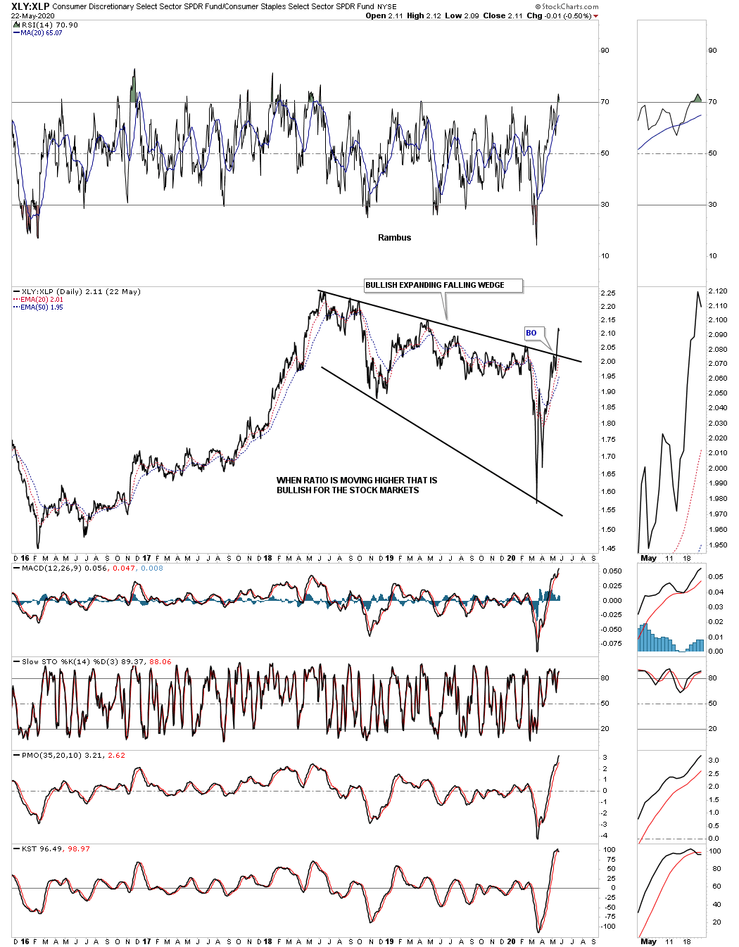
There is a lot that has happened since the last Quarterly Report. We experienced one of the strongest short term declines in history for the US stock markets and the Coronavirus that will be talked about for many decades into the future. We also had a major breakout in the precious metals complex except for silver with the commodities in general tanking hard to the downside.

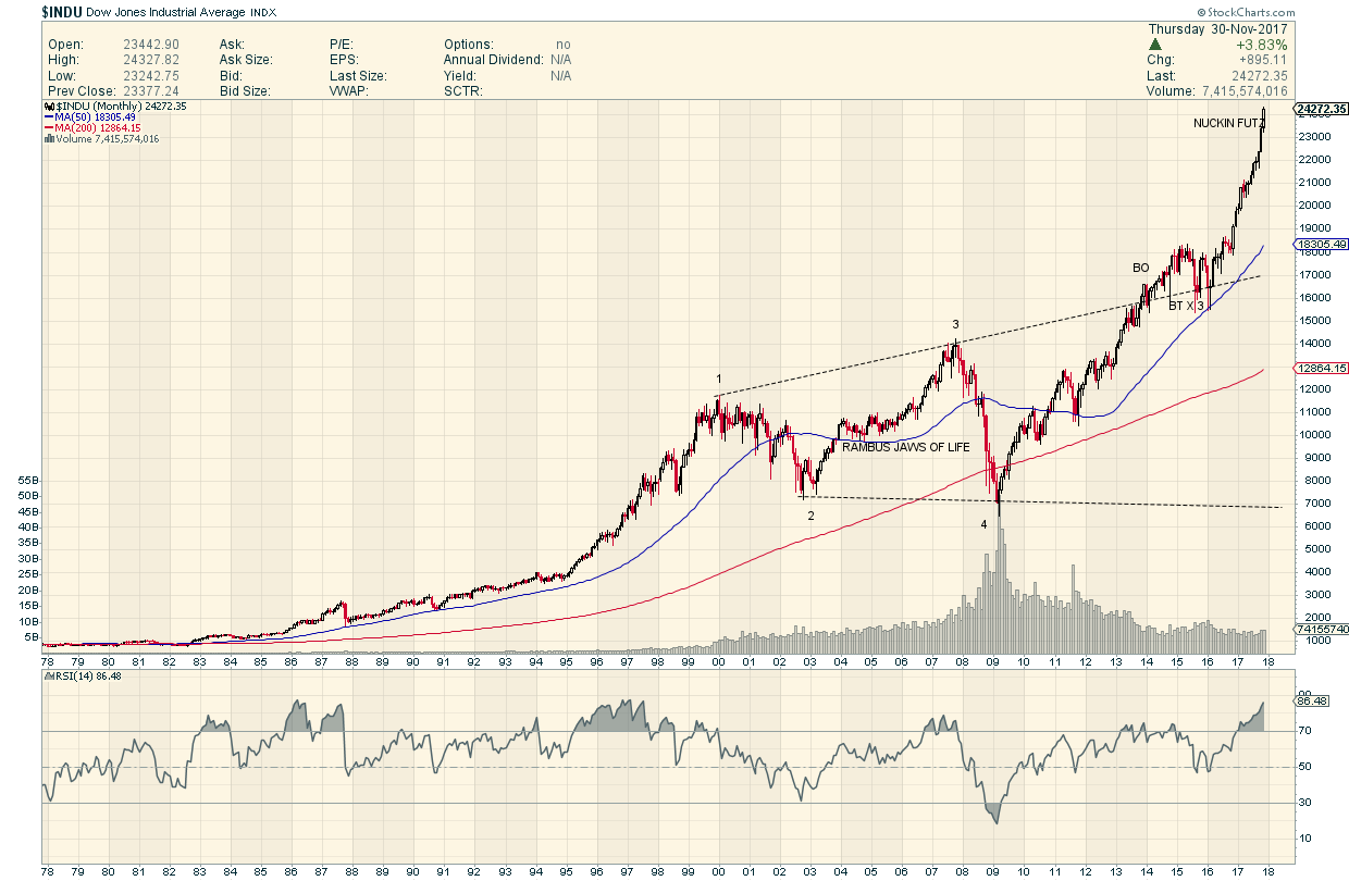
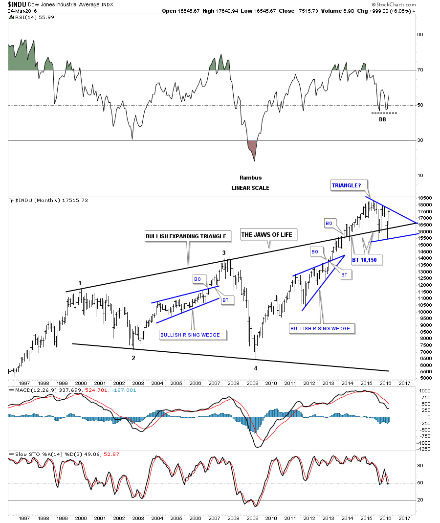
The 2020 stock market crash will be talked about a 100 years from now just like we talk about the Great Depression now. The great debate now is what is going to happen next. I sense the majority of investors are looking at the 1929 scenario to play out with another Great Depressing now upon us. The other scenario floating around is that we just witnessed something like the 1987 crash, which still has the biggest one day decline on a percentage basis in history of about 23% or so. Below is a weekly look at the price action leading up to the 1929 crash. This chart also shows you how human nature never changes by the same chart patterns that were formed back then, are the same chart patterns we see today almost a 100 years later.

Whenever you see a rising pattern where the top and bottom trendlines are slopping up you know you are in a strong trending market. As you can see there was a bullish rising wedge and the bullish expanding rising wedge that formed during the heart of the bull market. Then just before the 1929 top was reached the INDU formed an expanding triangle which is considered to be a pattern where investors are losing control of their emotions as the swings start getting bigger and bigger in both directions.

The roaring 20’s came to an end when the INDU put in a fairly small H&S top related to the size of the bull market. The initial breakout from the 1929 H&S top took only 4 weeks before to complete before the last countertrend rally, bearish rising wedge, really set the stage for the greatest decline for the INDU in history.

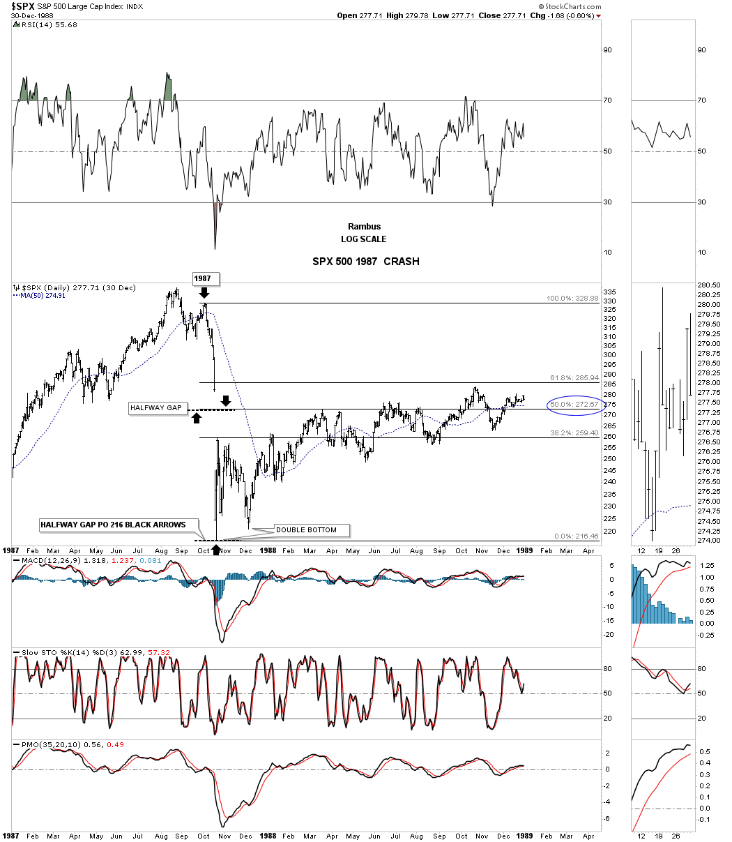
This next chart is 2 year daily chart for the SPX which shows the 1987 crash and what took place afterwords. After putting in the crash low on the left side of the double bottom the SPX traded sideways below the 38% retrace but never put in a lower low. Normally after a hard crash like this and the one we just experienced in 2020 the price action can stay range bound for a long period of time before the major trend can reassert itself again. There was a chart pattern that formed during the 1987 crash that looks very similar to the one that was made this year during the 2020 crash.

Note the big gap that was made on the way down that formed right in the middle of the crash which is called a halfway gap or breakaway gap. You can get a price objective by measuring from the last reversal point before the crash to the middle of the gap. You add that distance from the middle of the gap to get your price objective which was 216.

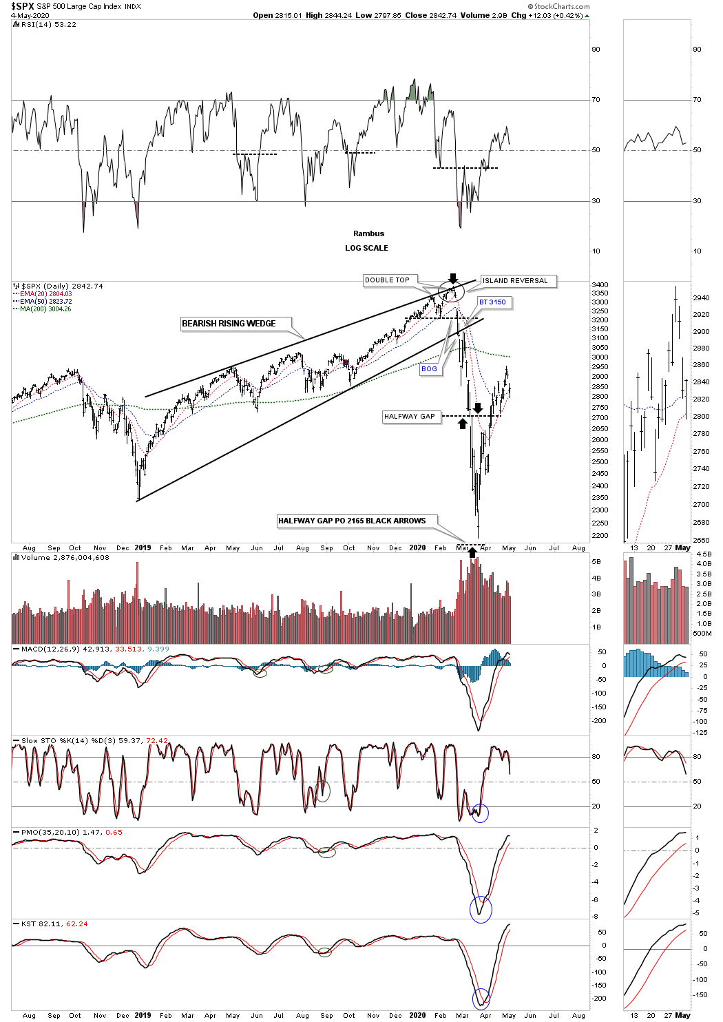
This next chart for the SPX shows the 2020 crash and how similar it is to the 1987 crash. Note the same setup to the 1987 crash by taking the last high, measuring down to the halfway gap which isn’t as pronounced as some of the other US stock markets, taking that distance and adding it to the middle of the gap to get your price objective down to the  2165 area as shown by the black arrows.

There is one more important bit of information on this chart I would like to show you. Anyone who has been following me for any length of time knows I was extremely bullish going into the all time high made on February 19th, 2020. Even on that day there was nothing on the chart to tell me that a disaster of major consequences would soon be upon us. The first real clue I got was when I recognized the small Island Reversal which isn’t that big of a deal but a short term negative. Then when the SPX dropped below the previous low a warning bell went off to look for a possible double top formation which is a reversal pattern. The breakout gap below the bottom rail of the 2019 rising wedge was my point to exit the bull market and wait for more information. At that time I mentioned that if the now bearish rising wedge played out as it should we could see a waterfall decline to where the rising wedge began to form in December of 2018. I really didn’t expect to see one of the greatest declines in history to follow but that is what happened. The reason I’m showing you this chart is because when the Chartology changes so do I, regardless of what I may think. Never underestimate the power of a reversal pattern no matter how big or how small it may be. We were able to avoid most of the crash by getting out early and actually made some money on the way down especially on the short oil trade.

Currently I’m neutral in regards to which way the major trend is eventually going to take hold. Until then I’m going to let the dust settle for a bit. In the meantime, below are a couple of rules I live by which may not make sense to some investors but makes total sense to me.

Let me start by saying, “The only rule when it comes to trading the stock markets is, “There Are No Rules.” The other important rule that I live by is that, “the markets are always right regardless of what I think.” It’s interesting to hear comments like, the markets don’t trade like they use to so its not any fun anymore. Even trading during the mania phase in the tech bubble parabolic rise wasn’t easy, or the markets can’t keep going up because of no volume or interest rates are too high or countless other reasons that only make sense according to traditional investing.

I personally fight everyday to keep an open mind to any possible scenario that may arise even if it doesn’t seem possible. I would venture to say that 90% of our members think I’m off the deep end because I believe there is a possibility that the 2020 crash low may already be in place and a new bull market could be setting up. How many are simply amazed by the strength the stock markets are showing? How can it keep going up with all the negative news about the Coronavirus and what its doing to the US and world economies.

Chartology is the study of chart patterns and human emotions which make up those chart patterns that are formed each and everyday. I’ve often said that we are playing a game of psychological warfare more than anything else. When the herd is moving one way it is very difficult as a human to move in the opposite direction because that’s our nature for survival. That works great in the real world but not so much when it comes to trading the stock markets.

I’v tried just about every trading discipline there is but I’ve always come back to building chart patterns and trying to interpret their meaning. From a Chartology perspective all the information an investor needs is in the charts. All the charts we look at everyday are made up from actual investors, institutions, mom and pop, the risk taker or the conservative trader with their hard earned capital on the line. It’s their view on the fundamentals or technicals or whatever it is that makes them want to invest in that stock that makes it go up or down.

The bottom line is that when a market or stock doesn’t do what you think it should be doing don’t blame it on the stock or the market because they are always right. It’s our interpretation of the information that is flawed. It can be a hard pill to swallow but that’s the nature of the game we choose to play. If it was easy everyone would be a millionaire, but then there would be no markets to trade.

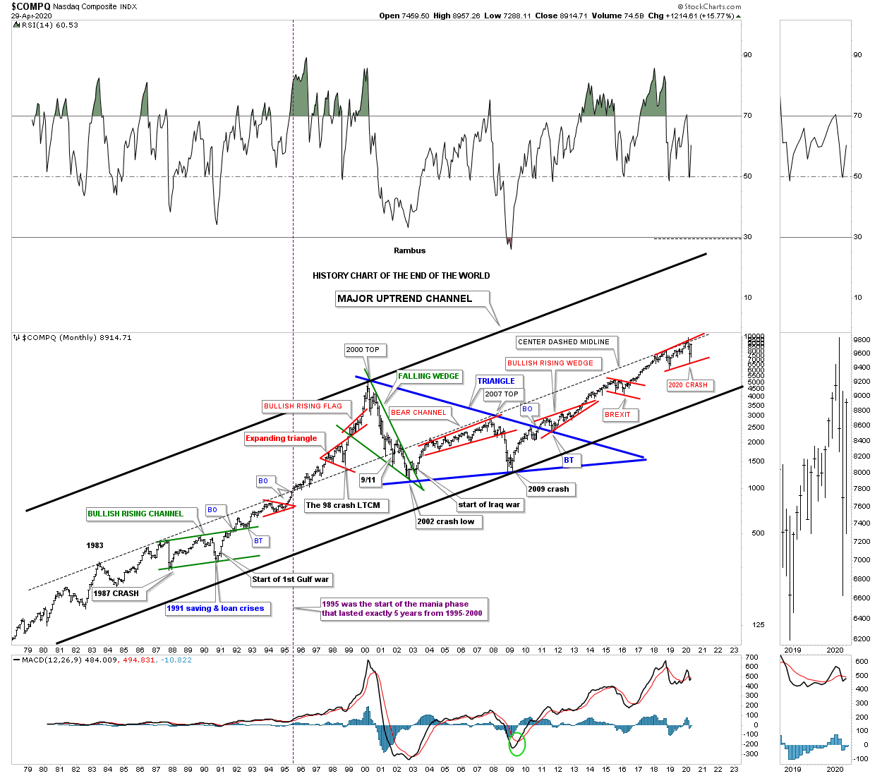
Last month when the 2020 crash put in the initial bottom I posted the, History Chart For the End of the World, that goes back to 1979. This historical chart shows all the end of the world events that I have personally traded through. I won’t go into a lot of detail since we just looked at this chart last month but for new members just start at the 1987 crash low which literally felt like the end of the world and is still the biggest one day decline in history on a percentage basis. Then just work your way to the right to see all the other history making events and chart patterns that felt like the end of the world when they occurred.

I view the center dashed midline as the most important line on this chart. It stretches all the way back to 1983 and kept the secular bull market in check until it came time for the tech parabolic move to take off beginning in 1995. In 1995 the price action was finally able to trade above the center dashed midline. With no overhead resistance the sky was the limit. After the 2000 top was in place the bear market crossed back below the center dashed midline once again where it turned back into resistance until the infamous 2007 top which led to one of the strongest bear markets in history. Since the 2009 crash low, which felt like the end of the world, its been very difficult for many investors to believe one of the biggest bull markets in history has occurred. Ask yourself a simple question. How much of the 2009 bull market have you actually felt comfortable trading, if any? How many reasons have you read that the rally was living on borrowed time or the fundamentals were sooo bad that there was no way the rally could continue.

So here we are again at another very important inflection point in regards to the 2020 crash low. Is this time going to be different and the end of the world is now upon us or are we witnessing another historical buying point? Note the small red rising flag that is forming just below the center dashed midline that is getting close to completing its 4th reversal point. We will get our answer if the top rail of the red rising flag and the center dashed midline are finally broken to the upside. Could we then see something similar to what we saw back in 1995 when the tech stocks went parabolic for 5 years? History has taught me not to bet against it.

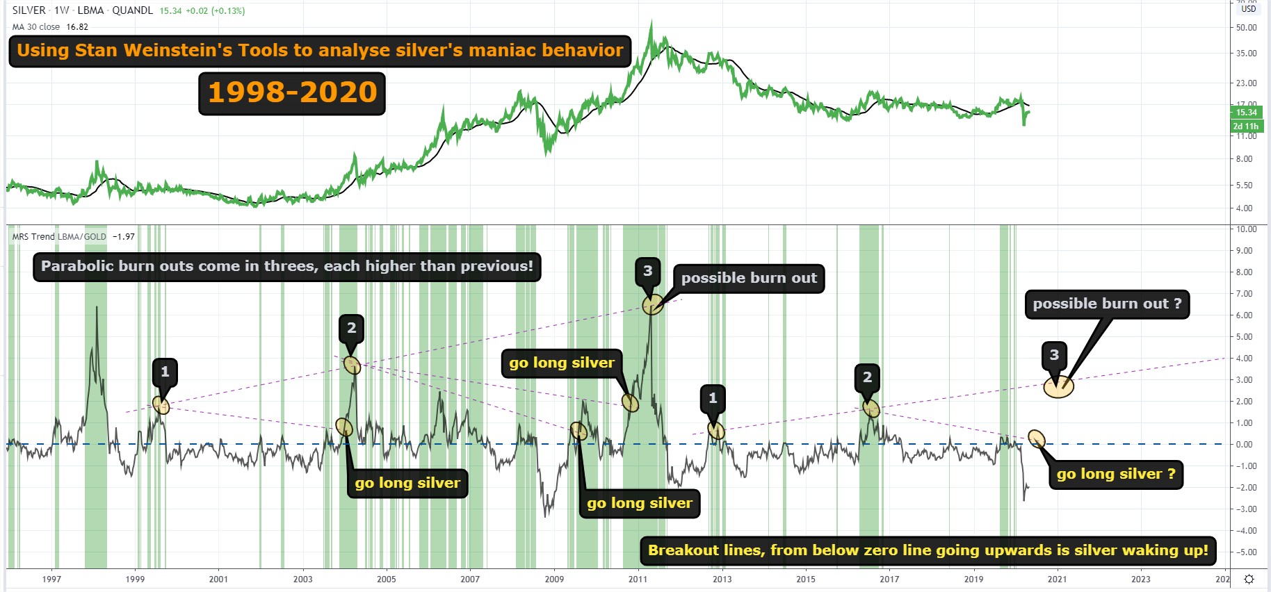
Precious Metals Complex:

There are as many ways to play the PM sector as there are investors. Some will only buy the big cap PM stocks for safety. Others will only buy the mid cap producers. Some will only buy a mix of big caps and mid cap producers. And then there are the PM stock investors that will only play the juniors. Each has its own advantage depending on your risk tolerance. Some of you are wondering why is Rambus’s portfolio structured like it is with hardly any big caps miners?

After a great run during the tech bull market that ended in 2000 I was able to basically retire and build our dream home. After that bull market ended I was left looking for another area in which to invest. It wasn’t until early 2002 that I saw a chart for gold which was showing a very large base that caught my attention. Whenever I see a big base I have to study it more to see what is behind the price action. The more I looked, it became apparent to me, that a new bull market may be starting to form in the PM complex.

Keep in mind I knew very little about the PM complex back then as I only traded the big cap tech stocks. I only knew a few of the really big cap PM stocks like Newmont, Barrick, ASA and just a couple of others. I didn’t even know there was a sector called the juniors. It didn’t take long, after I immersed myself in studying all I could about this new area to invest, that I became hooked. I still remember my first trades in the PM sector which were Newmont, Barrick and ASA.

I kept studying this new and exciting area for me and found out about the juniors and the possibilities they could offer. I read several articles about how many of the juniors went through the roof in 1997 I believe, when BRE-X supposedly found the Mother Lode. Juniors were going up 100’s of percent and many going up 1000’s of percent. There are few areas in the markets that a sector can go up that much so I had to study more. The more I studied this little sector the more convinced I became, that for me, this is where I wanted to trade. The rest they say is history.

I already had the foundation for identifying chart patterns so it was just a matter of finding as many juniors as I could and look at their chart patterns. Since the first leg up in the new bull market had ended there were many juniors with some decent consolidation patterns already in place. I was lucky that I was able to catch most of the 2nd leg up in the new bull market before it ran out of gas and needed to consolidate its gains. When I put my first PM portfolio together I bought 10 juniors all under a dollar and hoped for the best. By the time the correction began that portfolio was up 273% in just under 8 months which was more than I had hoped for.

During the next impulse move up that began in 2005 I had bought 20 juniors all under a $1.00 and when that impulse move ended that portfolio was up 328% in less than a year. Needless to say I had found a new home in which to trade.

What I learned trading back then was that the tide would lift all boats to a certain degree with the juniors, that had good looking chart patterns, 100’s of percent. What I also learned back then was that when the impulse move ended it was time to get out of those juniors as they could give back a large chunk of the profits during the next consolidation phase.

So that brings us up to my current portfolio. One thing about the PM stocks is that it is a small universe and following it through the years you begin to learn about their individual characteristics and how they may behave during an impulse move. Some would call my current portfolio very speculative because I don’t have any really large PM stocks, but I do have a decent mix of some mid caps and juniors.

Sir Plunger’s 4 horsemen are going to do very well and make a lot of money for those that invest in those 4 stocks. For me personally and what I learned in the first half of this secular bull market that ended in 2011 was that the juniors is where I want to mostly trade. If I don’t make at least 250% to 300% on this trade, which I finished up the buying several weeks ago, then I will be disappointed. I hope it will be more but I’ll be satisfied with the 250% to 300% profits.

Another important lesson I would like to share is that once you are in a confirmed impulse move the last thing you want to do is try trading it. That was a lesson I learned the hard way though the years. For whatever reasons once you get out of a trade in an impulse move the idea that you are going to buy back at a cheaper price very seldom works out. My experience has been you usually pay up if you want to get that position back.

I posted this history chart for the HUI several weeks ago which shows all the consolidation patterns that formed during the first half of the secular bull market that ended in 2011. The red arrows show you where the impulse move actually began. As you can see most of the impulse moves between each consolidation pattern lasted for many months before they became exhausted. If you recall the last time I posted this chart I put the red arrow under the 5th reversal point on the 2016 triangle reversal pattern. I said I wasn’t going to wait for the breakout before I got positioned which so far has worked out well. The price objective for the 2016 triangle is above the 2011 all time high over 700 but I’ll be satisfied to reach  the all time high before the next consolidation period begins.

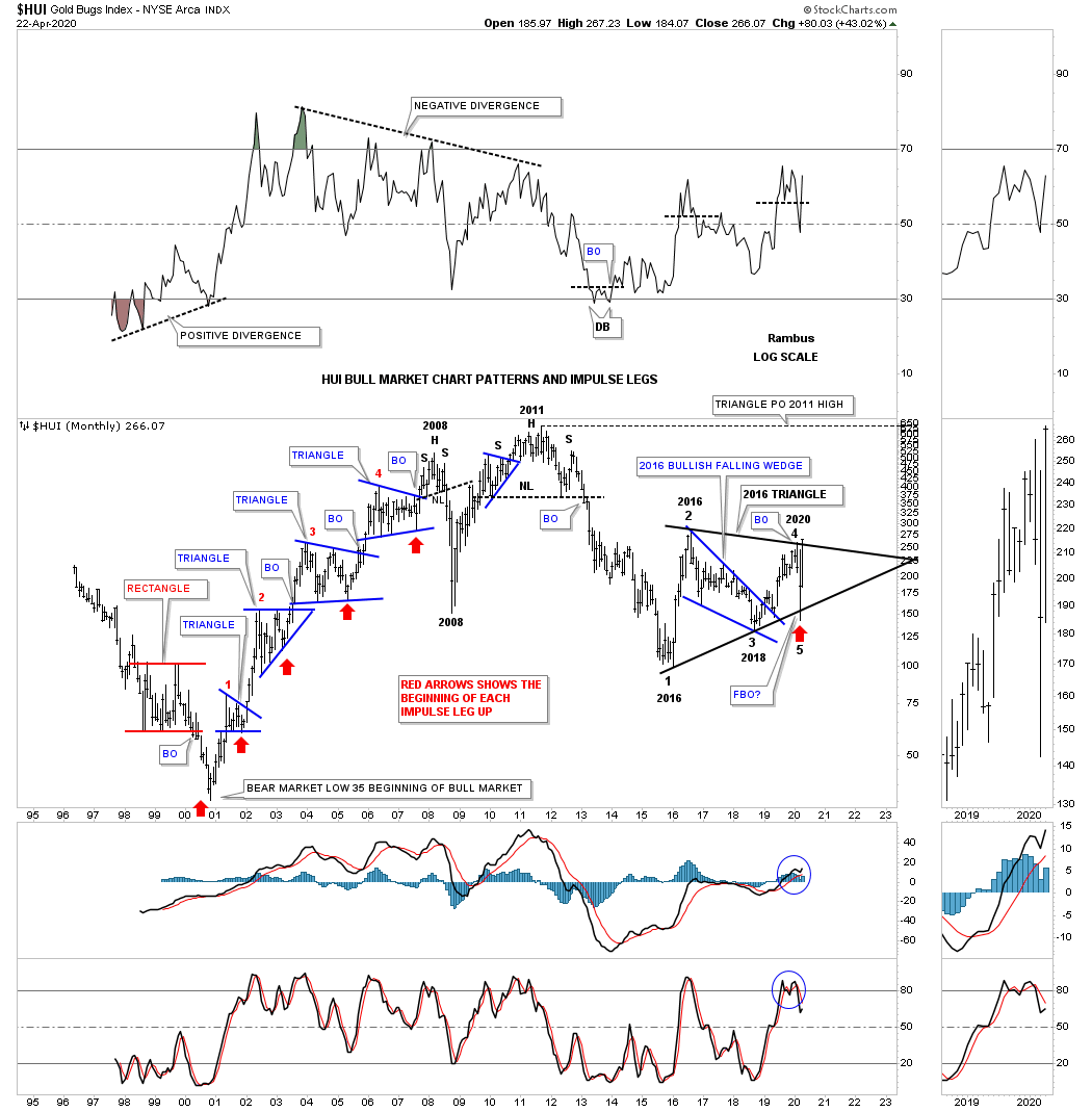
So how does the 2016 triangle reversal pattern look on the long term secular bull market uptrend channel? It has been forming right on the bottom rail of the 2000 bull market uptrend channel. Where will the HUI be trading if the top rail of the bull market uptrend channel is reached in the future?

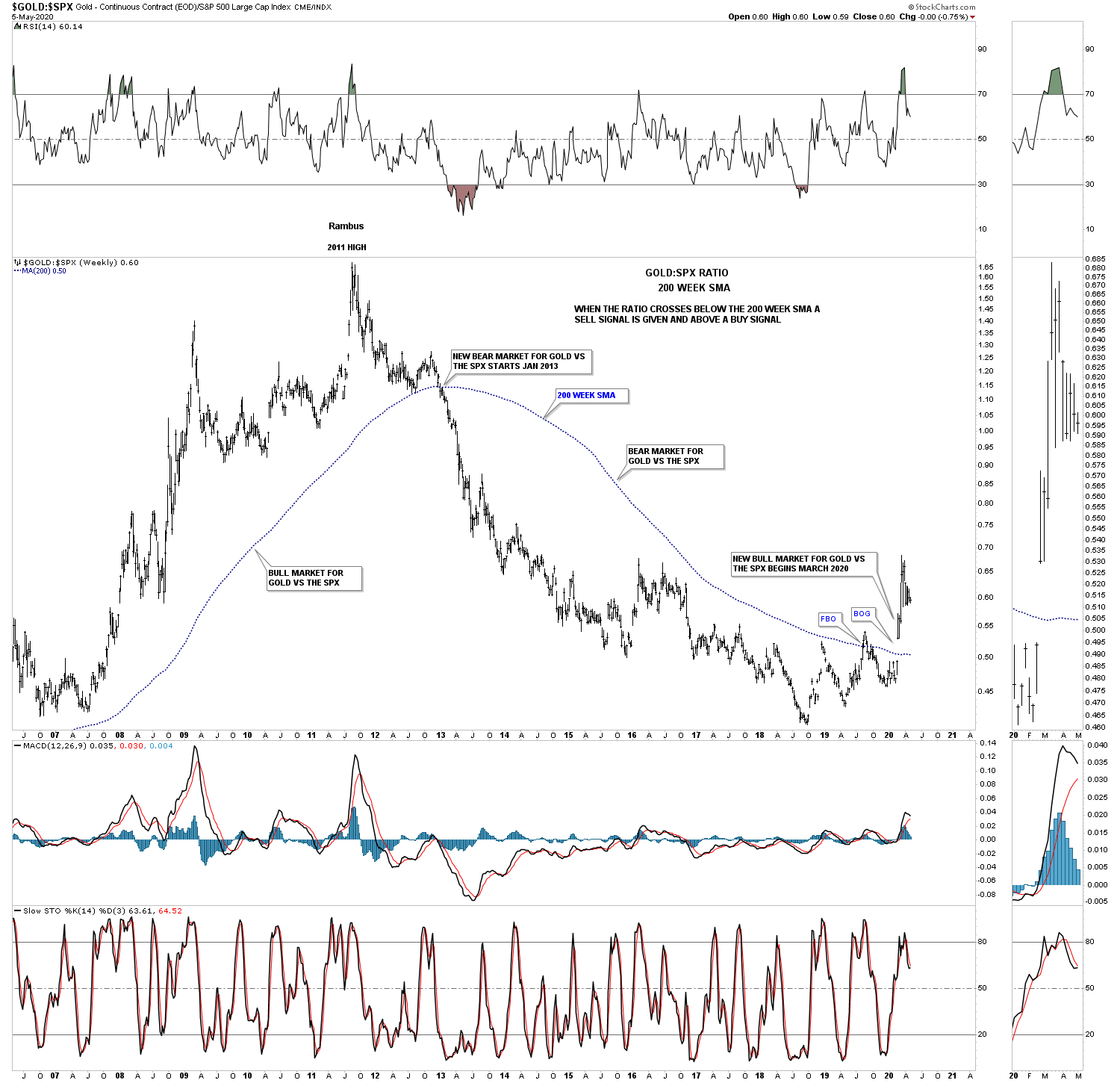
This next chart is a ratio chart that compares GOLD:SPX which gives long term buy and sell signals. When the ratio trades above the 200 week sma a long term buy signal is given and when the price action trades below the 200 week sma you are on a long term sell signal. Recently in March of this year the ratio finally broke out above the 200 week sma giving a brand new buy signal. The previous bear market sell signal occurred in January of 2013 over 7 years ago. This chart tells us gold is now set to outperform the SPX until the next sell signal is generated.

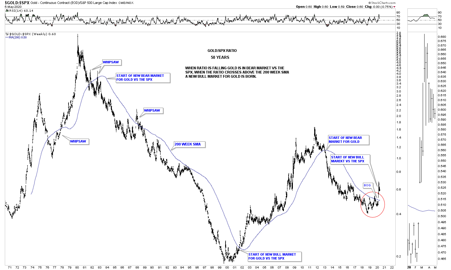
This next chart is the same as the one above but his chart goes back 50 years and shows all the long term buy and sell signals. As you can see once the dominate trend gets established it can last for many years. In over 50 years there has only been 3 whipsaws where the ratio traded over the 200 week sma only to trade back below it.

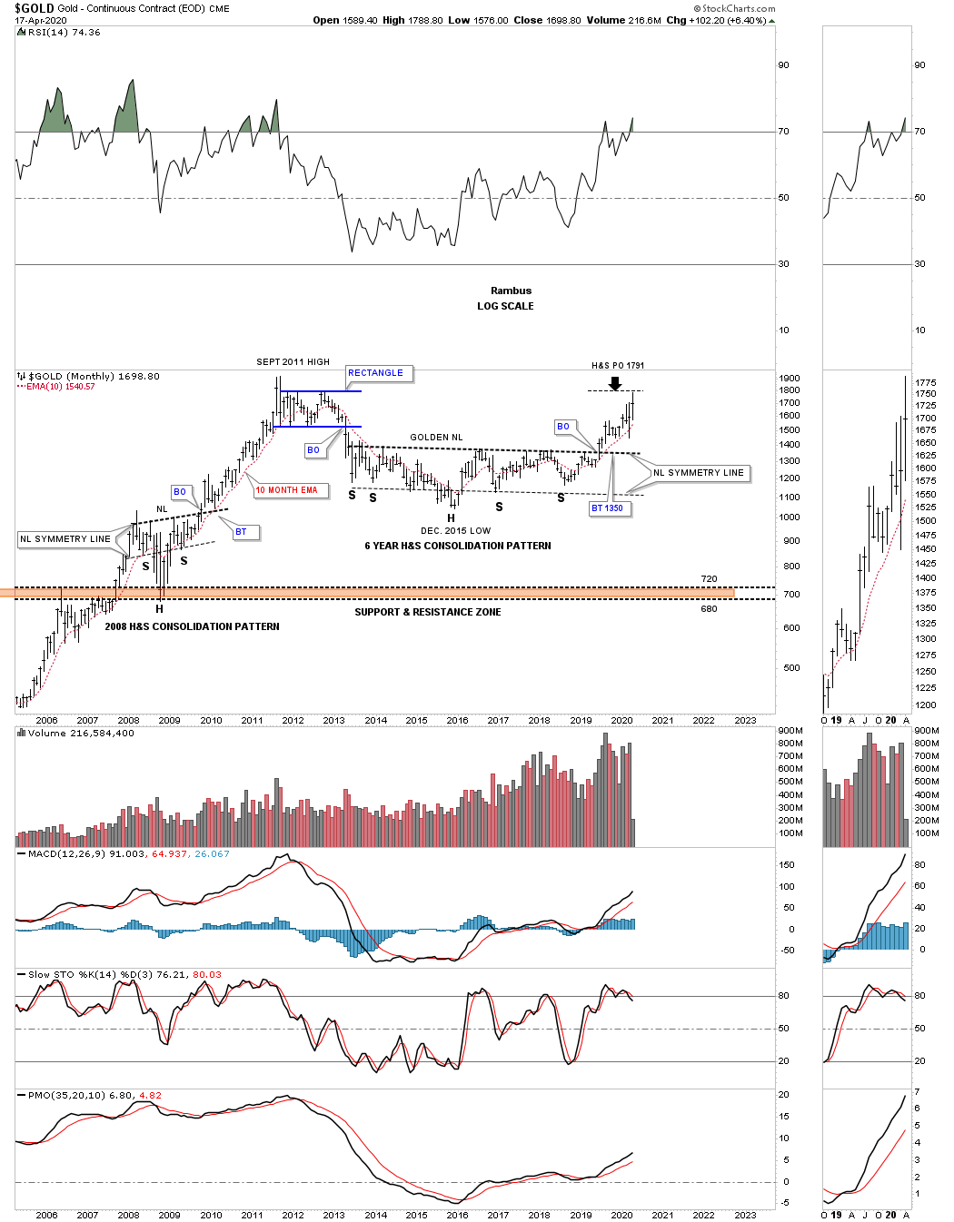
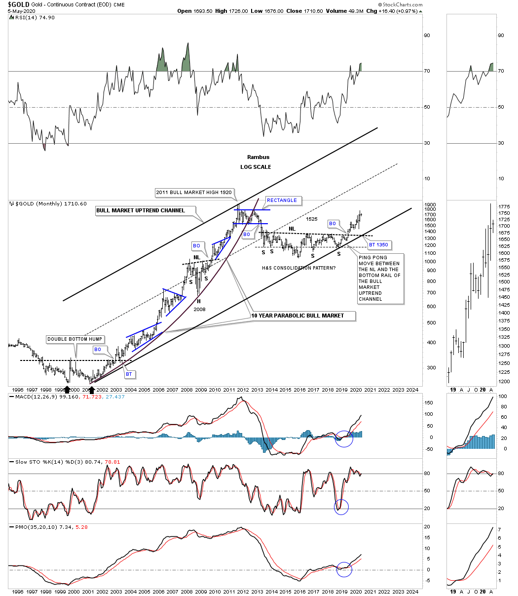
For those that want to see what a secular bull market looks like this long term month chart for gold shows the first phase of the secular bull market that ran from 2000 to 2011. Gold has been correcting the first leg up for almost 9 years now building out the massive 6 year H&S consolidation pattern. The 6 year H&S consolidation pattern could very well end up being a halfway pattern between the first leg up and the current leg up. Note the blue consolidation patterns that formed during the first bull phase and how each one of those blue patterns formed about the halfway point between each impulse move.

There is one subtle bit of Chartology on this long term monthly chart that is easy to see if you look for it. In any strong uptrend you will see higher highs and higher lows that is by definition an uptrend and just the opposite for a downtrend. If you start at the double bottom that launched the 2000 – 2011 bull market follow the price action starting at the right side double bottom as shown by the black arrow. Follow each monthly low all the way up to the 2008 H&S consolidation pattern. Not once during that entire move did we see gold make a lower low. During the formation of the 2008 H&S consolidation pattern we did see gold make a lower low which formed the head. Now follow the price action from the head of the 2008 H&S consolidation pattern up to the all time high made in September of 2011 and you will see higher lows all the way up.

Commodities:

After a long term bear market in most commodity related stocks we are starting to hear analyst talk about inflation. From a Chartology perspective the deflationary scenario is still in play but how much lower can this sector go? In tonights Weekend Report, I’m going to update some long term commodity charts we’ve been following for years to see where they are currently trading in their bear cycle.

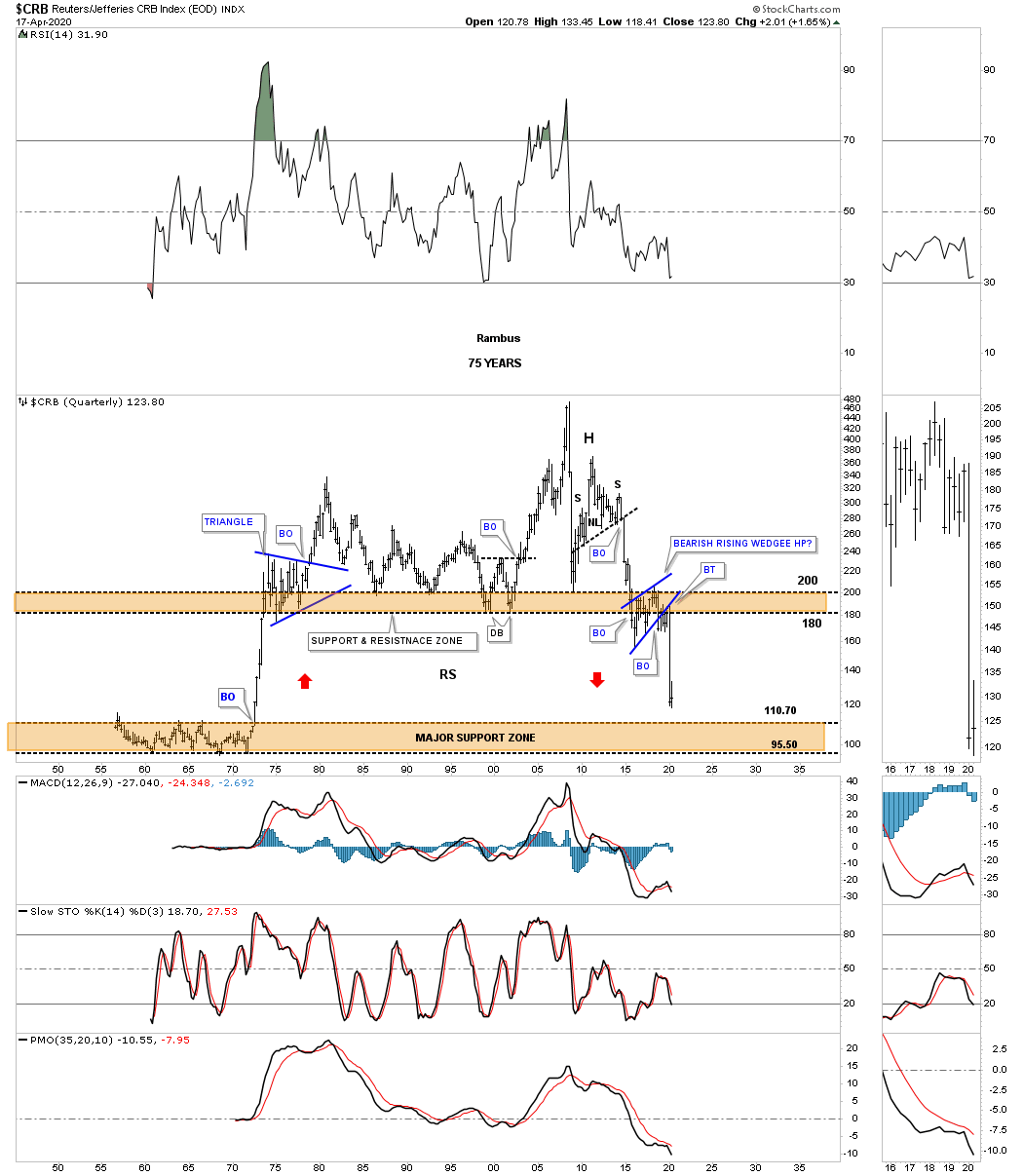
Lets begin by looking at one of the most widely followed commodity indexes the CRB. This 20 year monthly chart clearly shows the bear market began in July of 2008 which puts the age of its bear market at 12 years and counting. The initial crash, out of the 2008 high, was the same crash that the stock markets and PM complex experienced. The countertrend rally out of the 2009 crash low setup the next important high in the ongoing bear market which was the 5 year H&S consolidation pattern. The impulse move out of that 5 year H&S consolidation pattern took the CRB index down to the January 2016 low where we saw another countertrend rally that concluded in May of 2018 forming the head of the 4 year H&S consolidation pattern. The H&S neckline gave way in February of this year and has reached the minimum H&S price objective at 134.23. The CRB index has now reached an important point within its impulse move down where we could see either another small consolidation pattern start forming, similar to the blue expanding triangle halfway pattern in 2005, or some type of reversal pattern.

This is what I wrote back on August 23, 2019. This next chart for the CRB index is the infamous 75 year quarterly chart which shows the trading range that formed between the mid 1950’s to the early 1970’s. This chart shows how the H&S top and the bearish rising wedge fits into the big picture which could have serious negative consequences for the CRB index. If the current bearish rising wedge fulfills its measured move as a halfway pattern to the downside the CRB index will be trading all the way down into the brown shaded support zone using the BO to BO method. Just measure from the breakout below the neckline to the first reversal point in the 2016 bearish rising wedge. Then just take that measurement and add it to the breakout point of the 2016 bearish rising wedge to get your price objective. As you can see the current price action is now approaching the top of the brown shaded support zone which goes all the way back to the mid 1970’s.

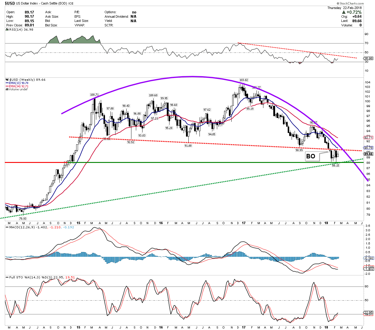
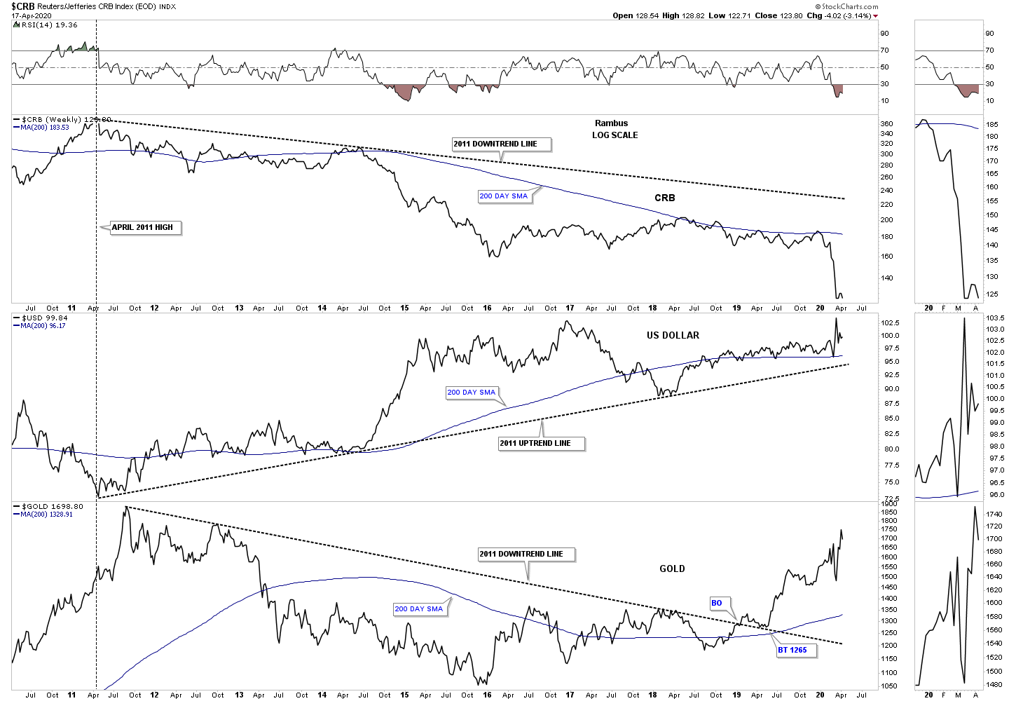
This next chart is a long term weekly combo chart which has the CRB index on top, with the US dollar in the middle and gold on the bottom. Since 2011 the CRB index has been moving inversely to the US dollar while gold has been moving generally up with the US dollar since the 2016 low. At this point a strong US dollar is still playing havoc with the commodities in general but not so much for gold.

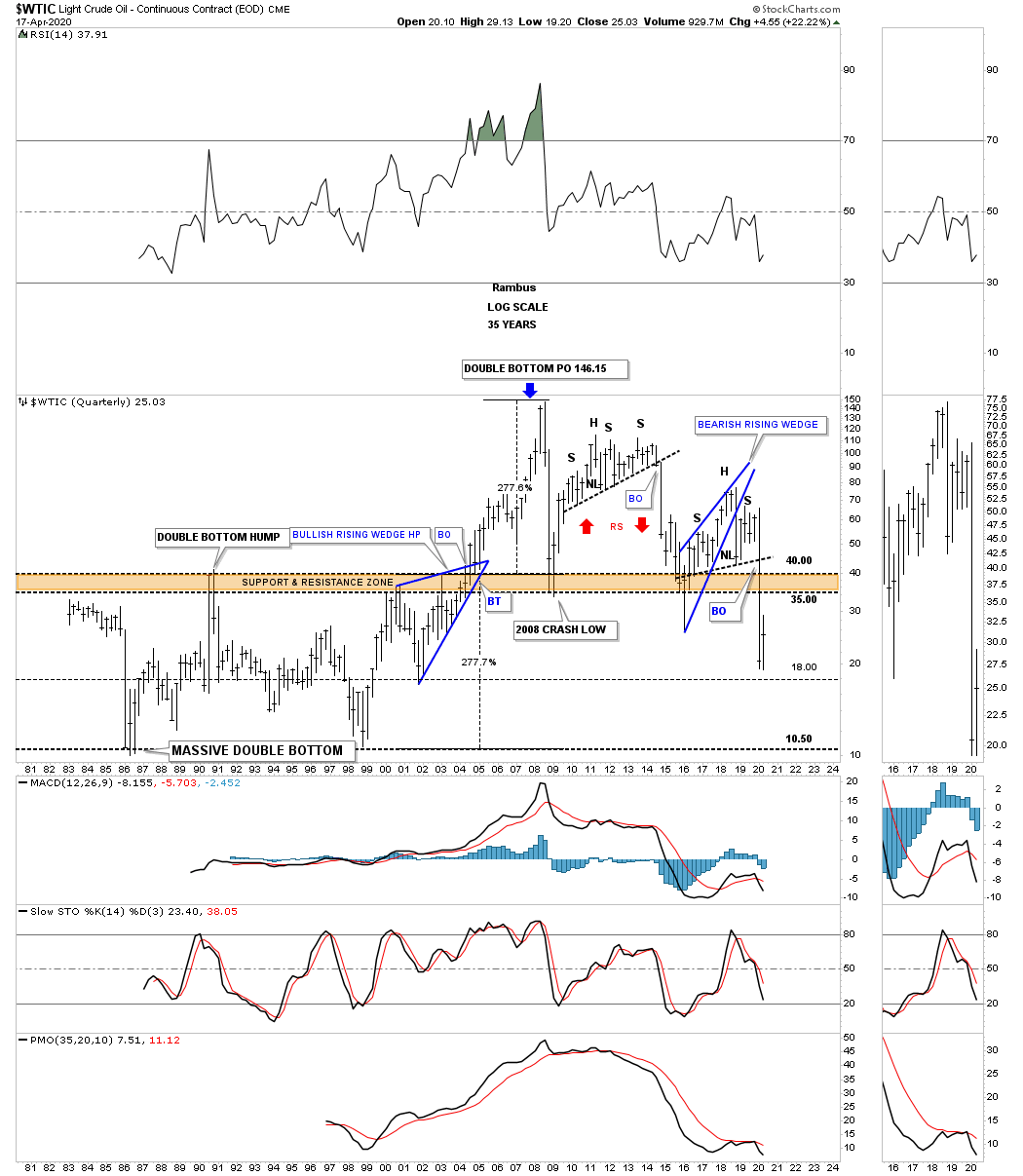
One of the most important commodities on the planet is oil, WTIC. Since the parabolic move that ended at the 2008 high WTIC has been in a severe bear market going from 147 to the recent low just under 20. What is most interesting about this long term monthly chart is how the recent low came in at the H&S measured move price objective down to the 23.19 area which was also the bottom rail of the 2008 downtrend channel. I’m keeping a close eye on the shorter term daily chart looking for some type of reversal or consolidation pattern to form.

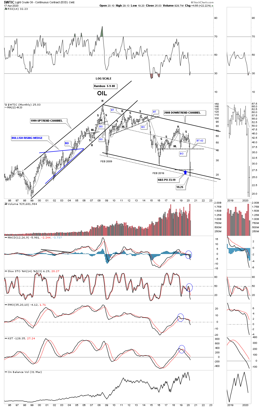
Just like the long term quarterly chart for the CRB index we looked at earlier the WTIC has a very similar pattern that goes all the way back to 1981 when the low in oil was 10.81. Note the massive double bottom which projected a move of 277% which was just a dollar or so off the all time high. I’ve often explained what a classic H&S top is. They start out with a rising wedge where the left shoulder and head form inside of the rising wedge with the right shoulder high forming close to the breakout point on the backtest to the bottom rail of the rising wedge. The short oil trade was our best performing leveraged trade during the 2020 crash.

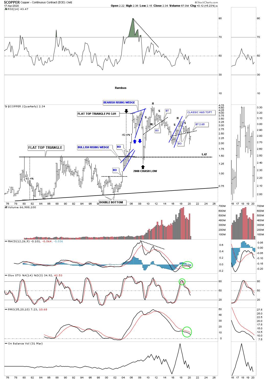
Since we are looking at long term quarterly charts for commodities we shouldn’t be surprised that many have similar looking charts. This long term quarterly chart for Copper shows a similar look to the WTIC which shows its recent H&S top is also a classic H&S top. You can also see the massive base that began to develop back in the late 1970’s which broke out to the topside in the middle of 2005 and reached its price objective at 3.81. Note how the 2008 crash found support right on top of that massive flat top expanding triangle.

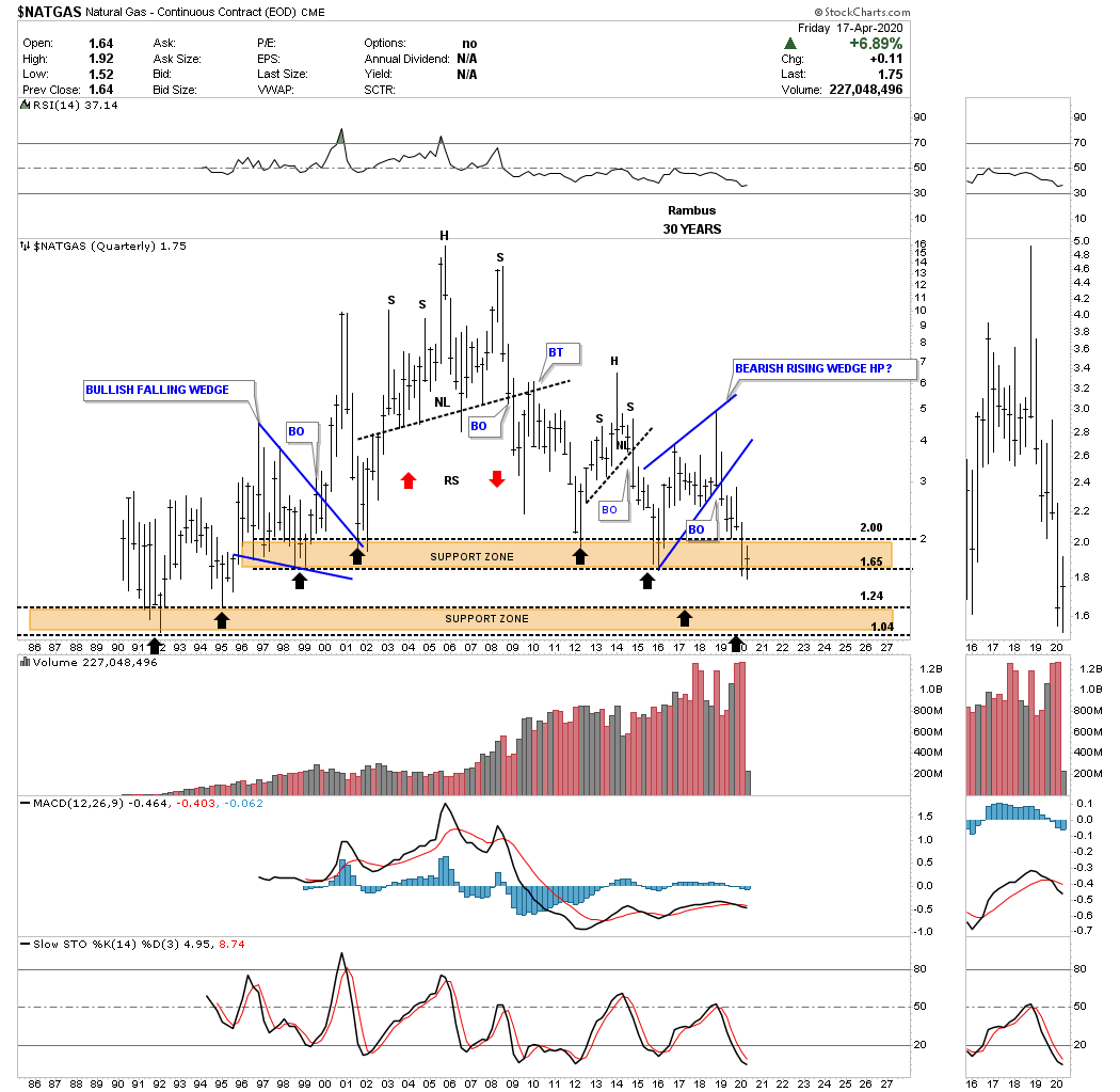
NATGAS, natural gas, is setup a bit differently in regards to its long term chart. The bear market for natural gas actually began in 2005 and has made a series of long term lower highs. When I first built this chart I put in two brown shaded support and resistance zones as the reverse symmetry was playing out so beautifully as shown by the back arrows. The upper brown shaded support zone has held support going all the way back to 1995. Is it going to hold support in 2020?

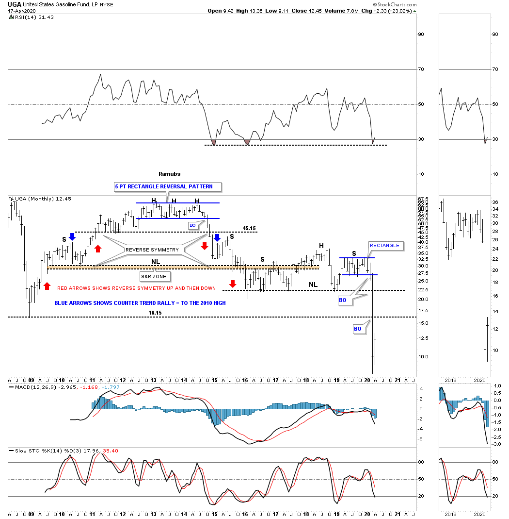
When we first opened up our doors at Rambus Chartology I would show this chart for UGA, gasoline, on Friday night after the market closed for the weekend. The trading range at the top of the chart ended up being a 5 point rectangle reversal pattern which ended up being the head for multiple H&S tops.

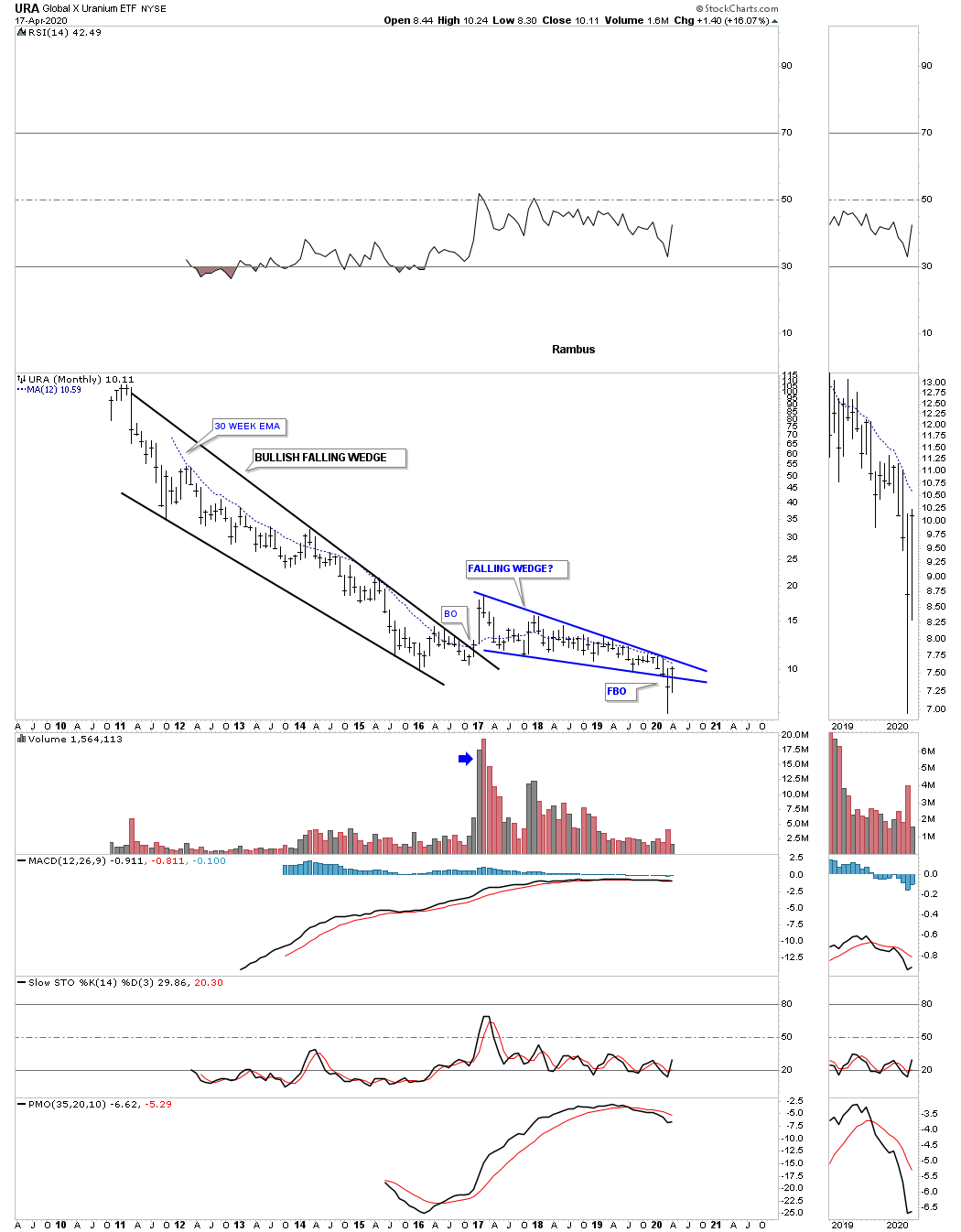
Lets finish up by looking at some different commodities and indexes. Last month the URA broke below the bottom rail of its 2016 falling wedge. So far this month the URA has managed to rally back up into the falling wedge negating the breakout for now. A move above the 30 week ema would help with a bullish outcome which is just overhead.

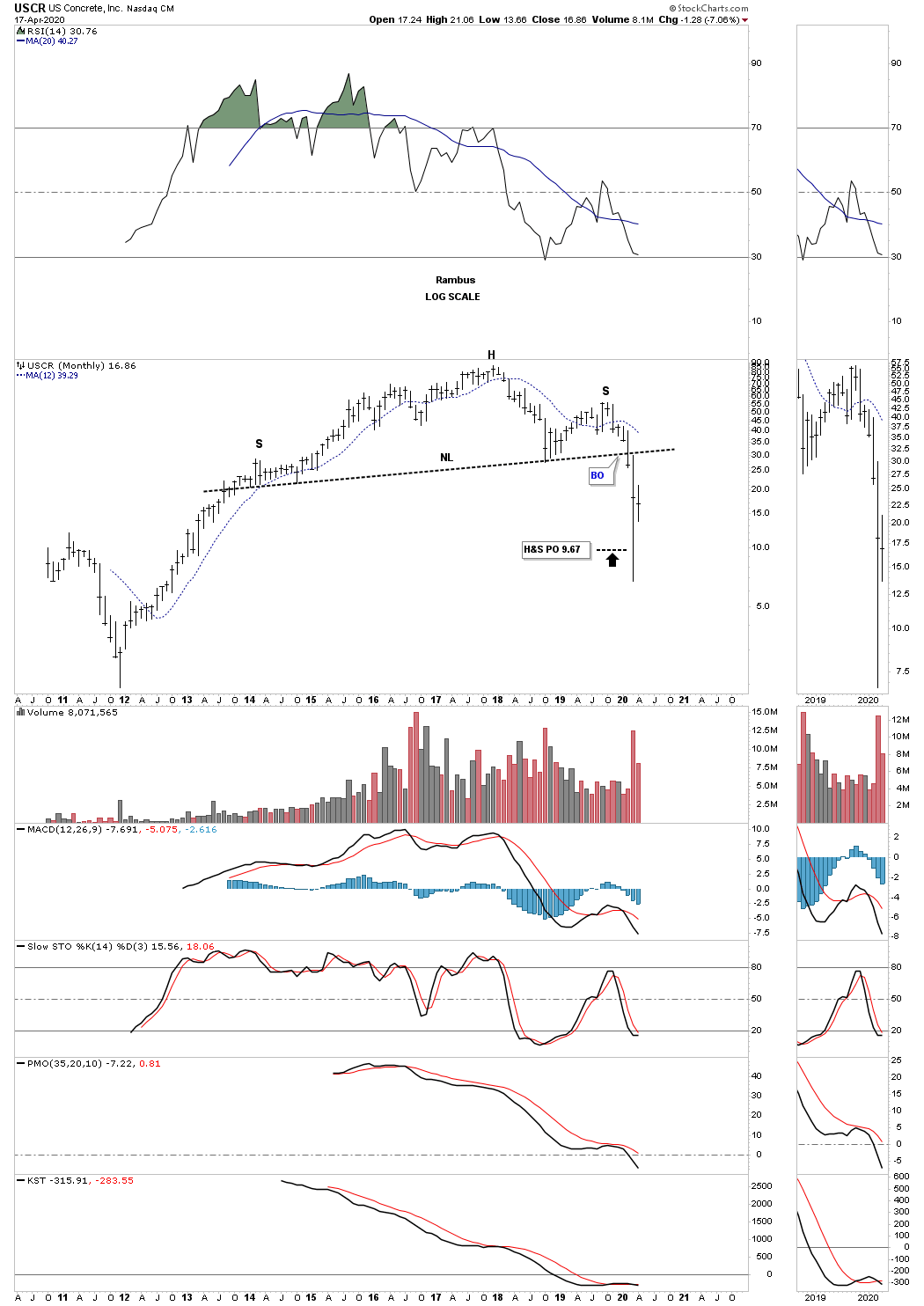
USCR, US concrete, has just achieved the minimum price objective for its H&S top after its massive bull market that began in late 2011.

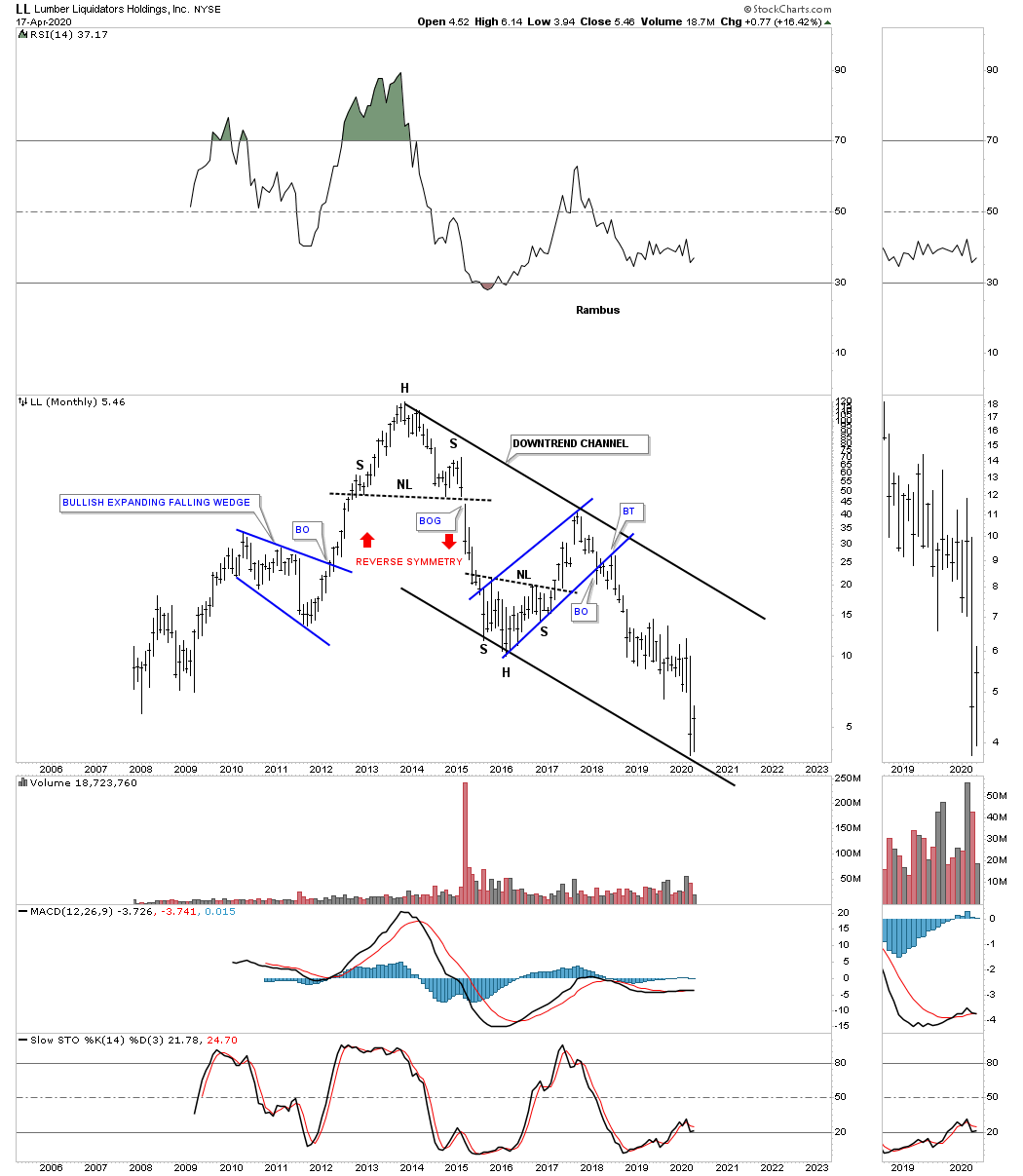
LL, lumber, has just hit the bottom rail of its 2013 downtrend channel.

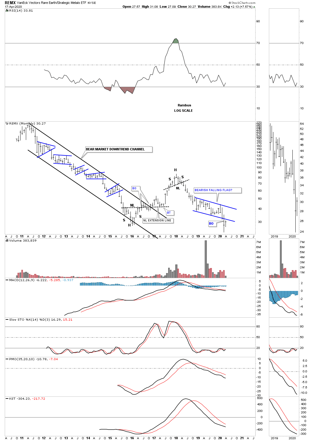
The REMX, Rare Earth etf, has experienced one countertrend rally during its lifetime going back to the 2011 high. Last month the price action broke below the bottom rail of a falling flag formation which is generally a bad sign unless the bulls come to the rescue and rally REMX back into the falling flag at a minimum.

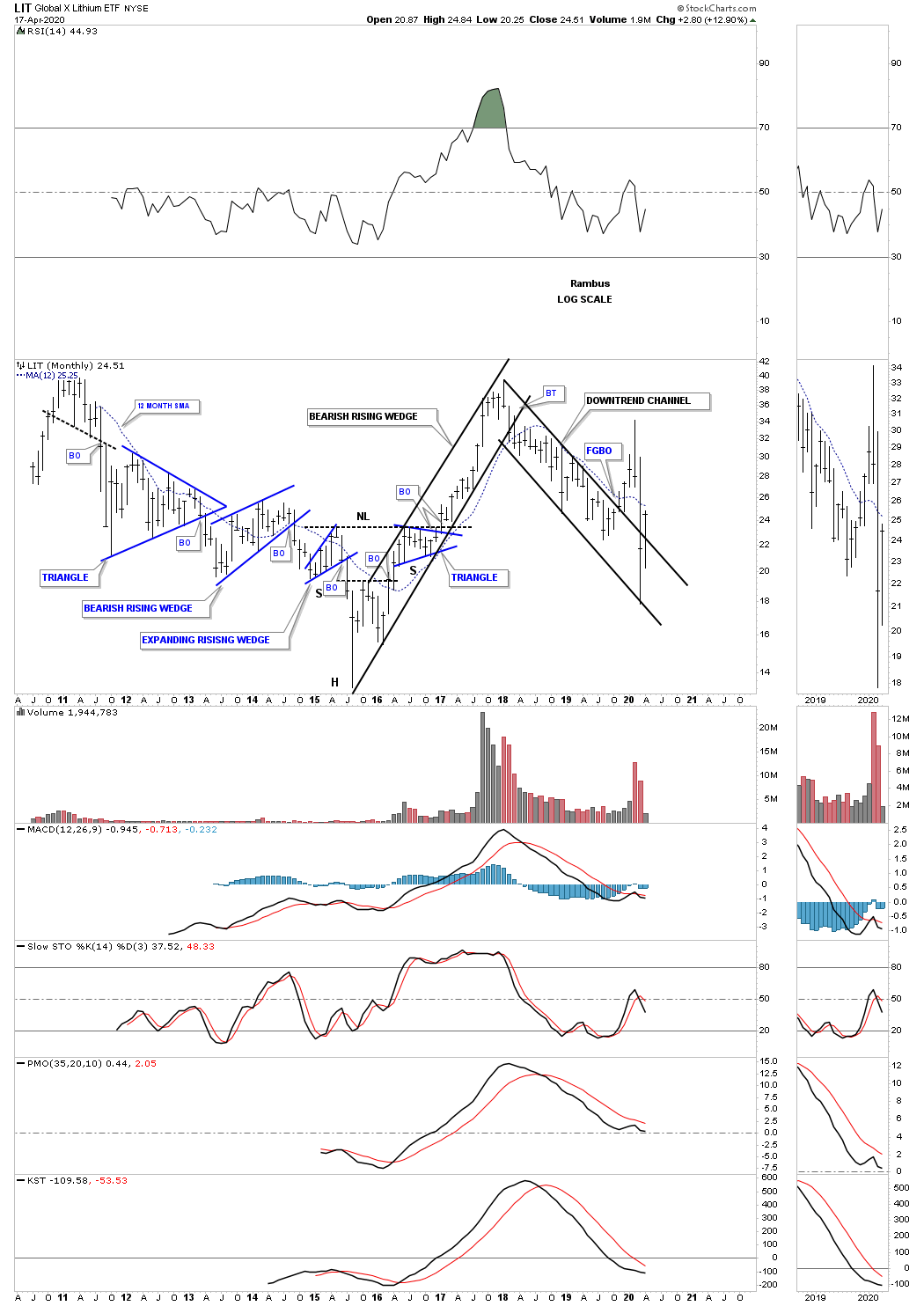
After putting in a false breakout gap last November the LIT, lithium etf, the price action negated that breakout when it traded back into the downtrend channel. This month the LIT is attempting to breakout again trading back above the top rail.

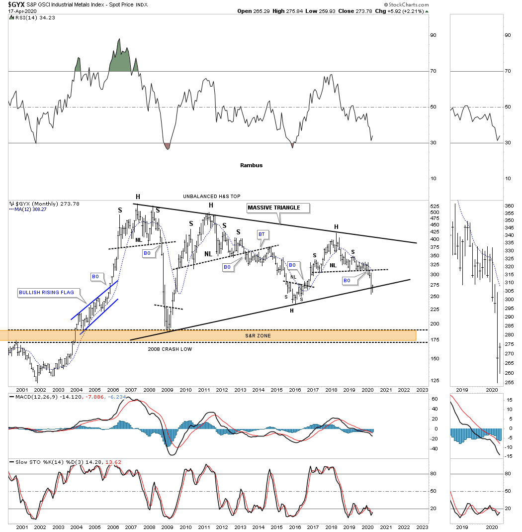
The GYX, industrial metals index, is trying to find support on the bottom rail of its massive 2005 triangle.

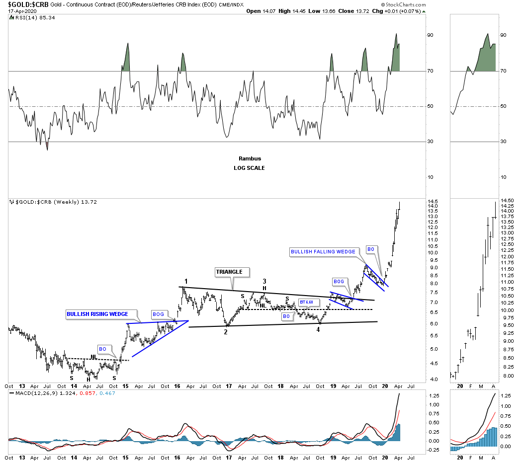
Below is a ratio chart that compares gold to the CRB index. How much longer can gold outperform the CRB index in such a big way?

This last chart for tonight is a long term monthly chart for gold with the 2013 golden neckline. This month the 2013 H&S consolidation pattern minimum price objective has been met a 1791.

The bottom line is that most commodities have been in a bear market since their 2008 highs. Now most have reached their minimum long term price objectives which puts them at a critical inflection point where they can form a consolidation pattern to the downside which would most likely complete their bear markets. On the other hand they could be either starting to form a reversal pattern of some kind which could end their bear markets. Keep an open mind watching the shorter daily charts to see what kind of pattern builds out.

Stay safe and all the best…Rambus


Gold to Silver ratio – Economic indicator 333 years history

Gold to silver is a reliable indicator of credit in market. Credit contract when ratio rises and expands when the ratio declines.
333 years of GSR research.

This research paper out lines why GSR has remain high since it bottom in 2011.

Many banks research departments like CITI and others watch movement of GSR.

Two current charts:
Gold to CRB indicating deflation
Gold to Silver weekly

The Gold-Silver Ratio is Indicative of Global Deflation

” For at least 150 years the ratio has served as an indicator of the global monetary condition. During periods of
inflationary monetary proliferation, the ratio falls. During eras of deflationary monetary destruction, the ratio rises. ”

“Two points summarize the overall story. Firstly, the gold-silver ratio has been an indicator of global monetary conditions for well over 150 years. It remains so to this day. Secondly, monetary conditions when viewed from the perspective of capital markets, commodities, and economic indicators are in concert that either deflation or disinflation lies ahead. ”

https://s21.q4cdn.com/266470217/files/doc_downloads/blog_post/2020-01-Jan-Macro-Metal-News.pdf

Au — long term

Look at the article at www.zerohedge.com/news/2019-07-13/will-history-repeat-itself-gold-market

You can read it or not (I skimmed w/o paying much attention). Look at it for the 1st chart. Expand it the chart.

Keep in mind a concept that I have, which is that the concepts “bull market” and “bear market” are a bit of hot air. They are somewhat arbitrary and depend on things like time scale, when you choose to start and end, what you decide to choose for magnitude of gain and loss and how much up and down there can be in between before you decide that a bull/bear is over.  I use a time scale of years.

Nevertheless I’d like to repeat a comment I made perhaps a couple of months ago. Someone made fun of it, pleasantly and politely, but I think I have yet to be proved wrong. I wrote very approximately something to the effect that that my home-made TA indicated in 1998 that the gold bull market had begun, that it was about 2 years too early but it wasn’t a bad time to have started buying with all I could, and that my TA screamed bull around 2000, and that I believe I was right, and that the bull is still in effect. I wrote that if one wants to use a shorter time scale we are in a bull market that began in 2016. Although I always try to note that anything can happen, I believe I have tended to scoff at as malarky talk since 2016 about bear market in Au unless one trades on short term. However many people here may be shorter term traders, in which case they may have been justified to use the term “bear market”.

But just look at the chart, which has no fabulous paid.  Don’t think of the gurus and Experts who make you worry that you just have to do this or that. Just look at the chart.

And as just about always I issue the disclaimer that nothing surprises me. Gold below 700? No surprise. Gold to <0 (efficient and thoroughly effective severe punitive confiscation)? Does Giant Meteor destroy all life tomorrow?  I can’t predict things with certainty. I just know that I have been doing my best to follow individual companies’ charts and have tried to hold the ones with the best fundamentals and best charts, not always competently and things haven’t been too bad.

Some GSR info. for any of us novices

Spock sent out a chart to day of the GSR.

There have been other charts here and comment but I wanted to try to grasp this better.

Kind of like learning where to place a volley when up at the net!…………

So it looks like the ratio is in the mid 80″s right now and this article points to maybe the 50′ as being preferred?


For the hard-asset enthusiast, the gold-silver ratio is common parlance. For the average investor, it represents an arcane metric that is anything but well-known. The fact is that a substantial profit potential exists in some established strategies that rely on this ratio.

How the Ratio Works

When gold trades at $500 per ounce and silver at $5, traders refer to a gold-silver ratio of 100. Today the ratio floats because gold and silver are valued daily by market forces, but this has not always been the case. The ratio has been permanently set at different times in history, and in different places, by governments seeking monetary stability.

  • 2007 – For the year, the gold-silver ratio averaged 51.
  • 1991 – When silver hit record lows, the ratio peaked at 100.
  • 1980 – At the time of the last great surge in gold and silver, the ratio stood at 17.
  • End of the 19th Century – The nearly universal fixed ratio of 15 came to a close with the end of the bi-metallic era.
  • Roman Empire – The ratio was set at 12.
  • 323 BC – The ratio stood at 12.5 upon the death of Alexander the Great.

These days, gold and silver trade more or less in sync, but there are periods when the ratio drops or rises to levels that could be considered statistically “extreme.” These extreme levels create trading opportunities.

How to Trade the Gold-silver Ratio

First, trading the gold-silver ratio is an activity primarily undertaken by hard-asset enthusiasts often called “gold bugs.” Why? Because the trade is predicated on accumulating greater quantities of metal and not on increasing dollar-value profits. Sound confusing? Let’s look at an example.

  1. When a trader possesses one ounce of gold and the ratio rises to an unprecedented 100, the trader would sell their single gold ounce for 100 ounces of silver.
  2. When the ratio then contracted to an opposite historical extreme of 50, for example, the trader would then sell his or her 100 ounces for two ounces of gold.
  3. In this manner, the trader would continue to accumulate quantities of metal seeking extreme ratio numbers to trade and maximize holdings.

Note that no dollar value is considered when making the trade; the relative value of the metal is considered unimportant.

For those worried about devaluation, deflation, currency replacement, and even war, the strategy makes sense. Precious metals have a proven record of maintaining their value in the face of any contingency that might threaten the worth of a nation’s fiat currency.

Drawbacks of the Trade

The difficulty with the trade is correctly identifying the extreme relative valuations between the metals. If the ratio hits 100 and an investor sells gold for silver, then the ratio continues to expand, hovering for the next five years between 120 and 150. The investor is stuck. A new trading precedent has apparently been set, and to trade back into gold during that period would mean a contraction in the investor’s metal holdings.

In this case, the investor could continue to add to their silver holdings and wait for a contraction in the ratio, but nothing is certain. This is the essential risk for those trading the ratio. This example emphasizes the need to successfully monitor ratio changes over the short and medium term to catch the more likely extremes as they emerge.G

Conclusion

There’s an entire world of investing permutations available to the gold-silver ratio trader. What’s most important is that the investor knows their own trading personality and risk profile. For the hard-asset investor concerned with the ongoing value of their nation’s fiat currency, the gold-silver ratio trade offers the security of knowing, at the very least, that they always possess the metal.

Metal Monday: 11 More Leading Gold and Silver Miners

If you recall my post last week of 18 leading Gold and Silver miners, I expanded the list to a total of 29 leading Gold and Silver miners with charts that have recently broken out of downtrends against the Nasdaq 100. I’ll include the 11 new charts below with thumbnails. To see the full list of 29 miners with full size upside projection charts, please see this post on my personal blog. List of tickers includes AAU, AEM, AG, AU, AUMN, AUY, AXU, BTG, BVN, FNV, GFI, GOLD, GSS, HMY, KGC, MAG, NAK, OR, RGLD, SA, SAND, SBGL, SILV, SSRM, SVM, THM, VGZ, WPM, WRN. -Harry

Gold Fields (GFI): 207% Possible Upside

Northern Dynasty Minerals (NAK): 275% Possible Upside

Vista Gold Corp (VGZ): 147% Possible Upside

Western Copper and Gold Corp (WRN): 186% Possible Upside

Alexco Resource Corp (AXU): 114% Possible Upside

Almaden Minerals (AAU): 182% Possible Upside

Golden Minerals Company (AUMN): 253% Possible Upside

SilverCrest Metals Inc (SILV): 35% Possible Upside

International Tower Hill Mines (THM): 150% Possible Upside

Silvercorp Metals (SVM): 77% Possible Upside

MAG Silver Corp (MAG): 109% Possible Upside

Gold Exploration – Report December 2006- Bob Hoye

A must READ REPORT for investor in Exploration sector.
This report was written when Gold’s real price ( ratio of Gold to commodity index,(Gold/CRB) bottom in 2006–2007. Since then Gold’s real price has been trending higher and lately has broken out to a multi year high.

All important stars are aligned for a long trend change in PM sector.

A historic account of the relationship between market (boom-bust) cycle and the credits:
Credit spread ; Yield spread; and Gold’s real price.

061222-GOLD-EXPLORATION

Some snipet from the report:

“The role of gold’s real price and the exploration sector is to meet an extraordinary increase in investment demand for gold that typically follows an era of remarkable credit expansion.”

“Once the era of asset inflation exhausted itself, typically gold’s real price increased for some twenty years. One explanation is that during the leveraged manias, reckless borrowing and equally reckless lending expands credit to an unsustainable level. ”

” Other than the exhaustion of speculative momentum, key determinants have been a turn to widening of credit spreads as market forces begin to ration the availability of credit for speculation. ”

“Typically, the height of a mania is accompanied by speculative demand for credit driving short-dated rates up relative to long-dated bonds. Just as typically, the end of speculation is marked by the reversal of the yield curve to steepening. On this, treasury bill rates decline in yield as long rates increase. ”

“Also, in each of these, gold’s real price turned up and initiated a lengthy bull market for the gold sector. Within this, the exploration sector provided outstanding performance. ”

“With these, it is evident that the gold exploration sector moves more directly with changes in gold’s real price rather than with the nominal price. Very few researchers have been using gold’s real price so the link from this to market participants remains curious, but it works.”

” this appears to be making a cyclical low for our gold/commodities index has been accomplished and conditions in the credit markets are similar to those that typically anticipate a cyclical increase in the investment demand. This could inspire all aspects of the gold mining industry. For investors who can handle today’s relative illiquidity in the exploration sector, the risk/reward opportunities are outstanding”

If you are convinced that it is time for better risk/reward in exploration stock than best place to find these investments is Spock’s site:

https://spockg.com/

Some current charts:

Gold’s Real price monthly chart, Gold’s real price vs exploration etf, GOEX, Gold’s real price (gold/CNX) ve credit spread (IEF/HYG) and yield spread vs HUI, Gold/CRB: Having difficulty posting here.

May post in a new post.

USD

Just a few different ways of viewing USD related charts:

USD v. Yen – Monthly – Symmetrical Triangle: Looks like a bearish 5-pt reversal to me…

USD Weekly – Expanding Wedge Top.  Well, it’s not like price made 4 contact points (instead of 5) and broke out to the upside, in bullish fashion.  Quite the opposite.

USD – Weekly – Dome Top.  And now price is clearly bound between the opposing forces of support and resistance…like squeezing a balloon!  🙂


Hello Mamare

Just wanted to say on the board for all to see , you are a much appreciated poster.

From what I gather,

1….You , like most here , are a Goldbug
2….You , like most here see all the fundamental reasons Gold should be doing very well going forward
3….You , like most here are somewhat frustrated with our PM Juniors and Explorers.
4….You , like most here really understand the Macro and fundamentals
5….You , like most here appreciate 2 way conversations and charts to have the most balanced view of the present Gold market you can get.
6….You , unlike most here come without charts …..but you enthusiasm and honesty and passionate posts are really welcomed

I Gather you are in Europe ( Italy if I am right ) …please expand on your comment that the European Union may be in trouble AND The Euro using Countries’ dilemma if the Euro continues to strengthen .

Other Euro Zone residents please join in …whats it really like over there Economically and Politically

Do you like a stronger Euro ? Cheap Travel in US-Buckistan ?

Will the Euro survive…its still in its infancy !

PS : How abut you Brits ? Is the Divorce going amicably or will it get ugly ?

PMs & Energy

People on this site have been calling for Oil to pop for a while, so congrats to those who were, great call. I’ve been focused on longer term trades compared to how I used to swing trade GDX/NUGT etc. I’ll post a few charts below of the longer term plays that I’m seeing. They’re each very exciting and I think could bring great returns. Click to expand images.

1. GDX Monthly – looks ready to explode upwards. I love the way the 13ma is curling up as it approaches the 34ma in these past 2mo. I’ve learned that’s a sign that we’re about to start a leg upward. 2017 was exhaustive for GDX investors as it didn’t perform. But I have a strong feeling the time is NOW(coming few months) where this bull flag will break upward. Target $35-40 (!)

2. Silver Monthly(by extension, gold) – Similar pattern & phenomenon here. Also, if you zoom out on the chart, you can notice an inverse head & shoulders pattern nearing completion of the right shoulder. When this pattern breaks out, it will bring silver to $25+. In 2013, silver went from $27 to $19 in 3 months. It can get back to $25 in 3 months.

3. XLE – Breaking out from a double bottom just like in 2010 & 2013. This thing may go straight up for the next 2-3mo. Look what happened for the other double bottoms I highlighted on the chart once price hit the upper bollinger and started pushing it upward. That’s happening again with this month’s candle. Conservative target of $85-86. BUY ANY DIP.

This is going to be a fun year 🙂

Personal perspective on gold & miners

I’ve been largely focused on daytrading cryptocurrencies the last couple months so I havent been focused on gold, miners or any related commentary. Thinking about the new year and how I’ll allocate resources, I’m taking a look at long term charts. This is what I’m seeing at the moment.

Gold week & month: (notes on the chart for these)

Edit: chart note references july $1265 high, should be july $1365 high.

USDJPY week & month:
Seemingly no-man’s land here…..why? Momentum is DEAD. 13ma is over the 34ma (bullish) BUT both have flatlined w/ no momentum on either side. Need a huge rip through 114.50 to get the bull going for USDJPY. Otherwise gold seems to have hardly cared much about this sideways action lately. I’m getting the same message from the weekly & monthly charts. One thing to notice on the monthly is that the 13ma has FLATLINED right before it crossed the 34ma. Very concerning & shows momentum is dead. Again it’ll need a rip through 114.50 to get the bull going & ma’s crossing.

GDX week & month:
Weekly chart looks great! Just like gold, hit the lower bollinger & bounced without expanding it downwards into a bear trend. Bounced at the same level as previous 3 bounces. Very positive sign here. The monthly chart is equally as exciting in my opinion. You have the 13ma still in a bull cross over the 34ma, and December’s monthly candle is closing strong and pushing the 13ma back in the upwards direction! Very encouraging! Maybe 2018 will turn into a replay of early 2016?

In summary, gold & miners look strong while the USDJPY looks questionable at best, IMO. So Im leaning towards bullish PMs here unless the picture changes drastically.

Good luck & Happy healthy prosperous New Year to everyone!

VIVE THE JAWS OF LIFE !

………………………………….

Rambus March 16 2016

“I promised myself I wouldn’t post this next long term monthly chart for the INDU as it has been frustrating watching the breakout and backtesting process over the last several years when I first posted the bullish possibility. As long term members know I call this very large pattern on the INDU, THE JAWS OF LIFE, which is the opposite of how most analysis see it. Most call it the JAWS OF DEATH. You can see the blue triangle that is basically forming on the top rail which is generally a bullish development. This is about as clear a picture you’ll see anywhere on the long term perspective for the INDU.”

Tip of the hat to Rambus.

Can somebody find an analyst who saw this coming back as far as 2014 ?

“I know many don’t believe in the longer term prospects for the stock markets but the long term charts are saying something totally different IMHO. Below is the long term monthly chart for the INDU which shows the expanding triangle that I’m calling the JAWS of LIFE. Note the long bar that bactested the top rail of the expanding triangle just three months ago during the October correction. That was one critical backtest that confirms for me the top rail is hot and the new impulse move is underway. There’s still a week or so of trading before the monthly bar for December can be put into stone. Unless things really change over the next few weeks this is a very bullish looking chart to me.”

https://rambus1.com/2014/12/21/weekend-report-41/