Silver charts & big picture hypothesis
I think the silver chart may be a bit more clear than the gold chart. It gives us a lot of clues as to how we may be able to invest over the coming year. I recognized 2 scenarios. Scenario 1 is bullish(best case), Scenario 2 is bearish(worst case). Regardless of scenario, I’m of the opinion that DXY & USDJPY are in the midst of short term(4-6wk?) upward moves.
Scenario 1:
Using a daily chart (blue circles kept in all charts for reference), I can make out a falling broadening wedge(bullish). We’d get a double-bottom around $16.60-16.70, and then lift off towards $19 mid-2018.
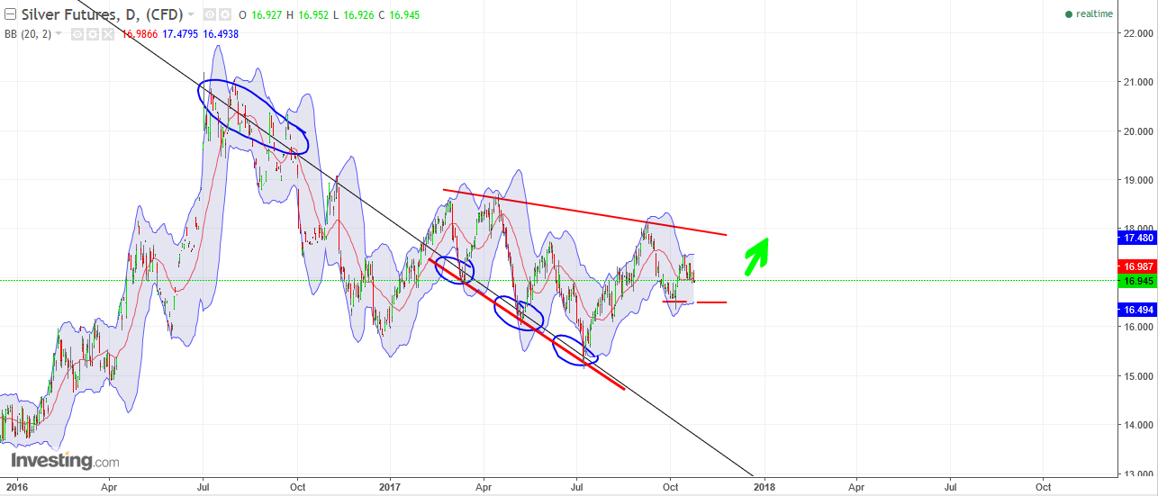
(click to expand)
Scenario 2:
For this scenario, I can see silver falling to the bottom green circle, between $15.50-$15.10 (keep a stop-loss at $14.90) in what will be the LAST chance to buy that price for many years. I’m willing to take the risk at that level because I can see fundamental economic factors lining up, as well as time running out for the FED to take up rates AND inflation (evidenced here & here). From there, we climb up to that top rail in the first half of 2018, and breakout.
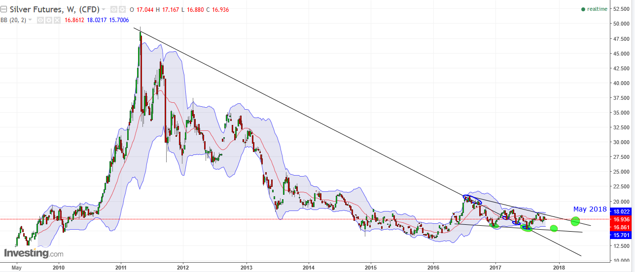
(click to expand)
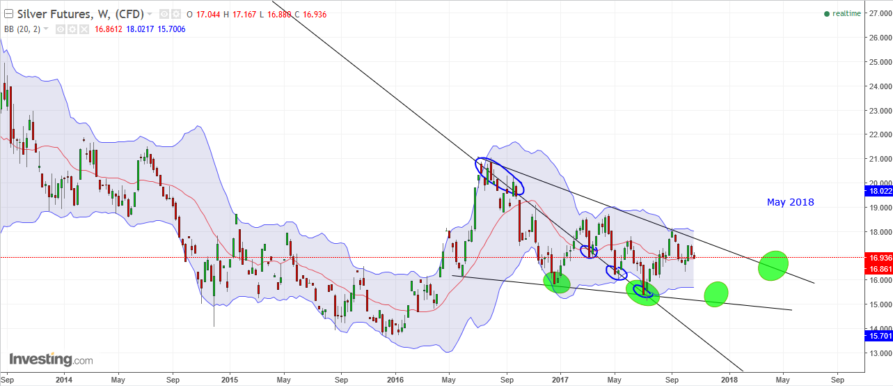
(click to expand)
Good Work Nick..so which one is Bearish ?
They all end well
🙂
Thanks. You’re right, only a matter of which has more short term pain 🙂
GSR hit 100+ in 1991
And what gets you to that point today? Fundamentally and/or technically?
When was the last time you bought physical Silver. Physical buying or it gets crushed by the Bullion Banks that’s what drives it too 100.
I buy physical a few times per year. But i get your point, physical demand this year was tough. I read an article saying demand in Germany outpaced russia & china this year, though. Who knows
I agree with you on the fact it’s just a matter of time. Devil’s advocate with the 100+ GSR but it can and did happen. People remember buying into the overbought PM market of 2011 and watching it fall off a cliff. Those memories have affected an entire generation of investors who probably won’t buy PM’s again. the only cure for that is a new generation of investors and time, maybe that is why it took 20 years between 1981 and the next PM BM of 2001? The next time the SM has a wipeout I’m not sure what will be the best investment to have been in to retain wealth? you can’t go wrong with physical Au Ag or Pb maybe a bit of all three it may get ugly.
Thanks Nick!