Rambus Interview – An Observation

Fully posted a link earlier. I read it too fast and thought it was posted recently, but realised my mistake when I looked at his gold chart.It was published around about the time gold hit it’s $1050 low. In it he says…

‘Since gold has been in a bear market since 2011, the latest chart pattern that has formed is the two-plus years blue falling wedge, which I consider to be a halfway pattern to the downside when all is said and done. Just look at the left side of the chart during the bull market years when each consolidation pattern broke out to the upside. Now look at how our current bear market is unfolding opposite to the bull market. This is how markets work.

On a bullish note, gold could be forming the last consolidation pattern within this bear market. If the blue falling wedge breaks out to the downside, which I expect it will, this next impulse move down may very well complete the bear market. As you can see, I’ve labeled this four-year bear market as a possible bullish expanding falling wedge. You can compare this possible bullish expanding falling wedge to the same pattern that formed the low for gold during the 2008 crash — it’s the same pattern, just on a longer time-frame. Even though I’m bearish for the short-to-intermediate term, I can still see the bull market continuing when the top black rail of the potential bullish falling wedge gets broken to the upside.

He included these 2 charts…

As we now know, he was right to an extent. The dollar did breakout upwards, but (due to the long established, and predictable dollar cycle), it has come all the way back to where it started. He wasn’t right about gold though. The falling wedge didn’t break down, but up. It hasn’t proven to be a halfway pattern to the downside. Gold has risen over $200. I’m not entirely sure why gold didn’t fall a little further or at least stay around the $1000 mark for the rest of 2016. Like Rambus, I would’ve expected it to. The gold cycle would’ve certainly allowed it. At the time, I remember reading an article by ‘Zeal’ on the Market Oracle website, which demonstrated that whatever gold was going to do, the PM mining shares were at an ‘absurd low’ that just could not be maintained, and that the upside over coming years is huge. I did my own research and was convinced. I put all my savings into a a portfolio containing most of the HUI and GDX companies. HUI was about 120 at the time. It feels now, to me, that gold began it’s upward charge too early, and the weak action recently has been the result. You need all of the wind behind you. It’s like weather forecasting – to get a CAT5 Hurricane, rather than a tropical depression, you need all the causing factors to be in place, not just a few of them. This is EXACTLY the same. However, if I’m right, the long term cycles that I’ve been banging on about, are about to reassert themselves hastening the dollars continued fall, and bringing about golds renewed bull. Here are the gold and dollar charts, so you can see what happened after the Rambus post.

At the same time, we have geo-political tensions rising, we have a US president in ‘trouble’, we have a debt ceiling debarcle approaching, the stock market is euphoric, the national debt is off the scale and rising EXPONENTIALLY, the dollar cycle is in its declining phase and the gold cycle is in it’s rising phase.

A CAT5 hurricane is in danger of developing.


SVXY Seems To Be Saying The Stock Markets Rally Is Nearly Finished

If you consider the bullish expanding wedge as a halfway pattern to the upside and calculated the target in arithmetic rather than percentage terms, you get a target of 180. If this is the case, then SVXY is saying the SM rally is just about done.

[Edit]

20 minutes later I thought to myself, “Er, what about the $VIX charts?”.  Price displaying bullish divergence with MACD on the weekly and

also has formed a (seemingly) bullish descending wedge:

Thanks Terry Callier and come back EagleSeagle!

XAU Weekly…

To expand on Dave’s chart and the rest of the BULLISH charts…
Folks, as we all know, this is BULLISH…
Put us through 3 weeks of torture–at last, some direction!
The coiling indicator action broke up and out 🙂
And the STOCH 5 symmetry continues to hold and continue on a BULLISH path…

$TNX

FWIW:


Could be a bearish H&S or possibly a bullish flat top expanding triangle, which is a halfway pattern to the upside.

I’m leaning towards the former option but IMHO there will be no real direction until after the ECB, Fed & BoJ meetings

are out of the way.


As of now, my charts are telling me there’s a big move coming in the miners one way or another once those meetings

are out of the way and assuming there’s no Syria, Trump, North Korea, etc., shock. Trouble is, I don’t know which way

that big move is going to be and, I think, no one else does either.

A Short History of the Post WWII Oil price- From a Technical Perspective

This is part I of a 3-part series introducing Plunger’s “Trade of the Year”. This section gives a review of the oil price from 1946 to present explaining the essential forces which powered its price through various bull and bear markets. It explains how we ended up where we are today in the oil market. Part II will explore the macro forces driving today’s economy which lays the groundwork for introducing my trade of the year in part III.

To acquire a broader view of oils path over the past century I highly recommend the following resources on the oil market. Daniel Yergin’s “The Prize” is an in-depth review of the history of oil up to the First Gulf war. It is indispensable in understanding the growth of the industry. Other books provide entertaining color to the industry by reviewing the swashbuckling nature of the early players who formed the industry as independents. I recommend “The Big Rich” by Bryan Burrough and JP Getty’s autobiography “The Way I See It”. Finally, David Stockman’s “The Great Deformation” is essential reading as it corrects all the false economic narratives of the past which have been masquerading as truth.

Boom and Bust

That’s the essential nature of the history of oil over the past 140 years. It tends to be that way for most of the commodity sector is because the cycle of production leads to it. Commodity bull markets typically last about 10 years. That is about the amount of time required for the supply/demand process to go full circle. Initially inadequate supply leads to a price response which over time brings forth investment and exploration. At first conventional bank financing is hesitant to fund the sector since it is out of favor. This delays the formation of investment, but venture capital fills the void. Eventually the ensuing development brings forth supply and the prevailing narrative wakes up and recognizes the bull market. Conventional financing then funds the industry bringing forth development on a grander scale. Since this is a time consuming process supply is slow to keep up with demand thus price continues to become elevated (bull market). Elevated price calls out substitution of other energy sources (ethanol, nuclear, natgas, LNG,wind, solar, fracking). Over time development brings forth much greater supply with the discovery of new oil basins, (North Sea, Prudhoe Bay, Bakken, Eagle Ford, etc) and new supply eventually overwhelms demand which completes the circle and leads the market into the next phase which manifests itself as a bear market.

We have seen this process over and over since the discovery of oil. This is the nature of the commodity cycle. When we overlay monetary policy onto this cycle it exasperates the depths and length of this natural cycle leading to euphoric bull markets and crushing bear markets.

Explosion in Demand

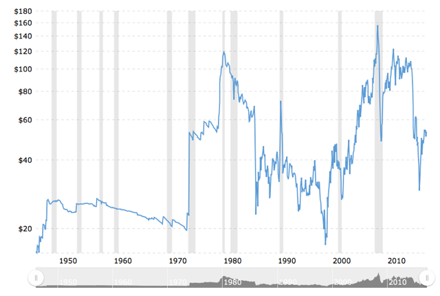
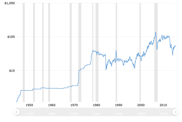
World energy consumption quadrupled between 1945 and 1972, with oil demand increasing by more than six times. World wide economic growth and the rise of the middle class led to staggering demand for oil products. The amazing thing from a current day perspective is that despite this growth in demand the price of oil was relatively stable. In the two charts below we see the nominal price appearing to virtually flat line from 1949-1972 while the real price (CPI adjusted) actually was cut by 1/3 over this period.

Note the first chart shows the real price of oil actually decreasing through out the decade of the 1960’s while the second chart shows oils nominal price increasing moderately from 1949-1973.

Bretton Woods- Postwar golden age and the fuel for monetary chaos.

“Inflation is always and everywhere a monetary phenomenon”- Milton Friedman.

To understand the oil market and price from 1946-1980, It is essential to understand the monetary backdrop of that era. The Bretton Woods monetary regime defines the grand movements of the oil price over this period. This agreement set up the post WWII monetary system which lasted until August 15 1971. It established the USD as the center of the world’s monetary system. Exchange rates were pegged to gold since foreign governments could exchange their accumulated dollars for gold from the US treasury. This anchored currencies to the USD and the USD was anchored to gold. It provided a stable monetary system and enforced financial discipline by limiting the expansionist policies of government to their ability to tax its citizens.

In the early years it served the West well, however by the early 1960’s the golden era of FED/Eisenhower financial discipline was over. The USA no longer desired this discipline and began to abuse its “exorbitant privilege” by “printing money” (expanding credit). It greatly expanded the money supply well above its taxing powers to pay for its imperial wishes. Social programs and its wars required vast money printing. The Bretton Woods system allowed the increased supply of dollars held by foreign governments, caused by money printing, to be exchanged for gold from the US treasury. These dollars represented debts owed to others by the US government, however the intent was to never pay. This is known of course as theft.

The London Gold Pool

In order to keep this lucrative arraignment of expanding the money supply over and above the creation of real wealth it became necessary to disguise what was really going on. The US after all was supposed to be anchoring the USD to a limited asset, namely gold. Throughout history gold production has only been able to grow at about 1%/year. The USD was being increased many times this rate. Since gold is a monetary asset (not a commodity) its price quickly reflects any monetary debasement occurring by central banks. So in order to keep the game under wraps the monetary powers set out to suppress the price of gold. A rising gold price announces to the world that debasement is ongoing and threatens the game.

So the US formed the London Gold Pool on 1 November 1961 co-opting 7 other central banks to dump gold onto the market to suppress the price. It was intended to maintain the Bretton Woods system of fixed-rate convertible currencies and defend a gold price of $35 through interventions in the London gold market. The US was the ring leader and provided 50% of the gold for operations from its vast post war hoard of 23,000 tonnes. By 1965 the pool was increasing unable to stem the rise in the gold price which reflected the level of debasement. Despite intense diplomatic pressure to limit purchases of gold, the pool found itself trying to hold back the tide.

By 1967 the French were no longer willing engage in a lost cause so they withdrew from the pool and sent a frigate to New York harbor to collect the remaining gold it held in storage at the NY Fed. Soon after in March 1968 the jig was up and the US asked the Bank of England to close the gold market. During the life of the pool the US had squandered the majority of its gold hoard which it had confiscated from its citizenry in 1933 by sending 12,000 tonnes down the rat hole in a retrograde action defending the Dollar through its gold price suppression. Over the next 3 years the US treasury resorted to strong arm tactics to maintain order. They were no longer willing to use any more of its precious gold which served as its bedrock to monetary legitimacy.

Strong arm tactics of course only can hold back the tide for a limited time. On 13 August 1971 the Bank of England requested its $3B of USD holdings be guaranteed against devaluation through conversion to gold. This was the straw that broke the camels back as the remaining US gold position had become too precious. Two days later on Sunday 15 Aug 1971 the US responded with Nixon reneging on his nation’s promise to redeem dollars for gold. This act today is euphemistically referred to as “closing the gold window”. This of course effectively ended the post WWII monetary regime of Bretton Woods I.

The Oil price pricing in two decades of Monetary debasement.

So why is this monetary backdrop important to understand? It is because ultimately this is the force behind the rise in the oil price throughout the 1970’s. The great rise of oil from $2.50/Bbl to $40/Bbl over the course of a decade was principally due to monetary conditions and not due to the supply/demand dynamic. Oil, being a real asset with intrinsic value is related to gold as it shares an element of monetary character. So by the early 1970’s the monetary debasement of the last 25 years finally began to be reflected in the price of any real asset with intrinsic value. Agriculture prices exploded as did gold and the entire commodity complex. Oil being the life blood of the industrial west led everything higher.

I was a young college student at this time and I recall going to costume parties where partygoers would dress up as “evil” oil sheiks. , They were proxies for who to blame for the shocking launch in gasoline prices. In the shallow minds of consumers the Arab oil embargo was the cause of these skyrocketing oil prices. Seemingly no-one understood that this event was simply the catalyst for the repricing of a real asset in response to decades of monetary debasement subterfuge.

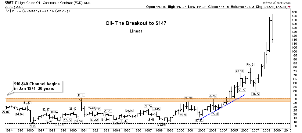
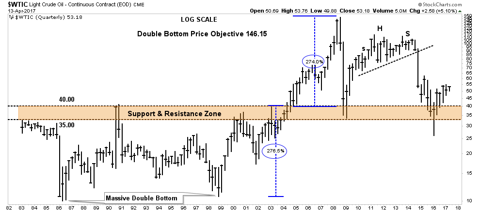
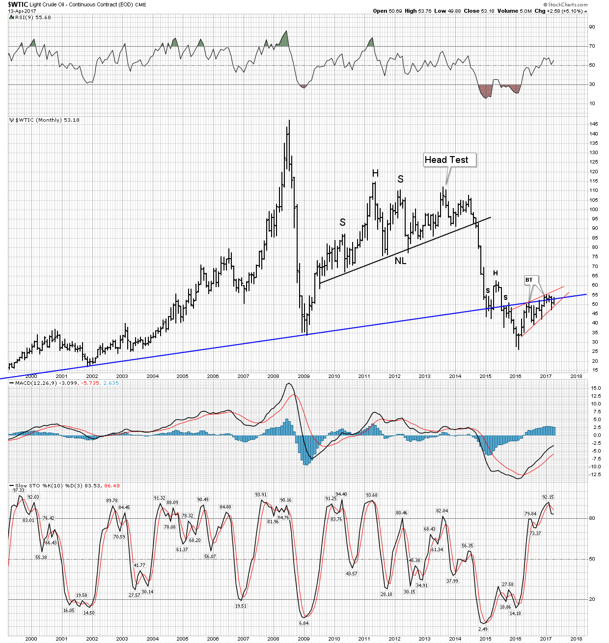
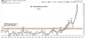
With this as background let’s view from a chart perspective what happened next. In 1974 oil began its run from $2.80/bbl to $40 by the end of the decade. This was such a giant move that it shocked the world. Whenever any market makes this big of a run it has to consolidate its gains. The bigger the gain the longer the consolidation is a good rule and that’s exactly what the oil market delivered. As previously mentioned the 10 year bull market drew in massive investment, ultimately leading to gushing new supply. North Sea and Alaska North slope came in. So below we see what this consolidation looked like. The channel depicted can be extended all the way back to 1974 where oil first entered the range and stayed there for 30 YEARS!. That’s right, the elevated price of the 1970’s bull market drew in enough supply to cause an 18 year secular bear market from 1980 to 1998.

The dynamic of the 1980’s was increased supply entering the market. OPEC attempted to maintain elevated prices using its swing producer status to cutt back production. In 1980 Saudi production was 10m bbls/day. As prices fell they continued to support the market price with further cuts. By 1984 they were down to producing 2.5m bbls/day. They soon tired of underwriting marginal producing members and In an effort to regain market share and control of the market they decided to flood the world with oil. Their increased production drove prices down to $10/bbl. This reasserted control of the market, however it had major geopolitical knock on effects that were unanticipated. The Saudi’s action led directly to the end of the Soviet communist system. At $10 oil the Russians were unable to hold their vast uneconomic system together and the entire system collapsed by 1991.

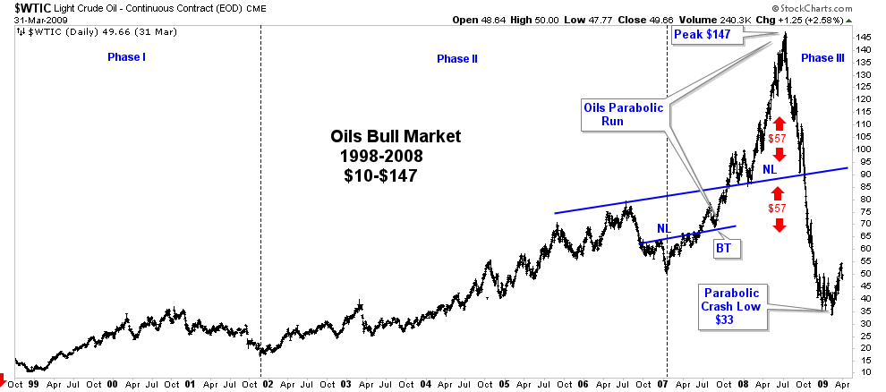
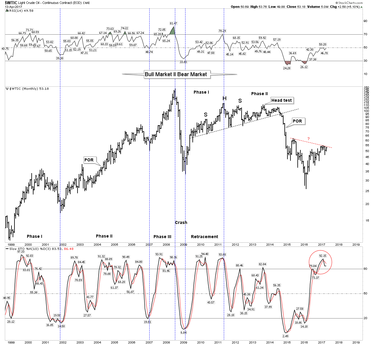
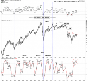
By 1998, price finally found its bottom at $11.60 after 18 years. Oil price then embarked in a series of higher highs and higher lows. We call this a bull market. This bull market ultimately lasted 10 years ending in wild mania-driven price action and peaking at $147/bbl. The narrative had progressed from cheap plentiful oil to scarce fear stoked “Peak Oil” . Commodity bull and bear markets give us pure technical chart formations and this 10-year bull market shows this. The chart below amazingly depicts how the ultimate price, despite being an unpredictable mania, was projected by the height of the channel. Ultimately, price reached the same percentage move above the channel as it was bound to within the channel for 30 years. The key takeaway here is that for 30 years price was building cause and coiling energy within the channel. Despite several spikes to the top of the channel the resistance repelled the move higher. The first bounce off of top resistance was the peak in 1980, where everything was dominated by oil. In 1990 we bounced off that same resistance as we went to war against Saddam. Ten years later we bounced off it again in the next encounter in Iraq. Starting in 1998 however, each time price got repelled by resistance it was bought at a higher low. The bull market was now on after 18 long years and when the breakout came above its 30 year resistance the energy it had been coiling over this time provided a massive propellent.

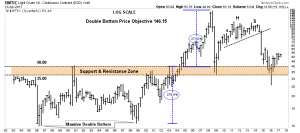
The below chart depicts the 10-year bull from 1998-2008. It shows a clear definition of the three phases of a bull market. The one area of original thought I offer is extending the work of Robert Rhea of Dow Theory fame. Rhea took Hamilton’s work and perfected the concept of psychological phases of bull and bear markets. Each has 3 definitive phases. I have extended his work to apply chartology to Rhea’s psychological phases. As mentioned, the commodities offer pure chartology and we see it here.

Three Phases of a Bull Market

Phase I- The accumulation phase. It is where informed investors establish positions in the early formation of the new bull market. This occurs without the awareness or participation of the general public or the financial institutions. They are acting counter to the prevailing psychology and narrative. The narrative is “its just another BMR”. They have been burned so many times before they are no longer willing to “go there”. Establishing major positions in this phase is how family fortunes are made. By the way I regard, this act as achievable for savvy students of the market willing to think independently.

Phase II- The mark-up phase. Where rising price action over time gradually attracts attention. This increased awareness leads to increased participation. In time the prevailing narrative comes to recognize a bull market is in force. This of course leads to the fabled point of recognition (POR), which ALWAYS comes in phase II. Phase II is the longest phase and ends when the public fully understands that the market is hot and and they jump in. This leads to a price break or a severe shakeout. However, new supply has still not reached market due to the prolonged period required to finance and bring projects to development.

Phase III- The Mania or Blow-Off phase. This final phase is often relatively short, but it is a sight to behold which will be remembered likely for decades. After the shakeout, the market is bought and the rise ensues. Once the previous high is exceeded all the cats and dogs come out of the woodwork. It’s where your Aunt Milda cashes in her heirloom china to free up some cash to “play” the market. Because its a sure thing and the crush is on. Its on the forefront of everyones minds. I recommend reading Edward Chancellor’s “Devil take the Hindmost” to see this pattern repeat throughout history.

Finally the last investor throws his last dollar into the market and we reach an exhausted top. The top is now established and the bear market begins. Step yourself through the below chart and see how these phases unfolded. If you were active in the markets during this time reflect on your memories as to the prevailing narrative in each time frame. You will be glad you did.

This bull market turned out to be an extreme outlier. Phase III actually resolved itself into a parabola- not good! It’s my view this occurred due to two principle reasons. First due to all the pent-up energy we saw released when it broke out of its 30 year channel and importantly due to the monetary ocean of liquidity provided by the FED. We had just finished the tech bubble and were smack in the middle of the housing bubble. Parabola’s, as a rule, resolve themselves by crashing down to their base or formation level minus 10%. That’s exactly what we got in 2008/9. Again this market followed the rules even though no-one seemed to know the rules.
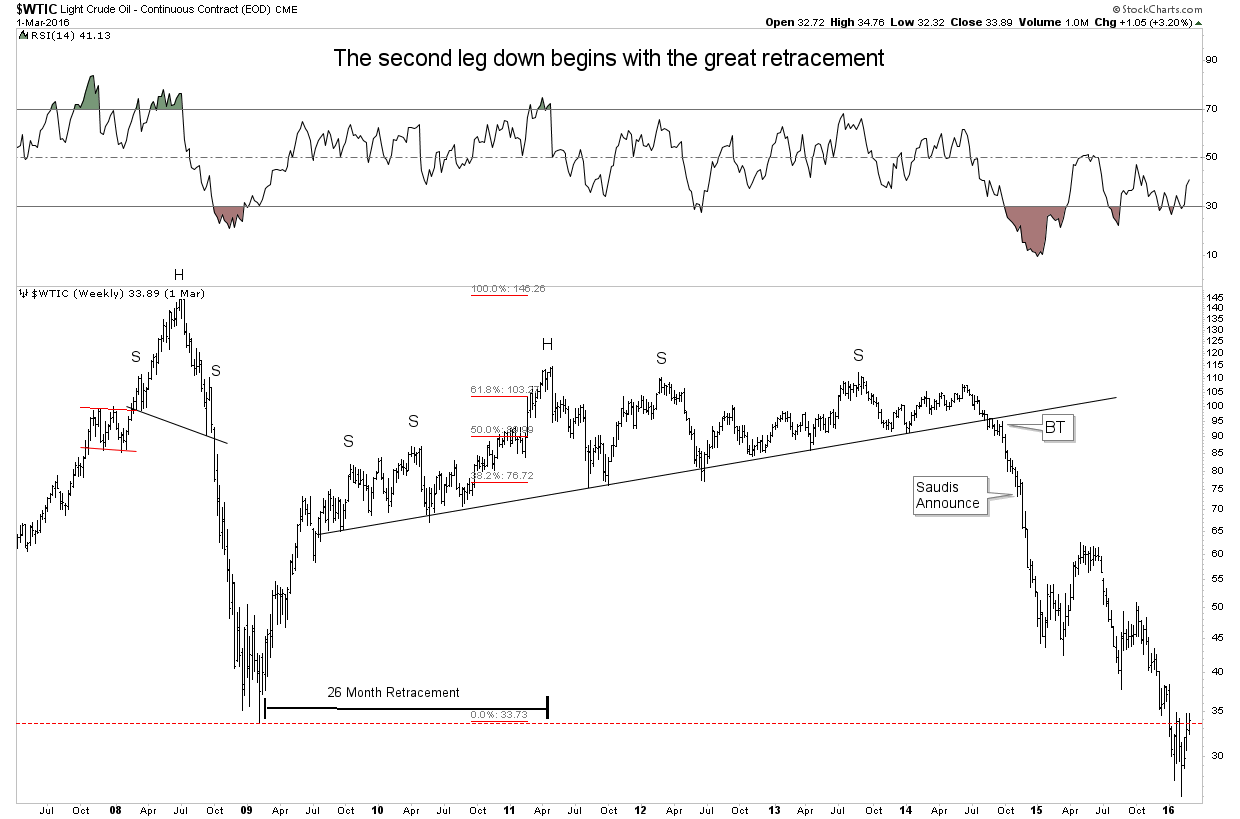
The Retracement

So here is what we know so far, the bull peaked in parabolic fashion on July 11 2008 putting in a weekly RSI of 77. The previous secular bull market peaked August 1980 with an RSI of the same. This had not occurred since the previous peak. Was this Mr. Market’s footprints announcing the great run was now over? In retrospect, indeed it was. The last secular bear lasted 18 years. We are now 10 years since the $147 peak. Could we still be in a secular bear market which began in 2008—-perhaps!

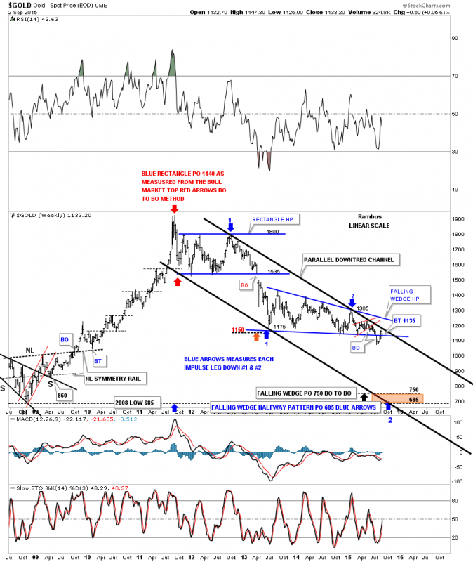
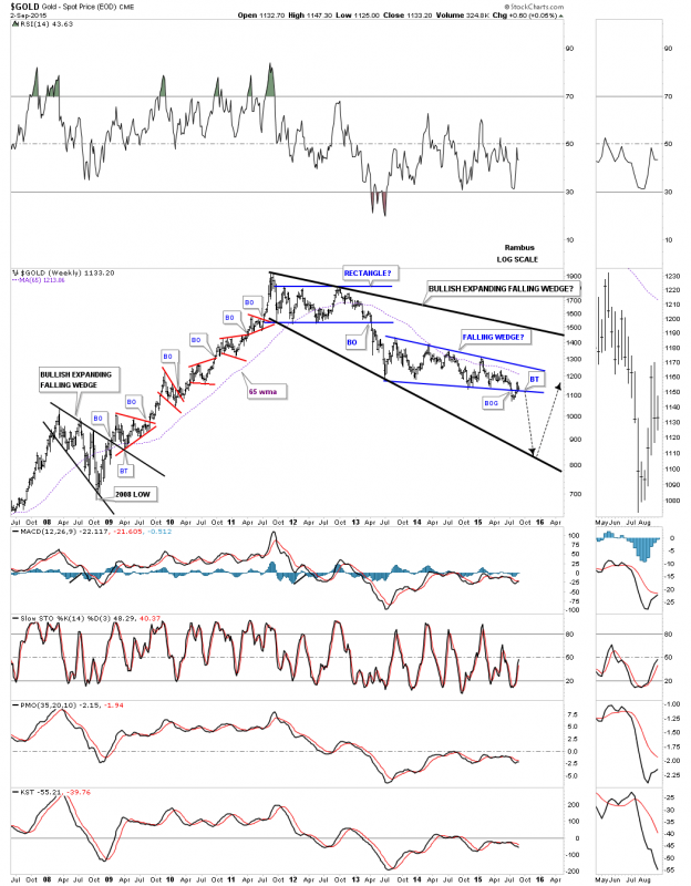
Secular bear markets are defined by cyclical growth below secular trend. They normally entail more than one cyclical bear AND bull market within the context of the secular bear trend. So far we have seen the 2008 crash, (bear mkt) a 26 month retracement (bull mkt) a 5 year move to a new low (bear mkt) and the current move of Feb 2016 to Feb 17 from $26-$55 (bull mkt). So the obvious question is: was the secular low established at $26 in Feb 2016? Are we in a new bull market since then? We will explore this question in part III, remember part I is just a history lesson.

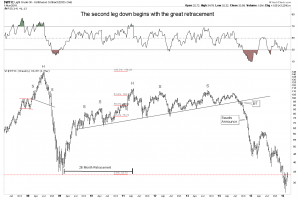
But let’s dig deeper into what I refer to as the “great retracement” In retrospect we can see this as just a cyclical bull market retracing the great crash. That looks easy from today’s perspective, but recall how everyone was getting lathered up again by the prospects for oil by 2011. Plus the noise wouldn’t quit as the elevated price was attracting more investment into the young fracking sector. (Thank you central banks for your easy money policies) Things got wild again and guess what supply got drawn into the sector. This entire 5-year move before the breakdown should be seen as an object lesson of Rhea’s psychological phases.

Psychological Phases in a Bear Market:

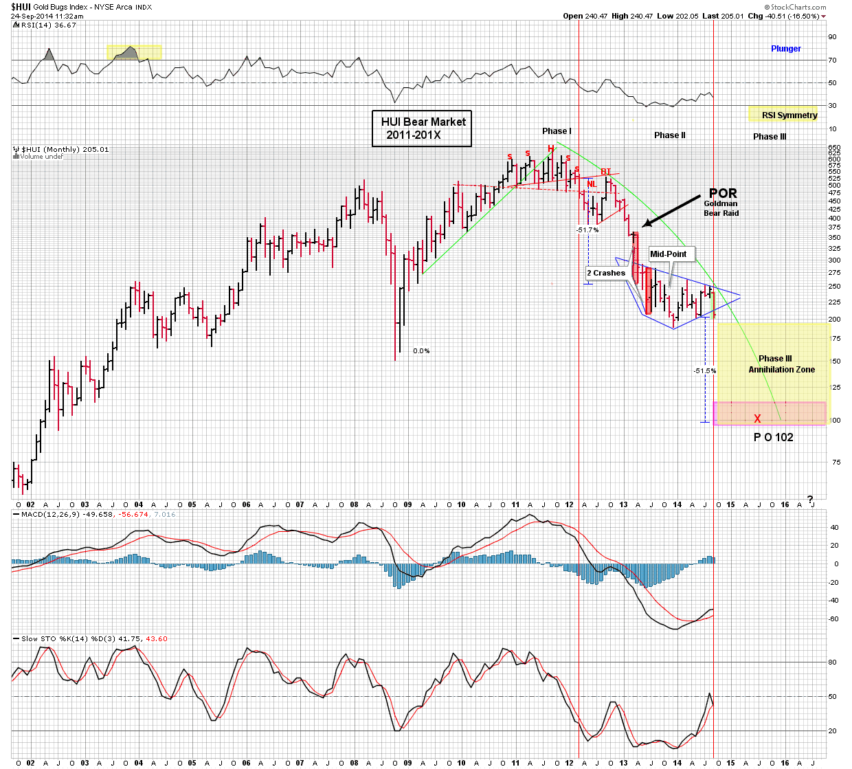
To review my essay on the three phases of the Gold Bear market go here

https://goldtadise.com/?p=342331

Phase I – Distribution Phase– Farsighted investors foresee the end of the bull and begin to unload their positions it begins before the top. The pubic remains active and perceives market drops as an opportunity to buy the dip. The market’s decline is perceived as simply pull backs within the ongoing uptrend. News headlines continue to be positive validating the existing narrative.

Phase II- Panic and Institutional capitulation phase. Most think panic occurs in the final bottom phase, it may however the majority of the panic occurs at the time of the POR in phase II. It is where the public and the institutions finally “wake-up” and recognize they are in a bear market. They no longer see it as a correction within a bull market. Its a bear market and its in their face!

Phase III- Capitulation phase or distressed selling. I personally like to refer to this as the annihilation phase. It comes after a prolonged period of liquidation. Final hold outs who saved for a rainy day wake-up and discover it’s raining.

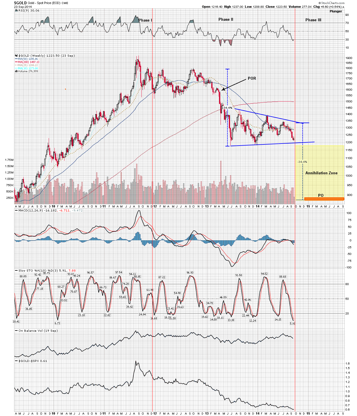
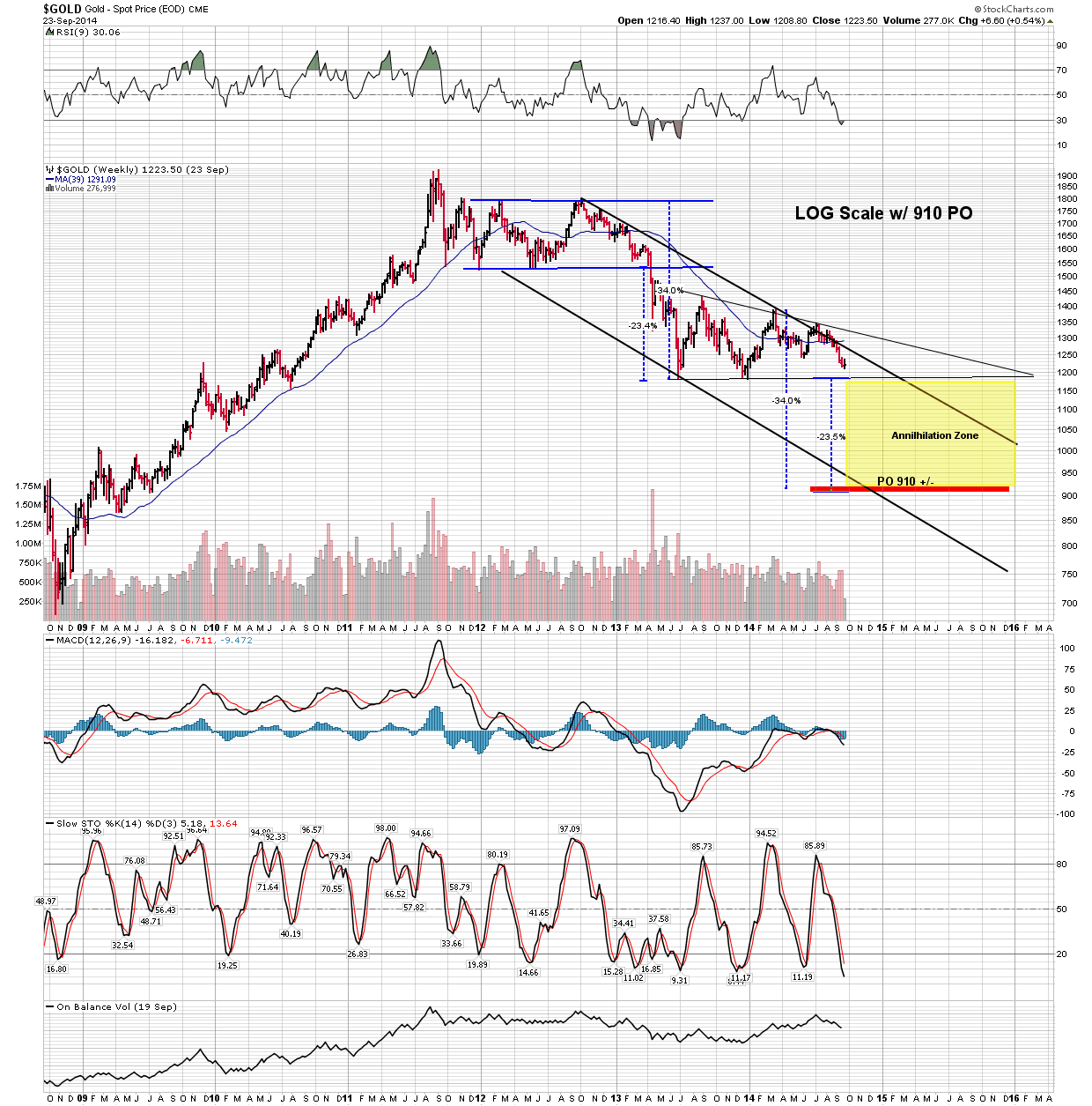
Viewing the retracement through this lens ask yourself what was the prevailing psychology during this move? Well it certainly was NOT bearish. I propose that despite the devastating crash of 2008/9 when the market bounced up into the great retracement, it exhibited the psychology and price action of distribution and I remind you that distribution comes in Phase I. I hope you can see the chilling implications of this statement. Incidentally this model accommodates the clear POR we saw in November 2014 when the Saudi’s announced that they were not going to underwrite the marginal producers of the world and would not cut production. The market clearly experienced a POR, I submit it was THE POR for the secular bear market which had now now entered into Phase II.

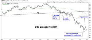
When the market broke its 5-year neck line it put on an extraordinary display of chartology. Below we see an amazing multi week complex backtest. Market price acts as a discovery mechanism and here we have a 5 week exercise of price reacting with the NL. It’s action shows that the NL is in fact drawn correctly. It tests from above and it tests from below. After 5 weeks it decides it has had enough and departs on its downward impulse. Price here is discounting the eventual Saudi announcement not to curtail production. Price is now well into phase II of the bear market.

The Phases

Now we put the phases together in one chart and see how they all fit. Below the 3 bull phases from 1998 to 2008 are clearly depicted. Next is the crash and the 26 month retracement. The market goes on to deceive for 3 more years then all the pent up energy being held back above the NL gets released in a downward impulse driving the price to a new secular low.

So where to now?

Now we put the phases together in one chart and see how they all fit. Below the 3 bull phases from 1998 to 2008 are clearly depicted. Next is the crash and the 26 month retracement. The market goes on to deceive for 3 more years then all the pent up energy being held back above the NL gets released in a downward impulse driving the price to a new secular low.

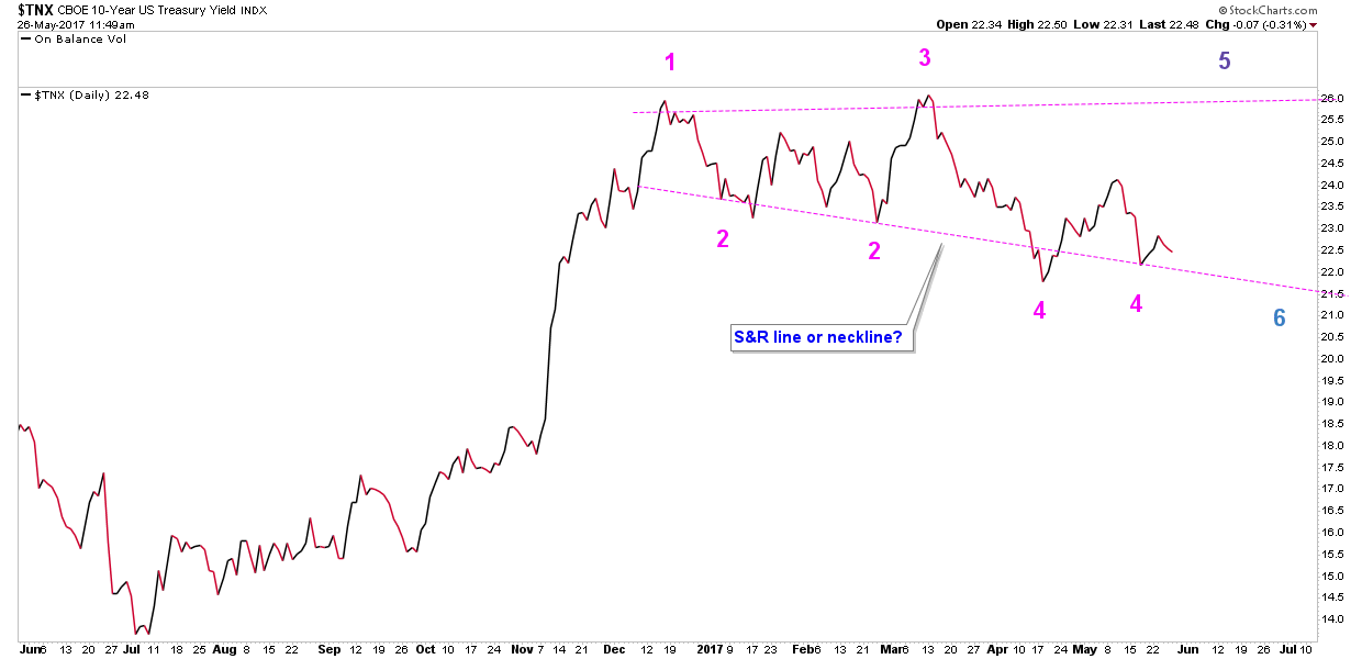
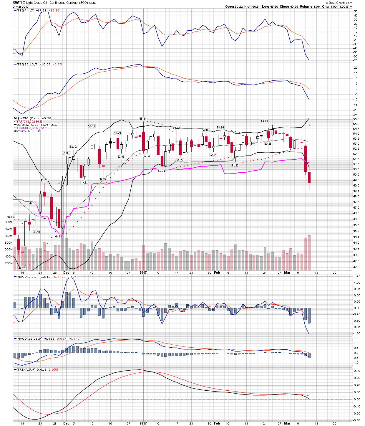
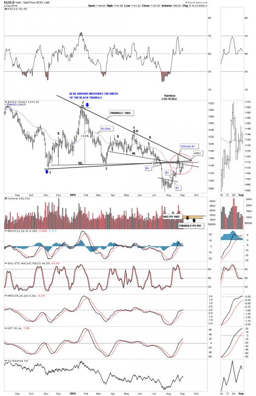
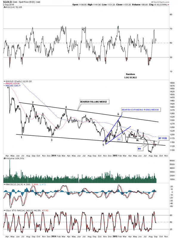
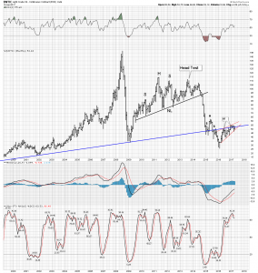
Looking at the pattern since the Feb 2016 low we see an obvious inverse H&S developing. Is this the start of a new secular bull market? I emphasize the word “obvious” which of course makes me recall the late Joe Granville’s phrase “what is obvious is obviously wrong”.

It’s starting to get more complicated.

Yes, there are other ways to look at the price action over the past year and see that “obvious” inverse H&S may not be so obvious. The below chart is where we start. Here we see a linear depiction of that bottom formation. Recall Rambus likes to point out the markets tendency to form patterns on both sides of S&R lines. Guess which pattern tends to get the traction? The second one does, plus both patterns displayed are bearish configurations, the first a conventional H&S above the S&R line and a rising (bearish) wedge on the bottom side. So maybe its not as cut and dry or “obvious” as we first thought.

Conclusion

My main premise is monetary policy has been the principle driver of the oil price over the past 70 years. The nature of commodity markets is inherently cyclical and when we impose central bank policies it makes it even more so. The effect of central banks has prolonged bear markets and increased the amplitude of bull markets. CB policy has caused the biggest duration bubble in history and one must ask what will be the knock on effects over time? In the next segment we will explore the macro forces effecting the market cycle and the oil price. Finally, I will propose my trade of the year.

o

USDJPY

After 2 weeks of chop, it looks like USDJPY is trying to reverse. Yellen didn’t provide USD any support in her remarks yesterday. Geopolitical tensions continue, which has proven to be bearish dollar.

If we break below 110.00 on USDJPY, we probably test 108.90 which is where the 200-MA sits. That would give gold/miners a continued boost. If we don’t break, it’s back to chop land until something decisive happens.

The charts on GDX/Gold look to have broken to the upside again. We’ll see if it holds this time. One thing still concerning me is that the bollinger bands haven’t expanded with the price rise & we’re sitting right at the top bollinger on GDX. Translation = it bounces off the top bollinger & heads back down if the bollinger doesnt expand outwards in reaction to the price rising.


Gold Tent Wars

TA (Technical Analysis), we can all agree is a wonderful thing ,

If you are involved in any Market ,any timeframe come to Goldtent TA Paradise to share , teach , learn or just observe “Those With Charts.”

Your chances of making good trades improves however , with at least a working knowledge of TA in at least One of it’s subforms. The focus here is Chartology , Cycles , Momentum Indicators, Moving Averages (all connected and subsets of Edwards and Magee) and to a lesser degree Elliot Wave ( pun) and others.

We are fortunate to have attracted many different Technical Analysts in the Goldtent Community

Each one brings their own unique work and reading and together with other contributers, in the spirit of all for one and one for all , many great calls are made and readers are kept on the right side of the markets for the most part. This of course benefits readers as all possibilities are examined and allowed to be critiqued.

Many of us have been at this long enough to have settled on a place like this as opposed to many other forums which tend to be confrontational based.

We’ve had and see enough of confrontations and ego clashes.
Having personally been in the middle of those enough times I am happy to finally remember ..its all about Learning to Trade Successfully, Ego’s are left on the camel, outside, in a bag hanging from his hump. Yes two Humps IS better than one . 🙂

So anyhow the Guys have different perspectives and right now they are quite different…which can be unsettling.

Let me try to summarize each ones position here. remembering everybody has their own unique trading profile, which is any % split of

Long Term Holds ( Years and decades)
Mid Term Trades( Months and Years)
Short term trades ( Hours and Days)

Some of our contributing guys have a large enough following to have attracted their own Pay site and some just tell us their thoughts and show us their charts for free. That’s the kind of community this is, all levels from beginner to pro are welcomed and respected.

Having said all this Kumbya . We reserve the right to delete posts or posters that confuse or don’t fit . That always lands the moderator in hot water.

Anyhow..so whats the current thinking ? ( feel free to correct or expand in the comments)

March 27 2017

Stock Market:

Rambus…..Consolidation of recent strong gains is at hand but mid term the targets are much higher.
Spock…….Sees Higher Mid term.
Surf……..Short term bearish
Norvast….Bullish Mid term ( convincing cycle work)
Eagle……Leaning Bearish short term
Graddhy…..Bullish Mid term

PM Market:
Jordan (The Daily Gold) …..Weak for a while longer then later in the year Strengthening.

Rambus…………Long Term…TBD…There is a good case for long term bull
……………….Mid Term….If 1100 is breached there are obscene targets to the down side.
………………( cant post here as its PG13)
……………….Short term…could go either way, tight leash , be nimble.

Eagle….Generally bullish and prefers trading from the bull side…but watches every minute of the day for signs.

Surf…..Short Term is the focus….Cycles top in Gold may be approaching , and Bottom in USD overdue. However the character of the cycles are to be determined following this short term out come.

Plunger…Has been bearish of late , his unique work with blending his study of Market Psychology and History and Rambus Charts, has him thinking …The kick in the ass to Gold Miner Investors wasn’t hard enough and we need to revisit the lows or a little above to really wash the sector out and destroy optomism …ie…he is still thinking the real comical selling lays ahead. Long term he is a Goldbug…a practical one ( RARE)…Plunger has had the hot hand lately ( see Plunger Nailed it on the sidebar) and is followed at the Chartology forum. ( Rambus Membership Perc.)

Norvast…Mid Term and Longer Term Bullish with specific dates and short term cautious.

Spock….Bullish in all time frames and patient ( the KEY)…. As his belief is we are buying Good Miners at the greatest bargain prices , maybe ever. Just look at the historical mismatch between the miners and gold…its pathetic…opportunity knocks but once. Oh and btw he has connections to some attractive Private Placements (where you buy the stock below the market price) and is a long termer in the funding of miners…ie ..knows the players. His service was rushed into production at the beginning of the 2016 7 month Gold Rush and is , despite the drawdown since still up Very substantially. However this was a mixed blessing as some members are in this for a quick hit and cannot stand the draw down that must be weathered to make serious money. However to their credit MOST members have stayed the course and intend to do so.

caveat…do not enter this mini miner sector without honest guidance or with money you cant afford to lose or need to use .

Graddhy…Extensive work on the currencies has him bullish on Gold in all time frames…One of the first to become bearish on the dollar..

pedro-deleon….Elliot Waves and some other proprietary work has him..long term bearish…short term bearish …mid term Bullish
do I have that right perdo ?

Now I am out of time…there are many other highly valued and well stated cases here.
You know who you are…Some New some veterans

Please post your take in a comment…everyone welcome :

Here are the associated Sites:

Rambus…. https://rambus1.com/

Spock Miners…..http://spockm.com/

Spock Global….https://spockg.com/

SurfCity and Norvast…https://surfcity.co/

Jordan / The Daily Gold…https://thedailygold.com/ ( Not associated with goldtent but highly recommended service)

Thanks all

Fully for

Goldtent TA Paradise

Plunger Nail It

This was posted at the Chartology Forum By Plunger. Plunger is a Loyal Chartology Forum Poster. Sometimes he also posts his work here at the TENT but unfortunately for tenters this was kept “in house”

Best Call of the year Award :

…………………………………………….

Oil-Flat tops make for big drops

Plunger

March 8, 2017,10:08 am

Forum Chat

That’s the principle here. Currently my “big trade”. Its either breaking down here or shaking out before an upside move. My bet is its a decline, based on several things not least of which is the COT.

The next series of charts show the particulars. Weekly has a well positioned stochastics. The second chart (the 4-horseman) shows the riders all in alignment to the downside and note the Chandler exit is ready to get triggered and the BB have narrowed and now in the midst of expanding. Finally on my standard daily it looks like it is just at the cusp of a cliff dive. Note the 150 EMA has been violated with a downside gap across it.

My preferred vehicle is shorting UWT. 3X leverage with decay to boot. Plus it trades with volume. By Shorting I get the decay in my favor.

WELL HERE IS HOW THIS TURNED OUT MERE TRADING HOURS AFTER THIS POST

I closed out my oil short today around mid-day. Covered the UWT ETF around the 18.5 level. I remain bearish on oil, however my trading discipline required me to cover the short for now. Reason-because we were well extended outside the BB on day #2. A snap back is statistically a high probability. So I covered. By the end of the day it indeed began to snap back.

The second chart shows the BB excursion in oil itself. I will likely reenter the short if we get back inside the BB. The below chart in UWT shows the precipitous textbook collapse out of a flat top. Record this one in your trading files for what it looks like.


The catalyst for the breakdown in oil was the excess inventory numbers. Supply finally tipped the balance and the price structure allowed a rapid collapse. (Flat tops lead to big drops) Ultimately in the medium term I have a $42 price objective for this trade. Likely I will reenter the short side very soon

Regarding the PM sector. I still consider this a very dangerous crash prone market. I have covered my shorts as it is too extended on the downside for my risk tolerance. If we do get a downside whoosh (crashette) I will be buying long for a bounce trade

……………………….
Not Only did Plunger Nail Oil at the Chartology Forum but there is this Call made well before the bottom

Using the principle of Halfway Pattern Plunger used this chart to take a very large Short position in JNUG just before the hard fall !!!!

…………………………….

From KenS at the Chartology Forum

want to take a minute and say thanks to Sir Plunger. The last month or two you have been a tremendous help as I have navigated the crocodile and piranah filled waters we call PM trading. You have been a sane calm voice that helped make my trading a bit less nerve racking and certainly more productive than I would have been on my own. You have really taken it up a notch lately – your skill and experience as a trader shine through and I just want to say thanks.
……………………………..

Marty

March 11, 2017,4:54 am at 4:54 am

Terrific work Sir Plunger! I also agree that Rambus and his charts deserve huge credit and it will always be different for me now after learning his techniques. Keep the posts coming!
……………………………….
Xeo

March 11, 2017,1:36 am at 1:36 am

I concur with KenS!
……………………………….
Cervantes

March 11, 2017,5:15 am at 5:15 am

Yes me too, I want to thank Rambus, and Plunger of course. But, but. In the long term I´m confident in Spock, and his rocks. I think we can catch some 100 baggers there (maybe more).

And of course thanks to this forum, and Fully in Goldtadise. I´ve been lucky finding this community where I can earn money, and lot of experience. Thank you all!
………………………………
Reply to KenS et al
Plunger

March 10, 2017,10:48 pm at 10:48 pm

Sometime your are in the zone sometimes you’re not. I was fortunate in the last 2 weeks I found myself in the zone. The 2 trades short PMs and short oil were barn burners for me. I am out of the PM short, I will say looking at the chart below it looks like we are set for a bounce. Will be watching. I still think oil heads towards $42-45 in the short term.

That may not seem like a big move to some, but when something can set itself up so clearly one can have the confidence to take a big position. I was able to do this with both these trades.

I give a huge credit to Rambus. His charts are so objective and one can’t find them anywhere else in the world. They give me a lot of guidance.

Just a caution however I am just a private investor trying to figure it out for myself. No agenda,(unlike many newsletter writers) allows me to turn on a dime, but I operate at a real disadvantage holding down a full time job often putting me disconnected from the market for 1-2 days. One just can’t get it right all the time so we have to settle for the high probability trades and set-ups. And again as for me personally I just want to buy and hold for the long term, but we are not there yet

…………………………

Then there are his longer term positions he has been posting at the Forum in Scandium and others which are doing very well indeed

……………………….

To sum it all up to say Sir Plunger has a hot hand lately is an understatement. And Yes, for more, you need to join Rambus Chartology if you have not already done so as The Chartology Forum is exclusive to members and If you are already a member you need to start visiting the Forum on a regular basis.

These two calls alone have made many Forum members 6 figures in a matter of days !!

Well done Sir Plunger. You are a Chartolgist Emeritus , using your unique blend and understanding of Market Psychology and Chart Patterns you Nailed It !

GDXJ Daily Perspective and the “Reverse Divergence”…

Expanding on “Avocado’s chart”…
Price is sandwiched between the 13 EMA and 200 SMA/trend line..
For this “reverse hidden divergence” thesis to work, the price has to march on and up…
From my experience, this “sandwiching/squeeze” leads to an explosive move–one way or the other…
The first warning for the bulls is a breach of the 13 EMA to the downside this early in the move…
Second warning, a breach of the 34 EMA. This is a red alert on the daily chart…
A trader has to decide what to do? Personally, I am out on a daily breach of the 13 EMA.
Can always reenter…
So, I continue to monitor the minute charts for a continued uptrend…I.E. the uptrend line on NUGT 15…
Good luck!

Edwards and Magee technical Analysis book Offering

I accidentally purchased too many copies of the 10th edition Edwards and Magee technical analysis books on amazon.   Considering I am not yet experienced enough to post any usable charts, I’ve decided to offer the book as a contribution to the (first serious responder) looking to further expand there knowledge in the charting world.  My two request are that the recipient be serious as its $100 book and that the recipient offers it back to someone who is interested in the event they are finished with it or have lost interest.  I hate to think it would end up in a box when someone more willing to learn could have put it to use.   To avoid any misunderstandings, the first request in the comment section gets the book.

Hello, I’m New to this Site

Although I’ve been studying chart patterns for almost forty years I find the work of friends who’re true professionals to be of great help at major inflection points in most markets. One such article is posted below. Hope you find this helpful!

************* ************* *************

GOLD: Different This Time Around?

October 25, 2016

Since early 1993 we have tracked the weekly Commodity Futures Trading Commission’s Commitment of Traders report which is released at 3:30 pm on Friday afternoon. The CFTC report is available online and reflects data as Tuesday’s close, 3 days earlier. When we started this process we made a decision to focus on the Net Commercial position in approximately 36 markets maintaining this statistic on accounting ledgers. It is time consuming but over the years, in different markets, certain tendencies will occasionally repeat which have proven to be insightful.

As an example, in the corn market, prior to the time when positions limits were expanded, the absolute magnitude of the net commercial position was an excellent leading indication of an approaching price high or low which normally coincided with the seasonal high or low.

In the gold market, one of the interesting facets we see periodically is the growth of the net short position during a large price rally and then the subsequent liquidation during the price decline which follows. The greater value however from our perspective has been the relative magnitude of major liquidations which coincides with important price lows.

Utilizing futures data for the first 6 months or so in 1998 and then shifting to futures and options, we have identified 9 liquidations which in percentage terms were extraordinary.

Before we illustrate our findings let’s explain what we did and more importantly what we did not do. We did NOT start from a major price high and note the magnitude of the net commercial position and then what that position was at the following price low. We simply looked at the extreme values of the commercial position and then proceeded to note on the weekly charts where those (CFTC) extremes occurred. The statistical data is on the following page in a spreadsheet format.

The standout statistic is the percentage decline indicative of a major liquidation. Not all price lows or many price lows will be preceded by a large net commercial liquidation, but, all major liquidations in the net commercial position appear to coincide with an important price low. Surprisingly, some of the observations required a great many weeks to complete and others relatively few.

Following the spread sheet we illustrate on a weekly gold futures chart where in time the extreme values in the net commercial position occurred and with a blue line, the duration of the liquidation. Each of our 9 observations is references on the weekly charts. All the position data on the spreadsheet below is in parenthesis indicating net short or negative result when subtracting the short positions from the long positions.

Here is an update from 1 week ago regarding the COT situation

Regards

Boobooman

Is dollar USDX chart in 2014-2016 looking like gold in 2011-2013?

Well, as Spock says, don’t analyse, just look: I looked at a chart from another goldtadise member (Surf City, link in comments section) regarding the USDX and before I expanded it and saw it clearly, I though it was a gold chart from 2011-2013. However it was actually the USDX from 2014-2016! The similarity struck me.

So here are the two charts.  Note as well as similar price action, the price swings are getting longer in time, which is one of Professor Didier Sornette’s favourite features of a post bubble action. A potential USDX target would be around 87 for an initial major downmove to be equivalent to gold’s trip to $1320 in April 2013:

gold bear market fork 2011-2013 like usdx now hands usdx looks like gold 2011-2013 hands

Now, I don’t have time to look at Commitment of Traders or any momentum indicators but I have just posted this as a little provocative idea for anyone to chase up if they see fit.

A couple of further points:

Of course, gold subsequently went to a low of $1180 and then later as far as $1045, so if the USDX were to follow that pattern it might end up in the low 80s. That would not really be a collapse exactly.

Secondly, the timing of this dollar action is a little faster than gold’s equivalent action. Following gold’s chart action from 2011-2016 would not fit in with the normal 8 year up cycles and down-cycles of the US dollar as far as I can see, that would perhaps predict a dollar top in 2016 but then a dollar low in 2023-2024. If gold has already made its low in December 2015, the dollar would make an equivalent low perhaps sometime in 2018. So I am not wedded to this idea; it’s just an idea!

What could cause a sudden down-move in the US dollar? Well, perhaps if we are in the midst of a large upside reversal in commodities and gold, inflation figures could fairly quickly turn up and wrong-foot the Fed as they are glacial in raising interest rates. In my article on Kitco’s marketslant.com, I proposed that a reversal in commodities could add up to 1.6% to the CPI-U inflation rate taking it from 1% to 2.6%, over the Fed’s 2.0% target while interest rates are still well below 1%.

http://www.marketslant.com/articles/has-fed-lost-plot-and-ignited-perfect-storm-gold


Big Cap PM Stocks…Can they Go Any Lower ?

Here is a small sample from Rambus Weekend Report

You decide the Answer to this very important question :

…………………………………………………………..

Rambus Labor Day Weekend Report

In this Weekend Report I’m going to take an indepth look at some the individual precious metals stocks so we can see where they’re at from a short to long term perspective. We’ll start by looking at some of the more important big cap PM stocks as the precious metals stock indexes can’t have a significant rally until this group is ready to run. Anything can happen in the very short term but the further you go out in time the less likely the big trend is going to change on a dime.

The first stock we’ll look at will be a daily chart of the ABX which is one of the biggest of the big caps. From late last year to July of this year ABX built out a shallow bear flag consolidation pattern. The breakout led to our most recent lows around the 6.50 area. Last Friday it gapped below the bottom black dashed S&R line and backtested it at the end of the day. So on the very short term time frame ABX is testing overhead resistance at 6.50.

r1

The long term weekly chart shows the massive H&S top ABX built out that reversed its bull market reversing the uptrend into a downtrend as shown by all the consolidation patterns. The close on Friday marked the lowest closing price since the bear market started in 2011 which is a milestone in its own right. You can see how the blue bear flag on the daily chart above fits into the bear market downtrend.

r3

The 20 year monthly chart shows the massive inverse H&S bottom ABX built out in the late 1990’s – earlier 2000’s which led to its bull market run. That major low came in around eleven. What this chart so clearly shows is that ABX has now taken out the major low in 2008 and now the other major low at the bear market bottom in the late 1990’s. Note how the recent blue bear flag formed right on that important bottom rail in the 1990’s signalling that if it broke to the downside new lows would quickly follow. As you can see ABX has been in free fall since the break below the bottom rail of the blue bear flag and the horizontal support and resistance line at eleven. This move down could very well mark the capitulation move is underway.

r3

Lets look at one last 30 year monthly chart for ABX which shows us how important that late 1990’s – early 2000’s bottom is that I’ve labeled as the support and resistance line. The number one rule in Chartology is that once an important support line is broken to the downside it then reverses its role and acts as resistance on any counter trend rally. That S&R line is almost 25 years old which makes it very important.

There is one other piece of Chartology on this long term monthly chart and that is the neckline extension rail that I took off of the 2000 inverse H&S bottom and extended all the way out to the right hand side of the chart. The black arrows shows you how it has reversed its role several times from resistance to support and back to resistance again. The bearish setup here on this very long term chart is how ABX formed the blue bearish rising wedge on top of the neckline extension rail and the red bearish rising flag formed just below it which I’ve shown you in the past is a bearish situation. That neckline extension rail is the same concept that I’ve been showing you on the long term chart for gold where I extended the neckline, all the way out to the right hand side of the chart, made during the 2008 crash low. I have to say this chart is a little scary looking to me once we broke below the all important 2000 low.

r4

…………………………………….

NEM is another big cap PM stock that in not looking very healthy at the moment on the short term daily chart. After forming a six month bearish rising wedge NEM broke to the downside finding initial support at the August low. At this point it looks like it has broken down from a small red bearish rising wedge and is testing the previous August low again.

r1

The weekly line chart for NEM does a good job of showing you how support and resistance works. Initially NEM bounced off of its 2008 crash low building out the blue bearish rising wedge. After cracking the 2008 crash low late last year NEM put on a surprising rally that broke back above the 2008 crash low that looked like it may have some legs to run higher. As you can see it barley moved above the top of the blue bearish falling wedge where it put in a double top that reversed the little counter trend rally that I’m sure trapped alot of gold bugs looking for higher prices. The initial low made late last year worked as resistance two weeks ago as shown by the black arrow. At the close of trading last Friday NEM made a new multi year low on a closing basis.

r2

Next is weekly bar chart for NEM which shows how it’s interacting with the 2008 crash low. It formed a small double bottom on the 2008 trendline which led to a small counter trend rally where it built out a small double top which led to our most recent multi year low. Note the one last backtest to the horizontal 2008 crash low trendline at 19.00. That’s how you takeout an important trendline. You get a bounce followed by the break and then one last test from below to complete the breakout process.

r3

The 20 year monthly chart for NEM shows a possible interesting setup from the long term perspective. NEM built out a big H&S top that marked the beginning of the 2008 crash. After finding the bottom NEM rallied right back up again to form a second H&S top that matches the first one in height. On this monthly chart I labeled the most recent consolidation pattern as a Diamond. Note the big breakout bar that occurred once the bottom rail of the blue Diamond gave way and then the subtly backtest last month to the 2008 crash low. There really isn’t much support until the big bottom in 2000 is reached

r4

………………………………………………………

Lets look at one last royalty company that is everyone’s favorite stock during the bull market years, SLW. This daily chart shows the triangle consolidation pattern that broke down in June. This stock shows one of the reasons I bought the Kamikaze stocks last week. As the GDM and GDX are showing a possible H&S consolidation pattern SLW formed a small blue bearish expanding rising wedge pattern that I’m looking at as a possible halfway pattern between the breakout from the black triangle to where the next low comes in

s1

There are several different ways we can look at the long term charts for SLW. Below is a weekly chart which shows the black dashed support and resistance line that defines, bullish above and bearish below

s2

This next long term weekly chart shows a possible expanding falling wedge which SLW tested the bottom rail again last week. This looks like a promising pattern but I’m seeing similar patterns where the price action is breaking below the bottom rail. At this point the bottom rail has held support which we have to respect.

s3

When I look at this long term monthly line chart for SLW I don’t get a warm fuzzy feeling that the worst is over for this darling PM stock. It formed a rather ugly double top that reversed its bull market. It then formed a six point blue triangle consolidation pattern which broke out to the downside and had a strong backtest. The strong backtest started at the S&R line which was holding support from the 2007 high. If there was ever a place to look for some reverse symmetry this monthly chart shows how it may play out, red arrows.

s4

……………………………………………………
Some of you may remember this long term weekly chart for the HUI to gold ratio chart. Several years ago I flagged the .13 low as a very important low for this ratio. It seemed like it would never get down there but it did and formed a small H&S consolidation pattern on that low that goes all the way back to the beginning of the bull market for the HUI. And That just had to be as low as this ratio could possibly go right ? Gold Stocks versus Gold had finally bottomed , a 15 year round trip was finally over and now the PMs could finally go up again right ? Well actually the ratio has now hit .10 with no bottom pattern as yet .

r1

This last chart for tonight compares gold to the XAU which has the most history of all the PM stock indexes we follow. This 30 year ratio chart shows gold is still outperforming the XAU which is unbelievable in its magnitude. Whatever happened during the 2008 crash had a profound impact on this ratio. Up until then this chart was money in the bank. Whenever this ratio got up to the blue line you would buy the PM stocks and when it got down to the red line you would sell them. I marked the failure back in 2008 with the green circle around the blue arrow. That’s when everything changed for this ratio chart. The under performance of the stocks that make up the XAU is truly amazing. As you can see even to this day the XAU is still under performing gold. This chart doesn’t tell us what the issue is with the PM stocks only that something is very wrong. I believe some day we’ll know the answer to that question.

r2

I hope everyone had a great three day break from the markets and enjoyed some time with family and friends. All the best…Rambus

What IF Gold is Just in a Great Big Bull Consolidation Pattern ?

Hello Goldtent TA Paradise

I used to post here back in 2007 / 2008 in its previous incarnation as a staunch goldbug chat board
It is great to see the transformation here from an all bull all the time site to a really good Technical Analysis Precious Metals Oriented Site.
My editor Fullgoldcrown suggested I have a look at y’alls work and do a post again at Goldtent… for old time sake …I see you have some excellent TA guys posting their work and teaching their methodology here.
Well done and keep it up .

Fullgoldcrown was a moderator at the original goldbug goldtent and he saved some of my work from that era.

Here is a sample of a Chart posted here in 2008

gold-695

Gold Did bottom at 695 and then the Bull Resumed

That was then and this is now

So lets look at some gold charts which are showing gold is at a critical level right here. Below is the daily chart for gold that shows its comb triangle / H&S consolidation pattern. I have shown you on the precious metals indexes the same combo consolidation pattern. The only real difference is the PM stock indexes reached their respective price objectives while gold has yet to reach its. So there is a big divergence between the Pm stocks and the metal. This counter trend rally that started at the August low finally ran into some serious resistance as shown by the red circle. There are two necklines, the top and bottom rails of the triangle and the 50 ema. The rally was finally halted at the top rail of the black triangle. What we need to see happen now is for the previous low from last week to be broken to the downside establishing a lower low and a lower high. As you can see the price action is sitting right on the 50 day ema at the close of trading today.

gold combo

g1

The next chart for gold shows it massive bearish falling wedge with the false breakout to the downside and the strong backtest to the neckline of the smaller H&S consolidation pattern. It closed today right on the bottom rail. I will feel more comfortable when I see the price action trading below the bottom rail of the bearish falling wedge. I can’t stress enough how important this area is right here and now for the longer term. This is a huge consolidation pattern with huge implications if it finally breaks out to the downside.

gold day line long

g2

Its been awhile since we last looked at this linear scale chart of gold’s downtrend channel. As you can see this last rally attempt was stopped at the top rail of the downtrend channel for the fourth time. Note that since the bear market stated in September of 2011 you can see a series of lower lows all the way down. If this latest topping area holds gold will have made lower highs virtually the whole way down. So this is a very critical spot for gold right now.

gold linear scale downtrend

g3

If I could show a perfect setup to end this four year bear market and keep the secular bull market intact I would shows this long term weekly chart for gold. This bear market would be one big consolidation pattern which would be a bullish expanding falling wedge consolidation pattern. The black arrows shows how I would like to see the rest of this pattern develop. Also notice the black bullish expanding falling wedge that marked the low during the 2008 crash. That was one hell of a rally once the top rail of the black expanding falling wedge gave way. Each low in each of the smaller red consolidation patterns were all right at 6 months from low to low. The 65 wma has done a good job of showing support during the bull market years and resistance during the bear market years.

gold expanding falling wedge short

g4

This last chart for gold shows you every chart pattern that formed in both the bull and bear markets. I have said many times in the past that gold’s bull market was one of the most beautiful bull markets I ever had the privilege to chart. The beauty and symmetry of the bull market was exceptional. Most of our members don’t know I was a staunch gold bull during the bull market years. I had no choice as the charts were so compelling. This is one reason why I’ve never commented on manipulation. I know for most gold bugs manipulation is like a bible to them but when I see the beautiful bull market gold investors created it can’t be manipulation. If there was manipulation we wouldn’t see such beautiful chart patterns IMHO.
If you are a goldbug looking for the final bottom or just plain interested in trading the Precious Metals Markets, it is time to focus on the Gold Charts . That is primarily what we do at Rambus Chartology . Have a Look see .

www.rambus1.com

All the best…Rambus

gold every pattern

g5

I Don’t Like The PM Market Action

As a result I sold all of my PM long positions I picked up at the bottom on Friday. If you have read my analysis on Bear Market crash #4 of last week it was the case for buying the bottom of last Friday and ride it for a bounce. We had finished the crash sequence which I had detailed, We were in day #9 and were down 21%. The crash had fulfilled all the normal modeling that I had outlined. It was worth a stab at a bounce off the bottom for either a short squeeze or the start of a BMR, so I took the trade.

I don’t like what we are seeing here. According to past models we should be getting some traction by now and we are not. One could argue that we are simply in a retest of the Friday low and then we could rally, after all, the COT numbers have never been more bullish. It might work out that way, however the action of the past 4 days looks very sickly to me. One may say I am acting on my instincts and preferred to rapidly reverse the trade and go full defensive. Recall again…we are in a bear market.

Today Rambus posted the chart of the GDX and posited that it might be an expanding triangle half way pattern. I see that possibility myself and we may be in “THE BIG ONE”. That’s right THE-BIG-ONE -the phase III annihilation crash. Last weeks action may have been the first half.

Note my charts below. They are 30 min charts and all the indexes are tracing out a diamond formation. We have seen this before. The Phase II post POR consolidation was a huge 18 month diamond. This markets charactor may be replicating in fractal forms of diamond consolidations.

sc-699 sc-700 sc-701sc-702

At first it appeared the market was attempting to establish an inverse H&S which it could base off of for a sustained rally, but in the markets deceptive way these have morphed into what could be more accurately described as a downwardly slanted diamond. Just like we had for the bears mid point consolidation below.

sc-703

The GDXJ is the only index one could argue potential bullishness, but it also has put in the little bearish H&S on the right half. Bottom line I am not willing to risk the small profits I still had waiting for this pattern to resolve on the upside. Especially now that the little squiggle has broken through those diamonds. These are thin reeds to make trading decisions on, however I can see the possibility that this one week sideways move is in fact just a halfway pattern down to GDX -10.0

Recall Phase III are liquidity events and “no one gets out alive”. I have learned to respect the market action of a phase III and given that context chose to go back on the defensive.

At todays conference an amature investor asked, how will we know when we have has a capitulation? The moderator’s answer was…Believe me, you will know it when you see it, you wont have to ask me.

If we now drop in crash form to GDX 10.0 I would think everyone would know it!

Plunger Checking in

Knights, its been a bit of a frenzy. Yesterday Tokyo today Vancouver. Just arrived for the Sprott conference. Try to put out a recap over the weekend. But for now , I am grasping at straws and talking my book. Was that a super pop and drop? A phase III immediate decent into hell? Maybe, but I wouldn’t bet on it….well maybe with your money.

Personally, I bought major at the bottom Friday, so I am still in the money, but not by much. Although the Franco position was a port in the storm today.

I find myself haunted by my previous writings. Recall my characterization of the psychology of Phase III. No one gets out alive… It’s no longer about hope its about liquidation. Embarrassment is no longer an issue, its now about survival…. people who saved for a rainy day now sell, because its raining. So after being the author of these words, how can I be long expecting a bounce. I don’t know, maybe for the same reasons that people get married for the third time, the suspension of reality for hope.

I am not delusional, as I refer to the charts. No doubt we go lower here, I am just saying we are entitled a bounce from these extended levels. I think the final washout of phase III will entail comical selling. The type of selling we would likely have if we break Fridays lows. I just don’t think now is the time. Maybe today was just the test of Fridays lows. That’s my bet at this point. That is what today was all about. If we violate it, I am outa here.

So lets look at a few charts.

Volume: Is this what you call chopped liver?

sc-696

This level of volume simply has to mean something very significant. You have all heard of a selling climax no doubt. Well this is what one looks like….yeah textbook. These just don’t come around every month or so. Golly gee if I wasn’t such a bear I might even try to make the argument that this was the end of the bear market. This chart is the definition of capitulation.

That was a weekly chart, now lets look at the daily. Since the fireworks began in this bear market (post POR) the two highest volume days came in this bear market last week. The highest down volume and the highest up volume. One must assign some kind of meaning to this. Again one must suspect some version of a selling climax (capitulation) and an upside reversal on the highest up volume yet in history…. again, just chopped liver?

sc-697

Let’s now move onto the RSi. You will note I have expanded the scale so it is easier to see what this chart is telling us. RSI performs the function of limiting a move. On the upside when RSI reaches 90 its just not likely the market can keep extending its upward projection. Well its the same on the downside. We hit RSI 8 on Friday and that is simply extroidinary. That level limits the move! One can see on the chart that it is now acting like Notre Dames four horseman. Just not going to let you through.

Now onto the grasping at straws department. Given a certain amount of artistic license I am redrawing the line that Rambus assigned to the HUI. Maybe a different alternative for a BT may come in around HUI 130. We are just going to have to let the market draw the lines for us in the days ahead

sc-695


Precious Metals Bear Market- Phase III ( Part III) ..The Strategy

Precious Metals Bear Market- Phase III

The Strategy (pt 3)

We ended our last essay, entitled “Phase III , Apocalypse Now “

Phase III – Apocalypse Now (Part II)

with the question has your market guru been advising you to buy all the way down from the highs of 2011? If so, don’t you think its time to reexamine your premise. Well, if you have maybe you are ready to adopt a different strategy so as to survive the final phase III of this precious metals bear market. This final part 3 essay lays out a suggested game plan to both survive the bear and to transition to the next bull market in the PMs. I want to remind all readers that I am not anti gold. In fact, I am a long term hard money advocate who in fact is anti fiat money, however I prefer to lose my opinion over losing my money thus I am not attached to dogma and I strive to be objective while analyzing markets rather than apply my own ideology to fit the market. Part one can be read here:

Precious Metals Bear Phase III – Dead Ahead- Part 1

I have deferred publishing The Strategy-part 3 until now as I first wanted Mr Market to deliver his verdict that we here at Rambus Chartology have gotten these market phases right. Since this analysis is so outside the mainstream it has been met with universal skepticism from the beginning. This week the PM market officially entered Phase III of the great precious metals bear market of 2011-201X, and the market has validated our thesis. No more can our analysis be panned by perma-bull soothsayers, as we have established a documented track record which forecast this event as far back as two years ago. After the Goldman bear raid 19 months ago, we were able to put a stake in the ground of this bear market and use that event to identify the public’s collective recognition that we were in a bear market which we labeled point of recognition (POR). Using the POR as a known time and event plus chartology we were able to model the eventual outcome of this bear market. Despite most PM market gurus repeating continuous calls of a bottom. we held steadfast in our conviction that this bear would not be over until we witnessed the final phase III.

The official entry of phase III occurred this week with the violation of the December 2013 lows in the PM shares. This should put the skeptics and doubters at bay . I now call the market gurus who have advocated “staying the course” over the past 3 years to account. Your dogma has cost your followers dearly. Just last week at a mining conference I had a conversation with a prominent market forecaster and self appointed pm guru , who still clings to his year end target of $2,000 gold. Apparently market reality has no effect on these delusional forecasts . Here at Rambus Chartology we have identified the bear market rallies for what they were, typical rallies in a bear market, and have used our analysis to forecast this ongoing carnage and in fact profit from it.

As a writer for Rambus Chartology I operate independently and my views are not necessarily in line with Rambus himself, however I have the freedom to present my analysis as I see it. That is what the community is all about, encouraging diverse market analysis combined with Chartology in a non dogmatic atmosphere.

In this final essay, I offer one man’s opinion on how to navigate the treacherous final phase III of this bear market : The following chart chronicles the series of bear market perspectives I have published over the past 18 months. While many PM market prognosticators were engaged in calling a series of bottoms and announcing a new PM bull market, we were exploring the bear market process based on bear market history and outlining the path to a bottom that would be shockingly lower than most could imagine. This week the market delivered its verdict and validated this analysis.

sc-783 sc-782

This weeks action in the metal stocks kicked off the final phase of the bear market. I have labeled it Phase III-the annihilation. This collapse has exposed permabull PM market soothsayers as clearly the price action has unveiled these gurus as operating with either delusion or with flawed tools and models.

Our objective has always been to leave opinions at the door and allow the market to reveal its truths through its price action. As Rambus recently put it when asked why Chartology works : “Many Thousands of investors created this chart and all I do is find the meaning of patterns they’ve left behind. Anyone can do it with a little practice”.

The goal of course is to arrive at the bottom with our capital intact and to be able to buy at below known values prior to the start of the next bull market. Instead of hoping for a double or triple bottom or the birth of a new bull market moonshot, we used our understanding of chart patterns and past bear market psychology to see a possibility that no one else seemed to see. The Possibility that this bear market was far from over. Chartology is where Classical Chart Analysis meets Market Psychology ( Chart Ology).

sc-773

Bear Market essays by Plunger:

1..The Three Phases of a Bear Market…The Big Picture

The Three Phases of a Bear Market…The Big Picture

2…Phase III : Past Bear Market Models

Phase III : Bear Market Models

3..Phase III- Annihilation in the Precious Metals Markets…”Are You Serious ?”

Phase III- Annihilation in the Precious Metals Markets…”Are You Serious ?”

The Trap Door revisited

In the last essay on October 8th I stated that the start of Phase III would initiate with the trap door swinging open. That’s exactly what we witnessed this past week. Phase III launched itself with a bang. Once the December lows were violated the deluge began, right on schedule, it symbolized the point where all hopes of a new bull market were now snuffed out. In the Apocalypse Now pt 2 essay I mentioned that gold bugs who have endured three years of pain would begin to lose grip and start the capitulation process. All but the most delusional would now be forced to confront the bald faced reality that the prophets calling bottoms for the past three years are themselves delusional. I mentioned as the gold bear market continued lower it will be seen as a bottomless pit and many faithful will finally give up while others will undergo forced liquidation.

Below is a quote captured from a popular web site forum this week that reveals this exact psychological shift which occurs when the trap door swings open at the beginning of phase III.

Hello XXX
As you know I’ve been with you for many, many years – through the ups and disappointedly, the downs. I’ve enjoyed the PM enthusiasm and analysis of you and your contributors. However, The one big miscalculation that I think you, me and the others have made (and continue to make) is in failing to fully recognize the limitless, unrelenting power and control that the central banks, on-the-take monster banks, wall street, the regulating system(?), and congress, (the cabal elite) have over the market system. I have finally reached the conclusion that they can keep this thing going for about as long as they want to…

I am now net negative to when I began investing in PM in 2000. It’s clear I have not been a good investor (gambler) who has continued to bet on the wrong horse for all of the right reasons. Having gone this far, I know of no escape from my financial wipe out that lurks on the near horizon. Surely selling my PM stocks this late in the game would be foolish; however, continuing to watch them crash daily without recovery of any kind is a recipe for yet further disaster. It is quite a conundrum. I, probably like others am beyond the point of no return. I’ve held on tightly to this point, but feel like a fool to continue, as I must.

This poor fellow is just another example of the fuel that will power phase III just like the story of Lloyd the goldbug (a true story) I described in the previous essay. It is sad to see someone so trapped in his dogma that he cannot bring himself to do the right thing. Do you think the man who wrote this is going to continue to hold or will he be a seller as we continue to plummet? , as his solvency continues to erode what do you think he will do?

The Jim Rickards Strategy

Jim Rickards is a dialed in analyst who operates in both circles of main stream and unconventional. In his excellent book The Death of Money he outlines a strategy for surviving the transition into the next currency regime. I fully endorse his view and regard it as a thoughtful game plan and I recommend reading his book for the details of his plan. In a nutshell he calls for a strategy of dividing ones assets into 5 categories:

Gold, Land, Fine Art, Alternative funds (speculative accounts), & Cash.

I like his rational for fine art as he says it performs the role of inflation protection as gold should do but hasn’t been able to. He points out that Janet Yellen does not wake up every morning focused how she is going to suppress the price of fine art today. I endorse Jim’s strategy however I recommend a few changes in light of our differing views of the current state of the gold market.

Plungers Phase III Portfolio Strategy

There is of course no one universal portfolio that fits all so consider this my optimal approach to surviving phase III and transitioning into the next PM bull market.

1. Cash-10%

2. US Govt. Long Term Bonds-40%

3. Speculative account 40%

4. Gold Coins 10%

5. Rare Strategic Metals 5-10%

The percent allocation for each category is a personal individual choice based on ones ability to mange and comfort level. I offer a suggested percentage.

Cash – The chief benefit of cash is it preserves optionality. Of course it’s earning virtually zero income due to the FEDs confiscatory ZIRP policy as the interest income you would be earning in normal times is being pocketed by the banks. The banks are lending at high rates (have you checked your visa card) and borrowing at 25 basis points. So cash seems like a bad idea, but its my premise that preserving the ability to move fast justifies the loss of income. Someday when your neighbor goes BK its going to come in handy to be able to take that shiny BMW off his hands that he can no longer afford.

The Case for US Government Bonds– This is my surprise candidate to face Phase III with. Frankly, I have never been a bond guy because I could never get past the gold bug narrative of evil FED prints money leads to hyper inflation tomorrow. I have to thank Van Hoisington and Lacy Hunt in giving me an education to finally let go of this analysis that sounds logical but just hasn’t unfolded…yet. Van, an institutional bond fund manager, has held US long term government bonds unwaveringly for over 20 years now. What he saw that took me so long to see was the power of debt overhang and its dynamic to force a deflationary outcome. It centers on the concept of the quality of income stream which is produced from the asset that the debt was used to purchase. I expanded on this in parts 1 & 2 when I established the macro case for financial asset deflation. Bottom line, the PM and commodity decline is signaling deflation despite the FEDs attempts to counter it and this will power long term government bonds upward. As the worlds reserve currency a major part of all world wide debt is denominated in US dollars. As marginal countries are forced to de-lever it will act as a short covering of the USD and force the USD to rise. As the economies of peripheral nations falter it will drive capital towards the core which is the USD and its economy. This will continue to stoke our Sovereign bond market until the currency becomes suspect. Just as occurred in the great depression government bonds should rally until we reach a point of banking conflagration as we did with the failure of the Credit Anstalt Bank in May 1931. By then gold should resume its traditional role of being an asset with no counter party risk and last ditch store of value. This is how we should transition into the next bull market in gold. It wont be an easy transition as Mr. Market will do his utmost best to throw off initial bull believers just as he has done to the bears on the way down. Until a similar banking crisis emerges US Government bonds should rally and interest rates decline. At present US interest rates hover above those of most developed nations and its easy to imagine how with a stronger USD rates can at least match that of other nations. Hoisington is forecasting long US rates to fall to a range of 1.7-2.3% If this outcome transpires holding US debt is a good place to hang out as Phase III ravages the PM sector.

sc-779Global Interest Rates

The Chartology of the 10yr Treasury bond has proven to be absolute text book as it has remained inside its channel and carved out perfect H&S patterns at its channel boundaries. These H&S have perfectly fulfilled their measured moves and have provided guidance in forecasting the 10yr.

sc-780

My personal choice of a vehicle to position myself in the long bond is TMF the speculative Dirextion 20 year Plus Treasury Bull 3X ETF. Its not for those with a queasy stomach, they may prefer the 10 year TLT.


sc-781

Speculative Account- I have seen statistics and believe up to 90% of retail traders actually lose money over time. Therefore, most should be cautious if they chose to speculate . But if one feels he can successfully trade, one could attempt to take advantage of market opportunities and insights while he waits for phase III to run its course. A case in point is the recent performance of Dave (Rambus). As of this writing his Kamikaze Portfolio stands up 440% since its inception of August 1st 2012. That’s correct in 26 months while operating in the worst PM bear market in history he has turned his initial position of $100,000 into $540,000
Caution He doesn’t call it a kamikaze portfolio for nothing : He is trading in the very risky 3X Precious Metals Bear ETFs such as JDST and DUST .

Obviously the US general stock market especially the techs and the Biotechs have been a great place to be for the past few years. It may or may not continue…that’s your call.

Gold Coins– Seriously? After forecasting lower prices I am suggesting holding a physical position? Yes, I am and its chiefly an acknowledgment that we are not infallible. The worst case price objective of gold that the charts reveal is in the $700s. Even if it gets there that’s just a paper price, and I suspect that just like silver in the crash of 2008 the physical was simply not available to be purchased anywhere near its lows. Its my thinking that the same occurs at golds upcoming low, you just wont be able to buy it down there. I am content in holding my physical position with the price decline as it is insurance for today. I also subscribe to the possibility, outlined by Rickards that the eventual outcome of the upcoming crisis is an overnight transition to a new monetary regime. It is speculation what this regime will look like, but it very well may include gold as a monetary instrument and overnight could be reset to much higher levels. If one is sitting on the sidelines he simply will not be able to enter the market as there will be no supply. You snoozed, you loosed!


Canadian Maple Leaf


Rare Strategic Metals– (Swiss Metal Group) Here is a new concept. It is my substitution for Rickards idea of investing in fine art. Rickards offers vehicles for fine art such as partnerships or mutual funds which do this for you, however the minimums can be a bit steep. Gold simply has not effectively fulfilled the role of an inflation hedge whether this has been due to government suppression or some other dynamic I leave for others to argue. Fine art fulfills this role, its an inflation hedge as the FEDs massive money printing has not flowed into the general economy but instead gone somewhere else. Its reflected in the prices of fine art which is a byproduct of crony capitalists channeling some of their profits into something tangible. Although I believe we are at the cusp of a deflationary impulse (hence phase III) I expect it will be transitory and will be followed by a significant inflation. This is why I offer strategic metals as an alternative to fine art. It acts as an inflation hedge while not subject to the deflationary contractions as the base metals are. As we enter a kondratieff war cycle governments will want their supply of war material and prices should remain elevated. I subscribe to the thinking that after the deflation the world will experience rampant or galloping inflation. The source of this inflation however will not be the US FED. Instead it will be the Bank of China as they will be able to debase their currency in a massive attempt to escape their debt bubble. The best source espousing these views is Russell Napier of the University of Edinburgh.

In Summary :

Phase III – We are there…

So here we are, finally reaching the long awaited phase III. Robert Rhea developed the 3 psychological phases of bull and bear markets in the 1930’s and I have extended his work by assigning actual price action to the 3 phases. Combining this with the art of Chartology we have been able to interpret the language of the market which has revealed to us that the PM bear market was far from over. Phase III is best described as The Horror, which I penned on April 6th 2014, it was not meant as hyperbole it was intended as a warning… it is now the reality.
Personally I take no joy in coming to these realizations , as by nature, I too am a goldbug .
For years I have been active in the gold community and travelled to precious metals mining meetings.
I count those in the industry and many precious metals investors as my friends . I look forward to
seeing this bear market finish its ugly business and seeing the precious metals investors again rewarded
for their faith .

Burt Coons (aka Plunger)

To contact the Author write to

Plunger c/o Fullgoldcrown

gmag@live.ca

Phase III : Bear Market Models

I would like to begin a series bear market essays. The objective is to learn how we can position ourselves so we arrive at the bottom of this PM bear market with both our capital and psychology intact. For it is only if we can preserve these will we be able to execute on what I believe to be a generational opportunity for prepared astute investors. This first essay is mostly just the charts of previous major bear markets of the past 100 years. Yogi Berra said: You can observe a lot by just watching! That’s the idea of this first piece. I have put together some action packed charts of these major bear markets and its astounding to me what one can learn from them. Even though they are all different, they have similar features and consistent themes. They all can be broken down into three psychological phases with the price action!. They all have a clear bear market point of recognition (POR), all occurring in the second phase, and their third phases, can be seen to be absolutely horrific, due to the logarithmic plotting.

I have followed the markets for 30 years and been a constant reader of market history and commentary during those years, however I have never seen a study presented in this way that gives a nuts and bolts, up close and personal view of these bears as this will give you. It should open your mind and allow you to see and understand a bear market as you have never seen before. You will see how a bear market is a process. A process that must progress through various stages of price action and psychology. The original observation of the 3 phases of the bear came from Robert Rhea. When one reads the source material from both Rhea and William Hamilton one sees that the analysts of old really have no equals in todays world. What I have done is try to attach chartology to the phases that Rhea discovered. I have never seen this attempted, this is a new original science. Therefore it is a work in progress and by no means do I have a lock on it. I solicit anyones critique on my methodology and how I can do it better. There is a lot I don’t see here, especially in the charts.

I should first explain some of my methodologies that I have come up with. Please reread my original definitions to the three phases. I chose to call the first phase the distribution phase as this describes its primary feature. Since distribution begins by professional and informed private investors before the actual top of the bull, I chose to depict the start point for phase 1 at the beginning of the last discernible chart formation that leads to the peak in pricing. This is because the pros are actively distributing their holdings to the retail public. The distribution phase continues on to where stocks sell minus the hopes from the preceding bull and progresses to where the optimism and excitement which existed with the preceding bull are wiped clean. There is still hope of course, but the hope associated with the top no longer exists. I believe an appropriate point to denote the end of this process is where the market completes its topping chart formation as it is at this point where clearly these functions have been accomplished. The market then progresses into phase II, the panic or institutional capitulation phase. This is the longest phase and is normally a gradual process, with a few exceptions, 1937 being one of them. This is the phase that reflects decreased earning power and deteriorating business conditions. The public slowly wakes up and experiences a collective reversal of expectations manifesting itself in the POR. This event is procedurally consistent through all the bear markets. Rarely in the world of markets is anything so consistent.

Once the POR is in, the markets normally crash concurrently then progress into a series of attempted consolidations or reversals that may manifest themselves as bear market rallies (BMR), or spiky short squeezes and eventually succumb to the gravity of phase III. In Phase III they get sucked down the vortex, in a final horrific treacherous collapse, a power dive of liquidation which destroys not only the financial capital, but the psychological frame of mind one needs to be able to maintain to win the battle for investment survival. Phase III is truly a rare, short brutal event that can appropriately be described as annihilation. It is most appropriate to define the starting point of phase III as the point where the attempted reversal and consolidation patterns have run their course and the price action breaks through to the downside and converts the prevailing psychology of remaining hope into that of disillusionment ultimately resulting in distressed liquidation. When viewed on a chart this point is quite prominent. In todays market it arrived when the price action broke through this summers diamond formations.

The most valuable bottom line point these charts reveal is how to look for a bottom. Here’s the principle: Once a market encounters a POR, you know you are in a bear market. All calls for a bottom after this point are invalid until the market enters into an identifiable phase III, where the majority of the decline occurs. A bull market signal is only valid in phase III. Until the market undergoes a cathartic selling event and volume then begins to recede on subsequent declines any attempt at a bottom will fail and it is false. All the bottom callers you have heard over the past few months do not know this fact. This is the single most valuable lesson from these charts. It is no less than scandalous that anyone dishing out market opinion does not know this. One can only attribute such ignorance to laziness, lack of knowledge and wishful thinking. Now you know why I never take professional opinion.

So let’s begin in chronological order, keeping a close look at each charts similar traits and specifically the brutality of phase III declines.

1907 Copper Bear Market

I call this the copper bear because the final financial collapse was triggered by the failed speculation of the copper interests. The top was propelled by great speculation centered in the copper industry and the new discoveries in Montana. There was great manipulation of copper shares and actual physical metal, but by late 1907 the ring had been broken and it led to receiverships and a banking panic. We can see a nice tight H&S top with the neckline violated by the push down triggered by the SFO earthquake. This was a big deal since insurance companies had to liquidate portfolio positions to cover claims. Nice H&S backtest taking 2 months to complete then onto a 5 pt expanding triangle reversal pattern which took 7 months to complete. (counts not shown). This long lengthy consolidation finally broke down for no apparent news driven event, beyond gradually rising interest rates. It broke down with a thunderous crash, accompanied, of course, with a phase II POR. As we always get following a POR-crash sequence is an attempt at a consolidation. This consolidation turned into a 4 point symmetrical continuation which resolved into another crash, ushering in phase III. Here we have a typical pattern: POR-crash-consolidation-crash entry to phase III. It looks eerily similar to our current set-up in the PM market. In April we had a POR-crash followed by another crash in June followed by a diamond consolidation and now entry into phase III. Could we now be set-up for a crash?

You can see once the phase III zone was entered it did fast work. The attempt at consolidation was a short lived 2 month pathetic 4 pt. descending triangle (how do you think that’s going to resolve?). It resolved of course with another crash, but this time one of epic proportions. Jesse Livermore describes in his book reminiscences as the day they did amputation without anesthetics. Being a short seller, Jesse said this was the day that he held the entire stock market in his hand. The data series does not include volume so we can’t see if it dried up at the bottom as is the norm in other bottoms. Specific issues of blue chip stocks were smashed beyond recognition, Anaconda from 76 to 25. Morgan supported US Steel from 50 to 22 while still earning $15/share. The list goes on. I mention these prices chartologists because you need to start thinking this way. Rambus’ POs for big cap gold miners are doable! This was indeed a selling climax and serious money loves bear markets and is prepared for such a climax. This bear is an example of how the final decent can indeed be treacherous and one must prepare oneself for such a possible outcome.

sc-154


1921 Post War Inflation Wring out

The 1921 bear market was due to the post war inflation wring out. The government stood by idly and let the market do its work. It did what 10 years later Andrew Mellon advised Hoover to do: liquidate capital, labor, & debt. Thats the purpose of a bear market. Industrial production collapsed faster than it did during 1931 in the great depression. The result, a relatively short, but brutal bear market that set the economy up for 9 years of prosperity. Chartologists should love the perfect measured move off of its well formed H&S top followed up by a classic double backtest. Once the backtest failed the POR arrived right on schedule in early to mid-phase II and of course in a crash. After a series of 3 continuation wedges/flags the market gave it up and crashed directly into a phase III liquidation. It tried a recovery, but was followed by failure resulting in its final crash and bottom. My data series does not show volume, however my text books say it was a low volume bottom. This bear is an absolutely classic picture of how a bear market “should” unfold. Its quite beautiful actually as I believe this is what happens when a market is not artificially propped up and nature is allowed to take its course. I suspect our current PM bear may have similar characteristics since it does not have sanctioned support from the authorities. Later on when we get to 1937, observe how it is much more deceptive and radical, I suspect due to the government intervention of the prior 5 years and the air that it was built upon, maybe like our general stock market today. We can see here how devastating phase III was with a 26% loss in just 7 short weeks. If after the POR one had waited until phase III psychology appeared and let the selling burn out he would have been safe. Essentially it ended with a double bottom with lower volume on the second. The double bottom carves out a nice upward slanted inverse H&S, like the gold bottom of 1976, This bear exhibits the principle of secondary reactions and how they typically last 3 weeks to 3 months and recover 30-60% of the previous leg. This is one of my favorite bears due to its text book simplicity. This bear should be exhibited in the Smithsonian museum.

sc-155


Ursa Major-Daddy Bear 1929-1932

This is the Father of all bear markets, the 100 year flood line. The endless selling orgy that eclipses all others of modern times. A short political point, if you haven’t read America’s Great Depression by Murray Rothbard you really owe it to yourself to do it. I hate to burst your bubble, but everything you have ever heard or been taught about why it all happened just happens to be wrong. Yes, that includes Ben Bernanke “student of the depression” and his false narrative, its pure BS. While you are at it read The Bubble that Broke the World. by Geret Garrett if you want the real debt soaked story of why it all happened. Ok back to the technicals, Phase I had been going on for a long time before the great crash of October 1929. You have all heard the Joe Kennedy shoe shine boy story. Well, that happened in May 1929 after getting stock advice from the shoe shine boy he went in and sold em all!. That’s Phase I action. The the great bear kicked off with a lightning bolt thunderclap heard around the world. We know now this was the markets way of announcing this was going to be big. Ultimately an 89% decline in the Industrials and it would change the corse of the nation for the next 100 years, epic indeed. The volume of the crash was not exceeded until 1962. The crash was followed up with a 5.5 month rising wedge retracement rally on increasing volume. Hope and speculation was returning to the market. In mid April 1931 the wedge finally broke down followed by a second attempt with bear flag. Once that flag failed it ushered in the POR accompanied with a crash. The next 2 years was a continuing series of consolidations, BMRs and a steady stream of disasters. You can see the scoreboard: 4 phase II crashes and a final epic phase III crash.

sc-156

Wow, look at this, at the end of phase II we have a continuation pattern in the shape of a diamond. The only diamond in the sequence and it ushered in Phase III. Could this be prospective for our current PM bear? What we need to grasp here is how utterly destructive phase III was and how fast it occurred. From March to July the market lost 53% in a grueling, take no prisoners liquidation. This was simply annihilation on a rampage. This is why it is so important to see this coming and to understand what can happen in a phase III. Even if you had been the smartest guy on your block and stayed in cash and waited for the market to have sold off 76% and figured that’s enough the market can’t go down much more so I am going to jump in, you would now precede to lose 53% of your money. That’s the destructiveness of phase III. That’s why when your favorite gold bug newsletter writer claims things are dirt cheap you need to tune him out until phase III runs its course. This diamond looks somewhat similar to the diamond we just exited in today’s PM charts. Note how there just was not any rally worth trading in phase III. This is a good example of why I have often stated that phase III liquidations simply are not tradable, certainly not from the long side. Finally note how volume dries up in the final bottoming sequence. After 3 years we finally have chart action that indicates a bottom may be near.

sc-157

I have always remembered this: 1929 was when the dumb money lost it, 1930 was when the smart money lost it, 1931 was when the really smart money lost it and 1932 was when the genius money lost theirs. Note how the volume finally dried up coincident with prices crashing to further lows. That was the sign the bottom was finally forming. Another thing this chart shows is there is always money on the sidelines to enter the market. You want proof? Take a look at the rally off the bottom, despite an 89% decline massive volume reenters the market from the sidelines. A few more things to apply from this chart; 2013 has seen the HUI decline 57%, therefore, conventional wisdom claims next year will likely see some kind of rise or a bounce back since, we are due and it just can’t keep going down forever…right? Well, in 1931 the Dow went on to lose 53% that year, and that was still in phase II, it hadn’t even hit phase III yet! So yes, it can decline considerably more.

Single-Digit Blue Chips

In the spirit of preparing ourselves for future prices in the gold space check out the prices of quality blue chip stocks at the end of phase III. John Deere from 163 to 3.5, AT&T 310 to 70 with a 13% dividend, RCA 114 to 2.5, In the following year many of these stocks would increase 3-4 times. U.S. Rubber, a blue chip would go from 1.5 to 25 in a year. This Bear more than any other bear drives home the principle of: Serious money is made in identifying the probability of a bear market low, not by buying apparent bear market bottoms Another lesson this bear reveals is buy and hold is a flawed belief. No such creature has ever emerged from the other side of a full fledged phase III like this one. The problem with buy and holders is they are never able to carry out the second half of their strategy when confronted with a phase III.

1937-1942 Reflation rally and early war bear market

The 1937 Bear was an extremely deceptive market. It occurred after a 5 year advance fueled by government policy intervention. It reflected an industrial collapse which struck with lightning swiftness and quickly crushed investors with a 49% decline. It is hard to analyze this market as its really 2 bear markets in one. I chose to take the comprehensive view and show the entire 5 year affair as they really are connected. To do this I depicted a bizarre 2-stage Phase III. Once the first short 3 month phase III did its damage the market entered into a long 2 year melee resurgence which ultimately broke down into a war entry liquidation event. This final phase III knee capped investors to the tune of 30% over 6 months, one of the longest phase III intervals…true brutality. The chief lesson one can derive from this series is the cause of the rapid catastrophic decline of phase II immediately after the POR. Consider this bear vs. the classic 1921 event where the government stood aside and did nothing. The 37 bear was the result of government stimulus and intervention finally flaming out. The volume characteristics of the 32-37 rise are somewhat similar to what we have witnessed over the past 5 years since 2009 in the general market, declining volume throughout fueling a prolonged rise. It was a false long term retracement rally essentially masquerading as a cyclical bull market, fueled by decreasing volume and once it flamed out it was simply an air-ball…pretty much what we have today. The series starts with a typical H&S topping pattern with a nice measured move once the NL was violated. Note the weak volume during the aggressive backtest phase that actually blew back through the NL by a significant margin. Once that test gave it up it was a violent gap laden downward cascade powered by climaxing volume. Quite impressive and of short duration, in only 2.5 months the DOW imploded 41%. Truly stunning. I will say it again, I believe this collapse is the analog to our current general stock market environment. This is the deflation shock scenario that I believe we are at the cusp of which the gold market is currently telegraphing. Once the POR-crash was over, as in all bears, we attempted a consolidation, which ultimately failed, again ushering us into phase III. You are starting to see this movie play out again… POR-crash-consolidation-crash- phase III entry.

sc-158

As I mentioned, here is where my artistic license comes in as I have labeled this as phase III-A. I could have ended this bear here, but I included the next 3 years as all in the same. The following 2 years was an assortment of confusing rallies and rapid declines. The initial volume surge in September 1939, when the Nazis invaded Poland, was due to the memories of the great commodities boom on the NYSE in 1915. In that year the markets had surged once the exchange reopened as it was clear the US would be the “arsenal of democracy” (sarcasm intended). From late 1939 to May 1940 the market build out a 5 point falling wedge reversal with a deceptive false breakout , but resolved itself with the Dunkerque collapse. The war time news was grim, but this collapse was followed up by a nice 5 pt rising wedge reversal topped by a beautiful weak right shouldered H&S. The failure of this pattern brought in a classic sequence of formations. We have a predictable measured move through the NL followed by a 9 month back test of that NL. A back test no doubt trying any short sellers patience, although once completed it lead to a phase III power dive. Another of histories “no one gets out alive” liquidations, where no one can come up for air. Note the classic tell tale signs of a bottom at the end of this phase III annihilation…lower volume on the final liquidation. The market bounced back immediately after the Pearl Harbor attack, a sign that the market was truly approaching sellers exhaustion. Despite profoundly grim war news the market bottomed 2 months before the battle of Midway, thus discounting an eventual allied victory.

The lessons we can learn from this series are classic. Despite its deceptive nature the formations are text book. The final decline was well telegraphed as we want to look for a final accelerated decline without increasing volume and that’s just what this bottom gave us in 1942. Again, no bottom calling until phase III is a rule that will allow us to win the battle for investor survival.

1973-1974 Cyclical Bear

This bear came mid-phase in the 16 year secular bear market from 1966-1982. It inked the bottom nominal price point of that era, although the market reached a lower value, inflation adjusted, in the summer of 1982. It’s actually a pretty classic sequence of what we would expect of see in a bear market. A H&S entry, followed by a long 5 pt expanding wedge reversal which sets up a classic 9 week BMR with confirming volume. Very similar to what we saw in early phase II in the current gold bear back in the summer of 2012. They were both just enough to convince everyone the previous bull market was back on. A rapid fall out of the BMR box on increasing volume, coincident with the oil embargo cinches the deal with a POR. Now, as always, we have a series of chart formations which ultimately resolve into a phase III liquidation. The first pattern to evolve after the November 73 crash is a nicely formed symmetrical triangle with an aggressive false breakdown followed by a run around the apex into a prolonged 4 point downward expanding wedge lasting 5 months. The resolution of this continuation pattern then ushers in phase III coincident with Nixon’s resignation. A violent treacherous vertical decent slices 34% off the DOW in the ensuing phase III over just 8 weeks with one week long short squeeze embedded in the fall. Anyone still holding the one decision buy and hold nifty 50 stocks were simply flushed down the hole. Phase III then ended with a classic bottoming sequence encompassing capitulation volume followed by a retest 2 months later on lower volume. Lower volume in phase III, accompanied with accelerated price decline means the all free klaxon is sounding. This bear showed that once the POR shows up one must get out and cease playing the long side. Once we entered into phase III there was no back test, it was straight down with just a one week squeeze in September 74. If you missed the bottom in late September you could suspect that it was not the real bottom, since high volume bottoms are normally retested. This is precisely what then occurred as the market double backed to retest on lower volume which is what we want to see.

sc-159

1975-1976 21 Month Gold Cyclical Bear

This is the bear that everyone thinks is the analog to todays gold bear market. It was a 50% decline (futures actually dropped below $100) that served to shake out most of the gold bugs, just prior to the 8X advance over the next 3 years. I do find the entry psychology to the bear similar to the current bear. Gold peaked at the end of the year in 1974 in anticipation of the US legalizing citizen ownership. With thoughts that future demand would ramp the price the market peaked. This in my mind is the same dynamic which existed in Sept 2011 when Bernanke promised QE programs which would stoke the gold price . We start out with a classic H&S bear market entry superimposed over an expanding bearish wedge which served as a backtest resistance line to the H&S. Once the NL was violated the market needed a 2 month period to complete its back test which was combined with a false breakout of its early rectangle formation. This 5 month rectangle formation contained the price action until the normal POR-Crash-consolidation sequence we always see around the middle of phase II. At this point the market constructed a long 9 month 4 pt declining wedge continuation pattern which itself ushered in phase III. Notice the backtest only made it halfway back up to the lower boundary of the previous consolidation. This phase III included a 19% decline over 2 months. (note my phase III measures are from the beginning of the decline just inside the previous phase.) This phase III bottom carved out a very pretty classic inverted H&S bottom. Note the tighter abbreviated right shoulder, followed up by a back test on the NL and rapid advancement. Just how we like to see them. This bear served the function of shaking the confidence of even the most inner core faithful of gold holders, just as the current bear is in the process of doing. Very few people participated in the full run-up to the 850 top 3 years later principally because they violated the rules and principles we have discussed. One needs to have your financial and psychological capital intact once the uptrend resumes or you will be left back at the station. This is a pretty clean bear market ( vs. 1937), with all the classic sequences H&S entry, POR crash, phase III entry crash followed by a H&S bottom. What more could one ask for?

sc-160


1989-1992 Tokyo First Cyclical Bear

This is the grandaddy of bear markets on the other side of the pacific. I spend a lot of time in Japan so I see the lingering effects of this bear constantly. It has wiped away the entrepreneurial spirit of the Japanese. I recall spending time in Japan in 1987 and the difference is night and day. This is just the first cyclical bear of the ongoing 20 year bear market in Japan and it has all of our familiar classical patterns. I remember Harry Browne laughingly offering a contest to his subscriber base in late fall 1989 to pick the top of the Japanese market. It was so obvious this was a bubble destined to pop and pop soon. Within a month it blew out, so Alan Greenspan who claims one can never see a bubble is clueless Mr Magoo. We enter with a long 9 month rising wedge which blows out the top in a state of euphoria, a classic end formation. It then celebrates the new year by doing an apex breakdown into a crash. Where else have we seen a bear market initiate itself in a crash??? 1929 of course and it was foretelling a similar fate, a launch of a secular deflationary bear market. What follows is 1929 all over again, a 28% 3 month crash right off the top, followed by a 4 month retracement rally which fails coincident with its POR. It is now hell to pay and we enter right into the second crash of phase II which crushes the market 40% over 11 weeks. Time to sell the vacation home in Hawaii. Post POR phase II consists of two major formations a symmetrical reversal triangle followed by….look at here… a diamond, which ushers in phase III. We also saw this diamond as the last stop in phase II in America’s great depression. Just like 1932 as soon as we exit the diamond we have the annihilation drive with a relentless collapse of 43% over 9 months. This is a long phase III.

sc-161

To recap, it is amazing how these bear markets progress in similar nature. It shows how we must learn to interpret the markets signals because once we understand the basic principles we have clues to where we are. One must start by being attentive, since there is no captain with a bull horn to order investors into life boats when the investment ship hits the iceberg. One must figure it out oneself, don’t count on your investment advisor. And finally, one must navigate the shark infested waters so he arrives at the bottom with both capital and psyche intact. If we can do both we have a chance of winning the battle for investor survival.

Next essay I would like to drill down on Phase III and take a look at the psychology, and finally I would like to take a look at the other side of this beaten down PM sector…that would be the bright side as it actually has me very excited and I will tell you why.

Plunger

Precious Metals Bear Phase III – Dead Ahead- Part 1

The current decline in precious metals will not be complete until it passes through all three phases of a bear market. This is the conclusion I have mapped out in previous essays. The PM bear market began in 2011 and declined steadily until the Goldman raid of April 2013. At that point the bear reached its point of recognition (POR) and underwent double crashes in April and June. After these two crashes the bear has been undergoing a complex consolidation pattern for the past 18 months. It appears that this consolidation is now complete and the bear is setting up for its final phase. This of course is the loathed phase III decline described in a previous post. In the 1930’s Robert Rhea described the three psychological phases of bull and bear markets. I have extended his work by using chartology to precisely assign price levels to these three phases. This is ground breaking work as it gives us a critical tool to assess where we are and what may remain in a bull or bear cycle. This tool identifies the critical flaw of the fervent gold bug who for three years has advocated “staying the course” which has resulted in lambs being led to slaughter. The previous essays can be reviewed here: Review Phases of a bear market and Phase III essays.

Phase III- Annihilation in the Precious Metals Markets…”Are You Serious ?”

http://forum.rambus1.com/?p=37780

In order to navigate through a phase III decline and transition to the follow on bull market one needs a grasp of the macro forces that are driving this process. We will take a step back and attempt to get our head around what is really happening from the overall macro perspective. This requires a comprehensive review of the entire history of the currency regime in which we live. We are now in the end game of the USD life cycle and one must know the signposts in order to navigate and thus transition into the upcoming bull market in the PM’s. After laying out the dynamics of this process I will propose a strategy to position oneself through the upcoming market turbulence. One interesting finding is a suggestion of where to “hang out” while phase III devours the gold bug faithful and its not where you think! There are certain markers to watch for to identify the upcoming phases in both bear and bull, so let’s get started, but first here is a depiction of what may lie ahead before this bear is over:

click 2X to enlarge charts

POR = Point of Recognition
BMR = Bear Market Rally

sc-696 sc-700

sc-698 sc-699

This bear is not over & drivers of the next bull.

The problem with people is not with what they don’t know, but in what they know that just ain’t so…Will Rogers.

Here’s the standard gold bug narrative: Evil FED prints money… money supply expands…inflation results….gold goes up…smart people invest in gold stocks… they get rich! Sounds logical, but as Will Rogers would say…”it just ain’t so”. In fact gold has proven to be a lousy inflation hedge, just ask the gold bug who held his inflation hedge for 20 years starting from 1980. History shows a gold bull market is driven by other factors than inflation, so let’s take a look at them. Great gold bull markets historically come at the tail end of economic depressions. This is due to debt deleveraging and the effect it has on input costs into the gold production process. In a post bubble contraction deflationary forces lower mining costs in the form of cheaper labor, energy, explosives and equipment. Meanwhile the end product, gold becomes more valued. Since gold is pure money with no counter party risk, its value increases relative to other items of account with counter party risk. In a deflation items such as bonds and financial assets eventually become less desired due to insolvency issues while gold provides liquidity and therefore attracts capital and offers a safe store of value. As gold’s value rises and input costs decline the net effect is improved margins of gold producers and increased valuations of orebodies. This is reflected in higher stock prices of gold producers and results in a bull market. Currently we are entrenched in a gold bear market, however, once we complete Phase III of the bear the process described above will lay the foundation to the upcoming bull market in gold stocks. The transition to this bull may be confusing and will be met with plenty of skepticism, however in classic form well prepared, informed investors will accumulate major positions at stock prices below known values. That’s the definition of a phase I bull market. This phase may be short lived but the transition into phase II will build over time. Martin Armstrong has often said that what gold needs is broader public participation. This describes the character of phase II, an increase in awareness by the public that financial assets are no longer safe to hold and there will be a great move, over time, to seek out objects of permanent value, of which gold is the premiere asset in this category. Investors will initially be motivated by their concern over the solvency of the system and how this affects their own well being. This is the classic move towards safety. Later on, as this concern develops into a full blown fear of a currency collapse , the bull market should move onto phase III which will be driven into a blow off and characterized as a mania.

In a nutshell, that’s the road ahead, but I need to fill in the detail and explain the macro dynamic that is driving this process. It’s important to comprehend the deflationary aspects of the debt cycle to understand that this is what will drive the upcoming bull market. This gold bull market will be the exclamation point to the end of this currency cycle. The gold bug narrative that money printing leads to gold bull markets is simply misinformed and it has cost its followers dearly in this path to phase III. Anihilated gold bugs will soon be bludgeoned in the upcoming phase III. Its really too bad since their hearts are in the right place, but they don’t understand the driving factors of this bear market.

The Nature of Debt

Debt is not inherently bad, but if misapplied it leads to a deflationary outcome. The key is in the income stream of the asset which the debt was used to purchase. If the resultant income stream cannot service both interest and principle repayment then the debt eventually subtracts from the overall demand of goods and services. As a result demand decreases and the economy contracts. Debt of course is the increase of current spending at the cost of future spending. Once debt reaches a certain level, future spending must decline. Eventually the future arrives and spending is reduced to service the debt. When debt is used for present day consumption , as opposed to investment to produce an income stream, future demand is reduced. Malinvestment works the same way, debt is used to built unneeded or inefficient projects in order to stimulate current spending, but in the long run causes deflation since the resultant income stream is less than the cost….think Solendra or just about any other government directed project.

The FEDs wrong prescription

Let’s be clear, we are in an economic depression, the first since the 1930’s. A depression is where cyclical growth remains below secular trend. In a depression growth does not have to be negative, in fact cycles of growth may occur as in the period from 1933-1937. A depression is caused by the lack of demand, Keynes got this right, however where he errored was in thinking demand could be replaced by synthetic credit rather than accumulated savings. When debt becomes elevated it robs the economy of demand and causes a contraction. Therefore the FED is applying the wrong prescription by trying to solve an indebtedness problem by increasing leverage. Currently the major economies of the world have excessive Debt/GDP ratios: USA-346% Europe 450% Japan 650%

Chart-Debt-during-depression

Debt Deleveraging-the historical solution

These two charts below show the interplay between personal savings rates and private debt and their role in causing and curing a depression. Note how savings steadily declined in the 1920’s while debt trended higher. The prescription to get out of the depression took nearly 20 years (1929-late 40’s). That prescription was to delever personal balance sheets, increase savings and pay down debt. Note government spending during WWII did not get us out of the depression it was the increased savings caused by the war which fueled post war demand.

It is interesting to note how dismally low our personal savings are today, in fact it has actually turned back down. One can see by this chart that the US economy has a long way to go to set the stage for a real organic sustainable recovery. Instead, the FEDs prescription of borrowing money and spending it gives a short term boost, but makes the economy weaker. The cure that works is high savings and debt pay down. Historically this process of deleveraging takes about 20 years.

VH Savings VH Pers Svgs

The Life cycle of the currency 1933-2020?

Prior to 1933 the currency was gold backed and inflation was experienced during economic expansions and deflation occurred during contractions. After 1933 this changed as we simply got inflation all the time, just in varying degrees. From 2008 to present we have been in a transition period into something we have not witnessed in 75 years. Inflationary finance is ending and the bottoming of the USD is an indication of this. This is driven by a maturing debt cycle and the current rise and breakout of the USD signals the triumph of deflation.

sc-701Rambus USD BO

The decline of the velocity of money and the money multiplier is consistent with this deflationary dynamic and the rise of the USD. Deflation is precisely what the FED has been battling with its zero interest rate policy (ZIRP), however this build up of debt and leverage actually insures a deflationary outcome due to debt dynamics. Today’s increasing debt levels and downward economic grind is all a prelude to reaching the Bang Point.

Money Multiplier Velocity 1900-2013sc-703

The Bang Point

The end of the line of a zero interest rate policy is the Bang point. This is where debts can no longer be rolled over because income streams are insufficient to pay off debts and service interest. When debt levels get too high the math no longer works. The market loses confidence and chaotic conditions prevail. When this point arrives it will provide the fuel for Phase II in the upcoming bull market in gold. The Bang Point will most likely be experienced in Japan first due to that country’s deteriorating demographics and elevated debt levels. It is not clear the timing of the Bang point , but once the conditions arrive it occurs quickly.

Austrian Economics- explaining the driving forces for Phase III and the next gold bull.

Soon a deflationary headwind will power the final phase in todays metals bear market. Debt dynamics will be the force behind both the decline and the upcoming bull market. With the Macro explanation now behind us we can move onto the markers along the path of the upcoming phases. In part 2 we will outline Phase III -apocalypse now, including some anectdotal stories and an update on the step sum indicator plus review some time lines. We  then will move on to the transition into the upcoming bull market in PM shares.

To Contact the Author
Plunger c/o
gmag@live.ca


PLAYING THE GOLD SILVER RATIO WITH PHYSICAL METAL

Saturday 26 July 2014

EDGE TRADER….FORWARDED BY CEDARWOOD

The magic of compound interest is well known. What is lesser known is the magic of
the gold/silver ratio, not as a measure as it is mostly viewed, but as an application for
increasing one’s holdings substantially, over time. What is so great here is that no magic
is involved, rather simply utilizing the market to more than double your holdings.

So-called “Gold Bugs” are considered ardent supporters of the PM [Precious Metal].
Silver stackers are just as avid. Then there are those willing to buy either or both.
The chart below is the gold/silver ratio going back 15 years, and this is a hindsight
analysis brought forth to the present tense for future consideration that can greatly
increase net holdings at almost no cost, those being transaction costs from a dealer.

Consider three investors: 1. a gold-only buyer who loves gold. 2. a silver-only buyer
who loves stacking. 3. A buyer of either or both and who wants to maximize what he
[she] owns. [Transaction costs are not considered, and some rounding off may occur].

Buyer 1 bought 20 oz of gold in 1995 for $380 the ounce, or $7,600. Buyer 2 bought
1,000 oz of silver at $4.30 the ounce, or $4,300. Buyer 3 bought 20 oz of gold because
the gold ratio favored holding gold, at the time. Buyers 1 and 2 safely stored their PM,
relying on over 5,000 years of history that could increase the value of what they owned.

Sure enough, by 2014, buyer 1’s 20 oz of gold are presently worth a tidy $26,000.
Buyer 2’s silver is now worth $20,500. Both have done well and are pleased with what
they have. Buyer 3 had something different in mind, and that was to put the market
forces to work in his favor and at no risk to his holdings. In what is to follow, there are
no right or wrong decisions, just some that work better than others.

Buyer 3 decided that at 80:1. gold over silver, silver would likely do better than gold,
strictly from a gold/silver ratio perspective. Price was of no consequence for he was
not selling his holdings, just switching from one to the other. Buyer 3 decided to take
his 20 oz of gold and exchange them for silver when the gold/silver ratio was at 80:1.

20 x 80 = 1,600 oz of silver exchanged from gold. He saw that 50:1 was strong support
and favored gold to outperform silver. In 1999, he switched his 1,600 oz of silver back
into gold. 1,600 divided by 50 = 32 oz of gold. Not bad. Now his original 20 oz of gold
became 32 oz, irrespective of market price. It was the relationship between the two that
mattered.

Around 2003, the ratio expanded back to 80:1, and his rule to switch from gold to silver
came back into play. His 32 oz of gold x 80 translated into 2,560 oz of silver, giving him
an added 960 from his last switch. Just like buyers 1 and 2, buyer 3 was at no risk of
loss because he was always invested in one metal or the other.

In 2006, the gold/silver ratio declined back to 50:1, and that was buyer 3’s signal to take
his 2,560 oz of silver and turn it back into gold. 2,560 divided by 50 = 51 oz of gold. His
original 20oz became 32 oz, and now he had 51 oz. Price was immaterial to his plan.

In 2009, the gold/silver ratio hit 80 again, and buyer 2 put his plan back into action,
switching his 51 oz of gold into 4,080 of silver. His application of the “magic” of the
gold/silver was working as planned, according to a few simple rules, his 80/50 rule, we
will call it.

A few years later, in 2011, when the gold/silver ratio came back to 50:1, buyer 3 was
ready. He took is 4,080 oz of silver and switched them for 81 oz of gold. All he did was
observe where support and resistance were in the gold/silver ratio. It did not bother
him in the least that the ratio went as low as 35:1 before turning back up. His plan and
his rules for implementing it were more important than trying to outguess the market.

One thing he did observe was how the gold/silver ratio kept stalling at 68 area. Things
change, like his original 20 oz changing to 81, and maybe the gold/silver ratio was in
the process of change? Like we said, there are no right or wrong decisions, just some
that work better than others. With that we are now in the present tense.

Buyer 3 has a decision to make. Wait for the 80:1 ratio, or recognize the possibility that
the current 63:1 may be worth taking some action and switching because 68:1 has become
resistance over the last 4 years. Buyer 3 could chose to hedge his bet, as it were, and just
switch half of his gold holdings into silver at 63:1.

If the ratio does go back to 80:1, he can switch the remainder. If the ratio goes no higher
than it has for the past 4 years and starts to decline lower, switching half his holdings at
63:1 made sense. What to do with the other half? What if 63:1 is a new high, maybe 35:1,
or lower can become a new low? There are always decisions to consider, but there are
none that are right or wrong.

Assuming buyer 3 waits for 80:1, he is now holdings 81 oz, up from his original 20 oz buy.
Buyer 1’s buy and hold strategy increased the value of his 20 oz to $26,000. Being neither
a “gold bug” nor a “stacker,” but just a “believer” in PMs, buyer 3’s $7,600 investment is
now worth $105,300. All three buyers were staunch “believers” in PMs, but buyer 3 held
a more pragmatic belief in the magic of the gold/silver ratio, as opposed to buying and
holding one or the other.

Let us add a 4th buyer who bought 1,000 oz of silver for $4,300 but also knew about the
magic of the gold/silver ratio. He began to implement the same rules as buyer 3, but had
started with silver, and not gold. Using the 80/50 rule, buyer 4 turned his 1,000 oz of
silver into 51 ounces of gold, presently worth $66,300. The difference is buyer 4 started
with silver and did not have the opportunity to start his plan until 1998, when the ratio
was at 50:1.

Presented for your own consideration.

Gold Silver RatioGold Silver RatioGold Silver Ration Jul 14Gold Silver RatioWhy do we show the same charts week after week? Because the market has not changed
materially over the past many weeks/months. As long as the market has not changed,
expectations that the price of gold and silver should not change, either. Expectations are
future hopes/plans that may or may not ever be realized. Present market conditions are
the reality of what is, without getting into the mental gymnastics about the degree of
reality reflected in the charts.

Market activity trumps everything, and one works with that reality or risks substantial
loss by favoring opinion/hopes/expectations. There is nothing overt that stands out on
the weekly chart. The fact that price closed in the middle of the TR [Trading Range],
means that the level of information is at its lowest. Price can rally to the resistance area
and fail, or decline to support and fail to go lower without violating the integrity of the
TR. Buying or selling in the middle can be costly, either way.

The D/S [Demand overtaking Supply] bar continues to hold as potential support. Gold
has declined deeper into its D/S bar relative to silver, but it is doing better than silver
by testing the upper channel line and holding the 50% on this decline. Price making a
lower high and lower low puts the daily up trend in question. It looks like more of the
same in the week[s] ahead.

The chart comments say what there is for silver. The trend remains down and rallies are
not sustained. It is possible that the D/S will turn into a valid change of behavior and lead
to a change in trend, but confirmation almost always comes after the fact. Just like in the
gold/silver analysis, one has to wait for confirmation of the change and no try to [usually
wrongly] anticipate it. In a down trend, time favors the sellers, not the buyers.

Where it looked like the daily performance in silver was relatively strong the past
two weeks, Thursday changed all that with another strong sell day followed by a
relatively weak rally. As with gold, there is nothing definitive for silver, either.

For physical holders, adding at current prices is almost imperative for those who
continue to buy. Adding the gold/silver ratio switch from one metal to the other,
as the ratio dictates, gives another option in the on-going war of Western central
banker destruction of paper currency in the service of trying to preserve it. That
irony will prove costly to those not holding physical PMs.