Rambus Weekend Report

For Members

https://rambus1.com/2018/10/28/weekend-report-168/

But here is a snip which sums things up

In Chartology when a stock has a sharp decline followed by a strong rally, forming a V on the chart, the rally that follows can be very exciting to be a part of. The problem with a V bottom is there is not a base to launch a new sustained rally. V bottoms typically burn themselves out and roll over. That has been the case with the 2016 V bottom rally that began in January for the HUI and burned out in August of 2016

$USD – Weekly Line Charts – and $GOLD Weekly

A longer term view here. Setting cycle analysis aside this time on the supposition that the dollar cycle may be delayed or failed (due to CB shenanigans) The recent dollar activity suggests an interesting parallel to 2008 when a stock market top, housing bubble pop, and interest rate rise gave birth to the Great Financial Crisis. If nothing else the fractal is interesting and is something to watch for.

The chart below is basically the same chart, but with $GOLD behind the price. On this chart note that as the dollar made a high in late 2015, GOLD bottomed – we think. After a reaction the dollar then went on to a higher high in late 2016. Did GOLD then make a lower low? No it did not. GOLD made a higher low (Bullish) Certainly GOLD has been weak in the face of the DOLLAR decline to the January 2018 low, but it has also shown resilience while the dollar scoots higher. So is it possible, maybe even probable, that if the dollar goes on to a new high GOLD makes yet another higher low – say $1260 – $1275 ish? From that point, Point “5?” on the chart, one might speculate that the PM bull market resumes with a vengeance. Wild speculation, but…

A $GOLD chart with cycle weekly lines has been posted previously. Nothing new here, but it indicates once more a time and dollar frame for a possible turn around in $GOLD and the PMs. Again, its speculation.

I apologize, Audept and Fully, for spamming the page. It didn’t start out that way.

Daily Chart Dump

You may have seen these charts before. Today is what I call a miniature repeat of the 2016 election: A capitulation on ultra-bear news. I believe today we ran out of bear fuel. Trump twitter storms, trade wars, AMZN wars, Immigrant wars…. at 5:00 AM EST today the sky was falling. The announcement of $50 billion in tariffs from China today was what I believe a sell (buy in this case) news event: all bad things are now priced in.

Remember that time we were down 1000 points overnight and then DJI rallied all the way to the previous day’s close and never went lower?  I believe we are having the same scenario play out. I would have liked to have seen more volume… but still. It is remarkable that we were down some 500 points only to gain it all back and make huge daily hammers.

We have tapped on the the 200 Day SMA on this retest of the February lows multiple times in the past 2 weeks. For the NASDAQ 100 futures… today actually marked the FIRST time. This is important as the indices are basically “watching” each other to assure that every index completes the same major benchmarks. Sometimes you will see one index close the previous day’s gap… which tends to make the other 3 (out of SPX, DJI, NDX, RUT) close their gap as well. Sometimes you see an index break the previous day’s high or low… which makes other indices do the same.

The 200 Day SMA was struck by SPX500 futures back in February twice. It also struck the 55-day lowest close. The 55-day and 21-day (both fib numbers) lowest and highest close channels are special. The are VERY special. They have worked over the past 50 years on hourly, daily, weekly, monthly time frames. The best way to use them is watching for a pullback after trending for “some time”. They work in bearish or bullish markets (we are still in a bull market).

I have the same indicators on the first chart here as before. The key ones to look at are the middle, and the second from the bottom. I like the trajectory of the 2nd from bottom indicator (this from Larry Connors book, I implemented in code in Trading View). The middle indicator is showing something that doesn’t happen very often. We are literally stuck in oversold territory with the vast majority of stocks beneath the 50 Day SMA. Whenever you see something like this after spending so much time doing the exact opposite, it usually means at least one more “final wave” up is coming. Is it “the top” and do we make a giant bearish Gartley Pattern ? Who knows.

Next up is the Dow Jones Futures. We finally hit the 200 Day this week, twice. Today was another massive hammer bar. Notice again how the 55-day lowest close provides support multiple times.

NASDAQ 100 Futures. Today we BARELY hit the 200 Day (yay). Again we found support on the 55-day lowest close.

The fact that we are having all around 200 Day strikes on the indices leads me to believe that we can move higher. The other reasons is that after this week we have managed to fill ALL of the remaining gaps that were generated on the way down since the top of January. There was a big gap left open on February 9th when all indices gapped higher. It took until late March to fill that gap.

NIKKEI filled 12 day old gap today. Looks good as it retakes the year pivot (thick cyan line). I like the butterfly harmonic pattern bottom. Experience would suggest a 78.6% retracement here too.

I am hoping for tiny gap down tomorrow so that we leave no unfilled gaps. When that February 9th gap happened… even though the Dow Jones accelerated some 1000 points after in the coming days I was forced to believe we would revisit that location. Most gaps get filled eventually.

Bullish % SPX stocks are at August 2015 levels this week.

McClellan Oscillator showing a big bullish divergence compared to February lows.

Find the original post here.

Tom DeMark Buy-Signal on Stocks

A Tom DeMark Sequential 13 Buy Signal completed today for the DJIA. The SPX is not far behind at a DeMark 10 count. Eight of the last eleven DJIA buy signals were good (72%).

If taking this buy signal use a close below Monday’s low (SPX 2553.80, ESM8-June e-Mini S & P 2552) as a STOP.

Here’s the list (right below the DJIA daily chart):

DJIA November 2, 2016 just before the Trump election
SPX Sept 29, 2011; two days before 32% rally into April
SPX August 1, 2011; premature
SPX April 24, 2010; two days before 16% rally into November
SPX March 4, 2009: three days before the bear market bottom
DJIA March 3, 2009: four days before the bear market bottom
DJIA January 12, 2009; premature
DJIA November 21, 2008; rallied from 7500 to 9000 in a month

DJIA September 25, 2008; premature
DJIA July 14, 2008; rallied from 11,000 to 11,800 in a month
DJIA July 13, 2006; bottomed next day and rallied from 10,700 to 12,800 by February 2007
SPX April 29, 2005; rallied for three months
DJIA April 21, 2005; the bottom. rallied for next two months
SPX March 12, 2003; end of bear market
DJIA – March 10, 2003; one day before the end of the 2001-2003 bear market
DJIA August 17, 2001; premature
SPX March 23, 2001; three days before 20% rally into June
SPX December 1, 2000; interim low
SPX September 4, 1999; around interim low and 21% rally into March
SPX December 9, 1994; bottom and beginning of rally into 2000.
DJIA June 24, 1994; Bottom. Rallied 8% in next two months

$USD – Monthly

The USD continues to look extremely weak.  In the chart below, we can see that the USD topped in January of this year.  Note that the USD was never able to close above the important 61.8% retracement level, a negative event, while at the same time exhibiting pronounced negative divergence.

Over the next several months, I read many reports from prominent websites promoted here indicating that the USD was back-testing this and printing that as half-way patterns to 120.  However, once a monthly reversal was confirmed in March-April of this year, there was no need to overthink it – this simple chart was all I needed to indicate the USD was toast.

Now with the USD nose-diving on a monthly basis, I am seeing and hearing more and more calls for an eminent “bottom”.  Perhaps that is why gold and silver have remained muted relative to the USD’s fall.

Yet I see the same technical indicators have broken below the levels they fell to and bounced at the 2016 low of 91.88 (circled), indicating to me that the 91.88 price level is unlikely to hold as support, other than perhaps a temporary dead-cat bounce.  Once this comes to fruition, despite market expectations to the contrary, I believe gold and silver will respond accordingly – by taking out the 2016 highs in short order.


GDXJ – Daily – Fib Time Series

Thanks Fully, and to the reader who inquired about my work.  Below is the updated chart for GDXJ, with Fib time series applied.  I took a break from posting to lurk from the sidelines, which I enjoyed, but expect to be posting more often.  I have some friends who are interested in learning about trading, so I will encourage them to visit this site.

As you can see, we did indeed get a trend change at about March 10, as called for in my previous post.  In addition, we also saw the market turn at about the first of May, at the confluence of two fib series.

Please note the addition of two new time series, the gold series placed at the March bottom, which by the way – called the intermediate high of $38.57 almost to the day, and the grey series, placed at the May bottom.

So what do we see now?  A cluster of several fib-cycles coming together during the latter half of July, one of which represents day 144 of latest cycle within the red time series.  This is the time series that began with the bear market bottom in January, 2016 – so I expect the end of that important cycle, along with the confluence of other, more recently placed time series, to represent a significant turning point.

Please also note what appears to be a rising bearish wedge denoted by the blue trendlines, which bears watching – pun intended.

The US Dollar

Although I’ve been studying TA since 1978 and have learned quite a lot about chart patterns, use of various indicators, etc, I rely a great deal on friends who know far more than I do. That’s especially true when it comes to Elliott and Gann.

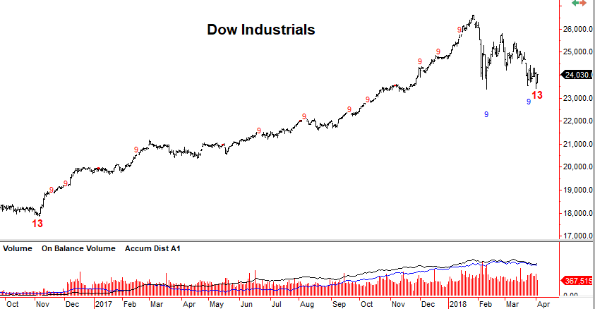
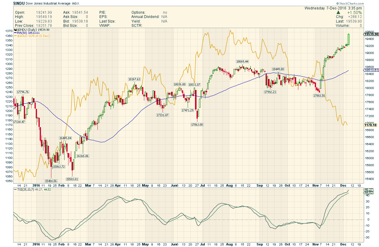
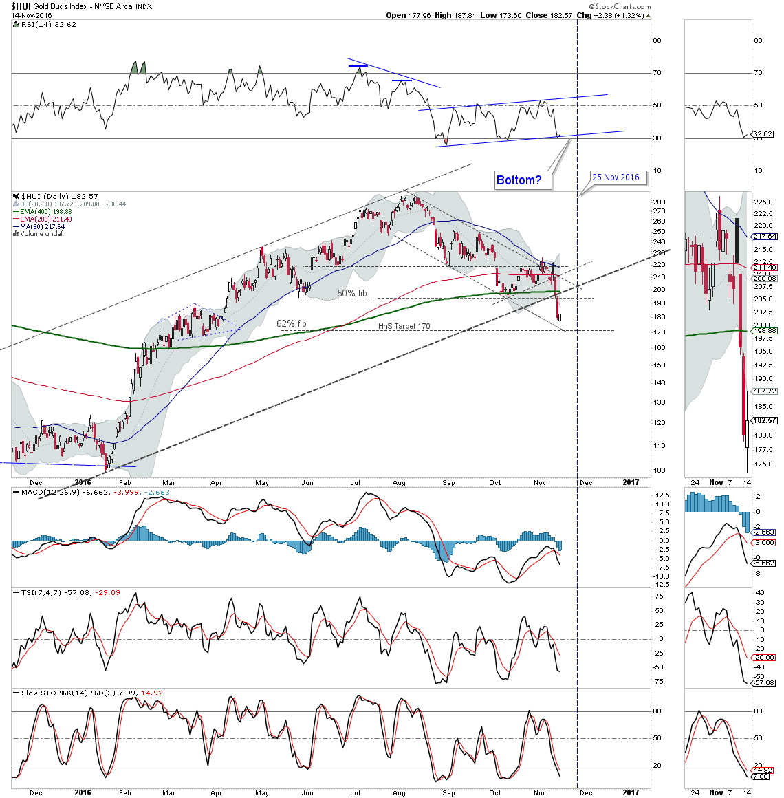
The research piece below I deem to be very important because (1) it deals with the one particular market that likely has more influence on the precious metals than any single other, and (2) the place in time we currently find ourselves.

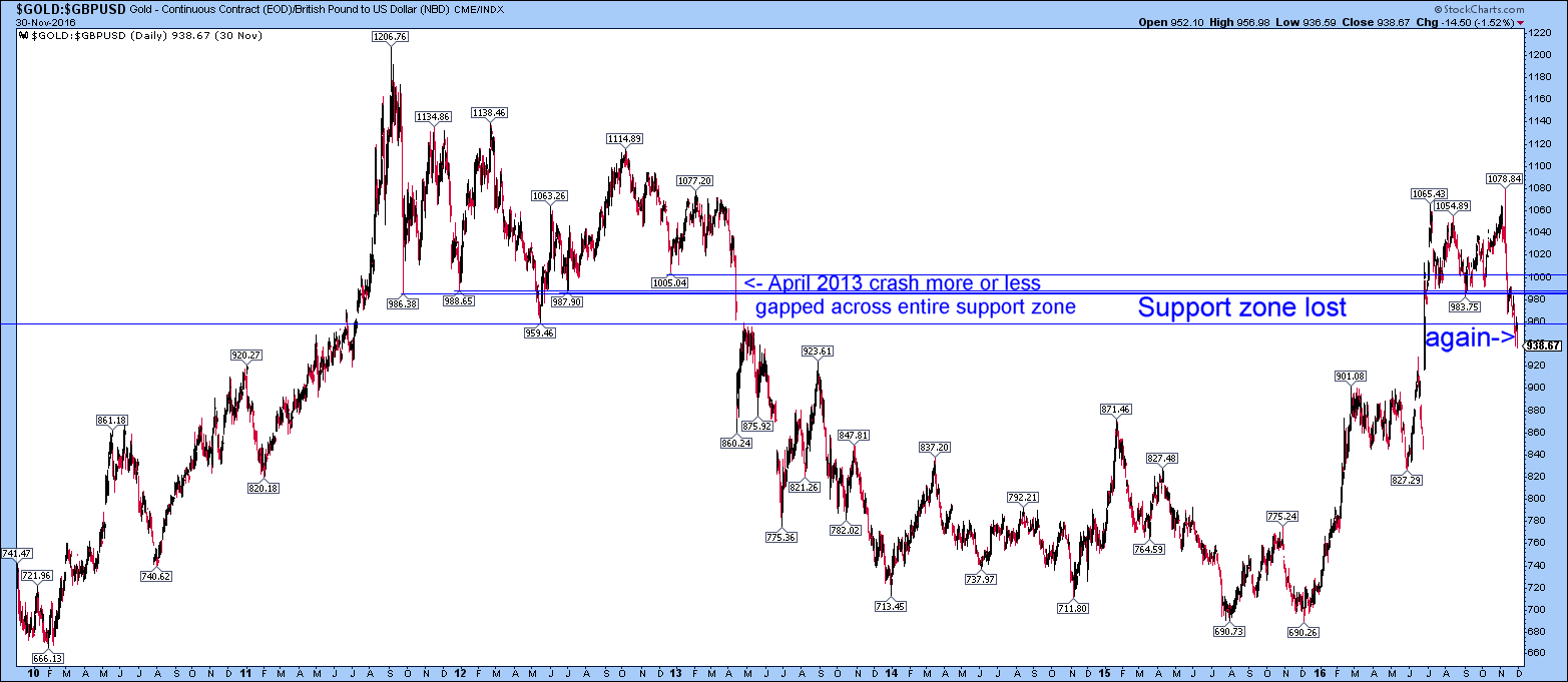
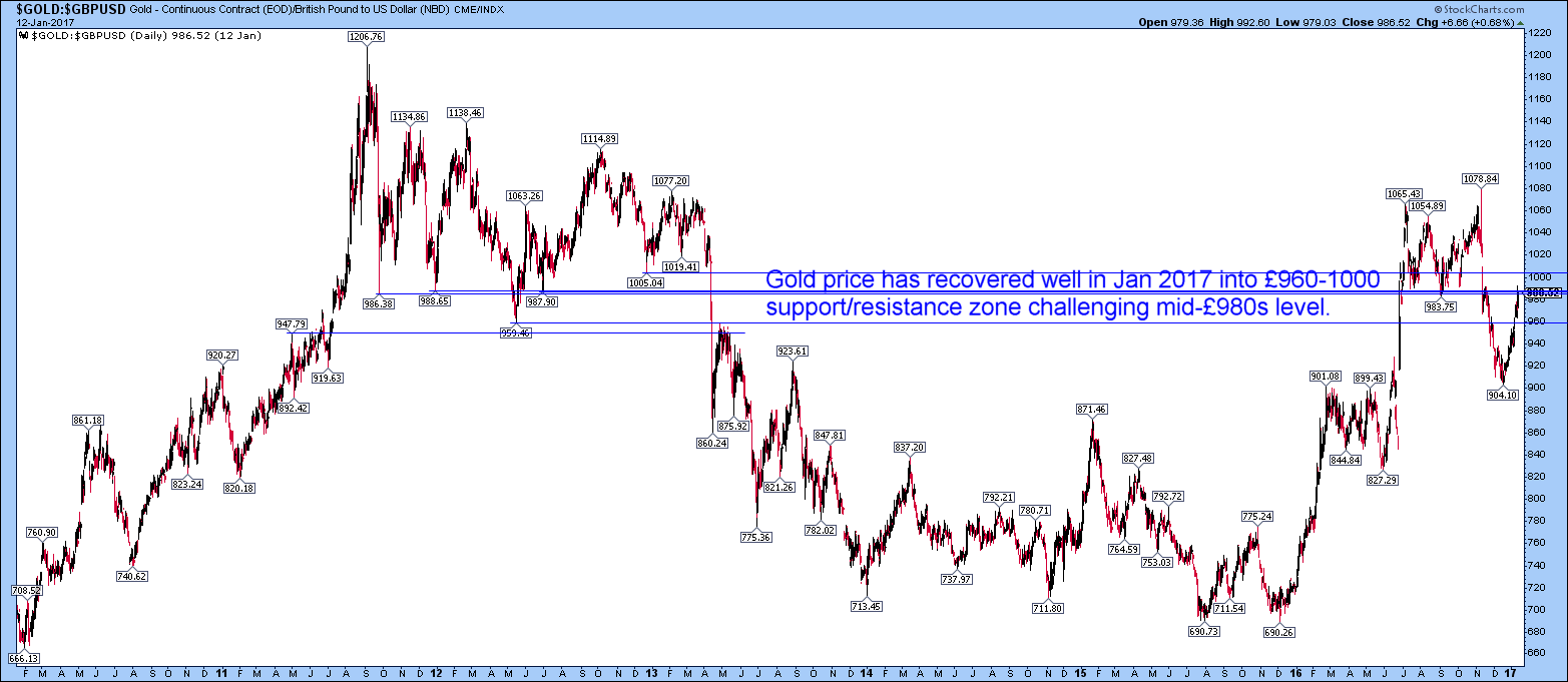
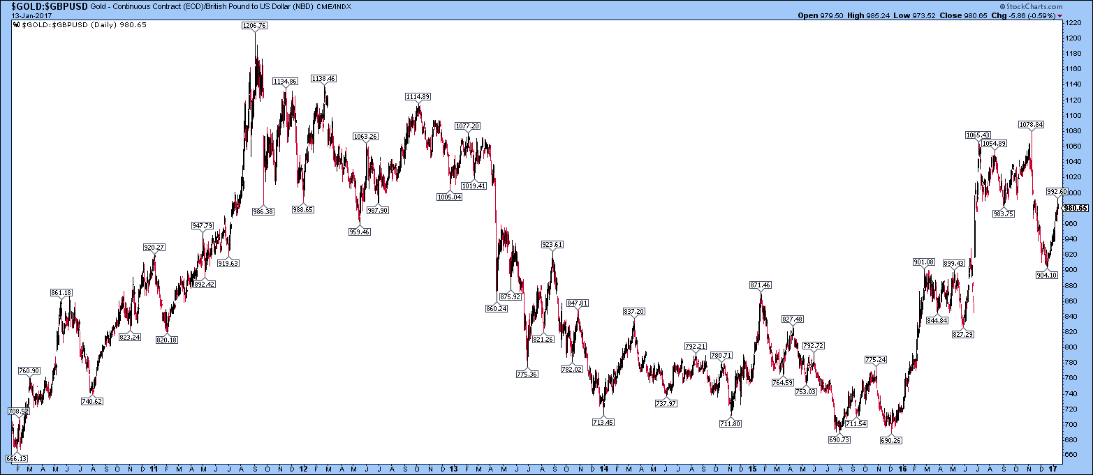
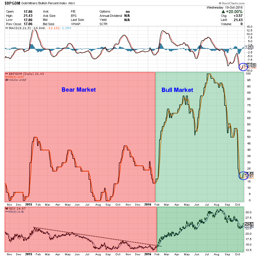
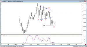
While I greatly respect Rambus and am inclined to agree with his bearishness on Gold for the Intermediate Term, there are other analytical methods that give a more guarded view of the mighty US Dollar, thereby mitigating much of the bearishness toward gold, at least for us here in “Dollar Land”.

Time will give us the answer as to which analysis was most accurate.

******************************************************************************************************************

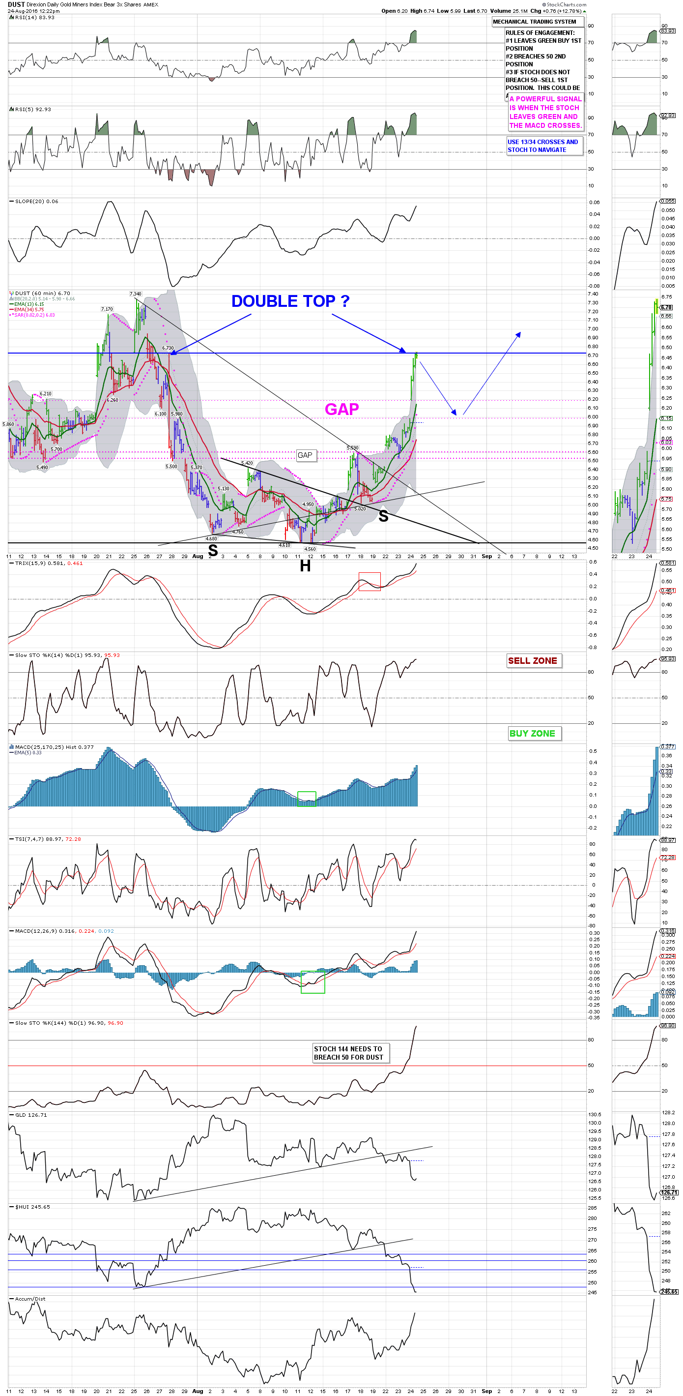
U.S.DOLLAR: Reasons for a High                                                                                                           March 28, 2017

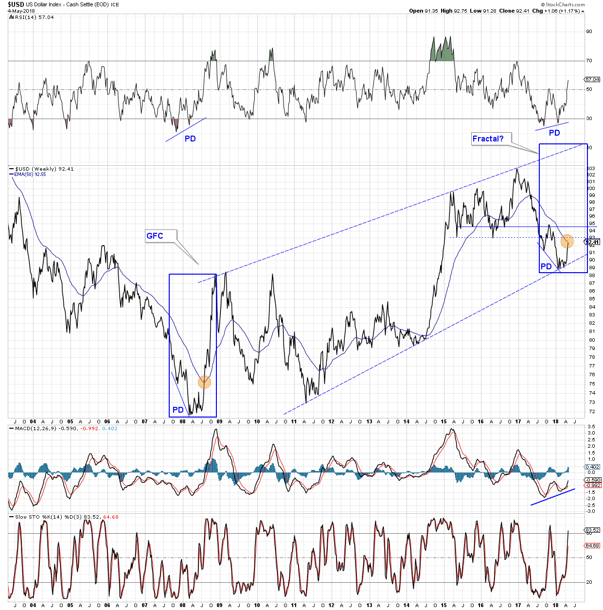
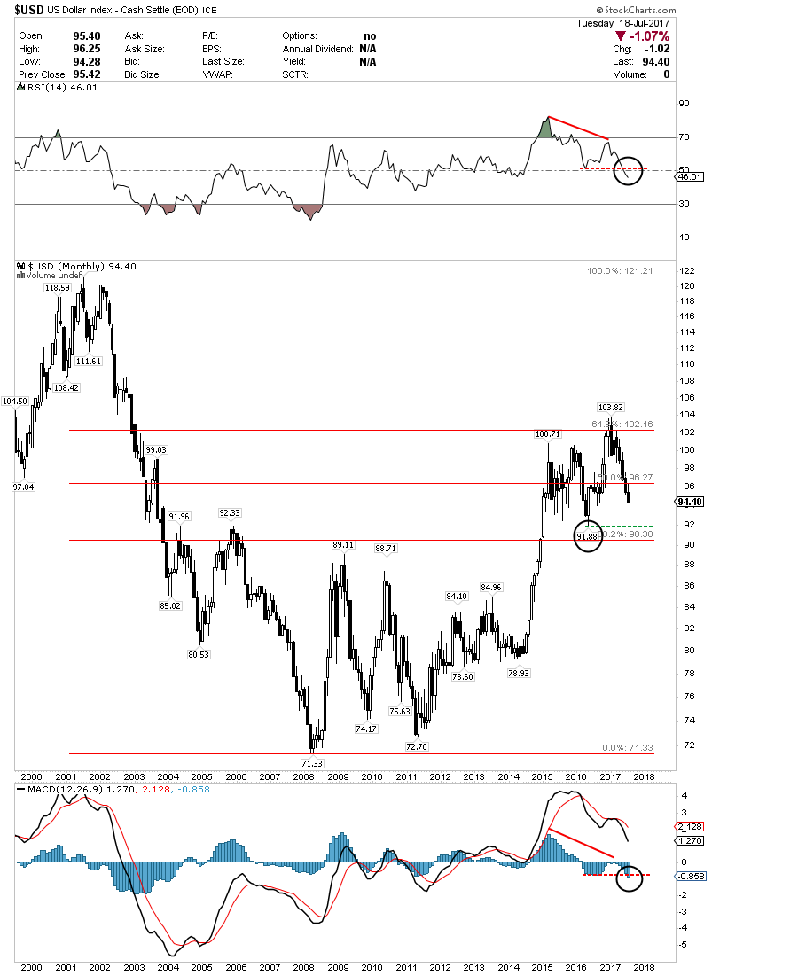
The dollar tends to follow a cycle of approximately 8 years. It is therefore not too often that the currency would be expected to arrive at a major point in time with regard to its long term rhythm. The current quarter however may prove to be one of those times. In the charts and descriptions which follow we will elaborate on a number of observations concerned with price and time. All of our information supports the idea that the dollar has reached a high. Some of our charts will present some complexity but we’ll start today with a monthly which is simple and straight forward.

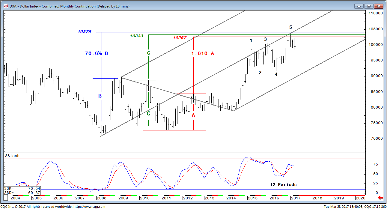
Cash U.S. Dollar Index: Monthly Chart (1)

The chart above shows a Fibonacci golden section which relates the timing of two past significant market turns to the recent January high. Accompanying the last high is a long term momentum divergence which contains multiple occurrences. The divergence is obvious as prices have climbed to new highs since March 2015 with momentum peaking at progressively lower readings. The foregoing is indicated with red lines. With the month of March having only 3 trading sessions remaining, it is very possible the oscillator will crossover to the downside by month end. If it does not, it will nevertheless leave the dollar in a potentially precarious position. Realizing this potential we will now move on to other more quantifiable evidence.

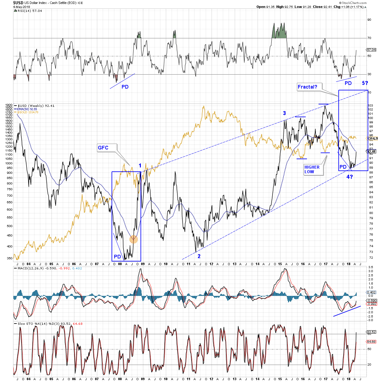
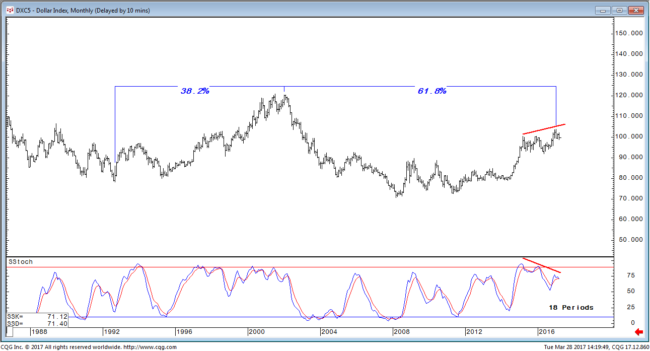
Our next chart is also a monthly. There are a few important points to note here. First is the Fibonacci 38.2% retracement level of the 1985-1992 decline at 10375. That level has been exceeded but in our estimation remains an important resistance area relative to the foregoing 7-year decline. A second more recent development is the current rally from March 2008 into 2017 and the fact that the move was very close to achieving a Fibonacci 78.6% relationship to the preceding 1992-2001 rally. The relationship would be exact at 10439. The January cash high was 10382. Perhaps the least ambiguous factor and really the most important is the fact that both the 1992-2001 and the 2008-2017 dollar rallies were 106 months duration. In calendar days, the first rally was 3,229 days and the second rally was 3,214 days. Given the magnitude of the time duration, that’s about as close to equal swings in time as we could possibly hope to find.

Cash U.S. Dollar Index: Monthly Chart (2)

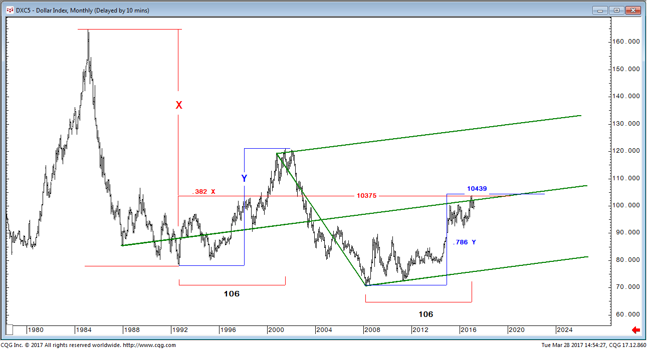
We started big picture with a couple of monthly cash charts and we will continue with a monthly chart which follows. This one however is futures. Our focus here will be primarily on price as we examine the recent 2017 high relative to 3 of the preceding trading ranges which occurred between 2208 and 2012. The three ranges in descending magnitude are B, C, and A. What we did was to test for common swing relationships which repeat in all markets and whether the dollar high in January 2017 was a reasonably close “fit” which would suggest the attainment of a typical measured objective. Actually, it is the attainment of 3 objectives coincidentally. For the B range, we applied the Fibonacci 78.6% ratio and then added the result to the B high. Similarly, we did the same for C and A applying equality to C and the Fibonacci 1.618 expansion to A. The resultant targets noted on the chart for each of the ranges was 10375, 10333, and 10267. The high on the monthly futures chart was 10381.5. Two of the three proved to be very close supporting the idea of having reached an objective.

Another factor on this monthly chart is the Andrew’s pitchfork and the fact that the median line although penetrated, eventually provided strong resistance. Interestingly, the penetrations were progressively less over time, perhaps a meaningful sign to remember in the future. Our old reliable “friend,” the 5-point reversal pattern, also materialized on this monthly chart with the 5th point accompanied by a momentum divergence.
We thought this chart was going to be primarily price oriented but we can see now it more accurately represents a synergy between, price, patterns and momentum.

U.S. Dollar Index: Monthly Chart (3)

                                                                                                +++++++++++++

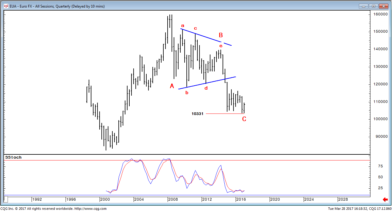
We will shift gears here and effectively back into other evidence which is worth noting. Anyone involved in the market recognizes that the Euro currency and the U.S. Dollar Index traded inversely. Below we are duplicating a quarterly Euro chart. It was from a January 20, 2015  article we wrote (Euro(FX): Longer Term Bearish Possibilities). Basically, we thought then that the currency was in a massive triangle and coincidentally the B-wave of a major A-B-C correction. Equality between waves A and C, a very common relationship, projected to target of 10331. Admittedly, we had a few targets but this deeper one was not closely approached until mid-December 2016 at the 10367.5 nearby low. If that was a significant low, it provides us with an additional warning vis-à-vis a possible the dollar high.

Euro(FX): Quarterly Chart (4)

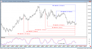
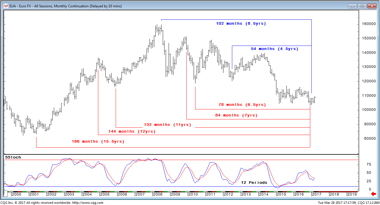
We have one final chart on the Euro which follows. It is monthly and concerns the element of time. We have illustrated anniversary years and half-years from previous significant market turns. Some of the intervals are well known Gann cycles in addition to anniversary periods (7 and 12 years). The fact that we have a sizeable cluster with terminations in the December/January period definitely adds to the probability of a euro low. The lows in December and January at 103675 and 103735 respectively, are so close in value that both may be considered as cycle terminations and certainly within the normal allowable variance of plus/minus 1 bar on the chart when dealing in time. Please also take note of the stark one-year momentum divergence (bullish) beneath the price chart.

Euro(FX): Monthly Chart (5)

Gold nearing £1000 in Sterling again. Crucial zone is £959-1005.

To my surprise, gold is nudging up against £1000 in pounds sterling as of 16 January, very soon after re-taking the £959 level last week. Tonight’s close is £997-998. This is well up the crucial trading zone between $959 and £1005.

In round numbers, we are very close to gold $1200, gold £1000 and GBP = $1.20.

Here is the narrative in charts of the bearish move of late 2016 and then the recovery up until last Friday:

Gold is back over 959 in GBP, a line in the sand for me.

I thought this level might be lost but it has been regained. £959 is the bare minimum of the support levels from the topping process in gold in 2011-2013 so in my view is it significant. Gold is £974 today. Strangely, now it just about coincides with $1180, another key level (in USD this time).

I cannot believe it’s true.

This was the picture as of the end of 2016:

Here is the taking back of that level as of 13 January 2017:

As of 17 January, gold is nearing £1000 at £997-998.


GLD Long Wave Count

Here is a possible Long term Elliott wave count on GLD. If it proves to be true it is would be very bullish.

The long range count is the purple capital roman numerals.

In this count The 2011 high is marked V (purple count) a significant multi decade generational high.

The whole decline from that point to Jan 2015 is a ABC correction (purple count)

The rally into June  2016 is only marked as WAVE ONE up in a new grand super-cycle I (purple count)

The whole decline since June is simply a WAVE TWO correction II (purple count)

Now the good news!

This month January 2017 We have completed the WAVE TWO correction!

Now we are entering WAVE THREE in the grand super-cycle.

Folks that is generational BUY SIGNAL Surpassing the great bull market of the 70’s.


GDXJ

A Possible inverse H&S pattern developing on GDXJ. A break above the neckline and the downtrend channel would be very bullish IMHO. January should be very interesting…

GDXJ WEEKLY

MACD’s got to start turning up or at least start to narrow like it did in January

Still looks like a bucket pouring out at this point.

chaikin money flow at the top of the chart looks abysmal

Looking for the bottom?

This chart is telling us we get a total retrace of last years move in Silver and turn up the first week of January.

EDIT: To the responses in the comment section…..all that is needed to generate this wave is for price to contact the bottom trend in the 15.50 range, can it break down? yes, absolutely. Don’t like the set up….don’t buy it then.

HUI:GOLD

We seem to have forgotten about this Important ratio

In January this year it had reached obscenely Low levels

The Parabolic decline was broken and it zoomed up.

But only to the point of the 2008 Low

However with Gold getting crushed lately this ratio is holding up rather well

I was over due for a bullish post eh ?

Thoughts From A New Member

Hi folks, just trying out my first post and sharing some thoughts. Go easy on me 🙂


I’ve followed PM for about 10 years now and been invested, one way or another for most of that time. I ventured into the miners in January, after years of research and following some great sites including this one. There seems to be some really good, well researched views being expressed here. I read all your posts, and weighed up the evidence. I was convinced we’d hit rock bottom, and was delighted with the returns. Like everyone here, I wrestled with trying to decide when to bail out. I exited once I’d seen a couple of chart patterns fail. They are the charts which show the 50 week moving averages on the HUI and XJY crossing above the 200 week moving average and yet failing to rally strongly, and plunging instead. On the charts below, you can see that this is unprecedented. Maybe a sharp reversal to come ? If not the averages will soon cross over again, but in a bearish sense…


Thank goodness for some of the pointers I’ve seen on here for energy and uranium stocks. Not taken the plunge into cannabis yet though, lol.


What a year. Cheers everyone, seasons greetings and all the best for 2017 🙂


Wow Dow

UP almost 300 today !

dow

Starting Mid January the Dow and gold were joined at the hip…a very positive correlation

Since the beginning of November there is a very negative correlation .

Its that Time of the Year

When we look around and see what is what and which markets have moved the best this year ( From Jan 1)

With 4 weeks left in the trading year…Rounding !

Oil is Up 40%
Silver is Up 20%
Gold is Up 10%
Commodities (Basis the CRB) are up 10%
Dow is up 10% ( but it was in a freefall for the first few weeks and is up 25% from the bottom in mid January)
Bond Yields (basis the 10 year) are up 5%
US Dollar Index is Up 3%

What are you smoking Fully ?

perf

So….What’s the take away besides EVERYTHING is UP ?

The US Dollar has basically been completely insignificant in 2016 as to what the other asset classes are doing !

So there…It is NOT The Most Important Chart on the Planet !

It’s Toilet Paper !

Ignore the Damn Thing !

UVXY

knife
Cost averaging into UVXY…
WAIT FOR THE MOVE!!!
BEARS BEWARE–The VIX is telling us a Santa Claus Rally could be around the corner…
Behind my current thoughts…
vix
January, all heck breaks loose…

HUI – Daily, Weekly

HUI Daily hit the bottom of the channel at the 62% fib, and bounced. What I like about the chart is that HUI is outside the BB and should allow a bit of a recovery. The overhead BB is opening up so that if a rally does occur, the index has an open roof. There is a slight positive divergence on the RSI, although one should note that it is much like October’s positive divergence that allowed only a bear flag rally.
What I don’t like is the terrifying plunge to the bottom of the channel. Until mid summer PM stocks indexes exhibited sudden, rapid upside moves, while downside reactions were ponderous affairs building support for the next jack rabbit hop. This market is the other way about. Rallies are hesitant, never gaining a lick above upside resistance while surprises are to the downside. HUI is below the 200 and 400 EMA. On thing to watch for is overhead resistance at either one.

sc

HUI weekly inverse SHS view. Reverse symmetry for an inverse SHS looks broken. Instead there may be a back test to the SHS top. Watch for resistance at the neck line.

sc

HUI weekly bull market BO and BT view. A faint hope is that the break down is a false breakdown similar to the January false move before the baby bull took off. However in January MACD was already climbing when the break down happened. Today MACD may be riding the “slope of hope.” One positive note – Is that a bit of a positive divergence on the TSI?

sc

Discosure. I am long the PMs for a bounce, but I am a nervous bull. Preservation of capital is imperative.
Humbly submitted. Views can and do change. Good investing all.

Perspective

How well you do in the market is really all about perspective, isn’t it? I’d like to show you two different perspectives on our rally since January from my Elliott Wave software. First is the view I have been focusing on since shortly after our bottom in January:

2016-rally

However, after hearing a number of people questioning if this rally was all it seemed to be, I decided to look at a longer time frame – to take a little longer perspective and see what it said. I was a bit surprised by what I found. First, here is what the software said about Gold:

gold-correction

Next was the $XAU index:

xau-correction

Do you see how the bullish perspective in the first chart is now just a smaller piece of the last two overall bearish charts? Perhaps this is what some of the folks here have been trying to tell us. Maybe this correction is not really over? I believe Armstrong is still projecting ~$800 gold.

Now for all my normal caveats – the software is far from perfect. I am not saying this is going to happen, but I thought maybe I should show a possibility that is not being considered by most on this board.

Macro View : U S Bond Ready to Enter Melt Up Phase ?

“All this QE and money printing is soon going to crash bonds”
“The 30 year bond bull market has reached its end and is about to implode”,
“US Governments are the ultimate return free risk investment”.

You have heard all of these statements and pleas to avoid the bond market, as its a train wreck waiting to happen. I sympathize with these arguments, but the charts don’t support this view. The opposite outcome is what the charts indicate. An analysis of the chart shows we are at the cusp of the final blow off leg up in the US government bond bull. This bull is 35 years running, but its got further to go and the next phase should knock your socks off.

Let’s review the chart of the 30 year US Bond and look at what it is saying to us.

p1

Here we see how the USB has been locked in a 35 year upward channel. Recently, however it has broken out of the channel on the upside. This is hugely significant. Observe that in early 2014 price bottomed above its historical channel support line. That was the first clue that there was unique strength in this bull and something was about to change. Then in January 2015 it broke the upper boundary, but within 4 months it pulled back inside the channel. That’s called a false breakout (FBO) and is normal for the first penetration of a resistance level. It then made a new bottom slightly above the red dashed halfway channel line. This is a very bullish sign and was another clue as to what was to come. It then powered up through upper resistance and broke the channel to the upside in early 2016. It is now coming back down in an apparent backtest (BT) of the breakout support level. All very normal to technical rules.

Bull Market Phases

I have written extensively on the three phases of a bull and a bear market. I have marked these three phase lines on the chart. In Phase I, few believed we could possibly be in a bull market and no one noticed that’s why its called the stealth phase. Phase II, the mark up phase, is the longest phase and it is the time that the retail buyer and institutions come into the market over time as they recognize it is a bull market. What comes next is Phase III, the mania or blow off phase. Think Internet stocks circa 1998-2000. The chart shows bonds now setting up for a parabolic move. This move actually started in the beginning of 2014. Once we complete the current backtest of the upper trend channel we should be off and running in the final crazy bond market blow off. No telling how long it could last, but its not out of the question for the 30 year bond rate to literally go to virtually zero!

So could this be what lies ahead in the long US Bond? If so what are the implications for commodities and gold?
Stay Tuned .

Plunger

p2

$BPGDM – PM Stock Buy Signal

I expect we may well see this indicator reach 100% again during the life of this bull market, but not 0.00% – which occurred several times within the depths of the 5-yr bear market.

Therefore, the fact that we are getting this buy signal so close to where it reversed back in January – at the bear market bottom – seems pretty solid to me.

bpgdm


GDX Daily…

This could be the bottom…
gdx
RSI 14 backtesting and bouncing off of trend line is huge for the bulls…
Positive divergences in play…
Trend line established end of January HOLDS…This is BULLISH…
TRIX is in the “turn around zone” same place before the big run up end of January…
The resetting of the TRIX is again HUGE for the bulls…
The only thing lacking is the 1,2,3 on the TRIX as the last time…
“IF” the 1,2,3 plays out, this could whipsaw GDX into the gap/yellow zone for the FINAL low…
However, the 1,2,3 is NOT necessary for a final low…

RIC which I consider one of the individual “leaders”…
Closed above the 50 SMA 9/12…
The important item is the TRIX crossing in exactly the same place as the end of last year before the run up…
ric
Same goes for GG…I find RIC more of a leader than GG
gg

Wxman’s 8 year Cycle Chart

A big shout out to WXman

He has been trying to get our attention with his 8 Year Cycle Bottom’s Chart

To be honest I scrolled past it because I couldn’t really see the cycles at a glance

The chart is too complex and filled with many other notations…including tops BUT

The simplicity of this pattern blows me away

Wxman has postulated the next bottom is due in October

Surf City points out …it looks like the 8 year bottoms are all very near or right in January…so the Bottomz Inn !

I agree…look at the 8 Year Gold Bottom Cycle Chart stripped of all other lines…with the Dollar overlaid

8yrcycle

Thanks Guys…this is so simple the mind boggles

ATTN Goldtenters…

I have been watching what feels like a “101 different scenarios” on the minute charts. Let me clue you in, nobody, I mean nobody is a prophet nor knows how exactly this is going to play out. The most conservative method is to stick to the charts on the daily time frame. When the daily RSI trend lines are breached to the upside, this is the time to go long. It’s all about momentum, and being on the right side of the momentum. This is when the money is made…
GDX had a bear cross of the 13/34 EMA today, the first since the end of January…
So I can expect a back test of the moving averages and further downside action…
Would be surprised if the positive divergence holds…

gdx
Until then, IMHO, it’s all a guessing game, and for disciplined day traders ONLY…
Good luck, I want to see everyone succeed…
DUST 60…
Possible “cup and handle” formation…
Best guess EOD 8/29; I mentioned this a few days ago…
dust
Watch reaction at this gap fill.
NOTE: SOMETIMES THE BEST TRADE IS NO TRADE!

GDX

GDX Has Just Made a Powerful Bull Flag
By: Brad Gudgeon | Thursday, August 25, 2016
The GDX daily chart below shows a powerful xyz e-wave bullish flat that is projecting to 35.42 by September 1, two trading days past the Mercury Stationary/Retrograde date of August 30. As of August 25th, GDX has closed at 27.31 off the earlier low of 26.64. A 29% increase on GDX and a nearly 90% increase on NUGT in one week seems likely based on the information on the chart from the August 25th close!
The chart below shows repeating 19-23 trading day cycle lows since the low on January 19, 2016. The low this phase went all the way to 23 trading days. The last (c) of C wave is also known as a bear market rally third of a third, which has the power of a third wave, but in reality is more like a 5th wave because of its finality. Another word for this coming move might be better termed: a blow-off top.
There are no 5 wave sequences in this move up, making this year’s rally suspect, at least regarding higher highs after September 1 (at least for this year). My best guess is we are going to see new lows ahead for the precious metals complex as we approach the usual October-December 8-year cycle lows.
GDX has not seen this level of oversold conditions since the January lows. The only difference this time is that this looks to be a blow-off rally, while back in January was just the beginning of the rally.
GDX Daily Chart
42369
As far as the stock market is concerned, there are way too many crosscurrents (cycle/wave/indicator/astro wise) going on to even get close to know where we headed in the short term. Ideally, we see a 10 week, 64 trading day top on September 7th and a major low on November 21. Saturn square Mars on August 24 presaged WAR and EARTHQUAKES. Turkey invaded Syria and we had an earthquake in Italy that killed 38 people.
Now we have Mars square Neptune on August 26 (squaring the north node of the moon on Sunday). Neptune rules crude oil and radical, misguided religion (like ISIS). Mars rules war. IF the stock market rallies to a new high on Friday (on the Yellen speech), we may see a fairly large drop next week into as late as Sept 1, but likely no lower than the mid 2130’s I would think in any case. Time will tell.
We use price/time targets as a road map of possibilities, not something necessarily to be traded. Keep that in mind when reading this or any other commentary on the markets. Stock market forecasting is much like the weather, it is constantly being updated. That is why we offer subscriptions.
I’m offering a special 2 for 1 subscription offer good until the end of August. See my website for details.

Brad Gudgeon, editor and author of the BluStar Market Timer, is a market veteran of over 30 years. The subscription website is www.blustarmarkettimer.info

First major correction of the new bull market

It appears we have reached the first major correction in the bull market which started January 19 2016. The slow down we had from late April into June was more of a sideways consolidation. This one is likely to be a more significant shakeout entailing a bit more pain. But, its normal- deal with it.

Personally, I had hopes that we could rally up to the psychologically significant levels of HUI 350-370 where we had PORs in the previous bull and bear markets. But instead I think the market is now succumbing to its own gravitational force.

In fact, this rally petered out right at the limit of other strong rallies. Like many forum members we subscribe to many different news services. One of my favorites is Bob Hoye and his partner Ross Clark. As it turns out his past bull analog comparison turned out pretty accurate and you can see how this rally flamed out in a normal zone.

That’s life, trees don’t grow to the sky.

Bull Rally analogs BGMI

http://rambus1forum.com/wp-content/uploads/2016/08/Bull-Rally-analogs-BGMI.pdf

Typically the first major correction in this index lasts from 5-8 weeks and declines 25%. That would put the HUI down at the level of HUI 214 and we are 3 weeks into the decline. So that’s the typical target for price and time. Trade it as you see fit, knowing that you don’t have to trade it at all.

What gold has been doing is very healthy. Recall my well worn Matterhorn chart as it clearly demonstrates that as long as it holds the 1309 level, it is simply a healthy B/T consolidation of the break out move. This process is referred to as “building cause”

I am trading a bit around the edges, I dumped most of my MUX as its liquid and very volatile. I am just improving my cost basis, nothing wrong with these companies. I am mainly sitting tight and remaining cool as Mr. Cucumber.

sc-331

PS… For those with really shaky knees the genesis of this bull market has not changed. It is driven by negative interest rates and government sanctioned financial fraud. Nothing will change for 5-10 years to reverse this trend

DUST 60

Mr. De_Vivre…
This is for you. If you feel a change of trend is upon us, this gap fill would make for an excellent cup and handle on the DUST 60.
Again, I am focusing on the GLDX lower trend line to help guide me on a possible trend change…
A “trend change” in my book is denoted by the moving averages, I happen to use 13/34. On the daily, it’s still bullish. On the 60 min bearish…Choose a method and trade it well. FYI, the daily trend has been BULLISH since the end of January on how I define a trend on the daily.
Also, stay away from NUGT/DUST if not an active day trader. GLDX is a fine trading instrument.
dust

SKI Gold Update

http://www.321gold.com/editorials/kern/current.html

“Significant wariness is appropriate for the bulls as the major intermediate-term top may have occurred via last week’s 16-20 index sell signal and the hit/touch of the long-term 884 resistance index. The 884 index may just have marked the exact top, and Friday’s (8/19/16) decline was consistent with that very real possibility. Jeff also has other reasons to be wary that are reserved for subscribers. Jeff is down to only a small long position. It won’t take much of a rise to activate a new buy and it won’t take much of a decline to activate a further sale. The indices have been extraordinarily exact during all of 2016. Purely Mechanical SKI remains completely long from the late January 92-96 index buy signal at USERX 4.99. The mechanical system always ends up giving back a significant portion of the current gain until it is stopped out via a 92-96 index sell signal, so Jeff is using the other indices to sell that purchase and/or to rebuy if there is likely to be another (unexpected) leg higher.”