A POST ELECTION ANALYSIS
THE OFFICE OF MANAGEMENT AND BUDGET ..OMB
MEDICAL AND MEDIA MONOPOLIES IN THE USA
MEDIA BIAS CHART
TRUMP TRIUMPH
WARPSPEED STOPPED THE FEMA CAMPS
NAUZEOUSLY OPTIMISTIC
THE TRUMP
TRUMP'S PICKS
MASS TRUMP PSYCHOSIS
Goldtent TA Paradise
GOLDTENT STATEMENT OF NON VIOLENCE
READ OUR DISCLAIMER
CONTACT
JOIN THE DISCUSSION
THE WIZARD OF RAMBUS
GOLDTENT ANTHOM
THE WOLFOWITZ DOCTRINE
"PLANDEMIC"
DEEP DIDDY DOODOO
PLATITUDE AND GRATITUDE
US CRIME STATISTICS
KILL SHOT
PENNSYLVANIA
17 GOALS OF THE NEW WORLD ORDER
WHAT'S ACTUALLY IN THE "VACCINES"
HEY GOOGLE
BOOM AND BUST
THE FINANCIAL SYSTEM RESET IS SHEDULED FOR SPRING 2030
Polls
 Loading ...
THE CULT OF MODERN MEDICINE
MASSIVE STUDY : WORLDWIDE EXCESS DEATHS
THE GREAT SET UP
HUGE SUPREME COURT VICTORIES FOR THE AGES
IS THERE A DEEP STATE ?
THE PLANET HAS NEVER BEEN SAFER , GREENER
DEFINITIVE US VACCINE POLL
VAXXINSANITY
HOW MANY VACCINES ??
FARMER'S FLAT EARTH SOCIETY
A REPUBLIC VS A DEMOCRACY
N95 MASKS ARE TOXIC
DEMOCRACY AND FREEDOM ARE VERY RARE CIRCUMSTANCES
THE MEDIA
* PIERRE POILIEVRE *
MRNA SHOTS PERMANENTLY ALTER DNA
THE EMERGING POPULIST MAJORITY
THE OCCULTISTS
MEET KYLE KEMPER
NUCLEAR WEAPONS ARE A FANTASY
WHEN THE FINANCIAL SYSTEM IMPLODES
YOUR MENTAL IMMUNE SYSTEM INTENTIONALLY UNDER ATTACK
FENBENDAZOLE AND TURBO CANCER
NO VACCINES HAVE EVER SAVED LIVES
IVERMECTIN AND TURBO CANCER
WHAT IS WOKE ?
MOON FRAUD
"CLIMATE"
CANADIAN TREES CLEAN 10 MORE CARBON
UNPACKING CLIMATE ENGINEERING
WHAT IF EVERYTHING YOU THINK YOU KNOW ABOUT CHINA IS WRONG
PARASITES AND DISEASE - PARADIGM SHIFT
DETESTED "ANTI-VAXXERS"
DO NOT FALL FOR THE DEMORALIZATION PROGRAM
THE THEORY OF EVERYTHING
WHAT IF VIRUSES AND GENETICS
VACCINE POLLS OF AMERICANS
THE OBLITERATION OF VIROLOGY
WHAT IF EVERYTHING THEY HAVE BEEN TELLING YOU
DON'T SHED ON ME
POLL: MORE THAN HALF OF AMERCANS SUSPECT
THE PARASITE PARADIGM
THE UNIFIED THEORY OF CHAOS
ABSOLUTE INCONVENIENT TRUTH
BUY IVERMECTIN ONLINE
MRNA VACCINES CAUSE CANCER
WHAT HAVE WE LEARNED ABOUT SOCIETY
VACCINE TRIAL FRAUD
SHEDDING IS REAL
NOBODY IS SAFE
SMOKING GUN : GERMAN PROFESSOR
NUCLEAR BOMBSHELL STUDY
GLOBAL WARMING DEBUNKED
THE GREATEST PRESIDENT
A BRIEF HISTORY OF THE ISRAELI PALESTINIAN REGION
WHO THE FUCK DO YOU THINK YOU ARE ?
"ORGANIZED" RELIGION
THE MYSTERY OF ISRAEL
DEFINE WOKE
HOW DO YOU LIKE THEM APPLES
HOW TO POST
CANADIAN GOLD MOONSHOT
WE CAN'T FORCE THE HUMAN BODY
FIRE
GOLDTENT STATEMENT OF NON VIOLENCE
GROWING PAINS
VACCINE SHILLS ALL IN ONE MONTAGE
MASK TOXICITY
CHRYSTIA FREELAND IN DEPTH EXPOSURE
1000 PEER REVIEWED ARTICLES
HEIL HITLER
INFORMED CONSENT
CDC CONFIRMS COVID VAXX PREVENTS 1 DEATH IN A MILLION DOSES
RIGHT TO
STUDY PROVES VACCINE INDUCED SPIKE PROTEIN
FOR THE GREATER
MAJORITY OF AMERICANS DUMB AS CARDBOARD
HAITI SAYS TO SWEDEN
CHINA : THE REAL STORY
THE WHOLE COVID PROJECT STORY IN ONE BRIEF VIDEO
1.600 SCIENTISTS DESTROY THE CLIMATE GHOULS
DON'T FEAR THE LOCKDOWNS
STUPID PEOPLE
FACE MASK SCIENCE
MEET ME AT
THE FUTURE AND PRESENT OF HEALTH CARE AND WELLNESS
BOOM : A BOMBSHELL THEORY
THE EV SCAM
THE TOP CLIMATE SCAM
VACCINES IN GENERAL
HOW POLITICS CAN DESTROY YOUR SOUL
CO2
WHERE DID THE FLU GO ?
THE MEEK SHALL INHERIT THE EARTH
Alberta Public Health Emergencies Governance Review Panel
SERVANT OF THE PEOPLE
1 IN A MILLION
HOW TO CREATE A DEADLY PANDEMIC
BEHOLD A NEW VIBRATIONAL DAWN
A SUCCINCT SUMMARY
JOIN THE DISCUSSION
COVID VAXXS HAVE KILLED 100s OF THOUSANDS WEEKLY
OUT OF AFRICA : WITH THE FARMER
CARBON DIOXIDE
THE GREAT AWAKENING
CANADIAN TRUCKERS FREEDOM CONVOY
WHAT IS A WOMAN
NO ONE IS SAFE
SIGNATURE (10 MIN ) PIECE
ZERO
NOT SAFE NOT EFFECTIVE
LEST WE FORGET
ARTIFICIAL INTELLIGENCE
* THE GREAT AWAKENING
CHOLESTEROL AND STATINS
ANTIDOTE TO AMERICAN PROPAGANDA MACHINE
AUTISM AND CHILDHOOD VACCINES
THE GREAT
SLAVERY : A 3 MINUTE HISTORY
ATHLETES OF THE WORLD
DON'T LET THEM GET AWAY WITH IT
RAPID ONSET GENDER DYSPHORIA
THINKING YOURSELF TO DEATH
ONTARIO COVID DEATHS
"MODERN" SCIENCE
CANADIAN EMBALMER'S SWORN
5 G LED STREET LIGHT
UNDENIEABLE PROOF OF HUGE VACCINE INJURIES
DEFINITIVE WORK
THE GERM THEORY
PSYCHOPATHS
CBDC ?
CBDC ALERT : ATTENTION AMERICANS
HUGE ANTI VAXX VICTORY
WHY I DON'T BELIEVE
WHY DO THEY DESPERATELY
ALL VACCINES PERFORM WORSE
WHY SOME HAVE ADVERSE REACTIONS AND OTHERS DON'T
PCR TEST WAS COMPLETE BULLSHIT
THE BIGGEST LIE
THE TRUTH ABOUT VIRUSES
DOWN THE RABBIT HOLE
MILITARY OPERATION
Global Public-Private Partnership
LEGAL WALLS OF THE COVID KILL BOX
DECLARATION OF HELSINKI
JOURNEY TO THE CENTER
THE THREE ERODING PILLARS
HOUSE PRICE IN GOLD OUNCES
VACCINE MANDATES
BLACK NOBILITY
OH CANADA
SUDDENLY DEAD : VAXX OR VIRUS ?
JEFF CHILDERS
WILL YOU STRONGLY SUPPORT
SURVIVING NUCLEAR WINTER
DID NOT WORK CANNOT WORK
IVERMECTIN !!
IT'S THE NANOPARTICLES
CARBON CREDIT SCAM
RAGE AGAINST
WHY WAS NATURAL IMMUNITY
SMART CITIES AND TOWNS
DEATH KNELL FOR MASKS
THE ANTI-VAXXERS
UM...SORRY GUYS BUT
THE MYTH :
NEIL OLIVER INTERVIEWS JOHN CAMPBELL
SUDDENLY AND UNEXPECTEDLY
BE YOUR OWN DOCTOR
- * DMSO HANDBOOK *
- * THE RANT *
- * THE UBIQUITOUS PHARMACEUTICAL SOCIETY
- 100% CANCER REMISSION (MONOCLONAL ANTIBODY)
- 2ND SMARTES GUY CANCER PROTOCOL
- ANTI PARASITIC DRUGS SHOW STRONG ANTI CANCER EFFECTS
- ANTIPARASITIC VETERINARIAN DRUGS SHOW PROMISE FOR CANCER TREATMENT
- BREST CANCER AND THE VAXX
- BRUSH YOUR TEETH DAMMIT
- C D S ( CHLORINE DIOXIDE SOLUTION )
- CBD GUMMIES AND TIGER WOODS
- CHLOESTEROL : A BIG PHARM BIG CON
- CHLORINE DIOXIDE DETOX
- CURCUMEN
- DISSOLUTION OF SPIKE PROTEIN ( NATTOKINASE)
- DMSO : MIRACULOUS PAIN TREATMENT
- DMSO2
- EARTHING
- FENBENDAZOLE Q AND A
- FIBROUS BLOOD CLOTS TREATMENT
- FLCCC VACCINE DETOX PROTOCOL
- HEALING POWER OF ILLNESS
- HEALTHY GUT BACTERIUM MICROBIOME
- INFLAMATION
- IT'S DEPRESSING : ANTIDEPRESSANTS KILL
- IVERMECTIN AND FENBENDAZOLE TO PREVENT CANCER
- IVERMECTIN PILLS HERE
- IVERMECTIN PROPHYLACSIS
- IVERMECTION CURES CANCER ?
- METHYLENE BLUE
- MICRODOSING LITHIUM BOOSTS YOUR BRAIN AND PREVENTS ALZHIEMERS
- MRE ON DMSO
- NATTOKINASE …SPIKE DETOX
- NATTOKINASE : THE HOLY GRAIL FOR SPIKE DETOX
- NATTOKINASE DISOLVES MICROCLOTS
- NEW STUDIES AND PROTOCOLS
- SHEDDING IS REAL : WHAT CAN YOU DO ABOUT IT ?
- SSRI ANTI DEPRESSANTS ARE A HORROR STPRY
- THE VEGAN SCAM
- TOP TEN DETOX ITEMS
- TREATING COPD NATURALLY
- TREATING COPD NATURALLY
- UVBI ( ULTRAVIOLET LIGHT BLOOD IRRADIATION )
- WHY HERBS AND SUPPLIMENTS WORK ( McCULLOUGH)
- YES VIRGINIA..A CURE FOR CANCER
THE CRIMINAL TYRANTS
THE TREE OF SHARED INFORMATION
BAD BATCHES
THE SPIRITUAL REASON
17 THOUSAND PHYSICIANS AND SCIENTISTS
FINAL TALLY : COVID INFECTION FATALITY RATES
NEVER EVER
* ANTI-ANTIBIOTIC MEASURES
WHY SOME HAVE ADVERSE REACTIONS AND OTHERS DON'T
THE SCIENCE
WHERE DOES ELECTRICTY
* ANATOMY OF A BULLSHIT "MODEL"
* CAUSE UNKNOWN
* ENJOY THE SHOW
ALTERNTIVE MEDIA INDUSTRIAL COMPLEX
* MUCH ADO ABOUT CORONA *
ELECTRIC VEHICLE HOAX
* SUDDEN ADULT DEATH SYNDROME
ALAS N95 MASKS
UNACCEPTABLE VIEWS
CAREFUL OUT THERE
GEOGRAPHICAL WONDER
OH WHAT A TANGLED WEB
* DIED SUDDENLY
* THE LOBOTOMY
CENSORING THE INTERNET IS LIKE
* THE WHO , FDA ET AL EXPOSED
* POLL : SCEPTICS ARE SHUNNING
YOU MURDEROUS HYPOCRITES
* A LOST SMALL TOWN
THE MOST EVIL MAN
* TOXICOLOGY VS VIROLOGY
THE REAL ANTHONY FAUCI
* GEERT EXPLAINS IMMUNE ESCAPE
* PFIZER SCANDAL GOES VIRAL
* GENERATION
* PIG SHIT
ANTIVAXXERS
* ANTI-GLOBALISM
* SAFE AND EFFECTIVE
* THE GREAT REVEAL
* WELCOME *
* WELCOME TO FORT DETRICK
* IVERMECTIN.COM
* WHAT ABOUT CANCER ?
* WELCOME TO
* DID YOU SCREW UP
* VAXX INDUCED CLOTS
* ISRAEL BOMBSHELL
* MY SON
* WE WERE RIGHT
* WHERE'S THE RAGE ?
* CERTIFICATE OF ACHIEVMENT
* FUCK
* ACCEPTANCE / REFUSAL RATES
* STATISTICAL TRICKS
* COVID-19
* SUPERHEROS
* THERE IS NO CLIMATE EMERGENCY
* HOW SWEDE IT IS
* THE DEEP STATE
* THE BASIC LAWS
* TOM LUONGO'S THESIS
* THEY ( THE UNVAXXED)
* ADVENTURES OF GOLDBALLON
- **THE COMPLETE WORKS OF THE ADVENTURES OF GOLDBALLOON
- ARTIC SKIING IN RUSSIA
- AZERBAIJAN ROAD TRIP
- CHECHNYA
- COMPLETING THE LOOP IN TAJIKISTAN
- DIOMEDE ISLANDS : FROM USA TO USSR IN A BALLOON
- FAIRY MEADOWS
- FROM THE ROOF OF THE WORLD
- ISTANBUL AIRPORT ART
- KALININGRAD
- KAMCHATKA
- KARELIA RUSSIA'S REMOTE NORTHWEST
- LITHUANIA LOVES UKRAINE
- MIDNIGHT AT THE OASIS
- MONGOLIA
- MOROCCO
- MOROCCO2
- MOSCOW FEB 2023
- NECTAR OF THE GODS
- NORTHERN PAKISTAN
- ON TARGET FIXATION
- PARMIR MTNS TAJIKISTAN
- SEVASTAPOL CRIMEA
- SEVESTOPOL CRIMEA
- SIBERIA 2
- SKIING IN SIBERIA
- SPRING IN mOSCOW ( ANOTHER LOOK)
- ST PETERSBURG RUSSIA 2014
- ST. PETERSBURG RUSSIA
- STONED
- TAJIKISTAN
- TAJIKISTAN 6
- TAJIKISTAN PARMIR MOUNTAINS
- TAJIKISTAND MOUNTAIN CLIMB
- THE BALKANS
- THE CRADLE OF CIVILIATION
- THE INTERVIEW
- THE LAST OF THE SIBERIAN SNOW 2024
- THE MIDDLE OF EVERYTHING
- THE STONES AND THE DOORS
- TIKSI SIBERIA
- TOP OF THE WORLD PART 2
- TREAVELS AT THE EDGE …MOROCCO
- TRUCK ART
- TURKEY 3
- TURKISH DELIGHTS
- TURKISH DELIGHTS
- UKRAINE 2015 …UNBOUNDED BEAUTY
- ULAN-UDE RUSSIA
- WINING AND DINING IN FRANCE
- YAJIKISTAN : GOING DEEPER
- YAKUTSK
- YAKUTSK SIBERIA
* UNINFORMED CONSENT
* GET YOUR IVERMECTIN
* FROM RUSSIA WITH LOVE
* CLIMATE EMERGENCY ?
WE ARE
* MASKS HARBOUR PATHOGENIC
* BAFFLED
* THE VACCINES CANT WORK BECAUSE
* BEST OF THE BEST
* NEW ZEALAND ADMITS VACCINE FAILURE
* MIKE YEADON
* WHAT IS A WOMAN
* THE WAR ON THE UNVAXXED WAS LOST
* FIRST A TRICKEL THEN A FLOOD
* SPIKE PROTEIN = CANCER
* WUHAN MILITARY GAMES
* ESCAPING MASS PSYCHOSIS
TOTALITARIANISM
* UNMASKING
* FREEDOM PASSPORTS
* OPTIMISM
* THE FREEDOM CONVOY
* RESPIRATORY VIRUSES
* WALLGREENS POSITIVITY RATE
* POWERFUL ANTI CANCER DRUG
* THE LYING MEDIA
* VACCINE COMPLIANCE IN THE USA
* NATURAL IMMUNITY IS KING
* 34% OF CANADIANS UNVAXXED
* DEFINITIVE ARTICLE
* COVID: ISRAEL VS PALESTINE
* THE THREE STAGES
* THE TRUCKS ARE COMING
* 100 MILLION AMERICANS
* GROUND ZERO
* TRIBALISM
* THE ZOOM CLASS
* COVID VACCINES CANNOT WORK
* HISPANIOLA
* CENTRAL AFRICA
* 400 STUDIES
* AMA CODE OF ETHICS
* HAND INSANITIZERS
* PUBLIC HEALTH
* WHO ARE THE VAXX REFUSERS
* MICROBIOPHOBIA
* ASYMPTOMATIC SPREAD
* REAL VACCINE EFFICACY
NATURAL VS ARTIFICIAL IMMUNITY
*DECODING THE NWO
PRE EXISTING T CELL IMMUNITY
THE SPANISH FLU OF 1918
THE ORIGINS OF COVID
POSTING INFORMATION
I’m Running Out Of Superlatives
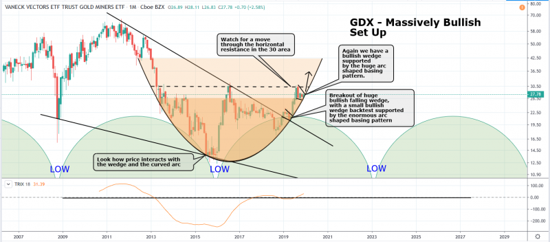
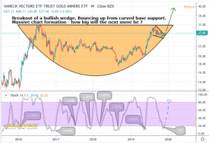
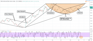
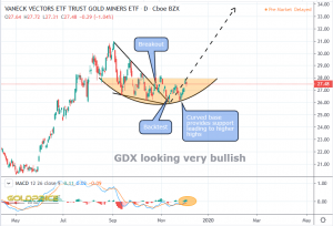
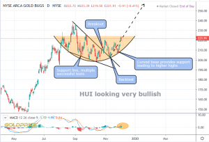
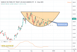
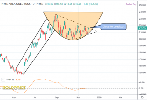
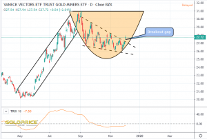
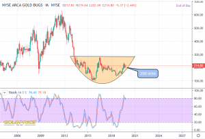
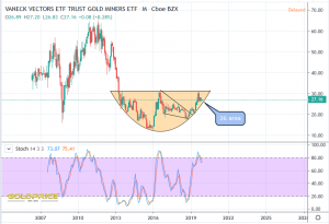
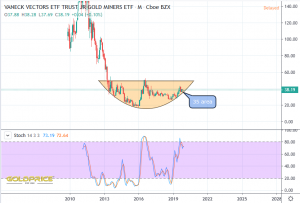
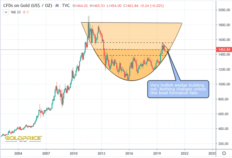
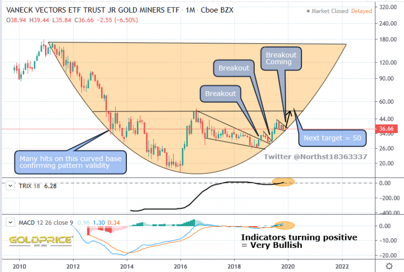
This has to be one of the most beautiful, technically perfect charts I’ve seen. GDX, GDXJ and HUI are all the same. When this thing moves, there are some signs and indicators that we may be staggered just how far and fast it goes. I could be wrong of course, but just look at the size of that bullish wedge and geometrically perfect arc. It’s pure poetry, mathematics and geometry. Price is obeying all the rules – perfectly. I don’t know how many other people (investors/traders) are seeing this and realising the potential. Compared to the general stock markets, the amount of money invested here is tiny. I suspect some big, smart money will head this way and for those who have been getting positioned, the gains will be superb. The trick, as always, will be locking profits in and avoiding the inevitable mid-cycle correction when it comes.
Three Gold Charts
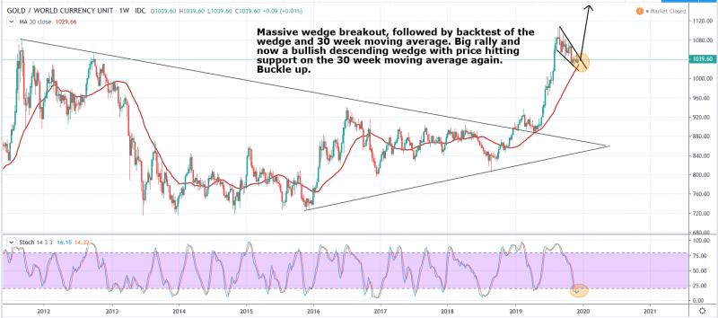
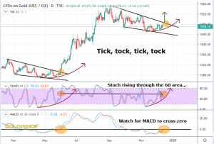
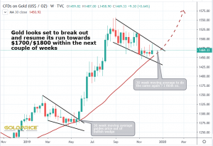
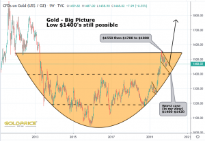
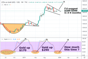
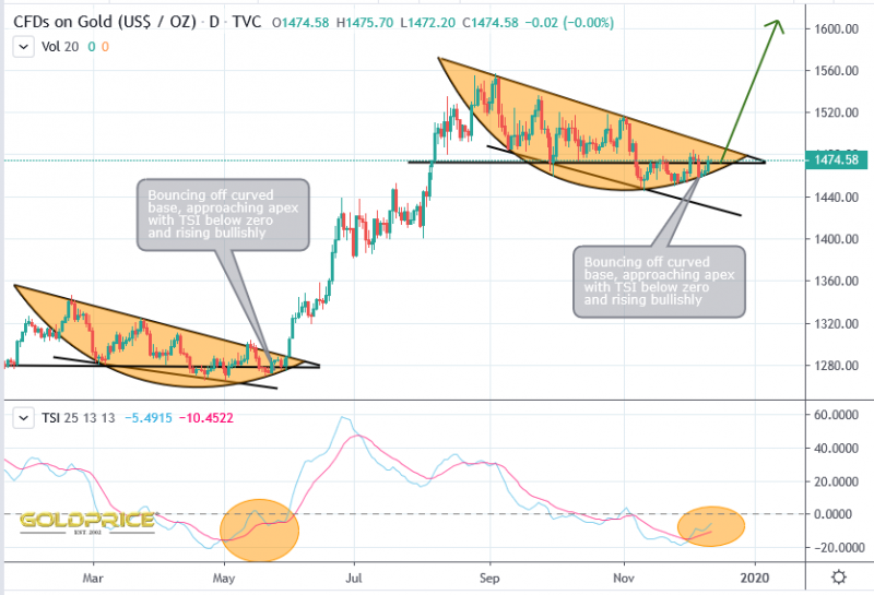
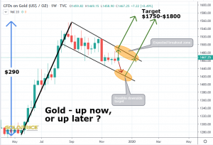
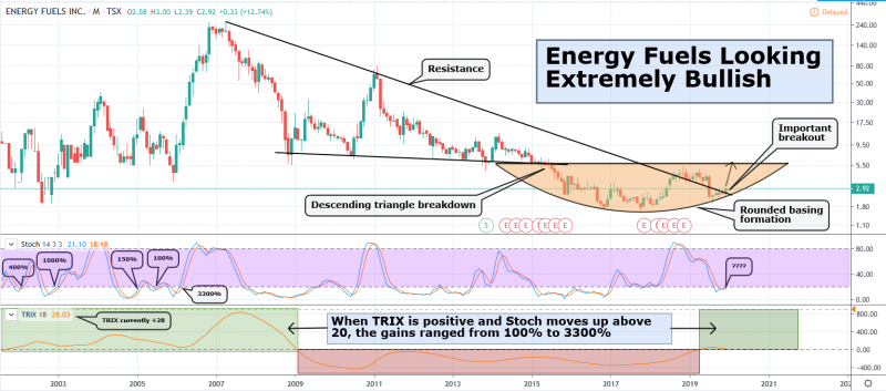
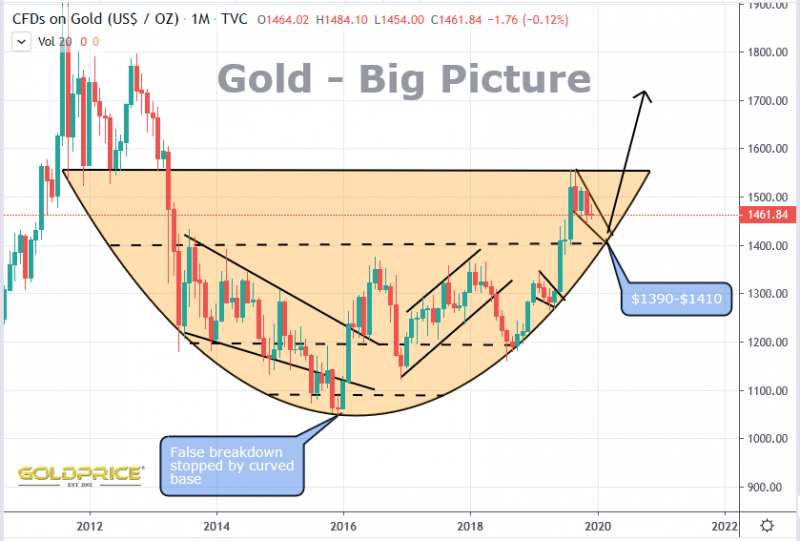
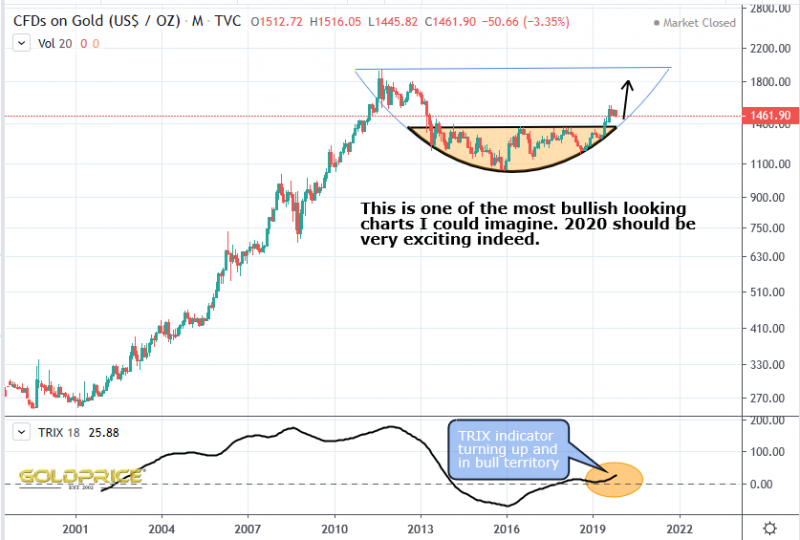
All are hugely bullish. The final one highlights the big picture – a reminder that one last drop down to the $1400 region is still possible. The 200 Day and 30 week moving averages offer support above that though. None of this matters much to me though, because the overall picture is looking very, very bullish in the short to medium term.
Post FOMC Round-Up
Interestingly, the announcement of no rate cuts, and probably none in 2020, and just one in 2021, resulted in gold advancing and the US Dollar falling. That’s more to do with market perception (QE4 is getting hard to disguise, and quite frankly, the suggestion of no cuts being required next year is, in my view, wildly optimistic). Just as important – rates can’t ever go back to anything like ‘normal’ without triggering economic meltdown. Gold knows this, and vis-à-vis all paper currencies, will continue to appreciate.
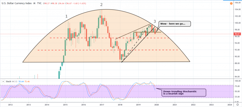
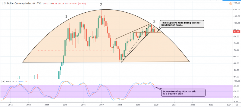
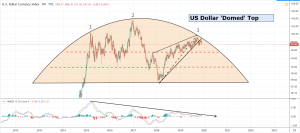
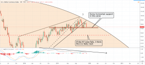
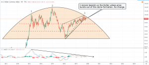
First up, my DXY chart, which just looks plain ugly. However, horizontal resistance is holding for now. My long term bearish view will only change if we break through the dome in the 99 area.
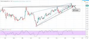
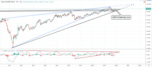
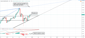
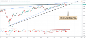
Next, what I see as the indicator which will tell us when it really is ‘game on’ for the PM sector. The point when silver begins to out-perform gold. It was breaking out, but interesting to see that has now become a wick on the candle, which is back below resistance (just).
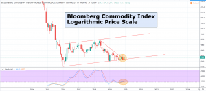
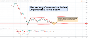
The Bloomberg Commodity Index has bounced off the lower support on the channel which I’ve been following (as you know, copper has broken out, and is rising strongly).
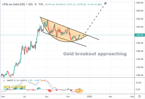
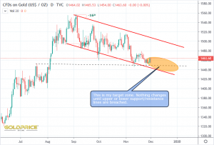
And last, but not least, gold. What can I say ? Perfectly poised for a $200+ rally in the next 3 to 4 months. Confirmation comes when we break out of the current bullish consolidation pattern – we need about $1490 for that.
Happy investing Goldtent friends.
Basing Patterns, Cycles, Indicators, Evidence Gathering
Commodity prices move in a cyclical fashion. I tend to look at charts visually, and just apply a visual ‘best fit’. That’s partly because I’ve come to realise that the exact date of the lowest price and highest price does not occur at the exact peak or bottom of the cycle. They’re affected by external forces, meaning the ACTUAL low/high can be left or right translated. That’s nothing new, and stating the obvious, but I prefer to be more fluid when looking at the ‘heartbeat’ that drives individual commodities or stocks.
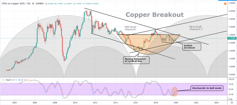
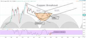
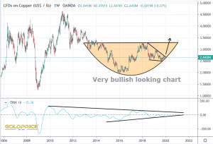
In the following copper chart, you can see that I’ve identified the 2 most recent lows, and surmise that the next one will occur in 2023. I also suggest that we may see a new trading channel develop. Further evidence comes from the bullish wedge breakout and stocharstic indicator. As well as that, this is all happening within a clearly defined bowl, atop a cyclical low.
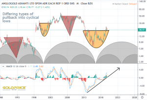
This type of behaviour can be seen in individual stocks as well. Here’s AngloGold Ashanti for example…
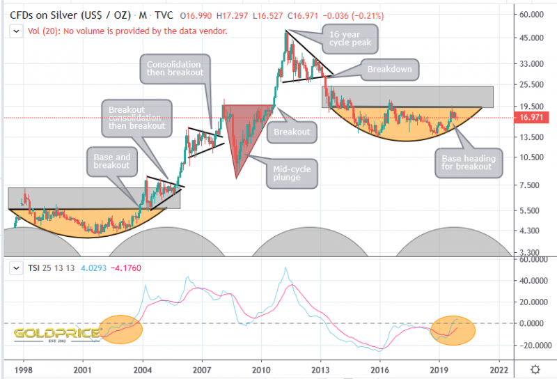
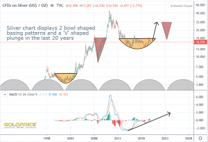
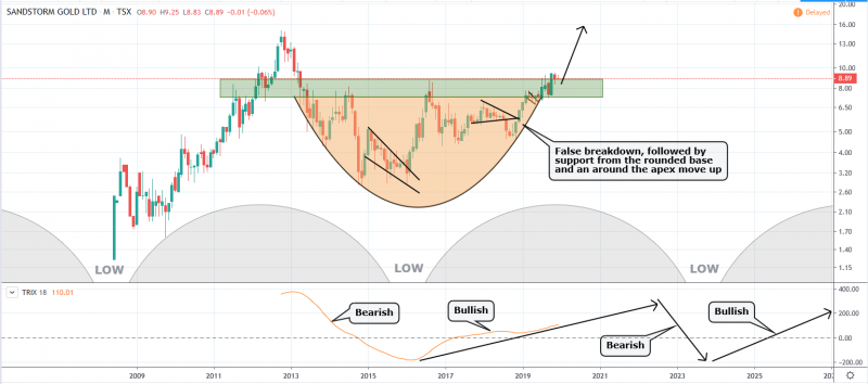
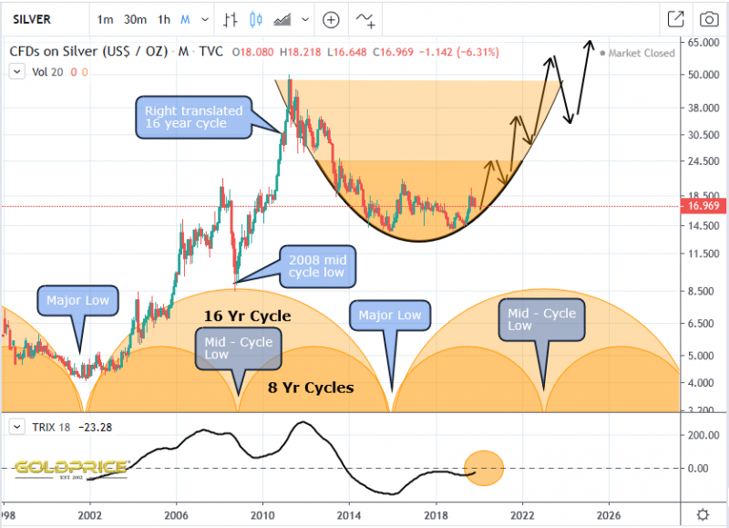
Sometimes price plunges very sharply, and rises just as sharply (red triangles). Sometimes the basing price action can be contained within a perfect arc. This brings us to the chart for Silver. Just how far and how fast it rises will be fascinating to watch 🙂
Copper Breakout – Hugely Important Year Ahead
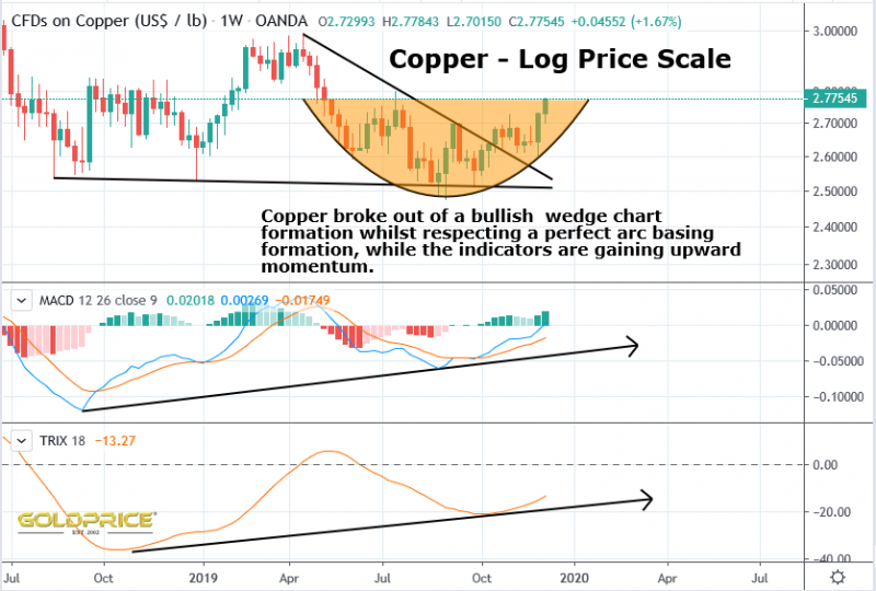
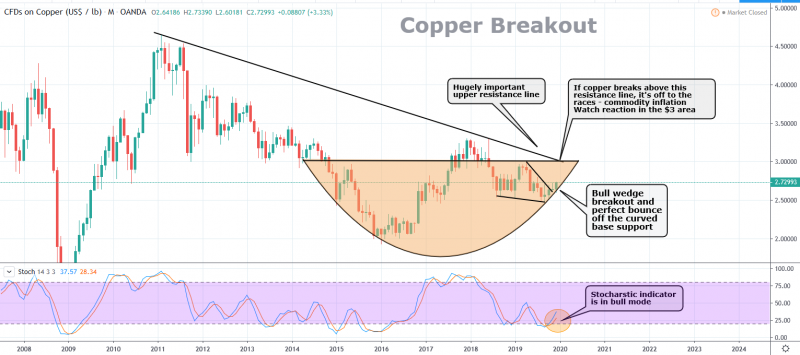
I’ve posted the copper chart a few times, most recently after identifying a bullish wedge coming up against the support offered by the round basing formation. The only way (if the pattern was to hold) is up. Fast forward to yesterday…
If price fails to break the $3 area, we’re looking at a strong case for more commodity deflation. If, however, we see a move above $3, I can’t see how anyone could argue against the case for inflating commodity prices. My recent posts of the Bloomberg Commodity Index support the case for a possible turn and move upwards here.
The importance of the outcome cannot be over-stated. It’ll shape the way the markets move for years to come. What’s it to be ? Inflation ? deflation ? stagflation ? Choose your flation, but, one way or the other, we’re going to find out in 2020.
Steady As She Goes
I’ve been fairly quiet lately. That’s because nothing has changed. I’ve read with interest, some fairly lively debate about the long term prospects for the PM market. Over the years I’ve refined my charting and fine-tuned my thesis. I’ve identified, what I believe are the key patterns and chart formations. I’ve narrowed things down to a handful of key charts (but there are many others I’m also keeping an eye on). I want to try and keep things as simple as possible. I’ll show a mixture of charts in the coming months/years, including the individual miner indices, gold in foreign currencies, silver etc, but there are 4 I’m following daily – Gold price, US Dollar Index, the Gold/Silver Ratio and the Bloomberg Commodity Index.
That brings me to the reason for the title for this post. Take a look at the charts, and you’ll see what I mean…
There are plausible arguments to support the view that gold will go down in coming years, but I think the evidence favours a PM bull market into the late 2020’s (with a mid-cycle plunge leading into a low in late 2023 and into 2024). My long term basing pattern has continued to hold at each test. I fully expect that to be the case this time as well. Having said that, we’d be foolish to disregard the bear case. That’s why I’ve built this chart, so that we can all track it, and know where the support levels are. Follow the evidence and act accordingly.
Whilst We’re Looking At Silver…
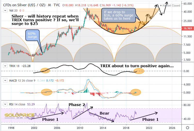
The Trix is soon headed into positive territory. Keep in mind the Silver/Gold ratio, and what it’s telling us. It ties in with this chart, and what the indicators are telling us. Imagine what happens next…the Trix turns positive, silver surges 60% to $25 and the Gold/Silver ratio FINALLY plunges in confirmation, It all ties in very nicely indeed. All of these pieces of the puzzle are increasing the evidence and likelihood that we will see $1700 gold and $25 silver within 6 months. That would give us a gold/silver ratio of 68. How perfect is that ?
Just A Little Further
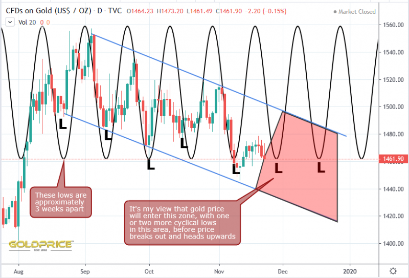
There’s a clear harmonic pattern, with a wavelength of approximately 3 weeks. All I’ve done here is place the sine curve on top of the gold chart visually. It helps to consider this alongside my other gold charts which show the bullish descending channel and the end point of that channel (the edge of the ‘bowl’ curved support). It looks as if there could be one or two more ‘surges’ downwards, to take us to the low $1400’s. Once that happens, we’ll be in the ideal position to take off and break out of this down-trending channel. One thing worth mentioning – we might just see higher lows starting to develop, meaning we trend towards the top of the channel, rather than hitting the bottom of it. Cycles experts will probably be able to shed more light on that. That’s the chartology, as I see it. All we can do now is sit back and wait to see if this stuff works.
