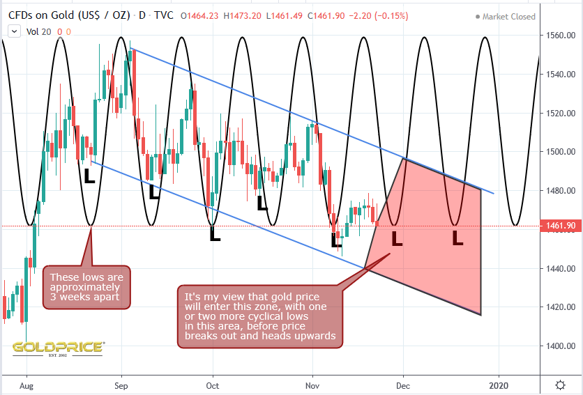
Just A Little Further
There’s a clear harmonic pattern, with a wavelength of approximately 3 weeks. All I’ve done here is place the sine curve on top of the gold chart visually. It helps to consider this alongside my other gold charts which show the bullish descending channel and the end point of that channel (the edge of the ‘bowl’ curved support). It looks as if there could be one or two more ‘surges’ downwards, to take us to the low $1400’s. Once that happens, we’ll be in the ideal position to take off and break out of this down-trending channel. One thing worth mentioning – we might just see higher lows starting to develop, meaning we trend towards the top of the channel, rather than hitting the bottom of it. Cycles experts will probably be able to shed more light on that. That’s the chartology, as I see it. All we can do now is sit back and wait to see if this stuff works.
Nice work again! Looks like the pressure cooker needs just some more boiling before popping off the cover (higher prob)! … Or fizzling out (lowe prob)..
Yep, time will tell which it is.
Nice perspective Northstar.
Looking for the same. However the GFC of 2008 is an interesting chart for the DXY and Gold……
Just had a visit with a friend who works the docks of Vancouver, an interesting economic indicator perspective on Asian trade with North America. I have him let me know when his work hours from any quarter drop significantly. This gent typically works on average of 650+ hrs per quarter about 7 to 9 shifts a week. Prior to the meltdown of the GFC he went to 2 shifts a week. Well this week he is not working, his quarter is way down and the company is floating the idea of layoffs……….fwiw.
DYODD and GLTA
Thanks for the info Red. Sure doesn’t sound good.