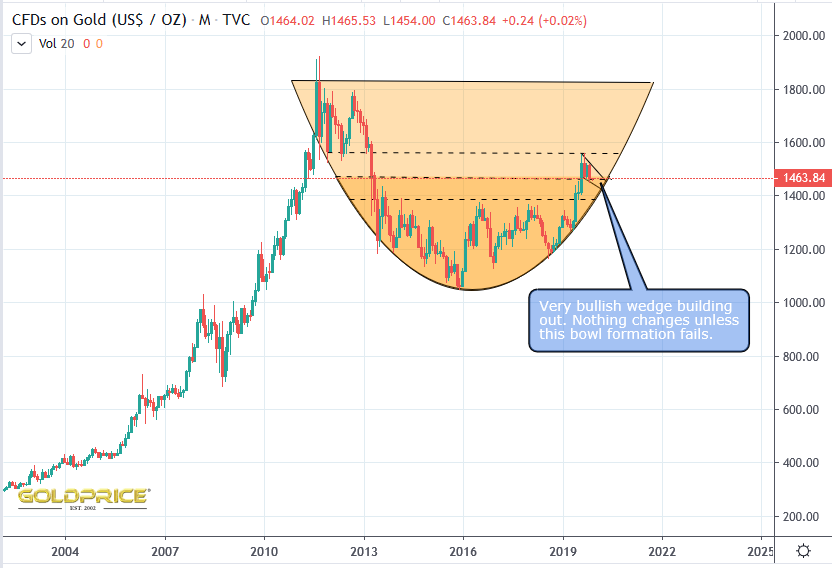
Steady As She Goes
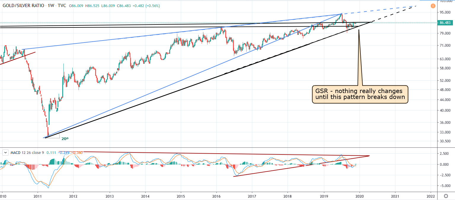
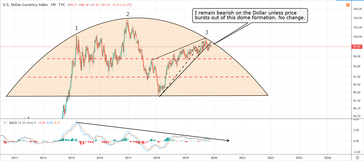
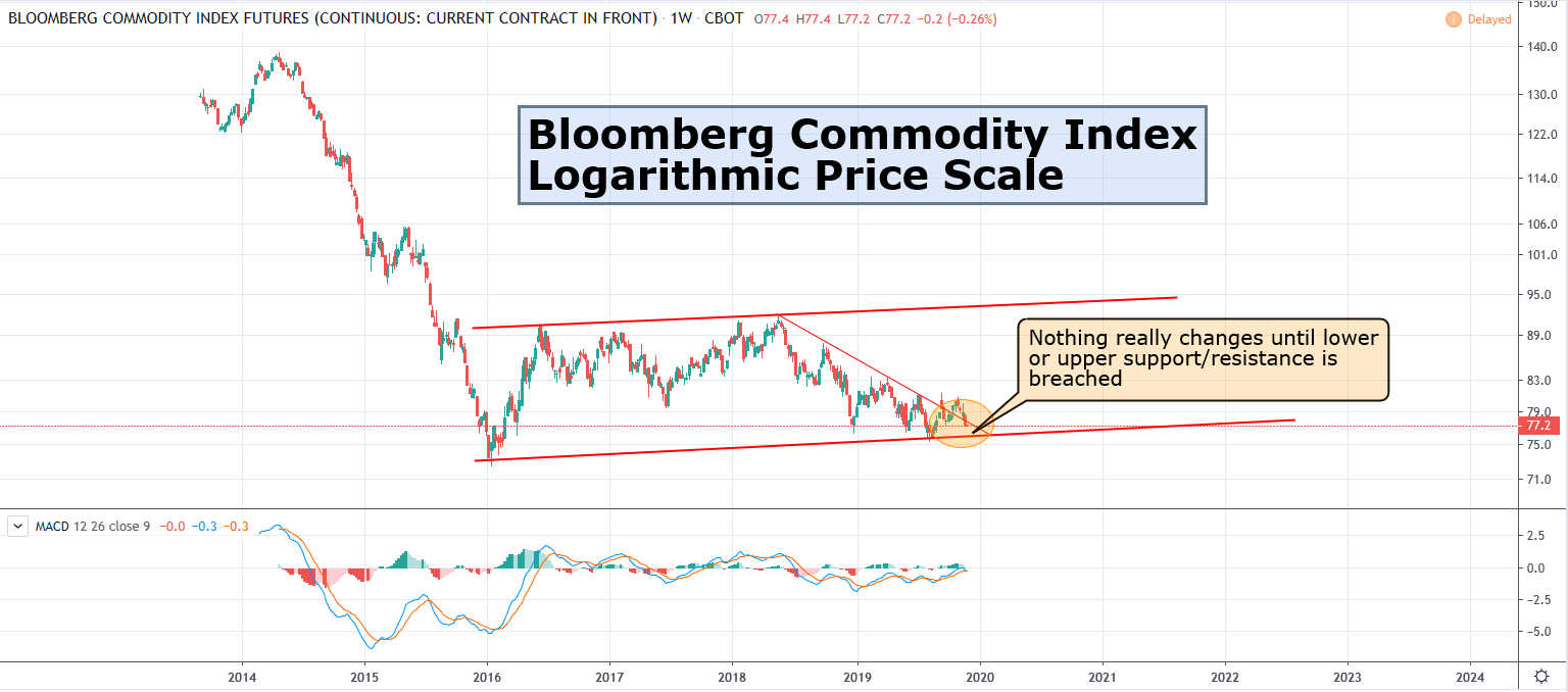
I’ve been fairly quiet lately. That’s because nothing has changed. I’ve read with interest, some fairly lively debate about the long term prospects for the PM market. Over the years I’ve refined my charting and fine-tuned my thesis. I’ve identified, what I believe are the key patterns and chart formations. I’ve narrowed things down to a handful of key charts (but there are many others I’m also keeping an eye on). I want to try and keep things as simple as possible. I’ll show a mixture of charts in the coming months/years, including the individual miner indices, gold in foreign currencies, silver etc, but there are 4 I’m following daily – Gold price, US Dollar Index, the Gold/Silver Ratio and the Bloomberg Commodity Index.
That brings me to the reason for the title for this post. Take a look at the charts, and you’ll see what I mean…
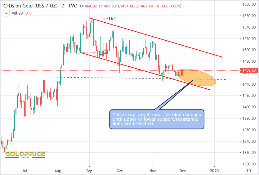
There are plausible arguments to support the view that gold will go down in coming years, but I think the evidence favours a PM bull market into the late 2020’s (with a mid-cycle plunge leading into a low in late 2023 and into 2024). My long term basing pattern has continued to hold at each test. I fully expect that to be the case this time as well. Having said that, we’d be foolish to disregard the bear case. That’s why I’ve built this chart, so that we can all track it, and know where the support levels are. Follow the evidence and act accordingly.
Ahhh Bloomberg. I now remember you saying you preferred using that one versus crb. Indeed, precious metals have a better weight in that basket! https://www.bloomberg.com/company/press/bloomberg-commodity-index-bcom-2019-target-weights-announced/
We’re just marking time at the moment
Appreciate the update NS. Especially interested in that do(o)med chart. I am still betting it gets trashed. I don’t get the folks calling for a moonshot USD. Time will tell per usual.
I can only call it as I see it. That whole set up (bearish rising wedge, within a perfect domed topping pattern), with a cyclical low coming up, just looks bad to me. As always, I could be wrong, and as you say, time will tell.