Basing Patterns, Cycles, Indicators, Evidence Gathering
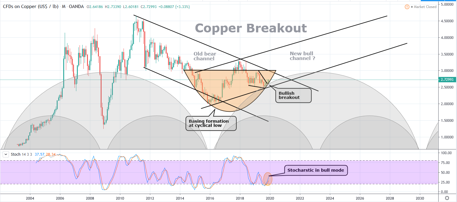
Commodity prices move in a cyclical fashion. I tend to look at charts visually, and just apply a visual ‘best fit’. That’s partly because I’ve come to realise that the exact date of the lowest price and highest price does not occur at the exact peak or bottom of the cycle. They’re affected by external forces, meaning the ACTUAL low/high can be left or right translated. That’s nothing new, and stating the obvious, but I prefer to be more fluid when looking at the ‘heartbeat’ that drives individual commodities or stocks.
In the following copper chart, you can see that I’ve identified the 2 most recent lows, and surmise that the next one will occur in 2023. I also suggest that we may see a new trading channel develop. Further evidence comes from the bullish wedge breakout and stocharstic indicator. As well as that, this is all happening within a clearly defined bowl, atop a cyclical low.
This type of behaviour can be seen in individual stocks as well. Here’s AngloGold Ashanti for example…
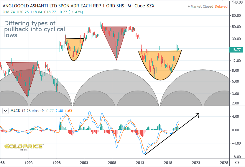
Sometimes price plunges very sharply, and rises just as sharply (red triangles). Sometimes the basing price action can be contained within a perfect arc. This brings us to the chart for Silver. Just how far and how fast it rises will be fascinating to watch 🙂
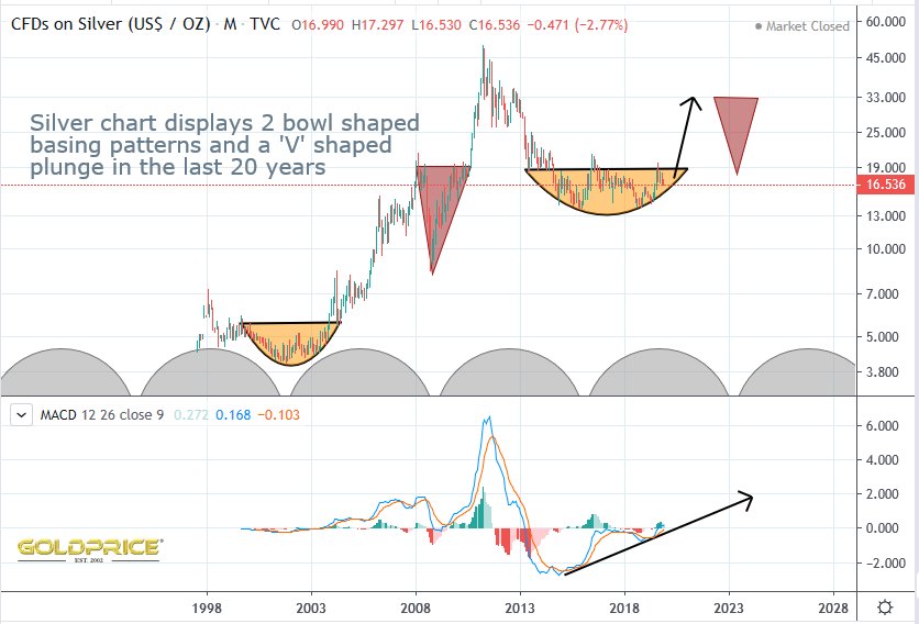
Fully should pin that in the side bar for reference. I like the next v shape projection inline with the time cycle analysis.. helps manage expectations.