Three Gold Charts
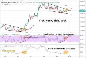
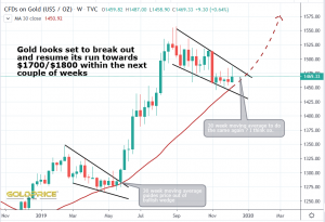
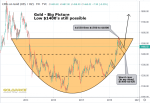
All are hugely bullish. The final one highlights the big picture – a reminder that one last drop down to the $1400 region is still possible. The 200 Day and 30 week moving averages offer support above that though. None of this matters much to me though, because the overall picture is looking very, very bullish in the short to medium term.


I like your charts. The only problem I have is that back in May sentiment was VERY bearish and now it seems so obvious gold will go up. I assume we will have more downside in gold first.