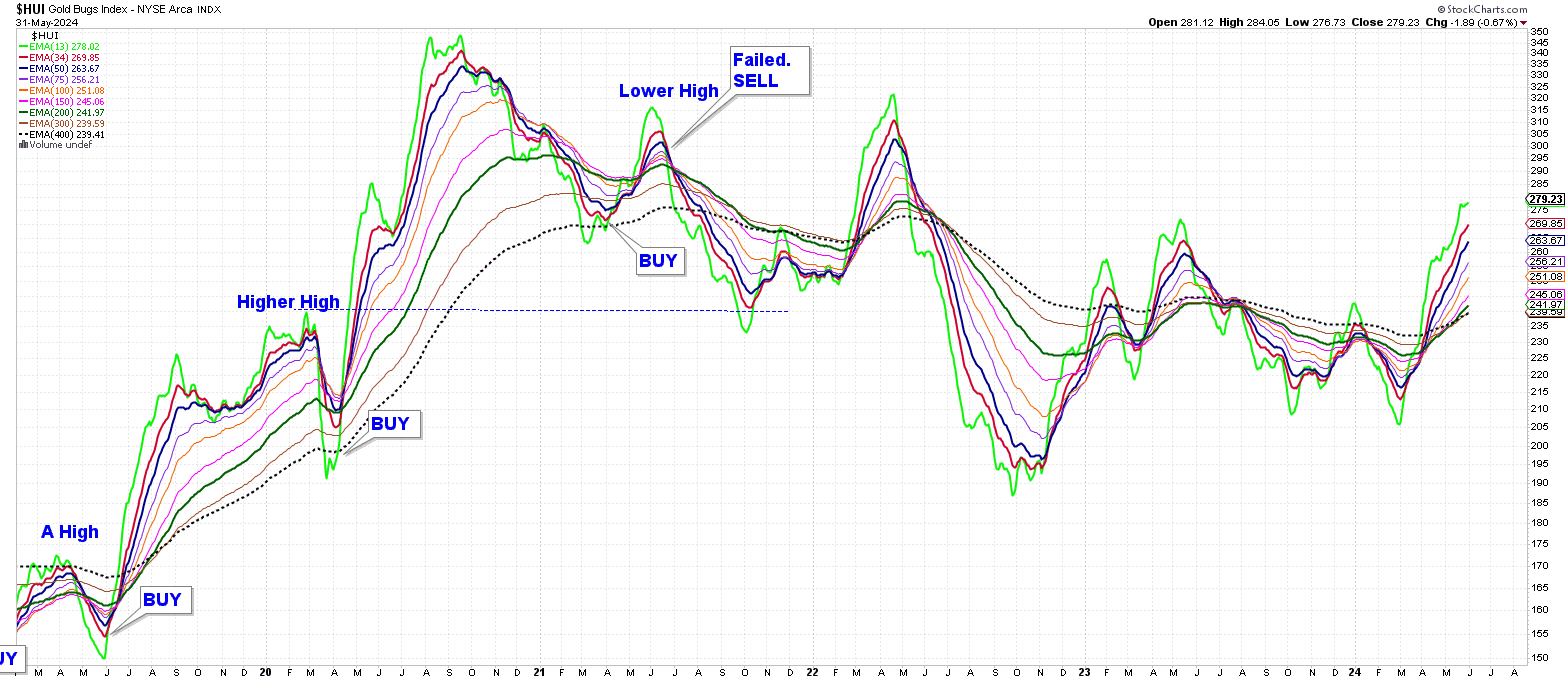
$HUI Invisible
I have posted this chart before, but want to look at it again,
To make this chart instead of choosing candlesticks, or line, or HLC, choose invisible.
In OVERLAYS set up a number of moving averages.
On this chart I am referring to the 13 Day EMA (lime green heavy dark line) and the 34 Day EMA (red heavy dark line)
Note: 13 and 34 are Fibonacci numbers.
When the lime green 13 Day EMA moves above the red 34 Day EMA and STAYS THERE – you want to be in the miners.
When the line green 13 Day EMA moves below the 34 Day EMA and STAYS THERE – it’s better to close up shop and go on vacation.
There are long periods of whipsaw consolidations where it is very difficult to make a profit.
At the moment the Brown 300 Day EMA is still hiding behind the Black dashed 400 Day EMA.
Otherwise the averages are lined as they are in a bull market. So far, so good.