EIGHT DYING PRESIDENTS
Goldtent TA Paradise
GOLDTENT STATEMENT OF NON VIOLENCE
READ OUR DISCLAIMER
CONTACT
JOIN THE DISCUSSION
THE WIZARD OF RAMBUS
A POST ELECTION ANALYSIS
THE OFFICE OF MANAGEMENT AND BUDGET ..OMB
MEDICAL AND MEDIA MONOPOLIES IN THE USA
MEDIA BIAS CHART
TRUMP TRIUMPH
WARPSPEED STOPPED THE FEMA CAMPS
NAUZEOUSLY OPTIMISTIC
THE TRUMP
TRUMP'S PICKS
MASS TRUMP PSYCHOSIS
GOLDTENT ANTHOM
THE WOLFOWITZ DOCTRINE
"PLANDEMIC"
DEEP DIDDY DOODOO
PLATITUDE AND GRATITUDE
US CRIME STATISTICS
KILL SHOT
PENNSYLVANIA
17 GOALS OF THE NEW WORLD ORDER
WHAT'S ACTUALLY IN THE "VACCINES"
HEY GOOGLE
BOOM AND BUST
THE FINANCIAL SYSTEM RESET IS SHEDULED FOR SPRING 2030
Polls
 Loading ...
THE CULT OF MODERN MEDICINE
MASSIVE STUDY : WORLDWIDE EXCESS DEATHS
THE GREAT SET UP
HUGE SUPREME COURT VICTORIES FOR THE AGES
IS THERE A DEEP STATE ?
THE PLANET HAS NEVER BEEN SAFER , GREENER
DEFINITIVE US VACCINE POLL
VAXXINSANITY
HOW MANY VACCINES ??
FARMER'S FLAT EARTH SOCIETY
A REPUBLIC VS A DEMOCRACY
N95 MASKS ARE TOXIC
DEMOCRACY AND FREEDOM ARE VERY RARE CIRCUMSTANCES
THE MEDIA
* PIERRE POILIEVRE *
MRNA SHOTS PERMANENTLY ALTER DNA
THE EMERGING POPULIST MAJORITY
THE OCCULTISTS
MEET KYLE KEMPER
NUCLEAR WEAPONS ARE A FANTASY
WHEN THE FINANCIAL SYSTEM IMPLODES
YOUR MENTAL IMMUNE SYSTEM INTENTIONALLY UNDER ATTACK
FENBENDAZOLE AND TURBO CANCER
NO VACCINES HAVE EVER SAVED LIVES
IVERMECTIN AND TURBO CANCER
WHAT IS WOKE ?
MOON FRAUD
"CLIMATE"
CANADIAN TREES CLEAN 10 MORE CARBON
UNPACKING CLIMATE ENGINEERING
WHAT IF EVERYTHING YOU THINK YOU KNOW ABOUT CHINA IS WRONG
PARASITES AND DISEASE - PARADIGM SHIFT
DETESTED "ANTI-VAXXERS"
DO NOT FALL FOR THE DEMORALIZATION PROGRAM
THE THEORY OF EVERYTHING
WHAT IF VIRUSES AND GENETICS
VACCINE POLLS OF AMERICANS
THE OBLITERATION OF VIROLOGY
WHAT IF EVERYTHING THEY HAVE BEEN TELLING YOU
DON'T SHED ON ME
POLL: MORE THAN HALF OF AMERCANS SUSPECT
THE PARASITE PARADIGM
THE UNIFIED THEORY OF CHAOS
ABSOLUTE INCONVENIENT TRUTH
BUY IVERMECTIN ONLINE
WHAT HAVE WE LEARNED ABOUT SOCIETY
VACCINE TRIAL FRAUD
SHEDDING IS REAL
NOBODY IS SAFE
SMOKING GUN : GERMAN PROFESSOR
NUCLEAR BOMBSHELL STUDY
GLOBAL WARMING DEBUNKED
THE GREATEST PRESIDENT
A BRIEF HISTORY OF THE ISRAELI PALESTINIAN REGION
WHO THE FUCK DO YOU THINK YOU ARE ?
"ORGANIZED" RELIGION
THE MYSTERY OF ISRAEL
DEFINE WOKE
HOW DO YOU LIKE THEM APPLES
HOW TO POST
CANADIAN GOLD MOONSHOT
WE CAN'T FORCE THE HUMAN BODY
FIRE
GOLDTENT STATEMENT OF NON VIOLENCE
GROWING PAINS
VACCINE SHILLS ALL IN ONE MONTAGE
MASK TOXICITY
CHRYSTIA FREELAND IN DEPTH EXPOSURE
1000 PEER REVIEWED ARTICLES
HEIL HITLER
INFORMED CONSENT
CDC CONFIRMS COVID VAXX PREVENTS 1 DEATH IN A MILLION DOSES
RIGHT TO
STUDY PROVES VACCINE INDUCED SPIKE PROTEIN
FOR THE GREATER
MAJORITY OF AMERICANS DUMB AS CARDBOARD
HAITI SAYS TO SWEDEN
CHINA : THE REAL STORY
THE WHOLE COVID PROJECT STORY IN ONE BRIEF VIDEO
1.600 SCIENTISTS DESTROY THE CLIMATE GHOULS
DON'T FEAR THE LOCKDOWNS
STUPID PEOPLE
FACE MASK SCIENCE
MEET ME AT
THE FUTURE AND PRESENT OF HEALTH CARE AND WELLNESS
BOOM : A BOMBSHELL THEORY
THE EV SCAM
THE TOP CLIMATE SCAM
VACCINES IN GENERAL
HOW POLITICS CAN DESTROY YOUR SOUL
CO2
WHERE DID THE FLU GO ?
THE MEEK SHALL INHERIT THE EARTH
Alberta Public Health Emergencies Governance Review Panel
SERVANT OF THE PEOPLE
1 IN A MILLION
HOW TO CREATE A DEADLY PANDEMIC
BEHOLD A NEW VIBRATIONAL DAWN
A SUCCINCT SUMMARY
JOIN THE DISCUSSION
COVID VAXXS HAVE KILLED 100s OF THOUSANDS WEEKLY
OUT OF AFRICA : WITH THE FARMER
CARBON DIOXIDE
THE GREAT AWAKENING
CANADIAN TRUCKERS FREEDOM CONVOY
WHAT IS A WOMAN
NO ONE IS SAFE
SIGNATURE (10 MIN ) PIECE
ZERO
NOT SAFE NOT EFFECTIVE
LEST WE FORGET
ARTIFICIAL INTELLIGENCE
* THE GREAT AWAKENING
CHOLESTEROL AND STATINS
ANTIDOTE TO AMERICAN PROPAGANDA MACHINE
AUTISM AND CHILDHOOD VACCINES
THE GREAT
SLAVERY : A 3 MINUTE HISTORY
ATHLETES OF THE WORLD
DON'T LET THEM GET AWAY WITH IT
RAPID ONSET GENDER DYSPHORIA
THINKING YOURSELF TO DEATH
ONTARIO COVID DEATHS
"MODERN" SCIENCE
CANADIAN EMBALMER'S SWORN
5 G LED STREET LIGHT
UNDENIEABLE PROOF OF HUGE VACCINE INJURIES
DEFINITIVE WORK
THE GERM THEORY
PSYCHOPATHS
CBDC ?
CBDC ALERT : ATTENTION AMERICANS
HUGE ANTI VAXX VICTORY
WHY I DON'T BELIEVE
WHY DO THEY DESPERATELY
ALL VACCINES PERFORM WORSE
WHY SOME HAVE ADVERSE REACTIONS AND OTHERS DON'T
PCR TEST WAS COMPLETE BULLSHIT
THE BIGGEST LIE
THE TRUTH ABOUT VIRUSES
DOWN THE RABBIT HOLE
MILITARY OPERATION
Global Public-Private Partnership
LEGAL WALLS OF THE COVID KILL BOX
DECLARATION OF HELSINKI
JOURNEY TO THE CENTER
THE THREE ERODING PILLARS
HOUSE PRICE IN GOLD OUNCES
VACCINE MANDATES
BLACK NOBILITY
OH CANADA
SUDDENLY DEAD : VAXX OR VIRUS ?
JEFF CHILDERS
WILL YOU STRONGLY SUPPORT
SURVIVING NUCLEAR WINTER
DID NOT WORK CANNOT WORK
IVERMECTIN !!
IT'S THE NANOPARTICLES
CARBON CREDIT SCAM
RAGE AGAINST
WHY WAS NATURAL IMMUNITY
SMART CITIES AND TOWNS
DEATH KNELL FOR MASKS
THE ANTI-VAXXERS
UM...SORRY GUYS BUT
THE MYTH :
NEIL OLIVER INTERVIEWS JOHN CAMPBELL
SUDDENLY AND UNEXPECTEDLY
BE YOUR OWN DOCTOR
- * DMSO HANDBOOK *
- * THE RANT *
- * THE UBIQUITOUS PHARMACEUTICAL SOCIETY
- 100% CANCER REMISSION (MONOCLONAL ANTIBODY)
- 2ND SMARTES GUY CANCER PROTOCOL
- ANTI PARASITIC DRUGS SHOW STRONG ANTI CANCER EFFECTS
- ANTIPARASITIC VETERINARIAN DRUGS SHOW PROMISE FOR CANCER TREATMENT
- BREST CANCER AND THE VAXX
- BRUSH YOUR TEETH DAMMIT
- C D S ( CHLORINE DIOXIDE SOLUTION )
- CBD GUMMIES AND TIGER WOODS
- CHLOESTEROL : A BIG PHARM BIG CON
- CHLORINE DIOXIDE DETOX
- CURCUMEN
- DISSOLUTION OF SPIKE PROTEIN ( NATTOKINASE)
- DMSO : MIRACULOUS PAIN TREATMENT
- DMSO2
- EARTHING
- FENBENDAZOLE Q AND A
- FIBROUS BLOOD CLOTS TREATMENT
- FLCCC VACCINE DETOX PROTOCOL
- HEALING POWER OF ILLNESS
- HEALTHY GUT BACTERIUM MICROBIOME
- INFLAMATION
- IT'S DEPRESSING : ANTIDEPRESSANTS KILL
- IVERMECTIN AND FENBENDAZOLE TO PREVENT CANCER
- IVERMECTIN PILLS HERE
- IVERMECTIN PROPHYLACSIS
- IVERMECTION CURES CANCER ?
- METHYLENE BLUE
- MICRODOSING LITHIUM BOOSTS YOUR BRAIN AND PREVENTS ALZHIEMERS
- MRE ON DMSO
- NATTOKINASE …SPIKE DETOX
- NATTOKINASE : THE HOLY GRAIL FOR SPIKE DETOX
- NATTOKINASE DISOLVES MICROCLOTS
- NEW STUDIES AND PROTOCOLS
- SHEDDING IS REAL : WHAT CAN YOU DO ABOUT IT ?
- SSRI ANTI DEPRESSANTS ARE A HORROR STPRY
- THE VEGAN SCAM
- TOP TEN DETOX ITEMS
- TREATING COPD NATURALLY
- TREATING COPD NATURALLY
- UVBI ( ULTRAVIOLET LIGHT BLOOD IRRADIATION )
- WHY HERBS AND SUPPLIMENTS WORK ( McCULLOUGH)
- YES VIRGINIA..A CURE FOR CANCER
THE CRIMINAL TYRANTS
THE TREE OF SHARED INFORMATION
BAD BATCHES
THE SPIRITUAL REASON
17 THOUSAND PHYSICIANS AND SCIENTISTS
FINAL TALLY : COVID INFECTION FATALITY RATES
NEVER EVER
* ANTI-ANTIBIOTIC MEASURES
WHY SOME HAVE ADVERSE REACTIONS AND OTHERS DON'T
THE SCIENCE
WHERE DOES ELECTRICTY
* ANATOMY OF A BULLSHIT "MODEL"
* CAUSE UNKNOWN
* ENJOY THE SHOW
ALTERNTIVE MEDIA INDUSTRIAL COMPLEX
* MUCH ADO ABOUT CORONA *
ELECTRIC VEHICLE HOAX
* SUDDEN ADULT DEATH SYNDROME
ALAS N95 MASKS
UNACCEPTABLE VIEWS
CAREFUL OUT THERE
GEOGRAPHICAL WONDER
OH WHAT A TANGLED WEB
* DIED SUDDENLY
* THE LOBOTOMY
CENSORING THE INTERNET IS LIKE
* THE WHO , FDA ET AL EXPOSED
* POLL : SCEPTICS ARE SHUNNING
YOU MURDEROUS HYPOCRITES
* A LOST SMALL TOWN
THE MOST EVIL MAN
* TOXICOLOGY VS VIROLOGY
THE REAL ANTHONY FAUCI
* GEERT EXPLAINS IMMUNE ESCAPE
* PFIZER SCANDAL GOES VIRAL
* GENERATION
* PIG SHIT
ANTIVAXXERS
* ANTI-GLOBALISM
* SAFE AND EFFECTIVE
* THE GREAT REVEAL
* WELCOME *
* WELCOME TO FORT DETRICK
* IVERMECTIN.COM
* WHAT ABOUT CANCER ?
* WELCOME TO
* DID YOU SCREW UP
* VAXX INDUCED CLOTS
* ISRAEL BOMBSHELL
* MY SON
* WE WERE RIGHT
* WHERE'S THE RAGE ?
* CERTIFICATE OF ACHIEVMENT
* FUCK
* ACCEPTANCE / REFUSAL RATES
* STATISTICAL TRICKS
* COVID-19
* SUPERHEROS
* THERE IS NO CLIMATE EMERGENCY
* HOW SWEDE IT IS
* THE DEEP STATE
* THE BASIC LAWS
* TOM LUONGO'S THESIS
* THEY ( THE UNVAXXED)
* ADVENTURES OF GOLDBALLON
- **THE COMPLETE WORKS OF THE ADVENTURES OF GOLDBALLOON
- ARTIC SKIING IN RUSSIA
- AZERBAIJAN ROAD TRIP
- CHECHNYA
- COMPLETING THE LOOP IN TAJIKISTAN
- DIOMEDE ISLANDS : FROM USA TO USSR IN A BALLOON
- FAIRY MEADOWS
- FROM THE ROOF OF THE WORLD
- ISTANBUL AIRPORT ART
- KALININGRAD
- KAMCHATKA
- KARELIA RUSSIA'S REMOTE NORTHWEST
- LITHUANIA LOVES UKRAINE
- MIDNIGHT AT THE OASIS
- MONGOLIA
- MOROCCO
- MOROCCO2
- MOSCOW FEB 2023
- NECTAR OF THE GODS
- NORTHERN PAKISTAN
- ON TARGET FIXATION
- PARMIR MTNS TAJIKISTAN
- SEVASTAPOL CRIMEA
- SEVESTOPOL CRIMEA
- SIBERIA 2
- SKIING IN SIBERIA
- SPRING IN mOSCOW ( ANOTHER LOOK)
- ST PETERSBURG RUSSIA 2014
- ST. PETERSBURG RUSSIA
- STONED
- TAJIKISTAN
- TAJIKISTAN 6
- TAJIKISTAN PARMIR MOUNTAINS
- TAJIKISTAND MOUNTAIN CLIMB
- THE BALKANS
- THE CRADLE OF CIVILIATION
- THE INTERVIEW
- THE LAST OF THE SIBERIAN SNOW 2024
- THE MIDDLE OF EVERYTHING
- THE STONES AND THE DOORS
- TIKSI SIBERIA
- TOP OF THE WORLD PART 2
- TREAVELS AT THE EDGE …MOROCCO
- TRUCK ART
- TURKEY 3
- TURKISH DELIGHTS
- TURKISH DELIGHTS
- UKRAINE 2015 …UNBOUNDED BEAUTY
- ULAN-UDE RUSSIA
- WINING AND DINING IN FRANCE
- YAJIKISTAN : GOING DEEPER
- YAKUTSK
- YAKUTSK SIBERIA
* UNINFORMED CONSENT
* GET YOUR IVERMECTIN
* FROM RUSSIA WITH LOVE
* CLIMATE EMERGENCY ?
WE ARE
* MASKS HARBOUR PATHOGENIC
* BAFFLED
* THE VACCINES CANT WORK BECAUSE
* BEST OF THE BEST
* NEW ZEALAND ADMITS VACCINE FAILURE
* MIKE YEADON
* WHAT IS A WOMAN
* THE WAR ON THE UNVAXXED WAS LOST
* FIRST A TRICKEL THEN A FLOOD
* SPIKE PROTEIN = CANCER
* WUHAN MILITARY GAMES
* ESCAPING MASS PSYCHOSIS
TOTALITARIANISM
* UNMASKING
* FREEDOM PASSPORTS
* OPTIMISM
* THE FREEDOM CONVOY
* RESPIRATORY VIRUSES
* WALLGREENS POSITIVITY RATE
* POWERFUL ANTI CANCER DRUG
* THE LYING MEDIA
* VACCINE COMPLIANCE IN THE USA
* NATURAL IMMUNITY IS KING
* 34% OF CANADIANS UNVAXXED
* DEFINITIVE ARTICLE
* COVID: ISRAEL VS PALESTINE
* THE THREE STAGES
* THE TRUCKS ARE COMING
* 100 MILLION AMERICANS
* GROUND ZERO
* TRIBALISM
* THE ZOOM CLASS
* COVID VACCINES CANNOT WORK
* HISPANIOLA
* CENTRAL AFRICA
* 400 STUDIES
* AMA CODE OF ETHICS
* HAND INSANITIZERS
* PUBLIC HEALTH
* WHO ARE THE VAXX REFUSERS
* MICROBIOPHOBIA
* ASYMPTOMATIC SPREAD
* REAL VACCINE EFFICACY
NATURAL VS ARTIFICIAL IMMUNITY
*DECODING THE NWO
PRE EXISTING T CELL IMMUNITY
THE SPANISH FLU OF 1918
THE ORIGINS OF COVID
POSTING INFORMATION
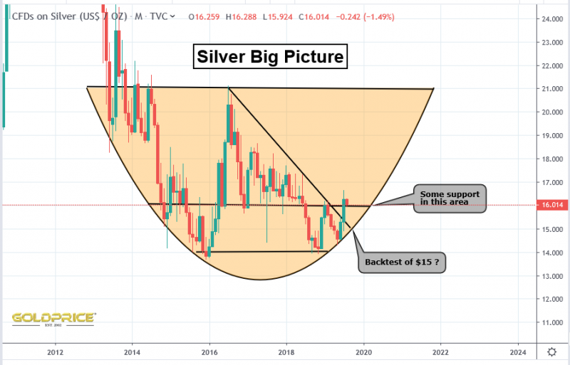
Silver, Gold and GSR
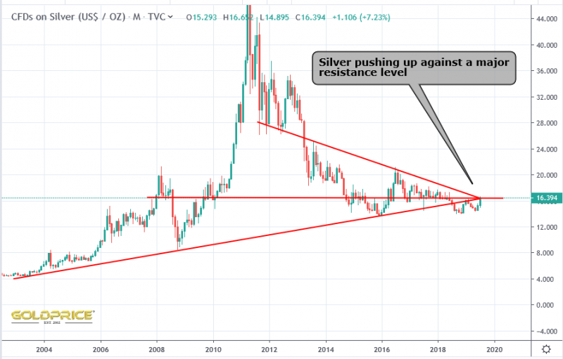
Silver…
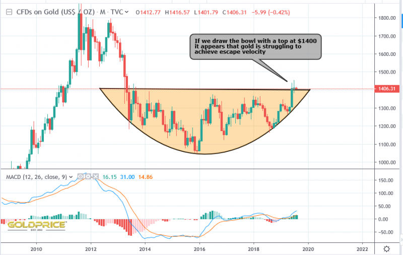
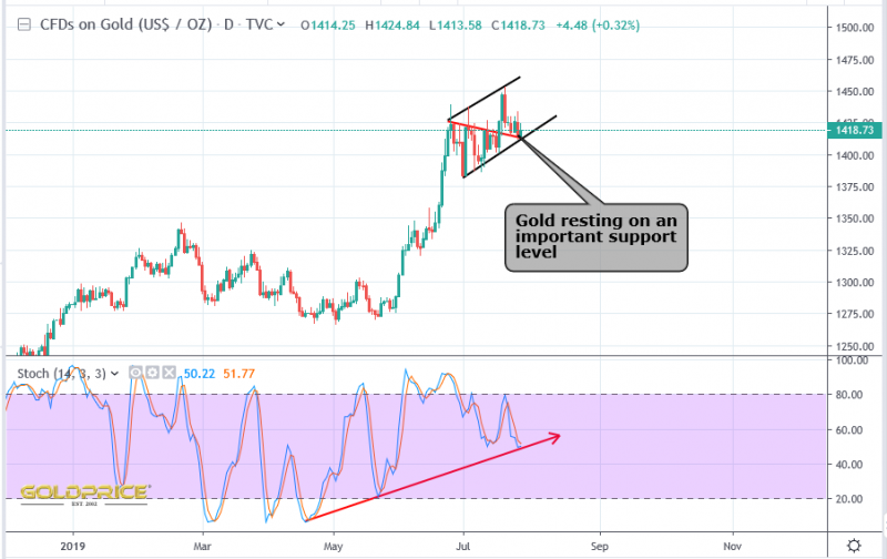
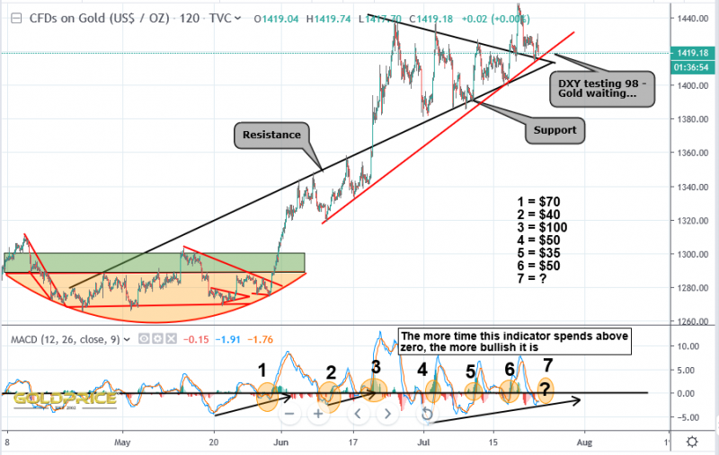
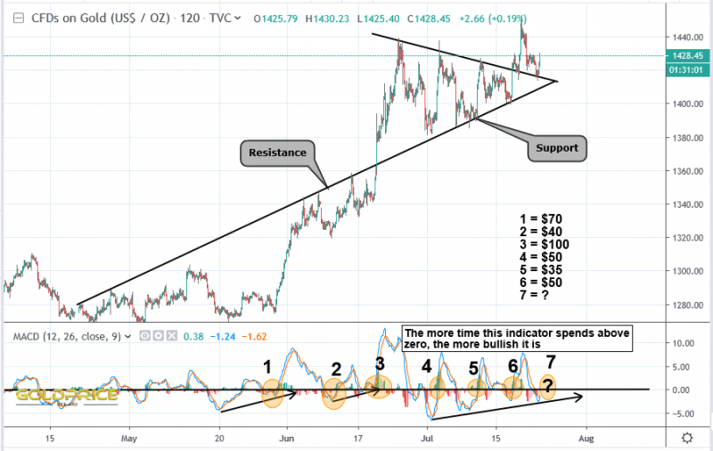
Gold…
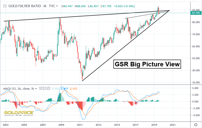
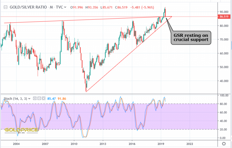
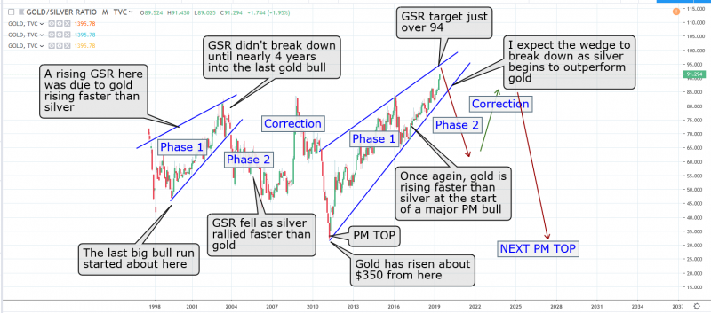
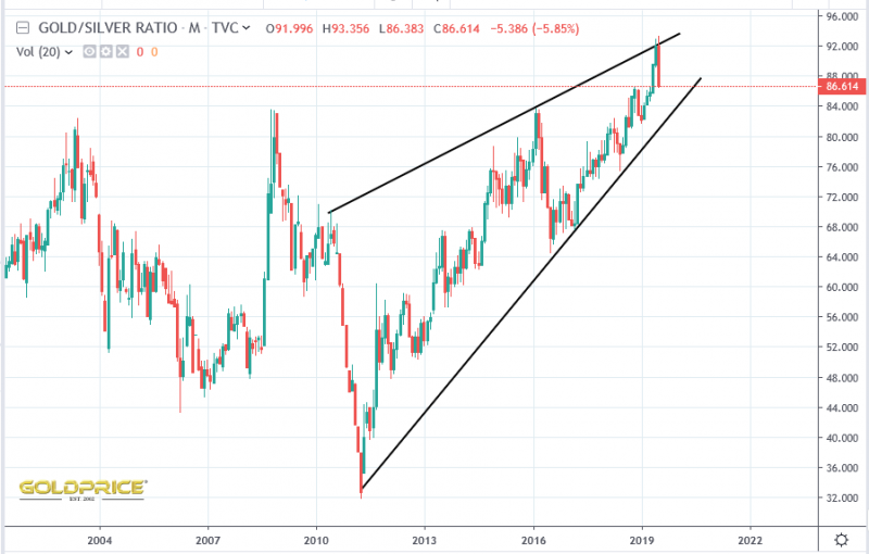
Gold/Silver Ratio Bouncing As A Result…
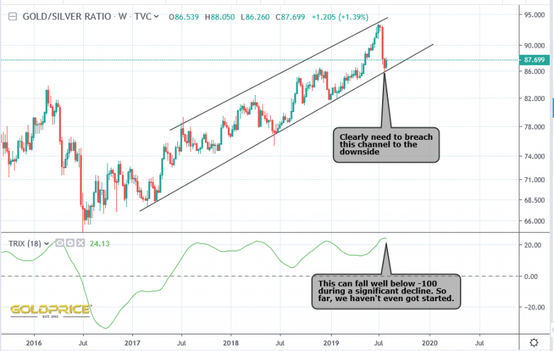
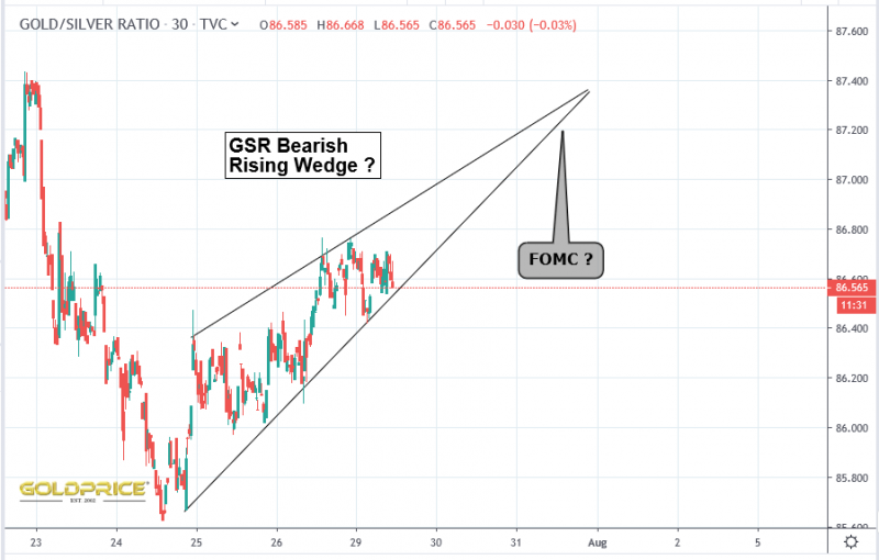
Zooming in we can actually see that we’re in a rising channel, and just bounced off support…
In conclusion, we could be looking at a significant consolidation/correction in the long term PM bull. A downside breach of the channel above will indicated the next big PM leg up.
King Dollar
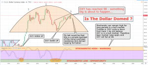
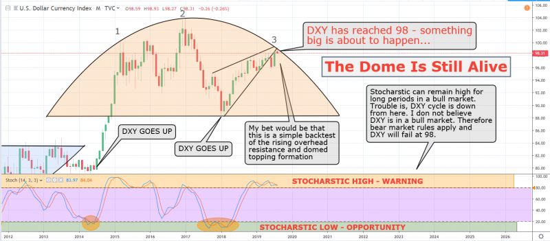
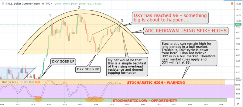
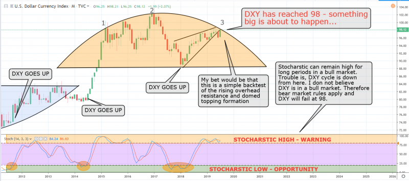
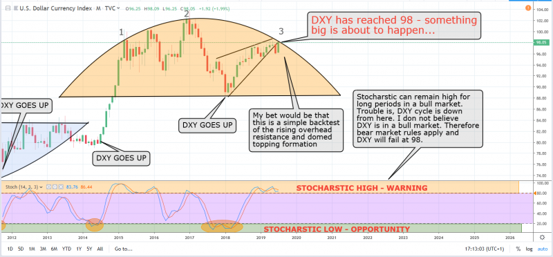
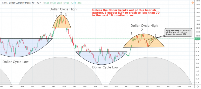
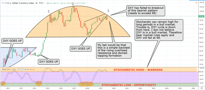
Well, the recent move has burst through the ‘domed top’ on my Dollar Chart. Someone on Twitter asked why don’t I draw it to take the spike highs into account, so I’ve done that here…
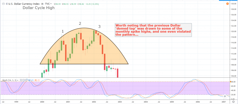
I left the original arc on so that you can compare the two. If valid, the new arc needs 99.3 to be breached. Before everyone starts crying foul and accusing me of constantly moving the goalposts, I agree. However the previous Dollar ‘domed top’ did accommodate the spike highs on the monthly chart…
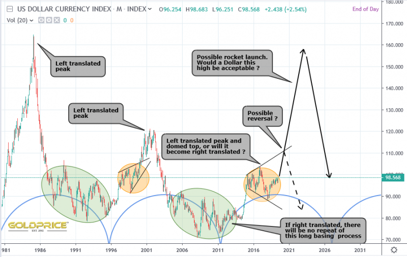
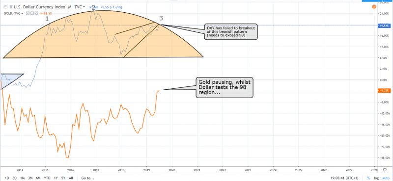
Having said all of that, I’m open to the idea of a right translated Dollar cycle, and if this goes up much further, we need to start thinking in those terms. It would surprise me, but gold seems to have been doing ok with a rising Dollar so far. Some initial thoughts…
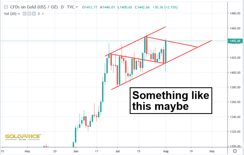
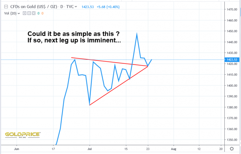
Once the FOMC decision is fully digested by the markets, I’d expect the next PM upleg to get underway.
DXY
Closed at 97.99 – who would’ve guessed. Place your bets Goldtent friends.
Supporting Evidence
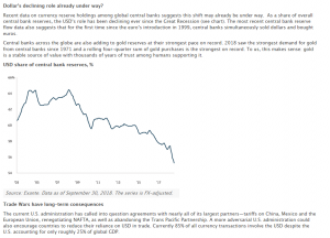
If the chart above continues to drop off, the Dollars significance, globally, will be much reduced.
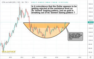
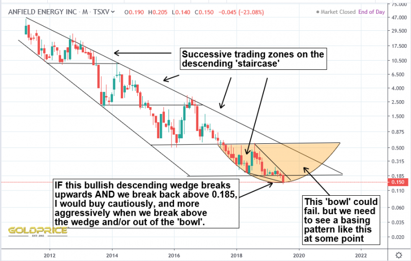
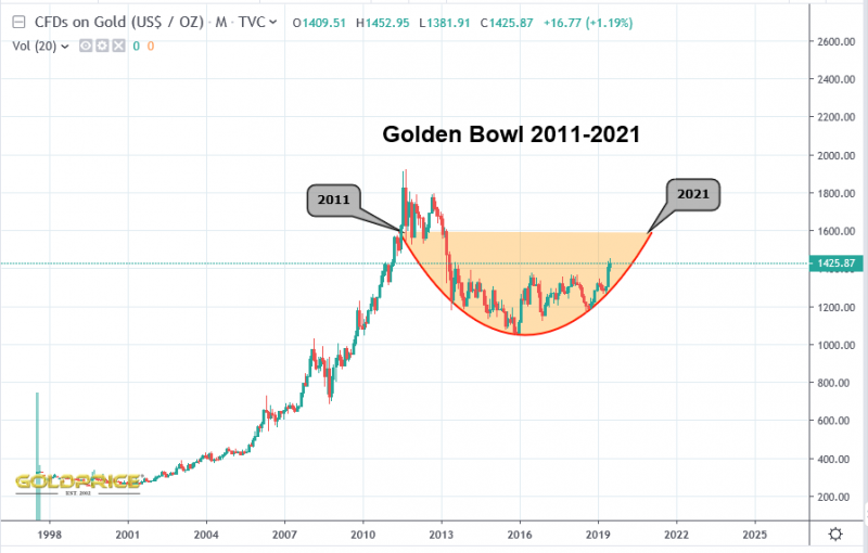
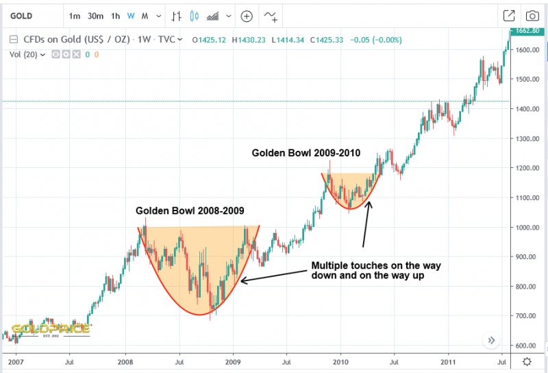
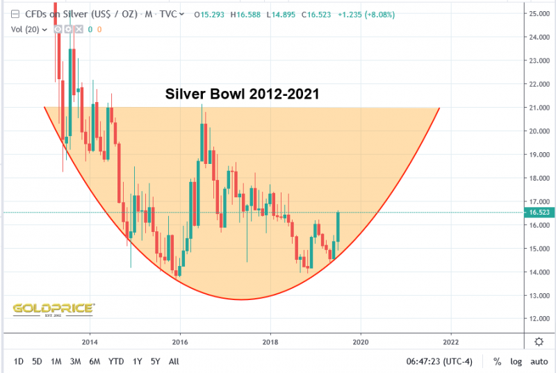
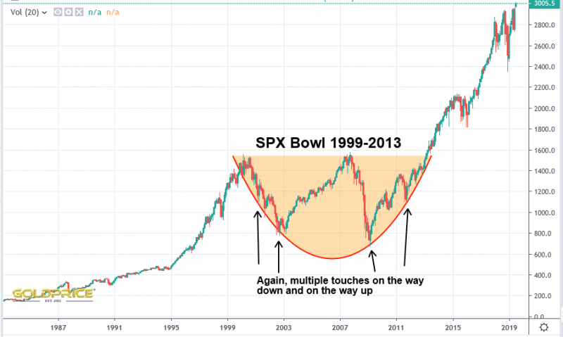
Bowl Basing & Domed Topping
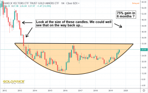
It’s natural that some sort of pattern builds out at cyclical lows and cyclical highs. Here are a handful of numerous examples in a number of markets, but once you start looking they’re everywhere…
The reason I’m focussing on this right now is that it can help to give us a very high confidence level that we’re on the right side of the trade (either long or short in a particular market). If you can confirm that a base or domed top is looking valid by demonstrating multiple touches and successful tests, you can identify the rising or falling support level (as I’ve done for DXY and Gold/Silver in recent posts). A breach of those levels would provide me with my first ‘warning flag’ that something is wrong. Additional confidence comes from the fact that an apparent base lines up with a cyclical high, or domed top lines up with a cyclical top. This is indeed the case for PM’s and the US Dollar. For those reasons, my confidence in PM’s up/Dollar down is pretty high. However – nothing is set in stone, and something that is very, very unlikely, can still occur. Just because the evidence stacks up to favour one particular outcome, an entirely different outcome may occur. That’s why I’m so focussed on reactions of DXY and Gold/Silver within the bowl I’ve identified. The remainder of 2019 is likely to provide all the answers I need.
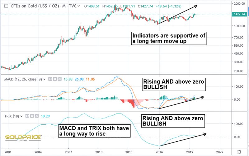
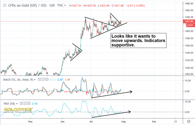
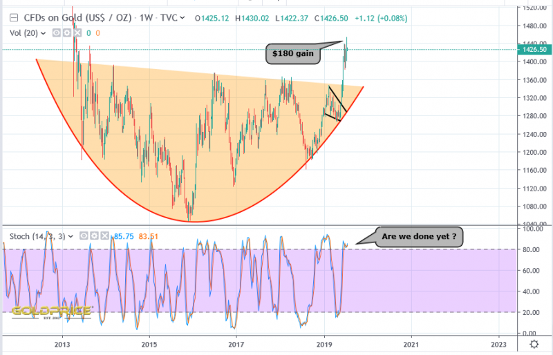
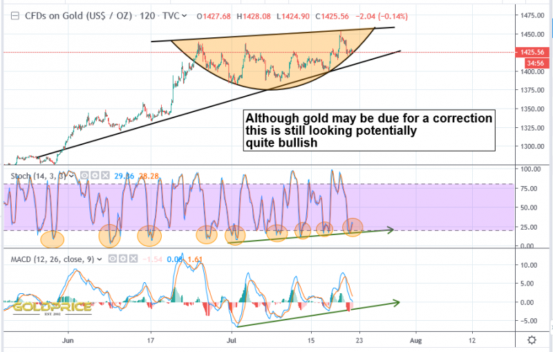
Gold Chart Still Looks Like It Wants To Climb Upwards
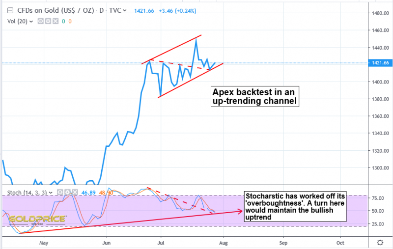
I know a correction is coming at some point, and the cycle experts will have their views on this. Smaller cycles frustrate the heck out of me, so I’m just focussing on the chartology, and this still looks bullish to me. Could we surge to somewhere in the $1500-$1600 region before seeing a meaningful pullback ? Quite possibly, especially if the GSR falls through the lower support line in the 80 region.
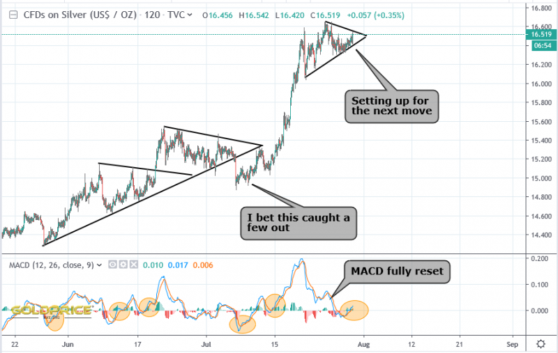
Silver is on a tear, so the GSR continues to fall…
Gold/Silver Ratio
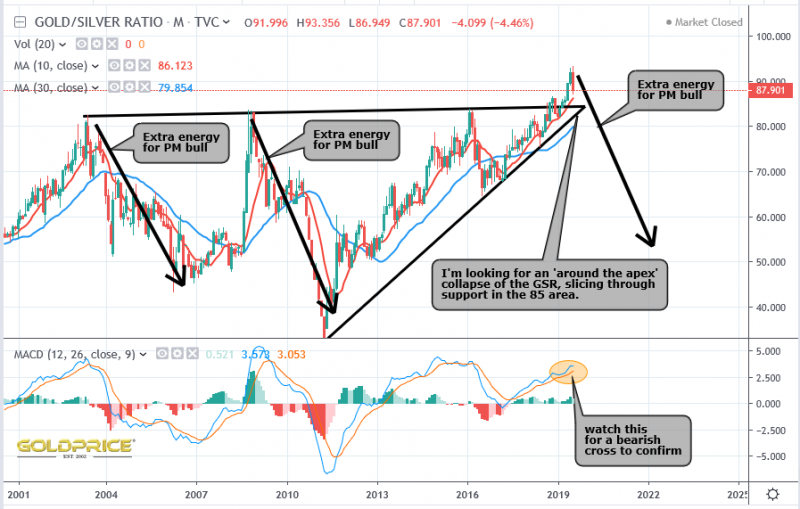
I posted this last month…
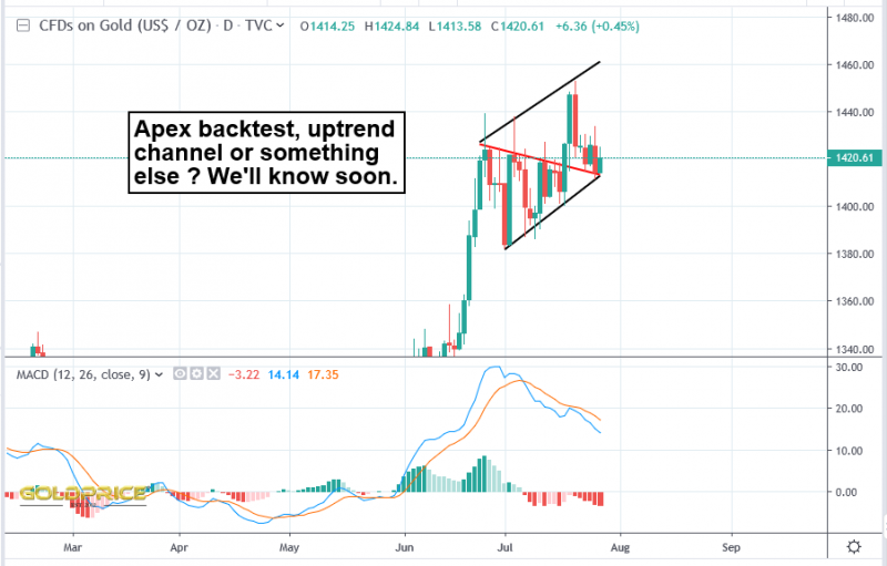
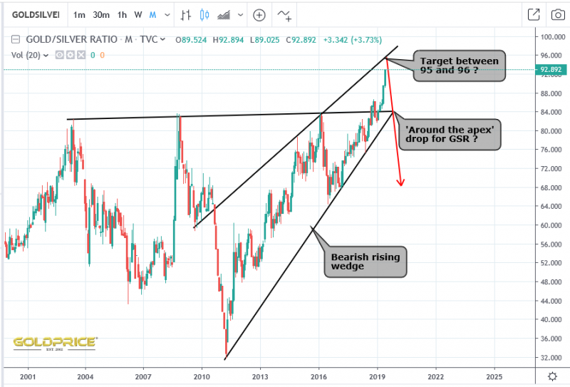
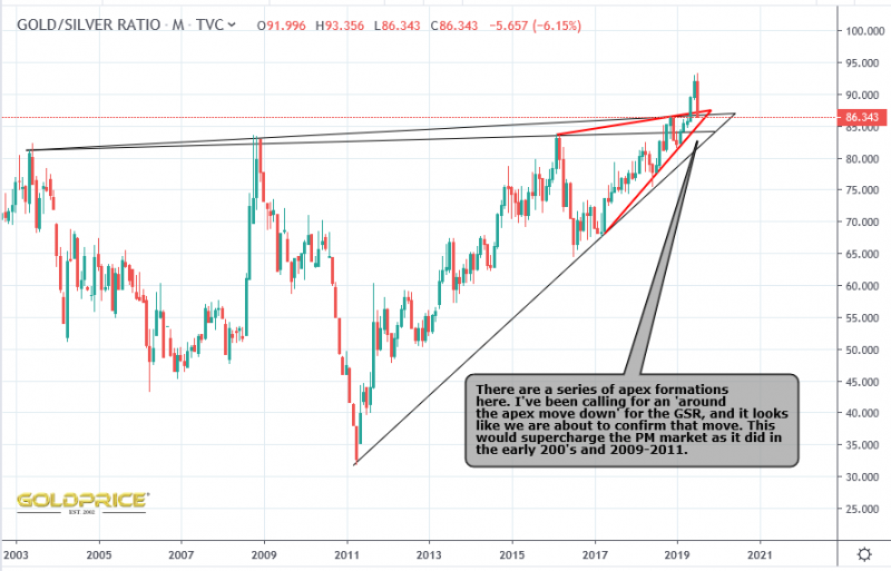
I can’t take the credit for the use of ‘around the apex’ moves. Graddhy (formerly a member here, and now to be found on Twitter), has been right, time after time with these. I’ve been studying them carefully and come to some clear, and probably quite obvious conclusions.
- An apex forms at the culmination of a pattern with decreasing price movement
- The resulting triangle or wedge can be level, or tilted up or down (you can read about them on stockcharts etc)
- The key point for me – If they form at a historic market high and break upwards, you can pretty much guarantee a violent ‘around the apex’ move down. The opposite is of course true at historic market lows.
- The GSR is at a historic high, so it was always 95% likely to reverse down to pass through the apex and provide very, very strong evidence that we have a developing PM bull market on our hands
So, finally, here’s the chart updated with todays data…
I’m going to refrain from declaring this a done deal until GSR passes through the lower black line (somewhere near 80). A lifetime of experience teaches you that very unlikely things do sometimes happen for unforeseen reasons. However, the odds are very strongly in favour of a crashing GSR and energised PM market, with silver and silver miners surging.
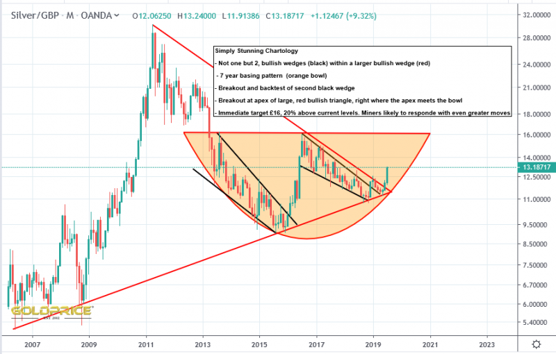
Silver – Incredible Chartology
Been looking at Silver priced in Pounds here in the UK. The big picture chartology is simply stunning. Straight out of a textbook. This is clearly, without doubt a bull market for PMs in my view.
The last 7 years looks more and more like nothing more than a ‘halfway pause’. A realistic target, when £16 is broken to the upside is £40-£50.
Looking Back – Where Are We Now ?
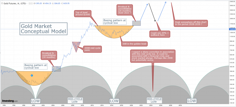
You might remember I posted this chart back in May https://goldtadise.com/?p=444548
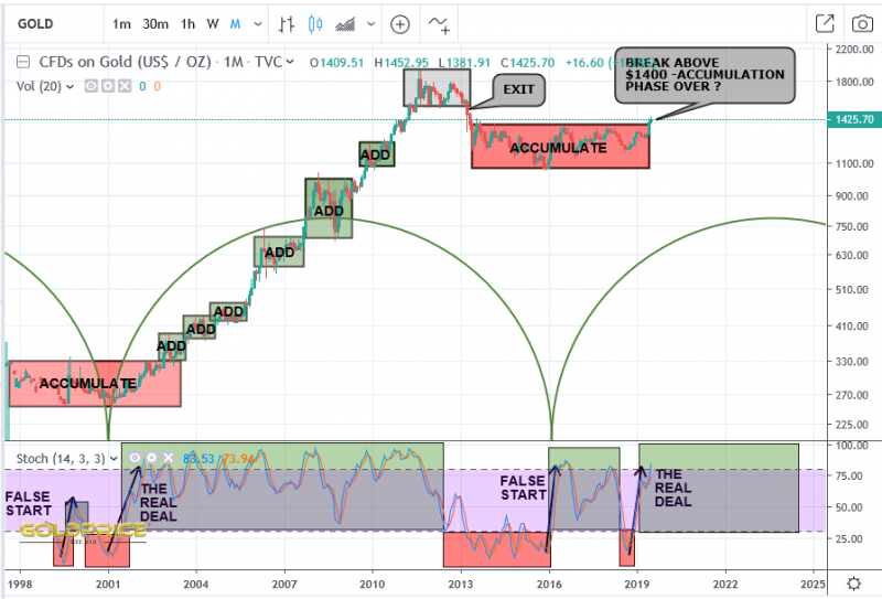
Here’s the same chart, brought up to date…
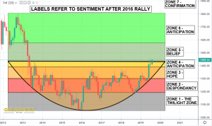
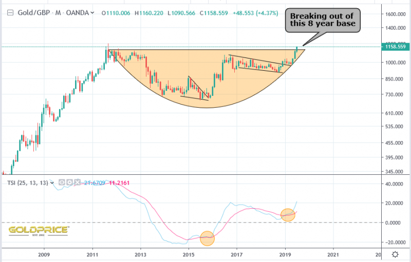
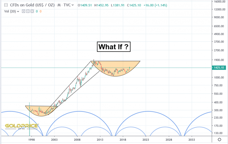
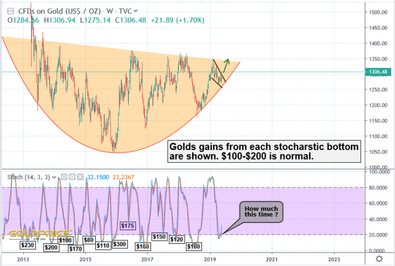
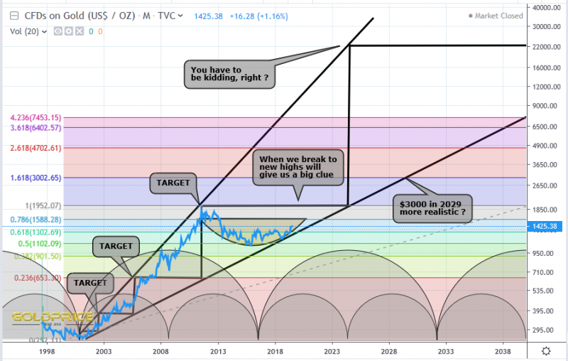
Since then, I’ve adjusted the ‘golden bowl’ in my conceptual model (the top of the bowl is now at $1600), but the base/support of the bowl is in a very similar position, currently providing support in the $1300 region. Any large correction should be supported there, and unless it’s breached, I have no concerns at all.
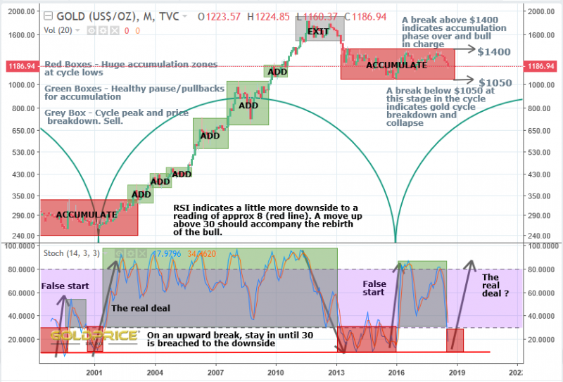
Here’s another blast from the past, this time last August https://goldtadise.com/?p=433668
Here’s the update…
Everything seems to be progressing well, and I have no reason to reconsider the bullish outlook unless $1300 is breached to the downside. It’ll be interesting to revisit this post in another 6 months or so – looking back at the end of the last accumulation phase, we may spend quite long periods of time oscillating around in ‘add’ zones. Also noticed I put the start of the 16 year cycle in a somewhat debatable position – but I do find the exact cycle lows can be a little out of sync with the actual price bottoming, so I try to only use it as a rough guide anyway.
Forecasting – Art Or Science ?
After 32 years of weather forecasting, I’ve come to the conclusion that it’s about 75% Science and 25% Art. Once you have your forecast, it’s then completely useless unless you can communicate it effectively, so that people understand it in the way you intend, and take the actions that you would like. I’ve worked in the field of civilian and military forecasting, and knowing your audience is key. In this example, one understands technical jargon and the other doesn’t. Even so, a fast jet pilot, actually isn’t interested in the weather forecast per se, all he or she wants to know is whether or not they can safely complete their mission, given the prevailing weather. Go or no-go, effectively.
Back in the day, our computer would churn out a crude forecast, which the human forecaster would consider, adjust and issue. Today, things are vastly different, we use some of the most powerful supercomputers in the world to model the global atmospheric interactions in three-dimensions, at ever increasing levels of detail. The computer then produces dozens of forecasts. Dozens of possible future weather patterns. We do this in the UK, and they do it in the US, Japan, Germany, France, etc etc. Every 6 hours, (Every hour in the near future), forecasts are produced for the entire planet going many days into the future. Where does that leave us ? Well, this is where you need to consider predictability. Chaos if you like. Sometimes the atmosphere across the Atlantic Ocean and the UK is in a ‘calm’ balanced state, where we have a good level of predictability. All of our predictions, and those which are done by computer models in other countries are saying the same thing. For example, at the moment, they are all saying that much of the country will be hotter than normal next week, with temperatures in the range 28-35 Celsius (UK Summer average is 20-23 for most areas). On other occasions, there are a range of predictions, all different. That’s where we have to examine what it is that’s causing the differences, and make a judgement call, based on evidence to suggest which is the MOST LIKELY outcome. It’s important to bear in mind that just because Outcome A has a 90% probability and outcome B has a 10% probability, it doesn’t mean outcome A will happen. The favourite in a horse race doesn’t always win…
All of this guides my approach to PM market analysis. I gather ‘evidence’ and weigh the odds. At periodic intervals I’ll remind the reader where the support level for my ‘forecast’ is. At the moment it’s in the region of $1300, because my conceptual model is based around the ‘golden bowl’ formation guiding us towards $1600, before we consolidate and make a break for possible new highs (the timing of which will help me get some sort of idea what kind of bull market targets might be possible).
Here are some pieces of evidence…
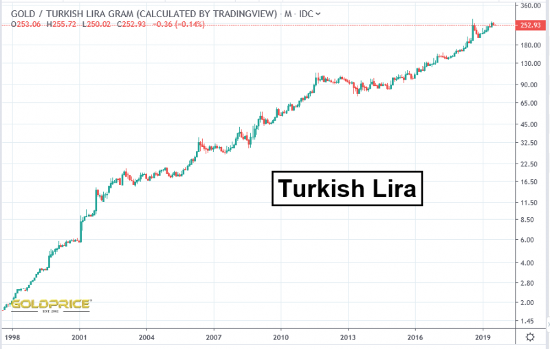
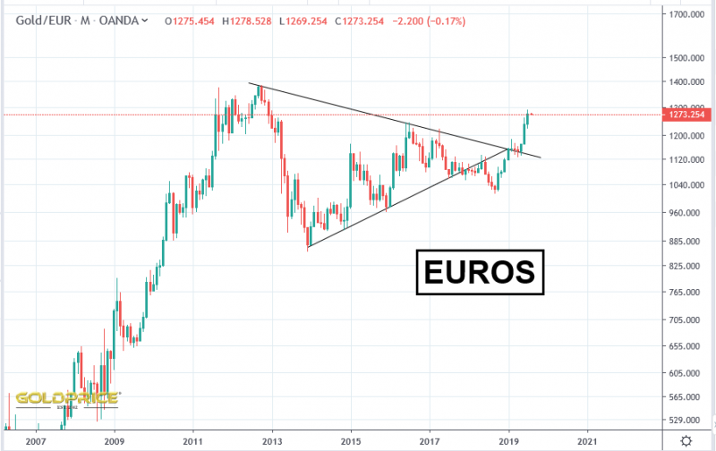
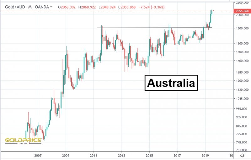
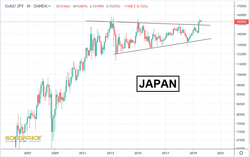
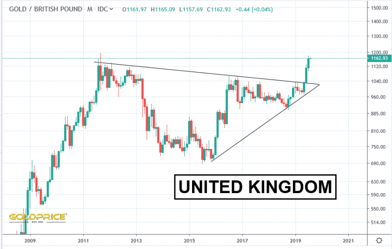
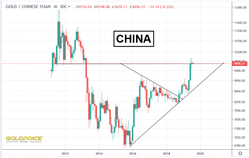
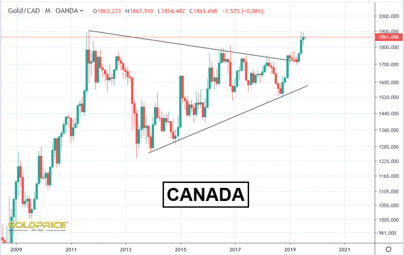
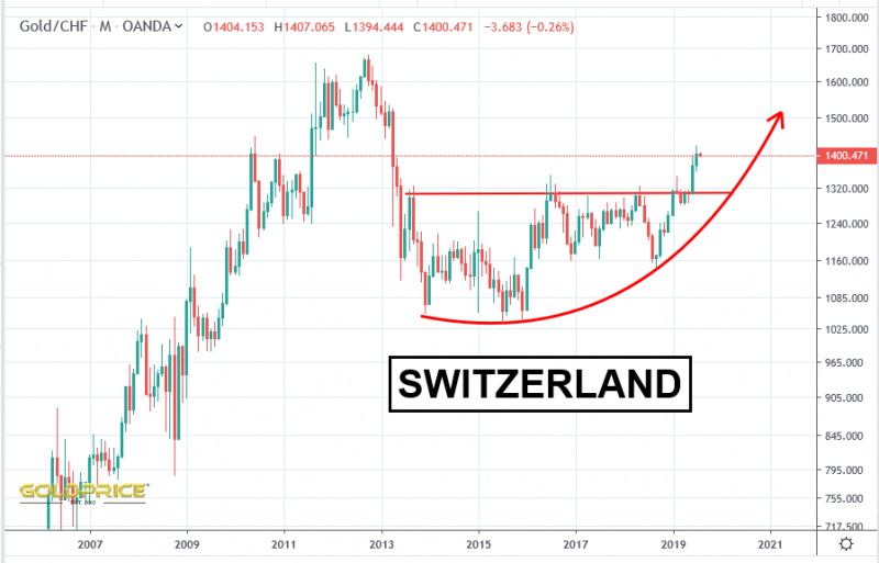
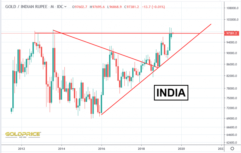
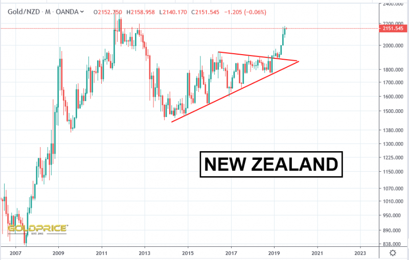
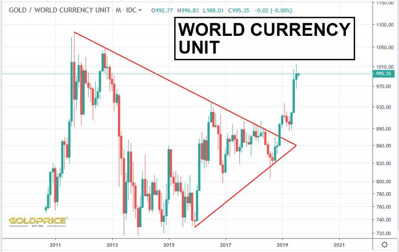
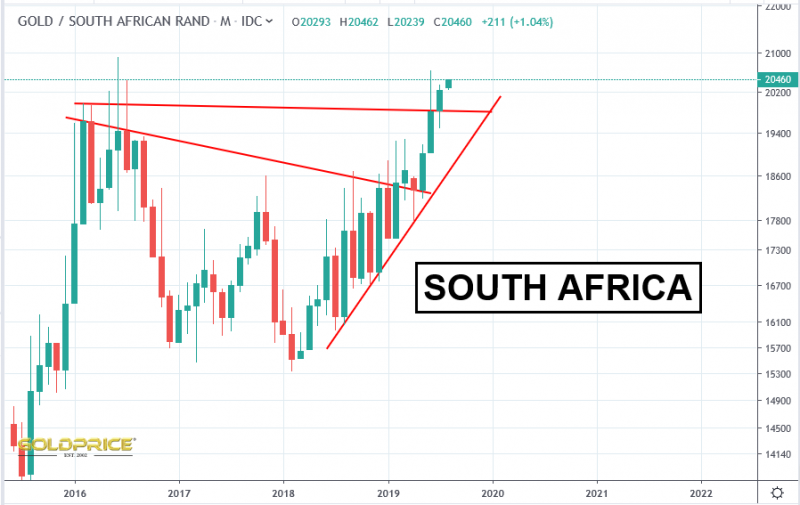
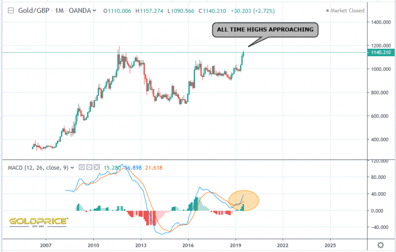
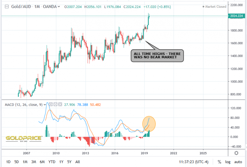
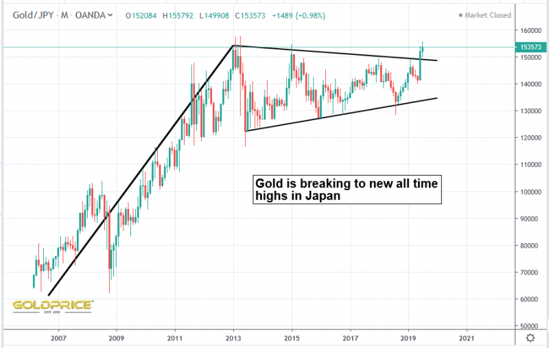
#1 – Gold breaking to new all time highs globally
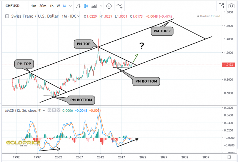
#2 – CHF/USD looking bullish
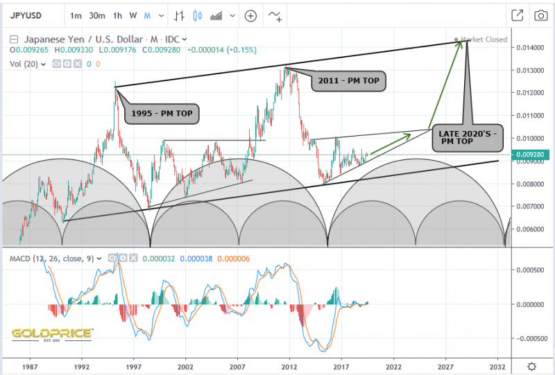
#3 – JPY/USD looking long-term bullish
#4 – GSR coming off all time highs
#5 – DXY hasn’t broken my ‘domed’ resistance area
#7 – ‘Golden Bowl’ basing formation is doing its job like last time
#8 – Silver is just starting to outperform
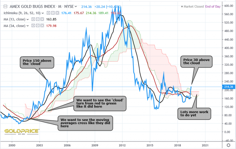
#9 – Miners are starting to move
#10 – Donald Trump is actively seeking to suppress the Dollar
#11 – Interest rates are not going higher – as I’ve been saying for years, they are unable to ‘normalise’ EVER due to the incredible debt burdon. Lord only knows what form of monetary saucery will be invented this time around, but none of it will be good for the long term health of economy. This is the case on a global scale – that’s why country after country is breaking to new all time highs.
This is the financial equivalent of a perfect storm. When it hits though, things will become a whole lot less predictable, and I hope at least some folks will have been paying attention to the forecasts and warnings (I don’t necessarily mean from me, I just mean that I hope some are able to protect themselves from the worst of the effects by taking effective action).
This is quite likely to happen slowly at first, then very quickly. In the meantime, expect plenty of pullbacks and consolidations as Gold and Silver begin to wake from their long slumber.
Paradigm Shifts – Food For Thought
Gold/Silver ratio is falling fast from VERY high levels. This tends to supercharge PM markets. The 85 level is very significant because it will confirm the completion of an ‘around the apex’ move which has been building for nearly 20 years…
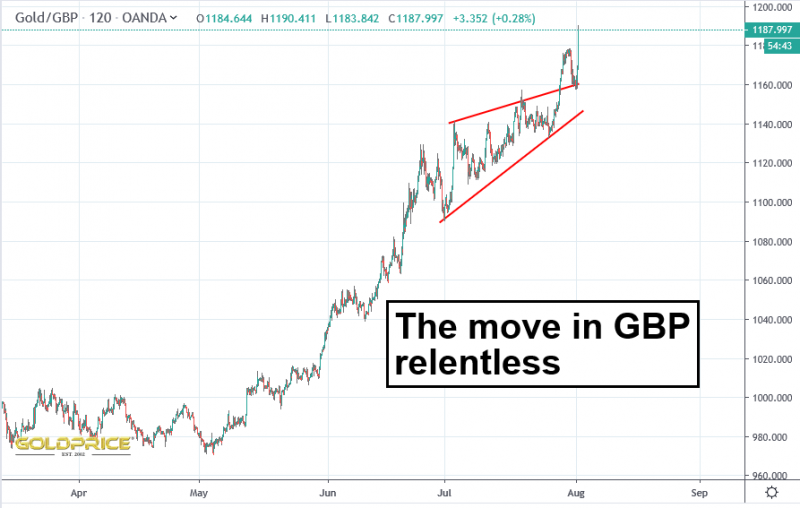
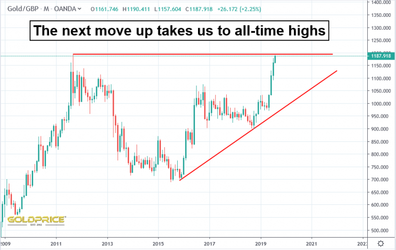
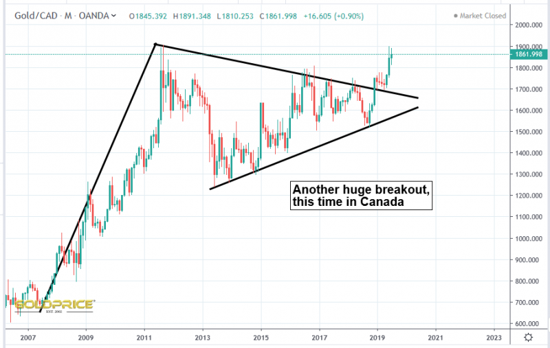
The rest of the world is already entering a new era, where gold is at its highest EVER level when measured in the local currency, in countries as far apart, and contrasting as Japan and Canada…
Gold is rising at a logarithmic rate (tens of dollars in the 70’s, hundreds of Dollars in the 80’s and 90’s, thousands of Dollars in the current decade, tens of thousands in the…). That’s represented on the following chart. The key for me, when it comes to trying to gauge just how high we go in the next 10 years, will be how long it takes to break above the old highs. Remember, much of the rest of the world is already achieving this…
