More about Housing — with charts
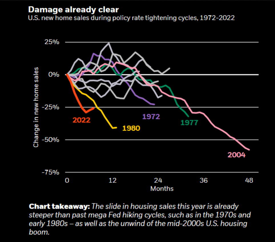 The red line on this chart of New Home Sales in the US is the steepest and fastest decline in prices ever recorded. That tells us something. Does anyone else think this is just the start of the fall? I mean besides realtors who will all say a bounce is right around the corner! LOL (Chart sourced from Zerohedge)[/caption]
 If I squint I can almost see a 5 wave Elliot count in this chart of Toronto real estate prices. So I drew it in green lines for good measure. If its the real deal then look out below!!![/caption]
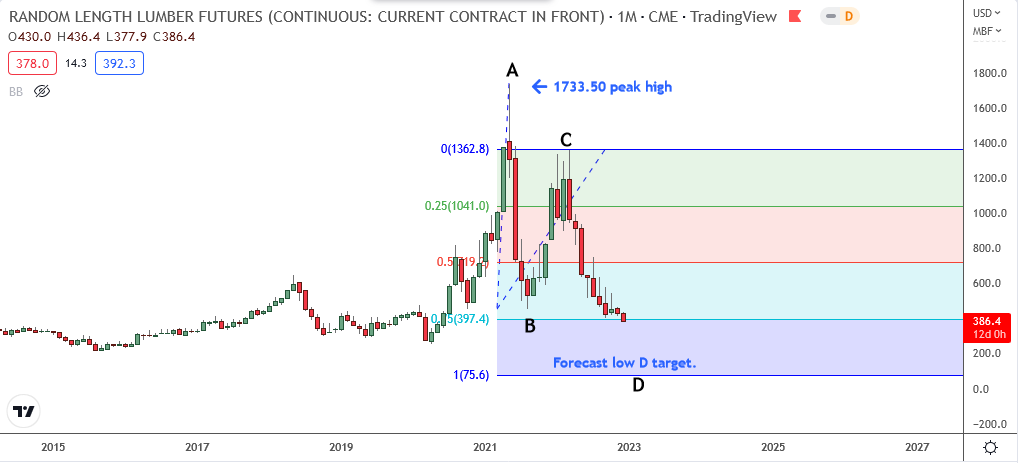
Here is our current Lumber Futures price crash as it progresses on its way below 100 dollars. (Monthly chart)[/caption]
Thanks for sharing
Anytime. I hope it gives a few loudmouth realtors indigestion.
A home used to be a place we all lived in. Now it is a wealth generator in the minds of the Millennials. That’s about to change.
Thanks for your input.
That Toronto chart is not correct
The Chart may be right but the Y axis is not
There are like 4000 HOME SALES A WEEK IN TO.
This shows 500 per quarter…maybe missing a couple of zeros