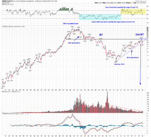
DOW to Gold ratio
Chart tells the story. Market topped in 2000 in relation to gold.
Break down from here is going to be interesting. After two BT and 50% retracement from top the ratio may be prime to head down to target 1.
100 year chart of dow to gold ratio.

Excellent Chart Bikoo
Thanks. Thats what learned from Rambus: Zoom out and see the full painting. Lets see if this resistance line holds here.
I can easily imagine Gold at $5000 but find it much harder to imagine that with the Dow also at 5000. We certainly wouldn’t be in Kansas any longer. I guess we better be careful what we wish for.
Well this is the ratio of Dow and gold.
In hyperinflation: Dow at 50000 and gold at 50000 for 1:1
Or in deflation: Dow at 6000 and gold at 6000.
Atleast in our life time we have seen the later one scenario: 1:1 in 1980: Dow at 850 and gold at 850.
We just have wait and see what rolls in????
Forgot to ask, what does volume mean on a chart like this?
Not much of importance.
Another great chart that says it all. Buckle up.