$YEN, $USDJPY, & A Price Performance Chart of Commodities
Some ruminations here, on the $YEN…
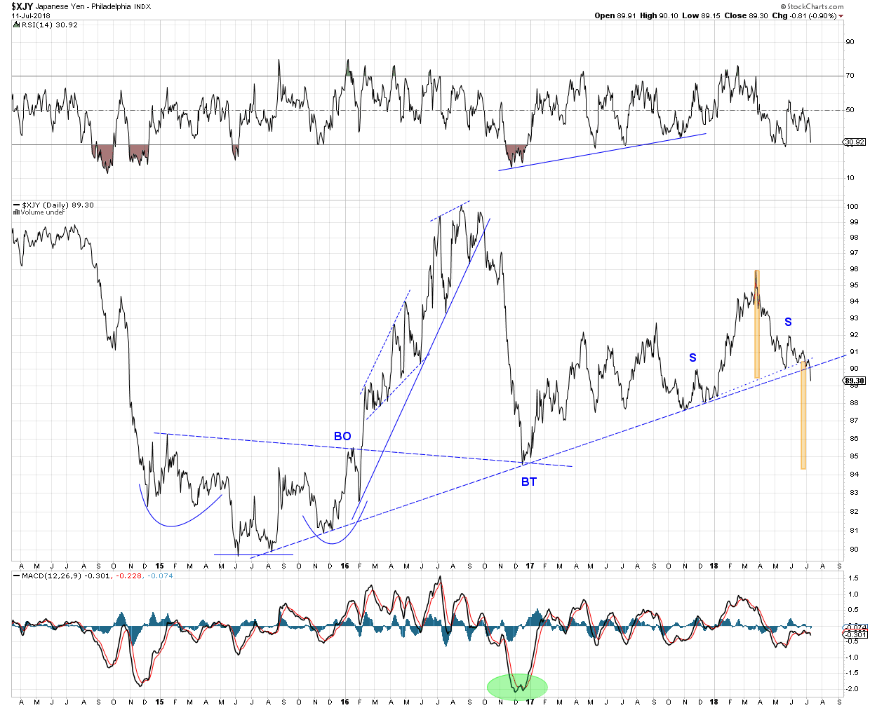
What happened to $YEN today? Was that a Trade War hissy fit, or was it the beginning of an impulse move down? Is it possible the $YEN May/June pennant is a half way pattern to the down side? If so it projects down to 85 ish. A BO to BO measure is almost a full point lower. Not saying its going to happen, but it could, it might. In any case it blew a pretty good hole in the lower B Band. One would expect $YEN to pause here then for a day or two, maybe retreat some. Feel free to disagree, but IMHO this is a serious breach, with more to come.

Here’s another look at the daily line chart posted yesterday. Assuming a valid SHS formation on the neckline, a price objective (PO) for $YEN is in the 84 area. (A daily HLC, or candlestick chart would be better for determining a PO. Maybe later?)
$USDJPY daily broke out above the inverse SHS neckline yesterday. Worse, today it broke out of that large triangle pattern we’ve been following (solid blue trend line) There is a BB break, so it might retreat from here. Therefore a definite break out of the large blue triangle is not yet confirmed.
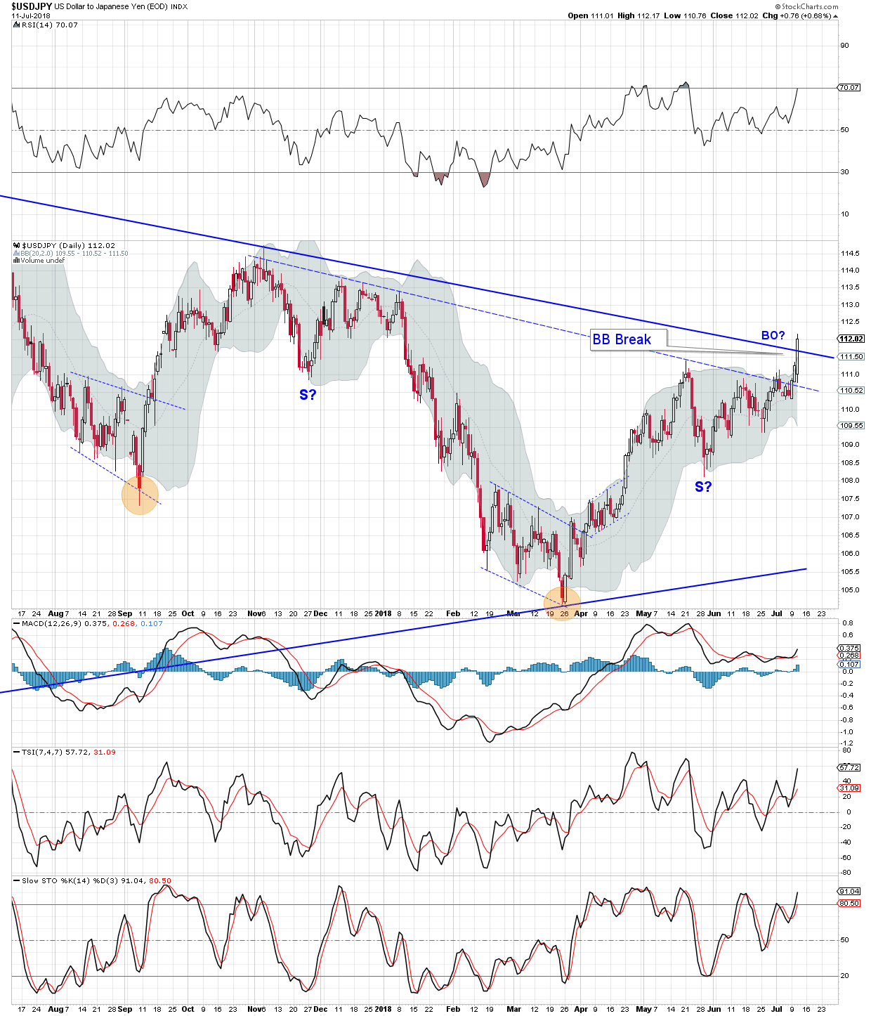
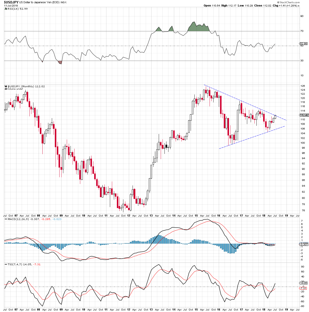
This is where it starts to get really interesting, maybe not in a good way. The dashed blue trend on this chart line defines the border of a pennant (triangle) four years in the making. Big patterns equal big moves – Rambus.
The inverse SHS on the daily chart suggests the triangle should soon be broken to the up side, although maybe not this week.
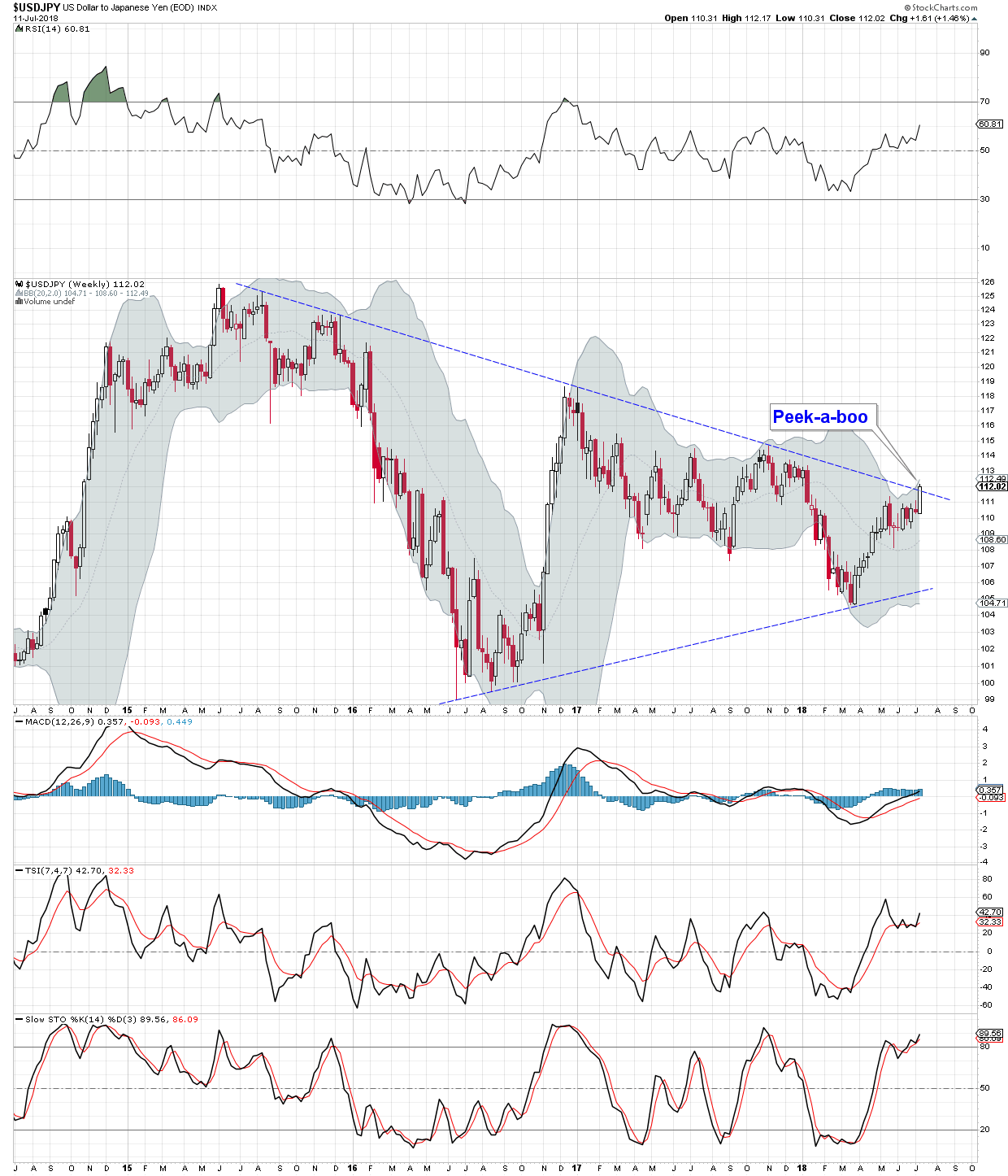
Zooming out we see the above pennant as a possible half way pattern to the upside. Its a crazy nightmare scenario. Could $750 – $800 Gold really happen? Its only a nagging possibility at this point, but something to keep in mind.
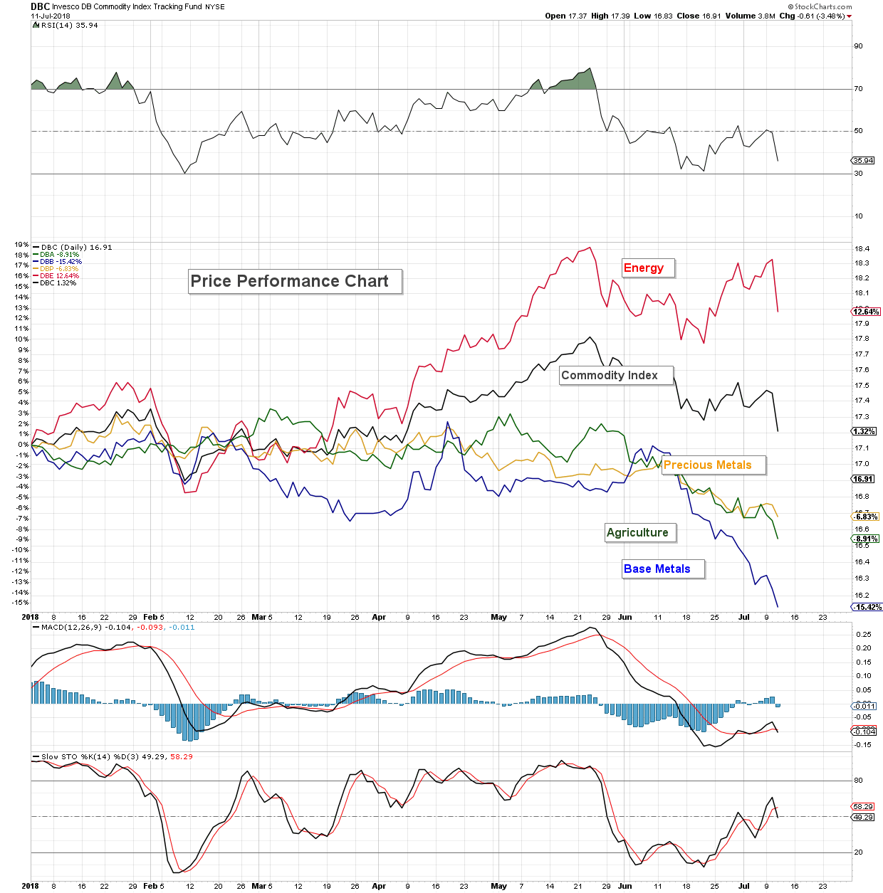
Off on a tangent, for general interest, here is a Price Performance Chart of select commodities. Those using stock charts and who subscribe to John Murphy’s news letter have already seen this chart. It was one of the charts in this morning’s email. Never saw one before, liked it and threw this one together to share. This chart shows the performance of selected commodities from 1st January 2018. A glance at the side bar informs us that DBE (Invesco Deutsche Bank Enery Tracking Fund) is up 12.64% this year. Base metals are down 15.42% At least precious metals are doing better than potatoes this year (DBA) (heh heh)
Ignore the graduated numbers on the side bar. They indicate the absolute value of DBC, set to invisible on this chart.
Back to the FOX HOLE Sir Fox
yuck
Looks like its just you and me tonite Silver Fox
I love those Perf Charts….Stock Charts is an amazing resounrce….we take it for granted
Keep exploring….we will find the holy Grail or die trying
🙂
Was expecting to get voted off the island for the ultra bearish post today, but I’ll take being ignored. Most are likely too discouraged to bother with a post, what with today’s violent down draft and all. Can’t blame them.
“…or die trying” – perish the thought, but the longer the bear the more likely the possibility. Jeez. Can’t live forever now, can we?
No SF I vote to keep you on the island
JL left this site cause of all the grief over Bonds…..guess what the Bond market is about to get real….come back JL!
IMO if you can’t look at the market in real time without predetermined outcomes entrenched in your psyche that is a disadvantage. I’m all for long term investment but the today and tomorrow matters also.
Everyday is a trading day and a day too reevaluate the reality of the world…..
I want to hear what everybody has for an opinion that’s part of the market also.
IMO the world is at the edge of huge wealth transfer….I want to on the positive end of the equation….do you? Well just what is the perfect vehicle to capitalize?
Anybody who can’t defend a position without rationale logical reason feelings aside well good luck in the real world….check the feelings at the edge of the tent If you’re gonna put you ideas out there maybe? Just my .02.
I also want to be a PM bull. At the moment I’ll day trade and maybe do some stacking maybe?
GLTA
Keep posting SF