Valuations (or Fun with Excel)
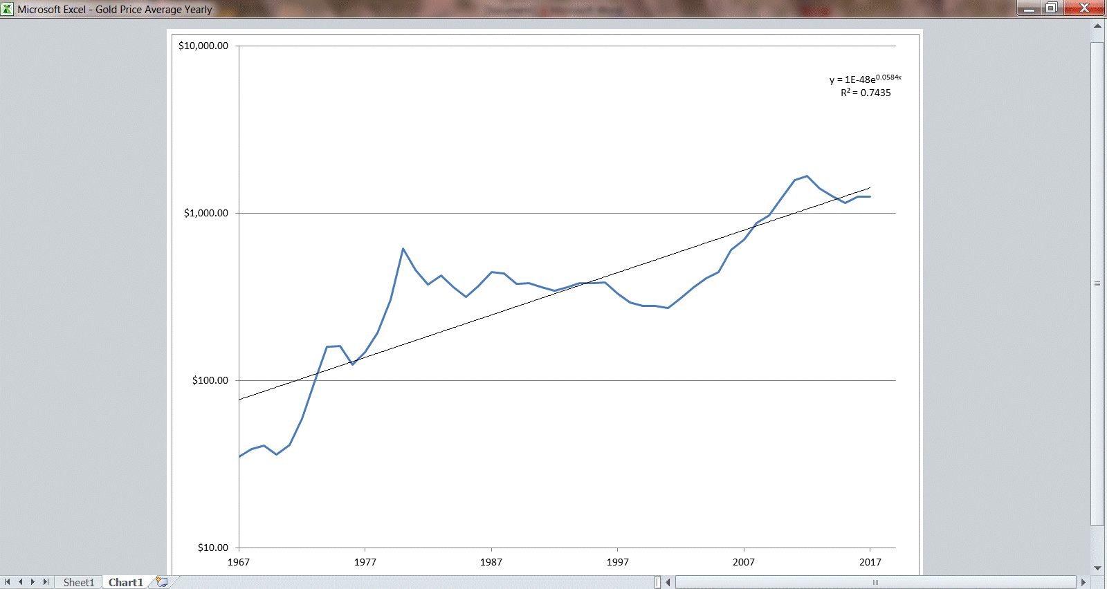
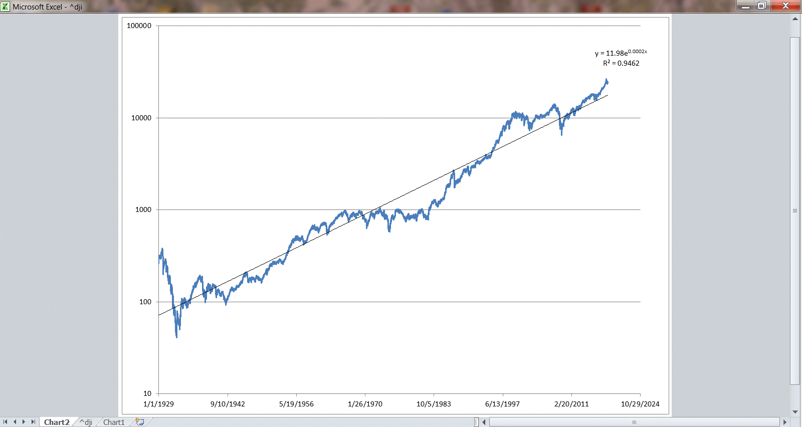
Here are two charts that show long term trends of the Dow Jones Industrial Average and then one of gold. The straight line through them is a simple linear regression – sort of a moving average. You hear that trends revert to their mean – well, this is a pretty good estimation of their mean.
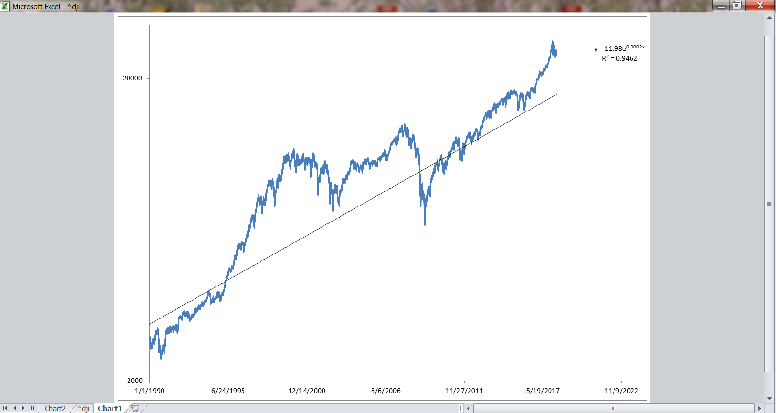
Here is a close up of the recent price.
And then gold, which is pretty much at its current mean.