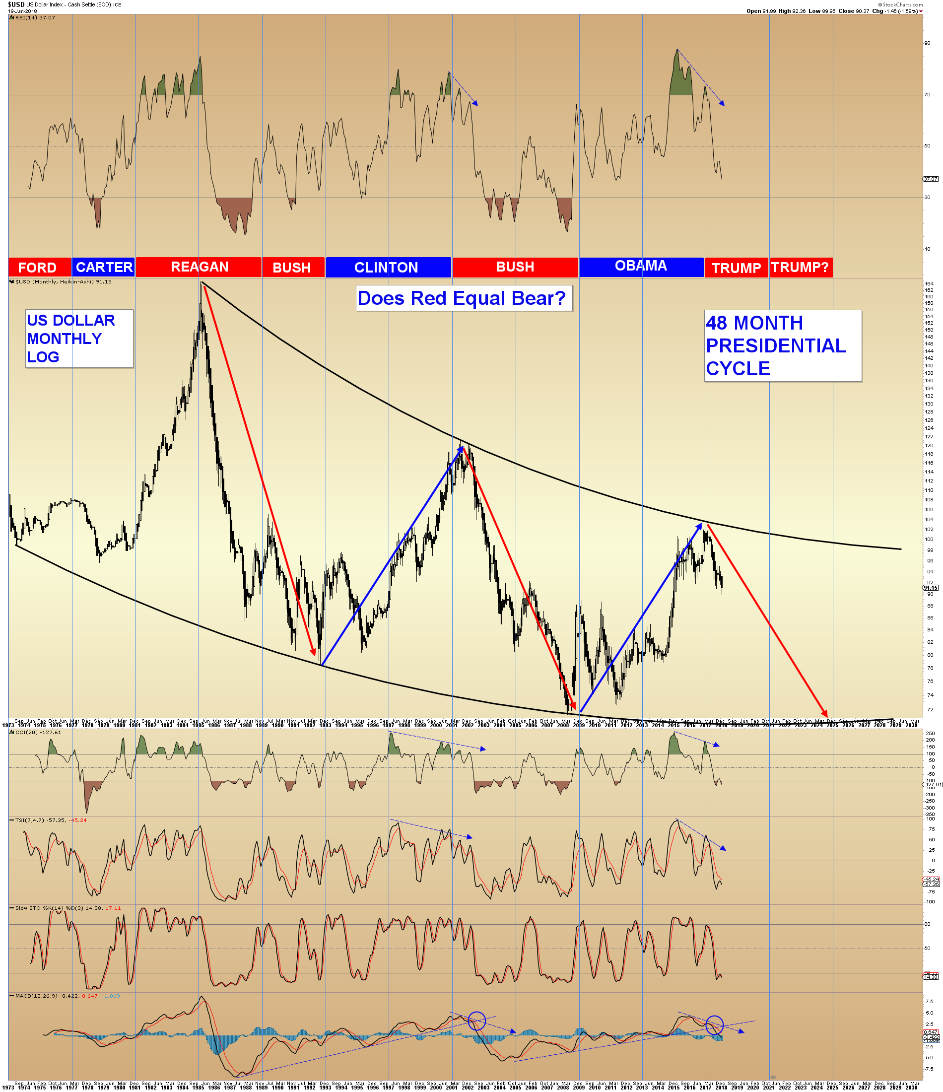
The Dollar
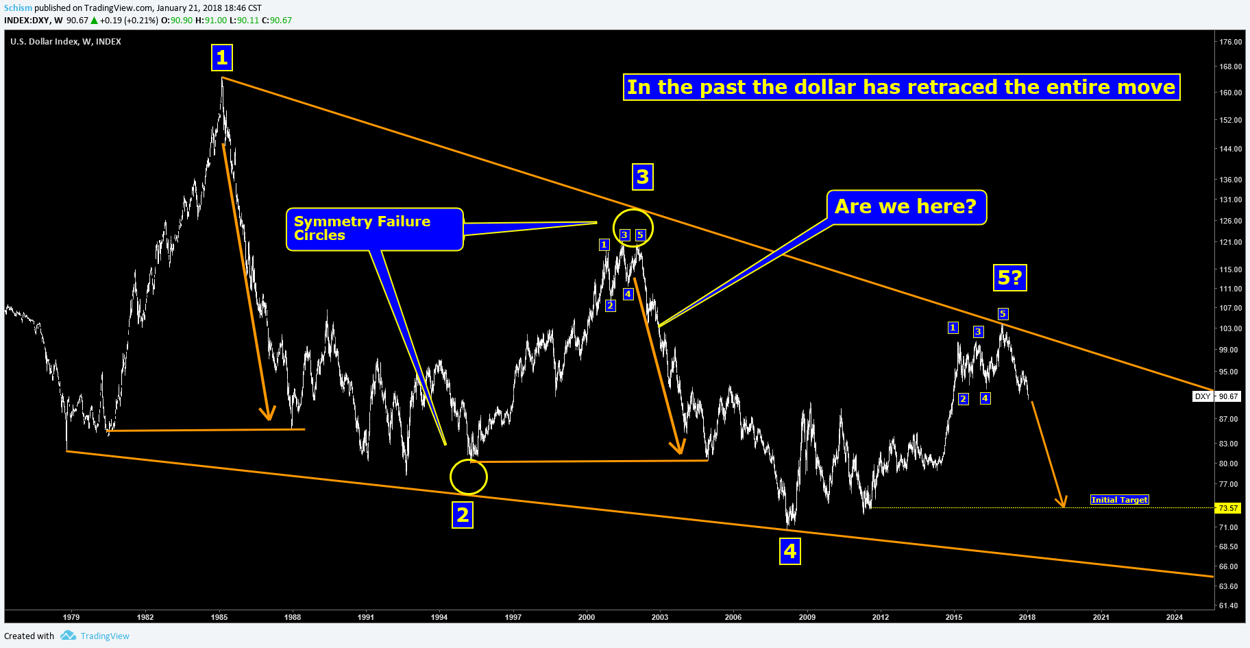
I think this is the most common perception of the current dollar pattern. The dollar building a pattern on top of a steel beam of support coming from the 1985 high to the 2002 high.

But what if the Dollar bulls have been duped? Sir Rambus taught about symmetry failure in chart patterns. Could this be applied to the dollar chart? I think it looks pretty solid.
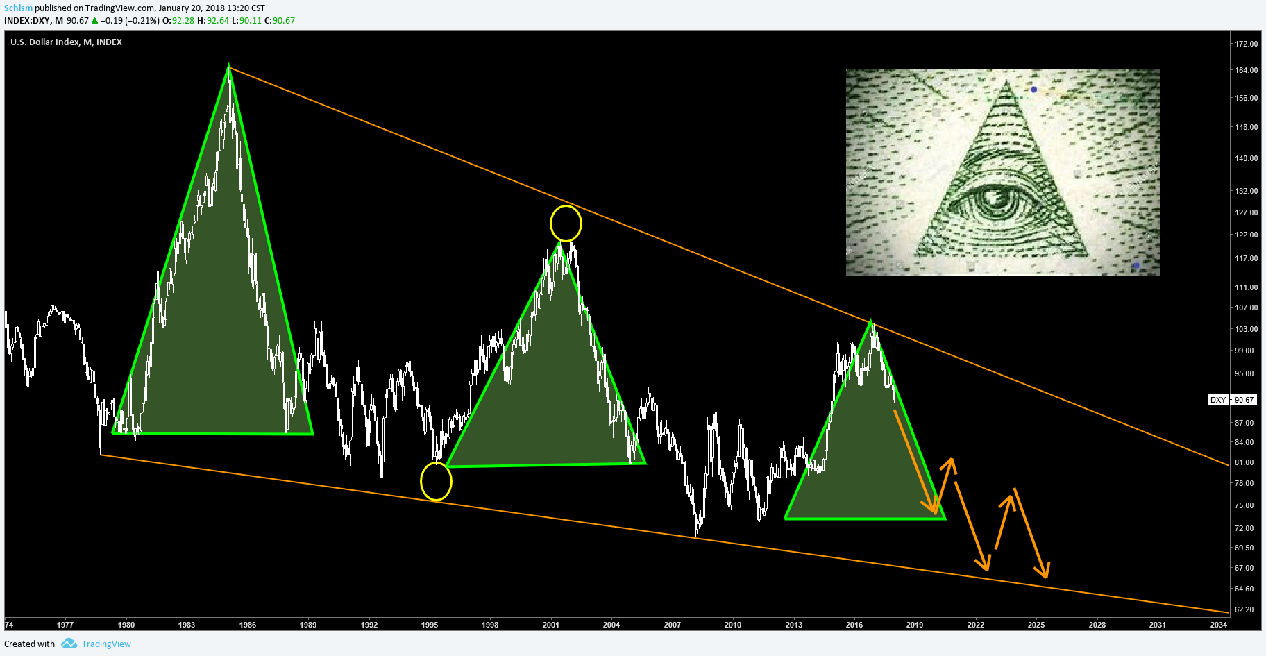
These charts are space fillers
 ,
,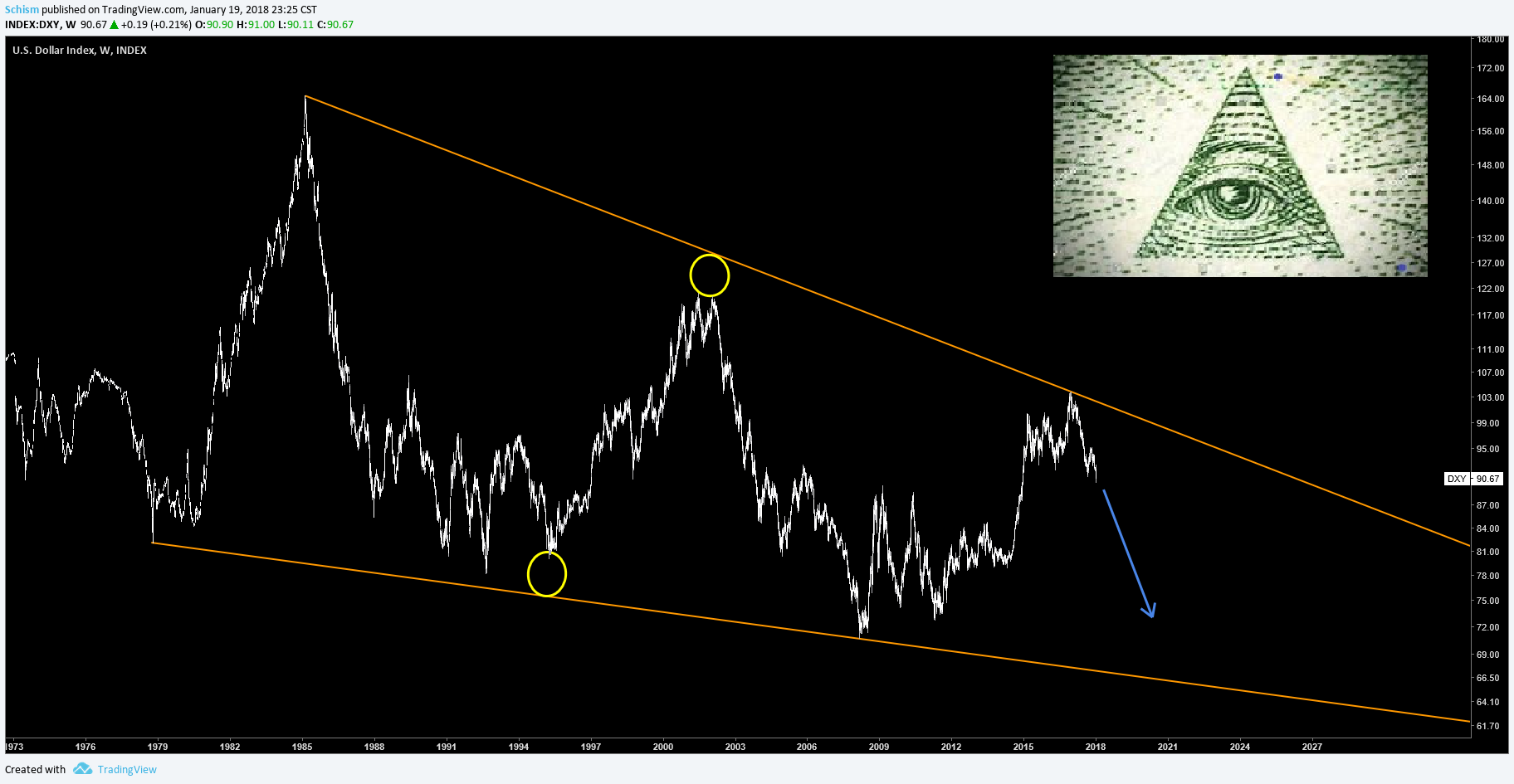
These charts show how time could be rhyming and also how gold performed during previous dollar declines.
 ,
,
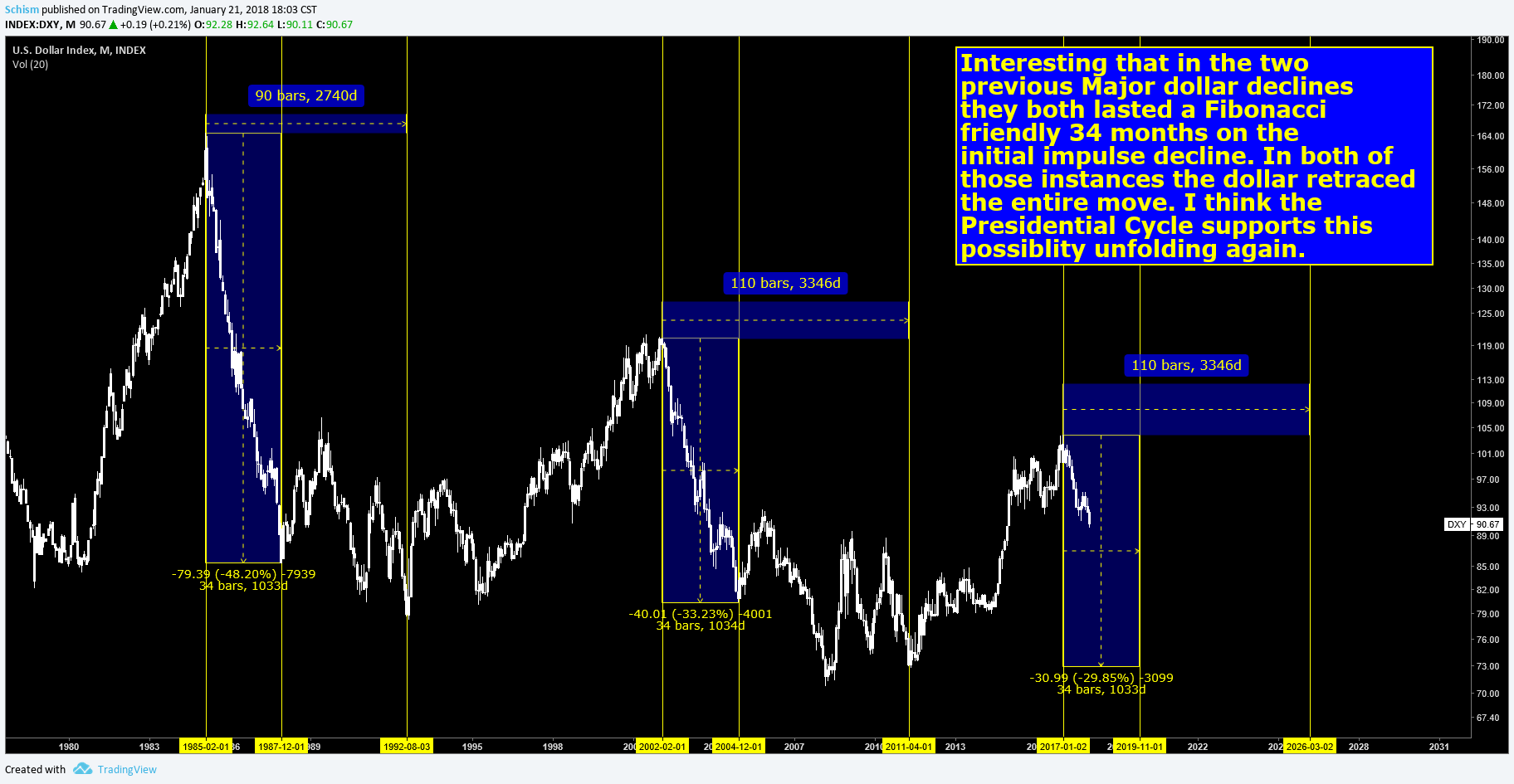
This last chart is not a new invention, everybody has heard of the presidential cycle but sometimes visuals are more persuasive. It does show the uncanny knack of Dems running the dollar hot and then the Republicans come in and cool it down. It almost seems like the chart guarantees that Trump will get re-elected. Nothing is certain but it appears that a good run could be imminent. I just wonder if we get a scare the shit out of people correction or if corrections remain shallow and swift leaving the doubters at the station. I’m guessing we find out sooner than later.
Excellent presentation!
Are we here? Yes exactly IMO
Does red = bear? Certainly does IMO
Weight of evidence suggest that the larger cycles, both commodity and USD are alive and well, which means commodities UP and USD DOWN until around 2024
After that date it will be a bit of a bummer as the credit cycle will more than likely top around 2026
What will save Australia next time around?
Well hopefully you bank enough coin in this cycle to get to a smaller island.
Maybe You guys can change your country name to Aussiechain or something. lol That solves all problems…but that is now. Is pot legal is Australia?
Sir Schism , as I know you do not self promote , let me be the next to say…. This is freaking incredible work !
Brilliant !
I’m placing this on the Sidebar in a prominent spot for future reference !
Symmetry Failure on the Dollar Chart….Ha !
Folks this is the kind of quality outside the box thinking we get excited about around here.
Schism doesn’t post much but when he does it pays to pay attention.
🙂
I’m just a Seinfeld chartist…an observation here and there. What is the deal with….
Excellent presentation indeed! I have spent lots of time studying several different 40 year USD charts and never considered failed symmetry as an option. Talk about doing a face palm to myself. As Norvast stated, I believe we are here. Thanks again!
Man, I had a very similar wtf moment. Like you, I’ve drawn and checked 100’s of dollar charts and that option hadn’t clicked. One reason is because you can’t draw this on stockcharts as the data is different from the dxy.
This is excellent work, Mr. Schism. Simply excellent.
Muchly appreciated and many thanks for sharing!
Thanks BBM, appreciate it
I like ‘Trump’ ‘Trump?’
Might get somebody triggered. )
Great charts. Thanks for sharing.
Fully, this is not the first time you have move other posts in front of my posts, it has happened many times.
I have not asked you all the other times you have done it but now I would like to know, why do you do that..?
This time you moved Schism´s posts from yesterday in front of my post below, posted today.
What is your thinking with doing this repeatedly really when I post..?
And now I see that you also moved Jordan´s Daily Gold post in front of mine.
I am just curious why you keep doing this when I post.
I believe Sir Schism’s post deserves TOP Billing at this time. I am thinking many readers in different time zones may have missed it as it got thrown off the front page after your lengthy contribution.
Same with Jordan’s Post.
Graddhy do you not agree Sir Schisms Post is Brilliant ?
And also Jordan’s work with comps is unique and very actionable ?
I thought it was a very odd move. Jordan’s post is a link to his site, how on earth does that take priority over a lengthy post meant for just GT? Strange.
The Lengthy Post bumped These two posts off the front page. Jordan’s Post is a tiny one liner.
And it is a very important piece of work IMO
It doesn’t matter to me that Jordan has a link to his site…He should …its a great site !
Graddhy’s post didn’t disappear…its still there on the front page
sheesh
Yes Jordan’s work is excellent that’s why I visit his site and seek out his work on a regular basis.
Jordan always has well thought through stuff.
About Schism´s post, since he calls my work “shit” among many other not very positive things, and since he has behaved like a complete ass in two of my posts recently, e.g. linked below, I will not comment on his post.
https://goldtadise.com/?p=418619
What I can say though, on Schism´s claimed failed symmetry take, the yellow circles, is that I don´t think it is a vaild application. I would say that it is not applied correctly as the lower yellow circle is not placed at the lowest point in the specific downmove formation; there are two previous lows before the used one in that downmove that are clearly much lower. This makes this failed symmetry take invalid as I see it.
Post number two.
https://goldtadise.com/?p=418924
Bullshit…whichever low you use is still a bottom which failed to hit the rail.
Graddhy you continue to reveal yourself.
That is absolutely not bullshit because as you see it you can use any bottom that fails to hit the rail when it comes to draw symmetry failure and that makes no sense whatsoever if you think about it.
The pattern only really means something if the top/bottom of the whole down-/upward formation does not reach the trend line/rail. Otherwise you could draw in countless of them and that brings no value whatsoever.
And really Fully, what kind of a comment is that really from you, quoted below?
“Graddhy you continue to reveal yourself.”
What the f*** do you mean by that?
Your behaviour as the moderator here is a real shame.
I am quite certain you KNOW what I mean.
we will leave it at that
That was a very tactical way for getting out of this one.
Of course I do not know what you mean as my track record speaks for itself.
Why should I leave it when you behave like that.
Great charts Schism, thanks for posting.
Schism, I hope you don’t mind but I’ve linked this post to my twitter account. That last chart is fantastic.
Thanks Dave and no worries
Very interesting the Reagan years,the first term ultra bullish for the us dollar,the second term ultra bearish.
Could happen the opposite this time? ultra bearish the first term and ultra bullish (if he will rielected) the second with the bottom of the bear market around 2021-2022 .
I know that this would be s too short bear market but it would be very severe.
Generally the pattern shows an impulse down in the first term and a consolidation in the second term. Shall see
Positioning of threads …. I visit another site regularly, where anytime someone posts a response within that thread, it gets bumped up again to first on the list of threads. Until someone else posts a new thread, or adds to a different older one.
Someone recently added a post there, to a thread from 2003. So it was suddenly revived for a few hours. Quite fascinating to reread that, and see old userids.
On any lengthy and notable post, that gets attention like this one, it would return to the top on the basis of FORUM INTEREST. And to me that is reason enough. And then at the same time, puts aside any claims by other posters of favoritism.
I would add that it would also solve the issue of good threads dying prematurely. Anyone who digs down a page or two has the potential to bring it back to the fore. I like that dynamic, myself.
That is a good format. Lets things run their course naturally.
Very good work.
What I always have at the back of my mind with respect to $USD is the Euro. At the end of the day, the $USD is simply a mathematical construct derived from the Euro, Yen, Sterling,
Loonie, Krona and Franc, with the Euro’s weighting (rightly or wrongly), being a massive 57.60%, almost 2/3’s. If the Euro’s long term viability was ever called into question, e.g.
Italy or France holding a referendum on membership, the Euro would plummet causing $USD to rally.
If the Euro’s viability does begin to be called into question, it would not be an overnight thing but a drawn out process, which would mean the $USD’s rise and the Euro’s fall would
happen over months if not years.
I can foresee the $USD falling, then things beginning to fall apart in Europe again, causing the Euro to begin a long term decline. I just do not thing Europe is stable over the
longer term, which means neither is the Euro.
I’ll post a link to one article arguing that Italy has no choice but to ultimately leave the Euro for its own economic survival. I tend to agree with it. In fact, I’ll post another,
which says that in private, at the highest level, everyone knows the entire Eurozone banking system is effectively bankrupt and needs massive recapitalization but no one wants to
admit that because EU (largely French & German), would be absolutely furious at having to bail out rich bankers to the tune of 1 Trillion Euro.
In a sense, the Euro is simply a keg of dynamite looking for a match.
Happy Monday!
There is a perhaps a thing that could make the euro even stronger and it’s if it will split into 2 currencies,one for north europe (THIS euro) and one for south europe (a WEAKER currency for Ital,Spain,Portugal ETC..)
This would make the current euro the currency of the strongest countries of Europe and maybe the strongest currency of the entire planet.
Impossible? maybe,but this option occasionally came out and could be the trick that will save the EU.
I doubt that would happen. If the Euro split into a Northern Euro and a Southern Euro the former would rocket in value, which would
mean all those VW’s, Audi’s & BMW’s would be massively expensive for anyone outside of the Northern Euro currency zone, German
exporters’ sales would collapse, unemployment would rocket and German voters would be hoping mad.
The German elite isn’t stupid IMHO. The Euro has been the best thing that ever happened to them in terms of business.
The bankrupt PIIGs hold down the value of the Euro so they can sell, sell, sell!
Thanks JL, and I don’t disagree. The one thing that bugs me about the dead Euro thesis is that to me it seems a very popular thesis and one promoted by many. Doesn’t mean it’s wrong but just may be the wrong time. These big ass monthly charts take a looong time to build out as you know. Is another 6-10 years impossible for the euro? I’m not smart enough to try and figure it out. All I can do is wait and see what happens at the 127-8 level.
Symmetry failure. Interesting. Thanks Schism. My view on the dollar is well documented. This from last August https://goldtadise.com/?p=411086
Thanks NS, have enjoyed your work from afar for a while now.
First class work Schism! Unique take and the best analysis i’ve seen in a very long time!
Thanks Pixie, didn’t get a chance to say nice first post the other day. Welcome aboard
Nice charts! Have a look at EU too!
https://ibb.co/dUVvgw
Nice chart Mort. You’ve put out several nice charts lately. Interesting take on the Fibonacci angle of ascent. Nice to see another TV chartist out there.