GLD:SLV
Stockcharts only publishes End of Day Charts for $Gold and $Silver BUT
we can watch the ratio in real time with GLD and SLV
Warning Not suitable for all viewers..viewer discretion is advised

Added…I swiped this off the Chartology Forum where Plunger holds court regularly form members.
I find there is little understanding of the GSR and what it tells us. It’s main utility is to use it as a metallic ratio spread which helps us discern upcoming credit tightness. Most cannot see any connection here, but it has provided a long range signal to what is coming. I have been chronicling the break out advancement move out of its base for a few months now and it is on track in forecasting credit tightness in the autumn months. Today we have a breakout move which is a confirmation of its previous signal. Again, this is another confirming element to the market toping process/thesis which I have described.
What this ratio is signaling is the preference of gold over silver. Gold, as we all know, is money… its a monetary metal whereas silver is predominately an industrial metal, with secondary monetary characteristics. So as credit conditions get constrained silver is going to drop relative to gold. That’s what we are seeing here and keep in mind markets are a discounting mechanism looking into the future. So we are now 2-3 months out from the fall market season where I am seeing a significant sell off.
…………………
For Pedro..
This intensifies the “gravity” of the situation…Pun
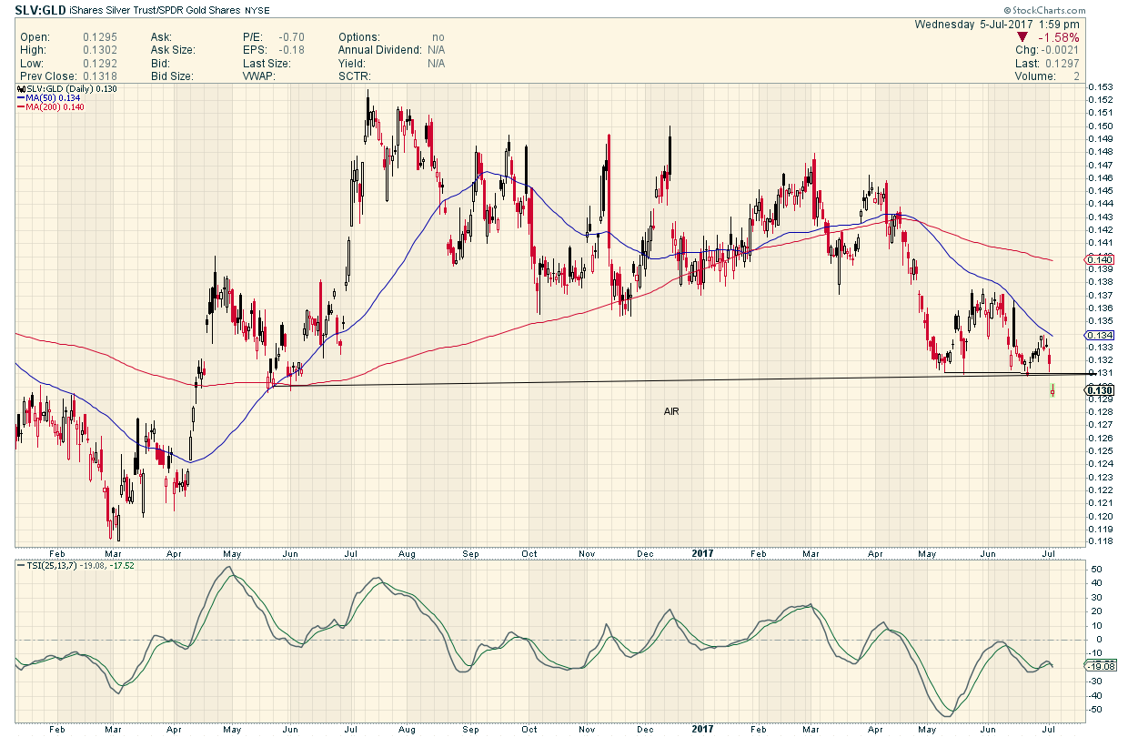
If silver leads, up or down, why not SLV:GLD ?
Then you get a likely read on sector direction.
Or We could just stand on our heads
Anyway you cut it its a breakout
see new chart
61.8% FIB from Feb 2016 high (8.386) to June 2016 low (6.589) is 7.70
Full gold, I agree on markets anticipating, but we are still far from the 2016 GSR levels. Anyhow current break out clearly shows either preference for gold as crisis metal and lack of interest in silver as inflation metal as there is hardly inflation. Depending how the next crisis will be solved by QE, rates lowering or anything else will depend the fate of silver. Anything with deflation will have its preference for gold, of course hyperinflation could still be in cards, I have no idea or clue how they will create it as money velocity is low and economic growth can only decelerate from now, but We should have an open view in mind, so on a LT basis I believe silver still has a chance to outperform, on ST certainly NOT
GSR is indicator of credit condition. When it goes up bust time and when it goes down it a boom time.
Beside metal prices going lower with GSR rising it also takes away the speculative sentiment in the mining sector.
Unless it is a FBO it is a warning for miner portfolio.
Just remember GSR during 2008 crash reached 94 briefly.
Yes you can get Gold/Silver ratio in any time period on Tradingview site.
https://www.tradingview.com/chart/ufduMUCA/
FGC I think you are going crosseyed on charts making you see GSR the way you do.