A Look At Pennant Breakouts In Gold
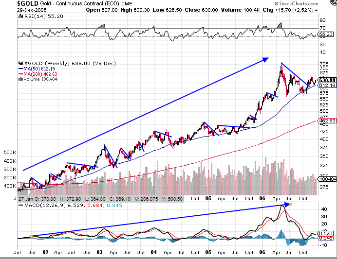
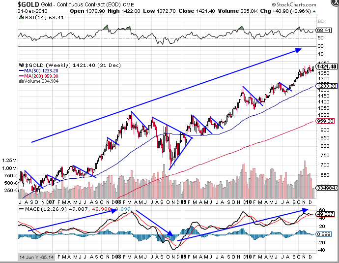
Here are a couple of charts 2001-2011 showing how, in a bull, the market rises and a pennant/bull flag forms as price retreats. I’ve just put in the top (resistance) line of the main examples. MACD is giving the clue that overall trend is up. each line breaks to the upside because all it is really doing is temporarily containing price. The momentum and energy in the market is UP. 2008 was a big worry – bullish pennant, but rapidly falling MACD etc. Worldwide monetary policy after the crash turned it around though.
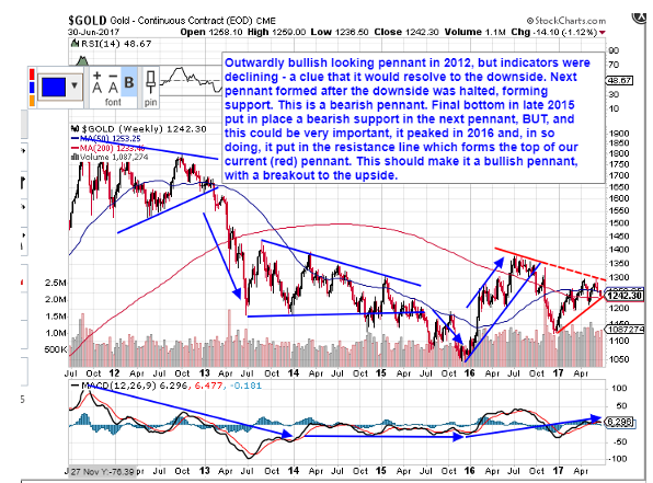
The peak in 2011 came from a pennant that looked bullish, with the upper resistance line being put in first, but MACD was declining and by late 2012/early 2013 the big money shifted to the stock markets as it became clear the Fed ‘had everyones back’. Gold plummeted. The next pennant started bearishly, with the first point of support formed before the first point of resistance, so this was destined to resolve DOWNWARDS. That formed the final late 2015 bottom and bearish first point of support for the next pennant. The following rally peaked and put in it’s (red) overhead resistance. This makes it a bearish pennant and it did indeed resolve DOWNWARDS.
Now, that same high from last year is the first point in our current pennant, with the lower support line forming later. This implies the energy of the market that is being contained is wanting to push us upwards. In other words, we’re seeing a trend change. Also, we have a slowly uptrending MACD.
Thats’s the theory. Now lets see if it works.
Edit: Missing sentence added above.
Exceptional work Northstar
Thanks…going back to re read.
Yes great work as always thanks NS.
Cheers both. One way or the other, we’re going to find out soon.