GDX V Nasdaq Patterns
Just thought I would compare the two graphs of GDX and the Nasdaq. Not the same periods, as they cannot be directly compared (the GDX started in 2006).
The GDX graph shows the large fall in 2008 I was referring to in my comments to Kens post. As you can see the patterns do not really match when you compare the top of the Nasdaq with the recent top in the GDX. The issue I think is that they start differently with the Nasdaq in a massive upward and relentless rise from a bottom in 96 ending with a parabolic rise, whereas the GDX has only just finished its first melt up from 2016. The rise in the GDX compares more to the HUI periods of 2002-2004 and so based on that we may have a lot more to come after further consolidation.
In my opinion, for any pattern to hold water it would have to be similar before the rise as well as after, not to mention that they are two entirely different markets.
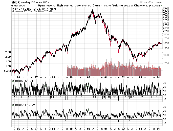
I tend to agree Odd Job. I highlighted pattern similarity between now and 2008 in gold price in a recent post – the set up is near identical. I prefer to compare within the same market because it remains subject to the same dynamics. Comparing apples with apples is fine, but once you start comparing apples with pears, there’s a lot more you need to take into account, and the comparisons may not be valid. The stock market is linked to PM’s and every other market by virtue of money flows in and out, but the fact that it has a pattern that is close to the one we are in currently with gold may not be relevant because what happens next will affect us in a different way to how it affected the Nasdaq.
Thanks Northstar. Yes apples and pears sums it up for me as well as the different periods of performance leading up to this point.
I understand your thinking too guys but KenS Pattern is really amazingly similar so far.
Certainly would be a non consensus scenario.
Compelling comparison but, different cycle; one ended and the other taking off though likely a U shape instead of V. Also the stocks of each are opposite ie tech stocks PE were into orbiting short of fuel and had to return to ‘earth’ whereas PM stocks just ‘completed’ getting lean and mean.
Very valid point Matthew.
But tech capitalization is huge…much bigger… just add up IBM, Microsoft, Google, Amazon, FB, …… IBM just like Austria’s GDP.