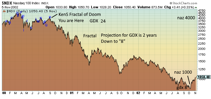
‘The Pattern.’ The Time Has Come.
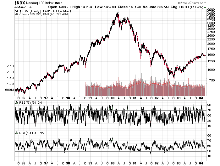
I think most people on the board have seen my posts about ‘the pattern’. A quick refresher – here is the reference pattern from the Tech bubble crash in 2000:
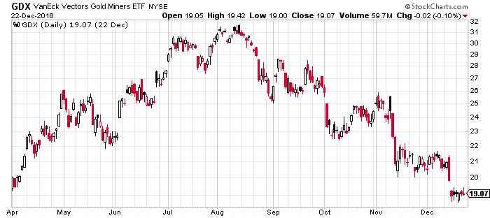
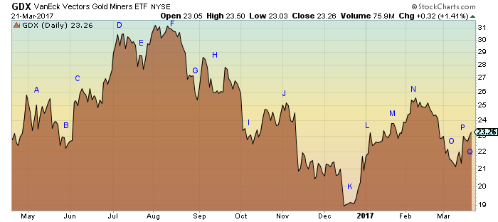
I have been showing this for some time now and how it relates to the current formation in GDX. Here is a chart from a post I did in September 2016 showing the beginning of ‘the pattern’

And here it is as I annotated it at the time:


And here is where it ended up some three months later (drop from 27 to 19):
As it turned out, it was quite a trade. However, soon after that, I realized that this pattern was a pattern within a pattern. The drop from Aug 16 – Dec 16 was the small pattern within the larger pattern. See below how the green outline identified the first small pattern that dropped over 30%.
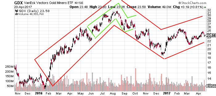
This was the baby brother of the pattern I identified shortly there after, the big brother which is outlined in red. Here is another view of ‘the pattern’ within ‘the pattern’:

Do you see it? Let me keep going. Here are some later posts that showed its progression:
(Reference Pattern)

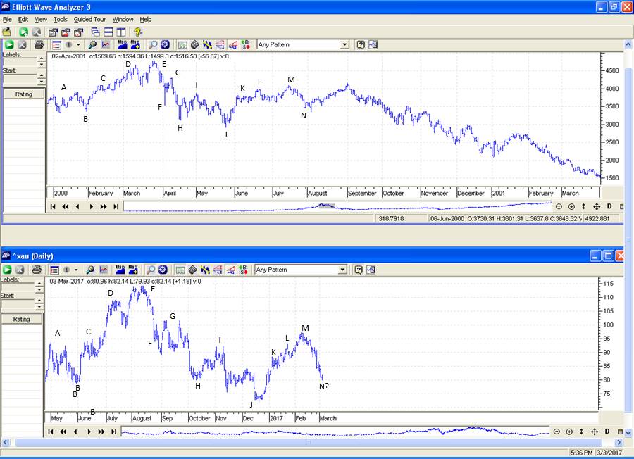
March 3, 2017
March 16, 2017
April 1, 2017
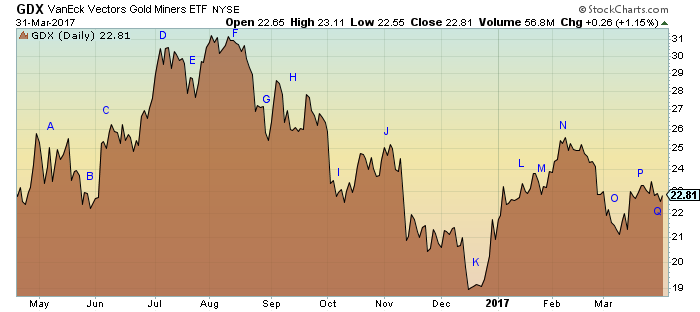
April 11, 2017

And Finally Today:
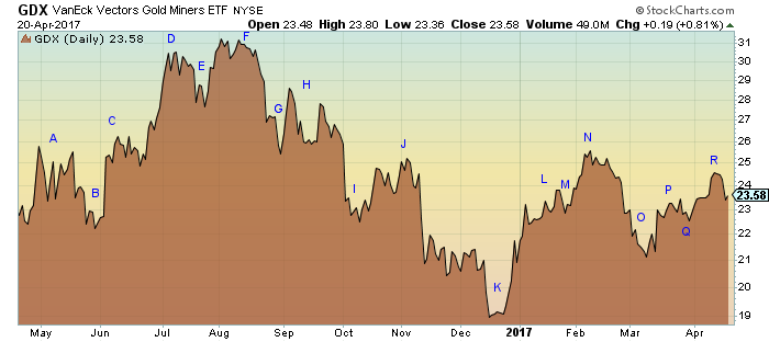
Here is the reference pattern in the same format:
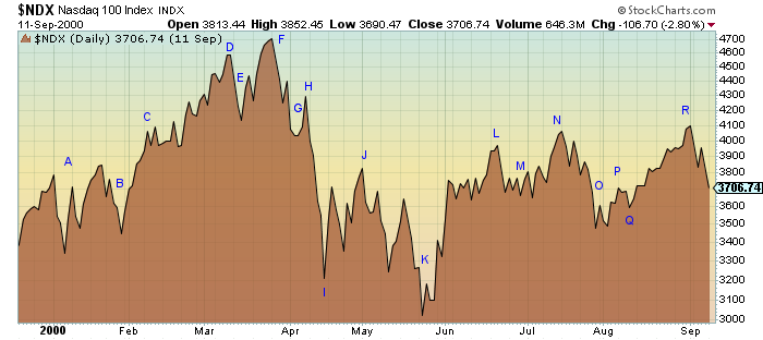
As you can see, we have hit the top of the second peak and we are headed down. How far? Here is the overall reference pattern:

You tell me how low GDX is going to go. I have patiently presented this board with the identification of the pattern and have documented its progress in real time as it followed the pattern from Nasdaq 2000 peak by peak and valley by valley. Well folks, the time has come. We are now over the edge – looking at a multi-year decline that will take us down to perhaps a third of current value of GDX. I can’t make it anymore clear. I hope this helps you all to prepare yourselves.
EDITORS UPDATE: I have annotated the Last Nazdaq (reference) chart to explain Kens thesis.
Boy oh Boy !
I hope not
I wish I had better news…
KenS…I have re read your amended post with the new charts and I must re read it again
IF this pans out this will be the pattern recognition and post of the decade. This pattern is so complex that this is difficult to absorb with one reading.
I sense your frustration with the muted respone. I admit I haven had a lot of faith in this fractal as it is really way out there to relate the GDX right now ( after it has suffered 5 years of down and just had a realtively small bounce….with the Nasdaq all time bubble burst. On the surface there should be no similarity.
Pass the Mallox
Ken can you put an X on that last reference chart to show where we are now ??
TIA
OH I see it now September of 00 ..right.
That is the precipice! I added an annotated chart for clarity of what you are saying
That area on the left side of the chart with all the letters was a very close facsimile of the
present GDX topping pattern from August 2016.Right ?
I have saved this post on the sidebar in Highlite Posts.
So Ken, you say there is a pattern, right? There might be a pattern here. First off, I have a friend/enemy in real life by the name of Ken and his last name starts with a capital S. So every I see your posts I think what a smug know what must have written it and I never read them. So I’m glad I read this one because there seems to be a pattern here.
Um, hmmm.
I don’t know about the pattern, I’m going to re-read again, but I’m mildly convinced you are on to something.
I have a small group of mining stocks I’ve held on to for a long time. I’m going to sell based on the weekly and monthly conditions of gold and silver, not bullish in my opinion. If the daily chart fails I perceive a big fall.
Thanks for posting your pattern.
The tech bull market was just the game at the time where the hot money was running to. Obviously it ran out of steam. We are in a time of revolt, banking issues, gov’t debt issues and so forth and the rise in gold thus far is smelling the turmoil ahead. Interest rates cannot stay negative forever and thus inflation returns as well. Gold will rise with the general stock market.The top in gold back in 2011 was from QE and banking crisis, and many many banks still in trouble in Europe as nothing was fixed, just prolonged. Just my opinion. Good to see so many bears lately.
I meant to write “know it all”.
The pattern seems logical, I see it.
You should name your pattern.
I could use some help with that. It really doesn’t look like anything in particular to me. Suggestions?
Fully has “Fractal of doom” out there.
Dead cat tumble.. ?
The Pattern ?
I don’t know..but we’ll all be watching it.
I agree the pattern similarities are irrefuteable thus far, however to forecast $356 gold at any time in the future (nas 100 from Your Are Here point fell 72%) is fantasy to me when I try to envision an economic scenario where US currency which used to be on a ratio of say $300:1oz given that currency has been created multiple times over since that ratio will once again revert even close to that ratio. There is a reason Gold hasn’t gone back to $35:1oz pre 70’s – it’s because of fiat and fractional reserve banking. So since we now have a $4trillion balance sheet, for $356 gold to happen the currency/metal ratio must implode. I’m not saying the path we’re on won’t eventually lead to the stone age but for $356 gold to arrive, I’m not going to be worrying about keeping my wealth, it’ll be about staying alive and conserving ammo.
Correction and I appologize Ken S, your comparison is against GDX not GOLD spot….I disavow any comments on the future of that ETF as it is really just a black box between investors and miners. As you were.
That is an amazing fractal. A GDX follow through with the NDX pattern suggests that deflation will win the inflation/deflation tug of war. Maybe Mike Maloney is right – first a deflation followed by a hyperinflation. I hope you continue to post this fascinating fractal until it either completes or fails.
Interesting? Definitely. Something to hang your hat on like you suggest by saying “looking at a multi-year decline that will take us down to perhaps a third of current value of GDX. I can’t make it anymore clear. I hope this helps you all to prepare yourselves”, absolutely not.
Very frightening interesting? Seems like gold may see an expanding flat after a likely B is done.
Got to hardcopy this post for weekend digestion.
It’s convincing thus far. If $1240 fails to hold, all bets are off. There are further support levels lower down, with a very strong one in the region of $1150 (drawn from the bear market bottom in late 2015). If that one were to fail, I would concede that anything is possible. BUT, as others have said in the comments above – just pause for a moment and think about the political and economic environment that would cause gold to fall to those sorts of levels. You would need more than massive deflation. You would need an economic implosion. If QE were to restart and interest rates drop to create more ‘easing’ we would surely be in massive economic trouble and safe havens would sky rocket. The reverse situation with rising rates and a USA becoming unable to even pay the interest on its debt would also kill the dollar and the massive economic reset would surely send money pouring into safe havens and away from the already over-valued stock market. You would somehow need to engineer a situation where there is literally no demand for gold. How could that happen ?
I agree NS.
There is no scenario going forward where gold do not rise intermediate to long term.
I’m trying not to have ‘tunnel vision’ Graddhy, and remain objective, but, like you, I just cannot comprehend how a sub-$1000 dollar scenario can arise. Even if it’s just a 1% possibility, I’ll not rule it out though. I just need to hear a convincing fundamental argument that supports that outcome.
Trouble is I have seen a few things happen that I thought was a 1% possibility beforehand. When silver was rising through the $40’s what % would you have given ever seeing a 13 handle on it ever again? When oil was $150 what % would you have given that 6 months later it had a $30 handle on it? I am a gold bull make no mistake, but to say there is no scenario where things can happen Graddhy, one day will make you broke if you persist with that view despite the scenario occurring you thought would not. I have been there and boy did it hurt.
I hear you A and I would normally also say what you say but the present situation is anything but normal or comparable to anything in the past, as I see it.
I like it but I don’t buy it. I like it as it is always good to see bearish posts showing extremes and in the same way that the posts that comment on gold going to $5000 will probably not happen, extreme bearish views like this probably will not happen.
My only concern would have been the period in July 2008 on the graph of the HUI I posted to complement Fully’s posts, which show a massive drop off a cliff following a very similar pattern to the recent movements. However, the period up to that fall, as with the Nasdaq used in this comparison was not the same. Still possible, of course! Here is a link so you see what I am referring to: https://goldtadise.com/?p=400472
By the way in 2008 GDX hit a low of 17.8.
I love the thinking out of the box whether or not the scenario plays out. I know very little about economics as far as what could make gold or gdx drop so much. My view on trading is to trade price and not try to guess what is going to effect the price in order to achieve a desired outcome. Within this pattern, there are many ups and downs so as long as one plays the price (suggesting swing trading), you can’t lose in the long run.
good play swami, definitely in and out and pay more attention this time around. cash in the till always good for a runner. If gold does drop below 1000, be the buy time. The further the drop, the higher the snap.!