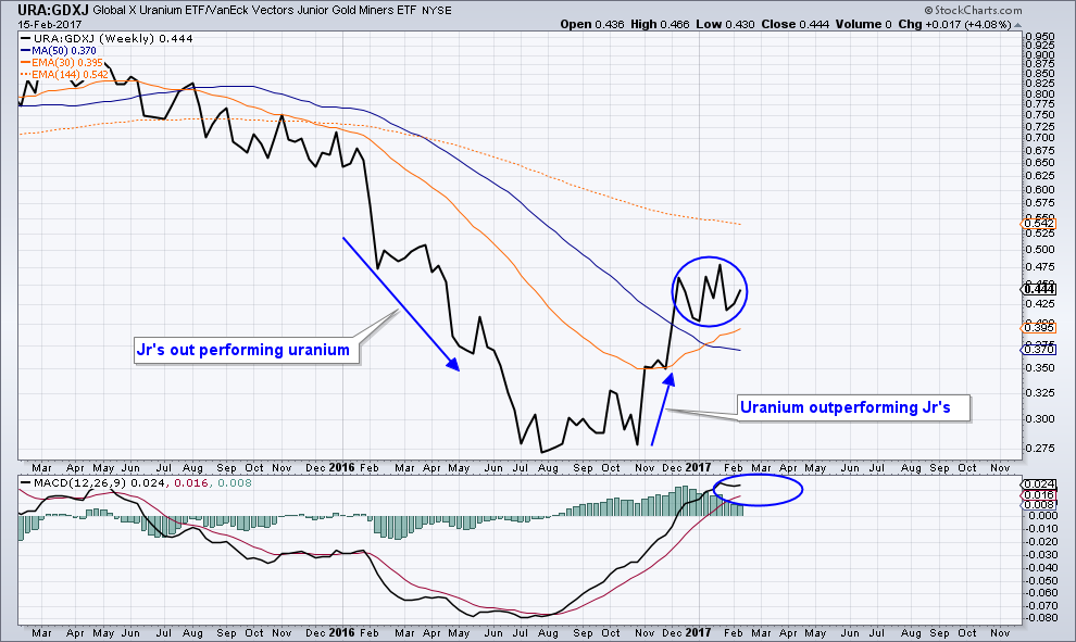
Uranium to GDXJ Ratio
After rereading Graddhy’s Nov 18th uranium post here https://goldtadise.com/?p=387708 I learned that my newly created URA uranium to GDXJ ratio chart was nothing new. I really thought I found something new. In fact, it was that very same piece that got me to start buying uranium in the first place while being unable to comprehend at that time the significance of the ratio charts he included in that very same posting. As a rookie, its very hard at times to absorb the massive amount of useful information that comes across our screens every day. With permission, I am doing a copy and past of a line from his post. “Judging from the ratio chart below showing URA vs GDX it looks like the pm miners are going to get whipped by the uranium miners in the coming months at least.”
I consider myself lucky to have acted on that post and I believe the following chart confirms such a great call on his part.
I have no idea where uranium’s heading from here however, I believe the following ratio chart or the charts in Graddy’s post linked above can offer a “possible” guide for allocation between the two sectors based on sector performance. Unless I’m missing something, I would love to see the future chart action trend horizontally offering us two different sectors to trade. Some things are worth revisiting I believe. Open to all views and perspectives.
Good Visual Optional
last year first half PM Miners were taking off
Now its Uranium
Great first (?) post Optional. Very good use of a ratio chart.
You have grasped the meaning of those charts in that post, good work.
The message of the many ratio charts in that post is one of many, many signs to me that uranium really is in a new bull market. Many have doubted me on this over the last months but I really do believe that is the case.
And just a general note here if I may, I want to repeat that anybody can of course use my material however they want as long as it stays within GT and RF.
The note I made a few days ago was only about the fact that a friend of mine saw my roadmap charts on a forum site I have never visited. Hi-jacking only the charts and using them in one´s own posts at other sites I think is not ok, especially since I myself only post at GT and RF. As long as my stuff stays within GT and RF, everything is ok. I just want to be very clear about that, I am not saying anything else.
Thanks Fully and Graddhy. Its not my first post but it might as well be 🙂
Im limited on TA experience however, until uranium shows me something like the Jr’s did in August, Im sitting. I wonder how long the well respected Rick Rule sits on the sidelines? If uranium continues its advance, will it be price, time or both that gets him to buy? Like Plunger said, when facts change, opinions are allowed to change with them. As a friend of mine just said the other day, big players sitting on the side lines like Rick has stated he is with uranium, are not going to share there new changed view until they are completely positioned. Is it possible hes loading up at this moment? Wish I knew. Its going to be interesting to see if uranium ever retest the lows and if doesn’t, at what price or place in time will Rick waive the green flag?