Apples and Oranges : Attention NFRH
Gary …Last night you posted some Ratio Charts Comparing Gold with Some Stock Indices
That is Apples ( Stock) and Oranges ( a Commodity)
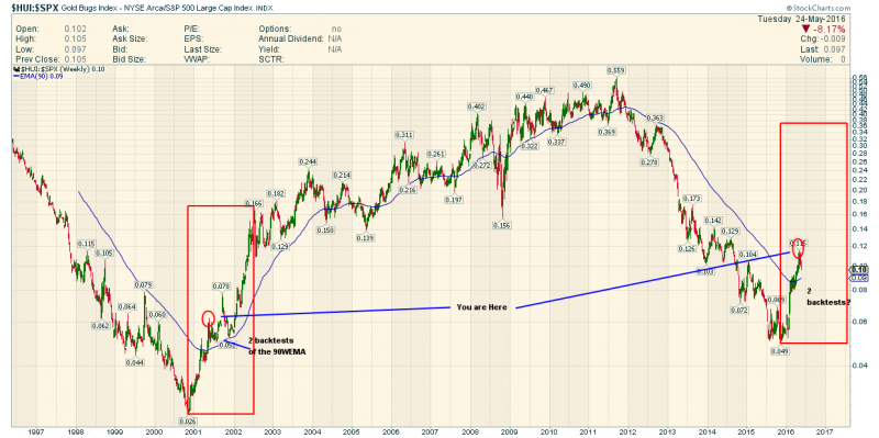
How about we look at $HUI:$SPX to see what is really happening
For Ratio Chart Lovers and Fractal Observers…this is Interesting !
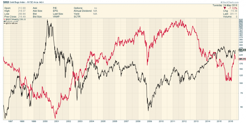
Also your assumption that IF SOX rises PMs will Fall needs a look
Answer…..sometimes yes but since 2003 they are mostly positively Co Related
Now we have Apples and Apples to consider
Thanks
Fully


Sir FGC, I would suggest volatility-adjusting ratios where you take the ratio of a volatile index with a less volatile one.
In this ratio the trend is dominated by the trend of HUI … SPX is almost irrelevant.
For example I would choose HUI / (3* SPX) to show the real ratio trend.
I assume you mean me Fully. Believe me, I keep HUI-SPX front and center and have done so for years. It has made some nice signals, I agree. But the point of the gold vs. stock markets charts is that those charts are macro funda to what makes HUI out perform SPX. Think about it, the average investor is not looking at gold stocks when all he has to do is park in the SPX and feel fat, dumb and happy. But when gold out performs and especially HUI out performs, the dynamic flips and in this relatively small market, it flips violently as we’ve just seen over the last few months.
I have been well and good with the new bull market scenario and a coming correction being simply a big buying op, but the semiconductor equipment sector’s book-2-bill just threw a spanner in the works. That is a very real, if early cyclical economic signal that should be respected. So now I am in no hurry to get more involved and am indeed, hedged on the small positioning I currently have. Disclaimer: I am always very long actual gold, and have been for 14 years.
All subject to change as we exist in a dynamic hype (global policy jawbone desperation amplified by mass media) enviro.
As for the HUI and SOX scenario, that fits exactly with what I wrote earlier about this needing to be an inflationary phase for gold to do well. The 2013 SEMI signal came amidst global deflation and Goldilocks in the US. The gold miners can rise a long way in a Greenspan style ‘inflation trade’. But at some point they will get destroyed again due to poor funda (ref. 2008).
It’s a weird thing. Miners often rise against their funda and at some point during that process you need to look elsewhere and not be gold miner intensive during an inflationary phase.
I think one can overthink these ratio charts…I am addressing Adamarla and Gary
They are what they are as is…no need to 3X the SPX on the way up and on the way down…this chart tells you which is the one to be IN (If you have to pick one)
HUI is outperforming SPX after a 5 year SPX outperformance. That’s a Full Stop .
SOX and HUI can rise together / Fall Together / and Diverge…so a Rising SOX does not preclude a rising HUI
Simple
My real point the 2001 Fractal gets no comment.
Still a man sees what he wants to see and disregards the rest….Paul Simon (The Boxer)
Just $0.02 here, but I find the 100yr index/commodity ratio chart of DOW/GOLD very useful as it compares the performance of competing asset classes – those ratio trends don’t turn on a dime but last for years, often decades.
Fully, similar to the ‘you are here’ (’01 vs ’16) chart you recently posted maybe throw in a ’77 chart of the same. Thanks.