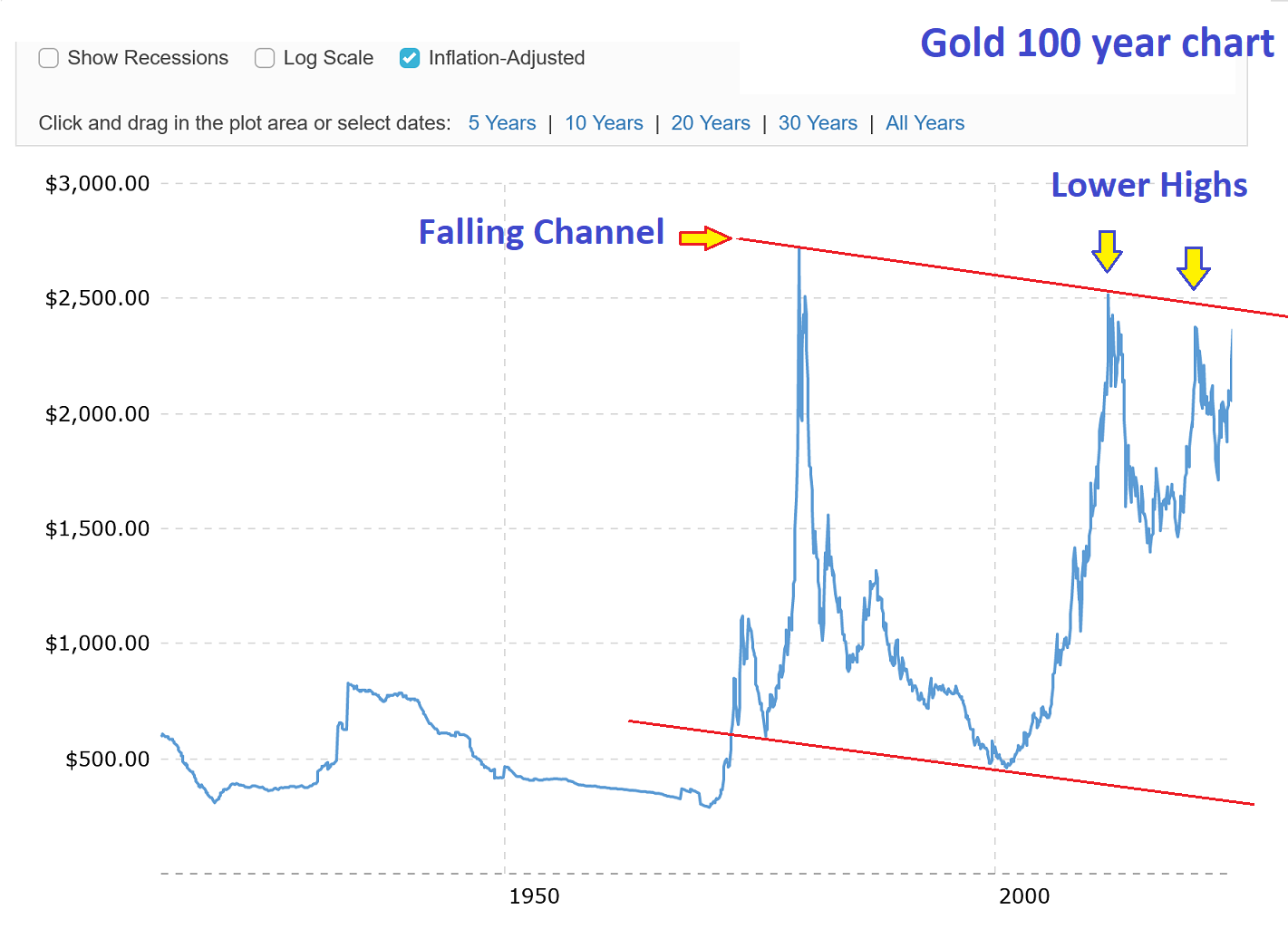
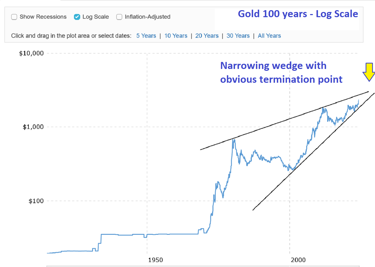
More About Gold Technicals
I will see your chart Fully and add two more to cap my point. Both are self explanatory but a few notes are added just in case. These charts come from Macrotrends and are shown on a one hundred year chart. Macrotrends offers its chart users the ability to look at the data in several ways. These include an inflation adjusted option and a logarithmic version. I have selected both options and presented charts here that I think reinforce what I am saying about gold. Namely, that gold is nearing highs from which it will soon retreat.
There is a price ceiling based on golds history. And these charts suggest where the next top will be located. Have a look. You may even come around to my point of view if you stare at these long enough. They are damning. Gold is going to have to put in a strong leap higher in order to break out of its channel and change the future. All things being equal and given that price behaves normally means gold will likely go back into a bear market in 2026.
Doesn’t it historically take three attempts before a trend line is broken??
No. There is no such technical rule.
I’m VERY skeptical of inflation adjusted data, since its official CPI based.
We know its bogus.
Better to use CB balance sheets instead or global money of some kind.
OK. Try this instead. View these charts together or in sequence. I have presented 4 today and all are telling the same story. I get that this one or that one may not be convincing, but in aggregate its harder to disagree with the obvious conclusion. Gold is closing in on a top. Exactly where it lies is not known yet. Maybe its 3200 dollars. I don’t know. What I do know is the technnicals tell me it will be a top you should sell and get the hell out.
I hear you on the big picture.
Sam using his RNE skills believes the Vth wave just got started.
And silver and the miners are lagging.
Reason enough (for me) to take YOUR concerns seriously, right there.
My points should not be taken against your conclusions, just as means to better reinforce your analysis in that direction. Maybe for fine tuning.
What does “RNE” stand for?
Ralph Nelson Elliott
easier than remembering 2 Ls and 2 Ts 🙂
>>narrowing wedge with an obvious termination point<< ??
…or a running correction halfway pattern to the upside.
Lol…I love your optimism.
Good to hear all sides. A breakout is a breakout until it isn’t. We’ll let the price action shows us the way.