Houses : Why We Feel Broke
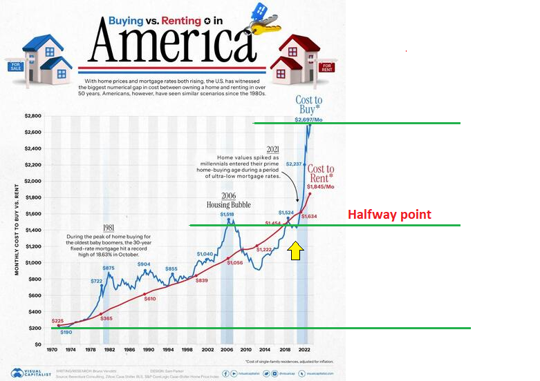
Below you will see a chart I saw over on Zerohedge today in an article titled “Visualizing The Monthly Cost Of Buying Vs Renting A House In America” which is linked below. This chart, produced by Visual Capitalist caught my eye. Its really a whopper. Don’t try analyzing it too much by numbers or dates. Instead, just try to take it in as a graphic pattern and get a feel for what is taking place in our economy with all the drama the chart clearly indicates.
I stare at charts all day long. But even I was not aware of how sharply the cost of housing has risen these past few years. The time periods we look at certainly make a difference to our perspective. In this case the chart runs from 1970 through to 2022 which makes it 52 years long. So I located the rough center and put a green line through it then also marked out the peak and low point with another set of green lines.
What you should notice is that it took almost 5 decades for price to reach the midpoint line but a mere 4 years longer to double the “cost to buy” of a family home. It staggers the mind. And the look is without any doubt parabolic and still rising. This is how real estate has eaten our economy since Covid struck. Between the cost of servicing debt and the costs of renting all that the other members of the economy hear is the sucking sounds of money rushing to fill a massive hole in a single obese asset class that now threatens to consume everything in its wake like a lingering black hole.
This is the picture of what we call an economy these days. Not manufacturing or high tech industrialization nor services and transport. No, its all about houses and the cost to live in one. That is what consumes our minds and drains our wallets as the majority of investment spirals in the darkness of the hole. It is withering as it eats away at the retail sector. It sucks the very life out of most small business too. And it leaves plenty little in leftovers for retirement savings and much needed future investment.
Can you see it now? That chart is the picture of economic damnation itself. It is shaping up to become a South Seas Bubble chart in the process. To appreciate what I mean by that, just look at the vertical line that formed during the last 4 years. Time has stood still….only price is moving higher.
We all know where this is going eventually. So you had best prepare and be ready. No asset has EVER seen this kind of a chart form without resulting in an inevitable crash. Let me repeat that for clarity. We have NEVER seen a pattern like the one you are looking at result in a soft landing or a keep rising into a permanently high plateau. Every single such chart ends in tears and gnashing of teeth. In the case of real estate such crashes typically end with deep depressions. I did some analysis on this chart incidentally, using a method I developed myself. We have not reached the top yet. Indeed we have just broken out to a higher level and there is plenty more room for prices to keep running higher.
The speculators will be thrilled.
But homeowners who have all their net worth tied to a single asset are going to get hurt very badly when it falls.
https://www.zerohedge.com/personal-finance/visualizing-monthly-cost-buying-vs-renting-house-america
Does anyone wonder what this looks like when it goes in reverse? Well over here in my neck of the woods in Africa where the economy absolutely cratered following Covid and unemployment rates exploded, my rent has dropped from 750 dollars to 400 since 2019. Thats a 47 percent reduction in prices because so many local renters abandoned their homes as the contraction got underway and they moved back in with family or returned to their villages in the country. Home prices have curiously remained sticky and refused to drop with the same intensity. But this feels like a depression as so many are struggling to make ends meet and my neighborhood is very quiet compared to before. Lots of empty homes, lots of empty parking spaces. That is the picture of how high prices eventually meet the market. The bottom drops out when demand goes limp.
Farmer, I agree that we are in for a RE drop. I believe we are already coming off the plateau and possibly a 20% drop from the lofty top of Feb 2022. Apartments are difficult to find in YVR. The surge in immigration takes up any slack in rentals.
As to SFHs, the influx of high net worth Immigrants have kept the mkt buoyant in most of Canada’s large metro areas. A different story as you move out of the commuting range of those cities. Prices are more affordable but jobs may not be. A mixed bag.
A mortgage broker informed me that many locked in their 2% rate for 2 to 3 years. A bit higher for 5 years. Just before the rate hikes. It appears that these renewals at 7% could shake many out of homeownership as in a distressed sale. Unless rates drop substantially, we could see the beginning of the increase in listings and a further price cut next year.
The other variable is the propensity of three generations of immigrants to live in the house, all earning a wage. Also, many properties in your former hometown have basement apts with a Laneway house as well. More recent zoning intensification. Many do not need to own a car so more goes toward rent or home ownership.
Bottom line, the prices will drop but if immigration continues at this torrid pace, there will be support at some level higher than we may expect.
Vancouver is one of the worlds 96 C40 cities. Prices in those locations could seriously escalate for many more years since the plan is large scale resettlement of populations into key regional centers. So there will be exceptions to the rule depending on where you live. For example, in Saudi Arabia they are building a brand new 500 billion dollar super city called Neom that is 170 kilometers long and vertically integrated. Everyone will live there eventually. Well, everyone who is part of the NWO anyway.
What does that say about the old cities and villages?
Basically they are all going to crash and become unsalable. The same may well take place in British Columbia where the rural regions which are now incinerating by fire cease to be viable places to live and the majority are forced to migrate to Vancouver. This is not some pie in the sky theory. The C40 city concept sees the majority of the worlds populations living in a mega metropolis by 2040 and the things that need to be done to make that happen are taking place right in front of our eyes. I would not sell a Vancouver home as a result. But the Kootenays looks doomed as does Kelowna and the Islands.
I get that nobody wants to comment on this. It sounds crazy. And yet its happening anyway. How do you think they are going to convince millions of us to leave our rural small towns? Same as always I suspect. They will crash the economy to force the change. Even Martin Armstrong cannot see it. Socrates is not capable of looking into the future and seeing Black Swans or deliberate economic savaging. Its because Socrates is a program that very cleverly uses past history and geometry to predict the future. But it does a terrible job of reading chart inversions which is why it has not made so many notable forecasts as it once did. Hell, the Fed uses its own version of Socrates using the exact same algorithms. I know that because I know how the model works in detail. I discovered it independently some years ago. Goldman uses it too. Marty sold it to them (or rather, they strong-armed him into giving it up in order to be released from prison). JP Morgan uses it as well. So does Nomura in Japan. For some odd reason Deutche Bank and Citi seem to have never figured it out.
In the old way of thinking a home purchaser should pay between two and four times his annual wages on a house.
The rules have gone out the window. Even the metrics that follow inflation have been violated. We need to look into the future now and imagine what the reversal will look like. Vertical price spikes don’t settle back gently. Speculation has absolutely run out of control at this stage and while there is a lot of money to be made for flippers over the next period there is also a harsh reckoning that is inevitable. I fear it will bankrupt us. The housing market is just so big and all encompassing it means nobody will escape when the air hisses out of this inflated gas bag. Like the Hindenberg going down, all hands on deck will feel the burning.
In early 1980, the median sales price of an existing home in the U.S. was $64,000. At the same time, a troy ounce of gold was selling for roughly $800. Also, 30-year mortgage rates were north of 13%.
So, at that moment in time, the median home price in the U.S. was the equivalent of 80 ounces of gold.
In Q4 of 2022, the median sales price for an existing home in the U.S. topped out at $479,500, while a troy ounce of gold was priced at around $1725 +/- $100.
The peak median U.S. home price of $479,500 in Q4 was the equivalent of 278 troy ounces of gold.
Even though home prices have started to decline since Q4 of 2022, 30-year mortgage rates have risen sharply this year. That has driven monthly payments through the roof.
On top of that, property taxes and property insurance premiums have been rising sharply in some areas.
This may be a good time to sell you home and purchase gold with some of the proceeds.
Excellent point Homer. Have you got a handy chart of home prices expressed in ounces of gold that is current to 2023? Can you post for us? Your observation is timely. Note that home price payments are expected to rise substantially from here according to my charting. Its not the same as home prices of course. But we should assume if costs keep escalating that real estate is still in a general uptrend.
Sorry, I don’t have a handy chart to share with you. But I do recall seeing these charts on ‘Gold Charts R Us’ and ‘J M Bullion’ web sites.
Depending on your source of data for the U.S. median home sales price, you will get somewhat different results.
When I looked into this some years ago, the government statistics for median home sales prices going back to 1940 are lower than the Case-Schiller numbers. I don’t have an explanation for that.
In terms of gold ounces, the lowest U.S. home prices were at the end of the Great Depression (around 1940). Based on the government data, prices bottomed at around 70 gold ounces back then.
Also, the gold price in January 1980 was very volatile. The gold price rose from $560 to $850 in early January and then quickly fell into the $600 range by the end of January.
So, depending on what gold price you use for January 1980, you will get a wide range of results.
For the coming Greater Depression, I expect that home prices will fall out of bed while the price of gold rises. We could see U.S. homes selling for the equivalent of 70 troy ounces of gold.
For certain Homer. Home prices will fall out of bed badly depending on where you live. I have concluded we are living in a kind of modern land rush. You are either in or out depending on how you read the future. The C40 cities will become the most expensive and desireable on the planet and most others will whither in shades as time passes with most eventaully dropping to zero. So its going to be a bifurcated market divided between the haves and the have-nots. Some people will try to survive in the outer regions and may fare ok over time. But once the decision is made not to keep up roads to rural outposts, nor to plow or maintain bridges and all the miscellaneous services that we see as basic human needs, those cities could end up dying a slow cruel death. And then there is the key aspect of power. If authorities decide to end the transmission of power to a city like Kimberly or Rossland for example then the end will have arrived. The population will be forced to move or face their own demise. Its so crazy I can barely imagine it but just look at what is happening and try to come to a different conclusion.
If they close the cities in rural BC or other states and provinces, how will the C40 cities obtain their building materials? All of these pipe dreams will wither on the vine as Net-Zero dies. Coal extraction is still a huge industry in BC to feed China and points all over the world. Same goes for forestry. We grow a lot of food outside the Lower Mainland. We are self-sufficent. The Okanagan feeds the much of the Canadian West with fruit.
It’s more likely that we cleave the Lower Mainland off from BC and the BC interior joins AB, SASK and possibly MB in forming a regional block. Complex systems eventually fail. That describes YVR and the growing breakdown in society as evidenced by the growing army of the homeless.
Yes, a bifurcation seems possible and likely. As for me, I’m staying clear of those C40 cities. I don’t even like to visit small cities.
One explanation for the differences in U.S. home sales price data might be that the Case Schiller Index is adjusted for inflation while the raw government price data is not.
To be precise, the raw government data (not adjusted for inflation) should be used to determine the median home sales price in terms of gold ounces, using the
gold price at that particular point in time.
Chart of median U.S. home sales price going back to 1965 (source: U.S. Census Bureau)
https://fred.stlouisfed.org/series/MSPUS
I wish I knew Columbia. It does not need to be rationale though from our perspective. All we need to know is that the agenda has decided most rural regions will be depopulated. It is written down in black and white and has been mapped out for the US. You may have seen the maps. In the case of Noem in Saudi Arabia, the project has already begun and is reported to be 20% complete.
https://www.designboom.com/architecture/neom-construction-short-film-the-line-02-06-2023/
Let me reiterate, real estate outside of the Neom project will fall to nearly zero as most Saudi citizens are relocated to the new city by 2030. In practical terms it will likely be that the old cities will not be permitted any expansion, some will be condemned and many will simply be illegal to move too. This is so serious it cannot be understated and shows the level of intent to change how the people of that country live and work in the future.
The same thing is coming to Canada. This is why petrol and gas will be outlawed eventually and internal combustion engines banned. By policy changes it will simply be impossible to live and work in many regions of the country in the future. There are no C40 cities on the prairies at all. Zero. So where will all those people be moving too? What work will they do if the buyers do not buy and shippers do not ship? I don’t think anyone is appreciating the gravity of these monumental changes because they look around and everything stil looks pretty much like it did yesterday. But under the surface the plans are being implemented to concentrate all populations across the globe into mega-cities and that is happening in stages while we are all distracted by Covid shots and LGBT conflicts.
We need to get our minds back on the business of what is REALLY happening in front of our faces and start to see this reoprganization of the human race for what it really is. This is a repeat and rhyme of the 1930’s (incredibly) with a massive shift of people from country to city but this time there will not be jobs waiting. That is why they will offer guaranteed incomes to satiate people until the population numbers come in line with the goals set out.
I hear what you are saying Farmer, however the author of this chart unfortunately chose to use an arithmetic chart instead of a logarithmic chart. This makes the larger numbers appear to be much more dramatic. For example, (using your chart and my uncalibrated eyeball) it appears that the cost to buy a home in the period from 1978-1981 went from about $300 to $722. This is about a 140% increase. From 1978-1982 it was a 192% increase. Recently, from about 2021 to 2023 it went from $1400 to $2700. This is about a 93% increase. 1978-1981 looks much less painful because of the arithmetic chart. My point is, yes we will have a housing correction, but take heart, it is not out of scope with the corrections we have had in the past. It just looks worse on this chart.
I don’t know if its unfortunate. Personally I would prefer a linear chart like this as it shows what is taking place in a visual format that stays truthful to the numbers whereas log charts tend to squash the upper ranges which deceives the eye. What we are looking at here is the raw numbers inflation adjusted over a 52 year period and it is truly just as dramatic as it looks. Crushing down the vertical move of the past four years would lead a viewer astray and minimize the intensity of the chart action.
My point is still valid though. Percentage wise, this is still a normal event.
Hahahaha…..no it is NOT!
Good discussion Guys
I came late
You all have made valid points
KenS …I do agree that a Log Chart which shows % moves give a different perspective .
A Point I will make is…I live in a rural area near a small town of 25 K which is an Hour north of Toronto
My Dental office is half an hour further north
All the small towns up here which were 5 k to 25 k in size for decades are now experience EXPONENTIAL growth
For years the Enviormentalists protected the “Green” Zones …BUT with this Imigrant made Housing Shortage…all that is out the window
Farmer..There is NO room in Toronto which as you know is a Spawling metropolis to put everyone in Ontario in
SO These Small Towns are becoming larger towns and the rural areas which outlie them are still going to be viable for the forseeable future IMO.
AND folks who love living in more remote areas are of the Original Pioneer spirit…They will NOT comply
They will find ways to thrive with LOCAL economies…in 2040 I’ll be 90..and thats where you will find me and my ass
🙂
However your point is well taken..Your chart shows clearly a HUGE Bubble Forming and we all know how Parabolic Charts end
Oh sure, no room at the Inn. I have been hearing that about the big Tee-Oh. But they also have a massive stock of unoccupied homes sitting empty. Tens of thousands of them. Some say its more than 7% of the city that is just pure inventory being held by wealthy elites and landlords. Honestly I do not know how any of this will work out but the WEF plan is available to read online and its pretty clear about the program. I did not write it. They did. And the plan is mega-cities not so different than Noem with small spaces that are sometimes shared. Like a couple hundred square feet each. Nobody believes it. They say it will never happen…..but I am not so sure.