The Financial System Reset is Scheduled for the Spring of 2030
Will the financial system really collapse as so many people fear? I have asked myself that question many times recently as the shrieking sirens of doom and gloom have nearly reached a crescendo in the alternative media and calls to buy precious metals are so numerous and insistent we might imagine gold is literally garlic against blood sucking Vampires.
There is a technical case to be made however. And it validates the theory of an inevitable collapse. The thing is that after a review I have concluded its suggestive of something deeper and more profound that even the biggest worriers are expressing. The worriers may not therefore be the lunatic fringe this time around. It appears they will be correct but are just a little early with the call. You can be the judge of that yourself though. What I will try to do is present the evidence of how our future is already encoded into the charts and in the process attempt to shed some new light on the timing of the great reckoning.
This post will run a little longer than usual. First off I need to set out the basis for the conversation to get this into focus. So without delay let me just get to the nuts of the charts. Some years back, a well known fellow technician by the name of Tom McLellan made an unusual discovery. He found a way to forecast equity markets like the DOW and S&P by using the price of crude oil ten years prior. He published a couple articles to back up his claim, one of which I will link here to get you up to speed. In them he noted this was a type of analog indicator that has been working reliably for past 100 years and he produced a chart showing the overlay of crude oil prices versus the S&P with a roughly ten year lag.
Here is a link to one of Tom’s articles on the subject: https://stockcharts.com/articles/tac/2019/08/tom-mcclellan-crude-oils-10yea-701.html
The quick conclusion of this concept is that if you know what oil prices did ten years back you will have a very good idea of what stock markets will be doing today, give or take a few months. So with that information in hand lets start with our first chart which is the Price per barrel of Crude Oil for the years of 1900 to 1945. You will note immediately that crude oil peaked in 1920 almost exactly ten years before the DOW peaked in the fall of 1929. What followed of course was the great crash of 29. Just note the peaks are separated by 10 years. That’s what this analog is all about.

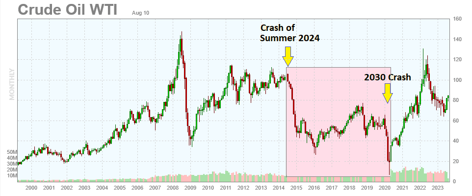
So this is some of the clear evidence of Tom’s premise that a 10 year lag exists and it is unquestionably interesting from a technical perspective. Those of you who follow oil closely will immediately notice that what happened in 2020 (a hundred years forward from the crude oil crash of 1920) is that we saw WTI Crude futures literally drop below zero during April that year. It is the inversion of the 1920 event which saw a sharp peak as shown in my chart. So the suggestion is that ten years from now in 2030 we will see an explosive move higher in stock markets and hurrah everything is fine and the world is saved.
But not so fast. The key point is that oil prices dropped below zero!
That is the reset in my view. Its literally the month and year when the reset takes place. That 2020 event was the formal trigger that told us when to expect an end to the current financial system and the start of the new ten years later. As you will recall, April 2020 was about when the Corona lockdowns got underway worldwide. Is it possible that Wall Street technicians who are knowledgeable with charts deliberately crashed oil below zero as a time marker for the beginning of a new Bull in 2030? This is where the story gets conspiratorial. I will do my best not to get into the weeds of it much but you draw your own conclusions. How in hell did oil fall below zero and on which planet was that even possible without artificial interventions?
Anyway, what we really need to focus on with equities is the key period of time between now and then which will be the mirror opposite of the Roaring 20’s. So lets stick with the current period and try to avoid the impending market pitfalls while leaving the wild speculations to others.
And that period is starting very soon indeed as you will note from my next chart which suggests a market crash beginning sometime around June/July 2024 and running for six years through to 2030. Keep in mind you are looking at a chart of historical Crude Oil prices and they are the forecast analog for what stock markets will do 10 years later. Hopefully my drawing is clear enough on this point. This crash horror will be starting before the November Presidential Elections in other words and if my thesis holds water it means you have as little as 9 month to prepare before the equity wipeout gets underway.
I am calling the impending crashes The Goring 20’s since they will pretty much destroy most accumulated wealth before they have done their work. Goring 20’s rhymes with Roaring 20’s for reference except the connotations are obviously negative. Our period of the 2020’s will be the inverse of what people experienced during the 1920’s as we see the wealth effect run in reverse for many years before possibly concluding with a complete closure of most markets and the destruction of almost all equity value. Yes, stocks can drop to zero too. Just ask the people over at WeWork! Anyway, Blackrock knows all this. That’s why killing stock values here and there does not matter anymore. All of it will be wrecked in the next few years anyway. They can make hay with their agenda while the clock ticks off on the coming meltdown.
By the time its all ended, most pension plans will have been wiped out to zero. No I am not kidding.
The good news of course is that should you survive to the other side then you will benefit from an incredible equity market boom as 2030 starts with an explosive move higher. The trick will be to stay solvent until then and not be wiped out like everyone you know.
The end of the period of Financialization should be traumatic for most. No less so than what people felt back in the 1930’s when America entered its Great Depression and the financial system was reset when the credit system corrected and bond markets melted down. What triggers the crash this time is not known to me. All I can say is its on the charts and there is a high probability this is the real deal. The indicator has been working for 100 years already. Why would it stop working now? So be guarded for anything really but above all keep the dates in mind since this is a timing event. Perhaps China’s debt troubles will be the thing that takes us all down, perhaps it will be election meddling or the war in Ukraine or even an attack on Taiwan. We don’t know.
The chart says we are going to start crashing though. And keep crashing for six long years!
————————————- ADDENDUM —————————————————-
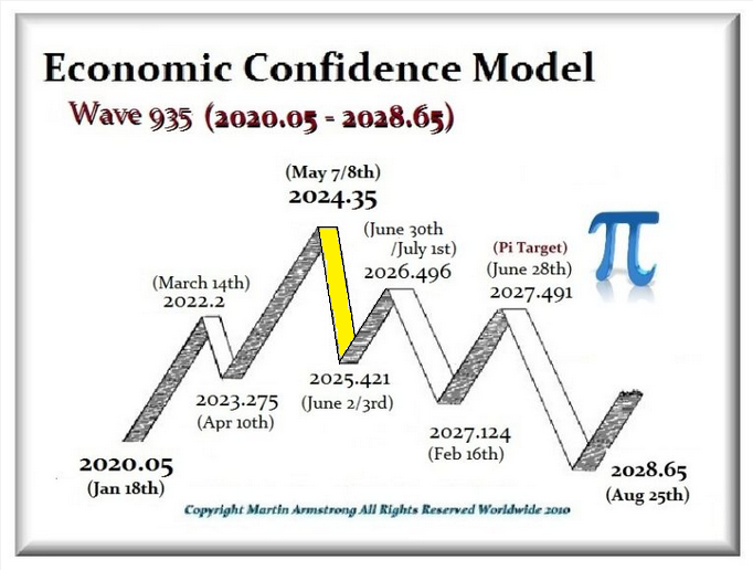
For those who follow Martin Armstrong you may find the following chart interesting. He is showing that the Economic Confidence Model will turn down from a key date of May 7th or 8th of 2024 which is just a month earlier than my own chart model suggests. There is synchronicity between them perhaps. When date targets of similar style merge together and reinforce one another it lends credence to both. I cannot read the future however. Martin does the best job of that. So I am adding his chart to flavour my post with a little extra sauce. lol
Love the thesis FARMER!
I like to add that as for markets your scenario could indeed come to fruition as for next 9 months where commodities and PM declines/crash-HARD next 12 months (which includes possible market elevation into 2024-Q1). After 2024-Q1 the market H O R ROR. So yes, all declines in sympathy into LOWs where PM (at least PHYZ) cycle turns-UP as from 2024-Q4 (possibly 2025).
YES EVERYTHING IS GOING TO BE WIPED OUT!
Agree Nightingale. It does look that way to me and its quite depressing when you can see it so starkly right on the chart. Even I am not sure which way to turn just yet but I realize equities will not save us. For that matter, housing prices almost always drop sympathetically with stock markets so we can probably expect the housing bubble to burst along with stocks and debt markets. That leaves us with the dollar, precious metals and industrial materials. Maybe the dollar haters are getting ahead of themselves. We must always keep in mind that not everything falls together. Its not even possible. Money always flees somewhere. But where will it go? That is the question we need to start answering for ourselves and answering in a big hurrey. Time is short.
I agree with ‘That leaves us with the dollar, precious metals and industrial materials.’.
I doubt RE as … well how many people will be left #1 in need for a home and #2 have funds (left) to buy. And further more … ‘they’ can use RE-tax hikes, making you not able to pay resulting in risking ‘them’ to confiscate. You will have to take the concept ‘you onw nothing’ very seriously in many ways. Many think the pan demi c just ended and life start anew but the SH*T has not even (yet) hit the Fan.
As readers are aware of my USD-thesis … USD goes ballistic into oblivion with an PO @ 30 while now @ 103: see my former post on me on USD’:
https://goldtadise.com/?p=557134
In that post I already made the statement: ‘This will make all other fiat go ZERO, makes Nations default and Enterprises bankrupt while People became poor & broke.’
Just think about all nations borrowed in USD over the last 1-2 decades and such debt will need to be serviced until it can’t.
Remember: it is a marathon, not a sprint! Your endurance will prevail. It ain’t easy with many handicaps (being created).
Remain faithful to your SOUL guiding you. Be fearless (do not give in), Be centered, think in solutions & think/plan ahead. Never surrender!
correction:
USD goes ballistic into oblivion with an PO @ 30
=
USD goes ballistic into oblivion with an PO @ 380
You are so right my friend. What is coming is a deadly economic pincer that will crush debtors. Same as it always does. There was a time prior to the Federal Reserves creation when depressions and deflationary periods came with regularity. Business could plan for the down times knowing the signs as they arrived. But in the 100 years since the fed started tinkering that old business cycle has been stood on its ear and we are now in a place where assets have moved into parabolic price trajectories meaning that when this all comes down it can only result in a very serious period of debt default, price collapses and a long depression. In other words, the old rules of the game are still with us but we will pay a harder price than ever since the rubber band has stretched so much further than it ever should have. The wealth evaporator is almost upon us. God help the blind and those who willfully have ignored the signs all along.
“Some years back, a well known fellow technician by the name of Tom McLellan made an unusual discovery. He found a way to forecast equity markets like the DOW and S&P by using the price of crude oil ten years prior.”
Tom wasn’t the first. Some other guy drew this connection many decades ago. You can still find graphics on the web. I suspect Plunger will know the name. (I can’t remember it.) The entire CRB crashed during 1920-21 (especially ag), due to the post war capacity to demand mismatches.
His name was Roger Babson
https://molivam42.wordpress.com/2015/03/01/roger-babson-the-eccentric-who-invented-economic-forecasting/
HA…Roger Babson !!!
I have a very strange Roger Babson Story
about a 15 years ago or more a Goldtent Lurker sent me an appreciative email thanking me for the Website which back then was ALL about Precious Metals TA ….and was populated by Major League Hard Core GoldBugs and Rednecks 🙂
The only present poster left from the group (all of whom “migrated ” to another site ) is Silverboom
Anyhow this Lurker asked for my physical address…and then forwarded an interesting out of print financial book he / she had bought in a used book store ( from the 50s or so)
I forget the name of the book BUT
The Book Mark I found therein was something incredible
It was a calling card
It said “With the Compliments of Roger Babson ”
I looked him up and he was some kind of guy…check him out !
I still have the card here…somewhere….I used to carry t with me in my wallet….gotta find it !!!
Sweet story Fully. You are a blessed man. You obviously came to his attention (and ours too). Congratulations!
Thanks pedro_deleon. I have not seen that chart for years but was certainly aware of it.
Great Post Sir Farmer !
Must keep an eye for this scenario
Goring 20s ? LOL
One thing for sure it’s NOT the Boring 20s
Just before his big championship fight with Evander Holyfield, Mike Tyson famously stated “Everybody has a plan until they get punched in the mouth” which was his response to the constant question posed to him of “what will you do” if such and such happens during the fight. This is a case of that. There is so much speculation about the future yet so many unknowns. We all have our plan B yet we truly have no idea if we will even be able to execute it should circumstances change unexpectedly.
My chart is a forecast for the future that even surprised me once it was drawn. Suddenly I felt I had a better handle on what would be coming next. And what this chart is saying is that we face a serious deflation of asset values over quite an extended period of time. I know what my old plan was. But its goig to have to be altered now to suit the new information. Previously I had thought I might store up food, medications and other goods to ride out a year or at most two years of trouble. Clearly that will not suffice.
The chart warns us the economy will just keep grinding lower for many years in a row and most people will run out of money before the smoke eventually clears. Preparations need to take into account an ability to sustain ourselves for much longer than I might initially have anticipated. Cash will come into serious shortage as asset values deflate and credit dries up. Nothing will sell easily in that environment. This is challenging beyond belief if you don’t have sufficient cash reserves.
Towards the end of the 6 year period there will be precious little remaining of most private pension funds. They will mostly be broke and will be gated or stop paying monthly cheques altogether. Redemptions will be impossible. Imagine the crying and gnashing of teeth in those days. Around that time the government will likely step forward with a plan to provide incomes in exchange for your property. Most people will take it. There may also be conditions attached such as vaccinations or biodata collection. Mark of the Beast time.
As the economy unwinds jobs will vanish and unemployment rise. We are heading into a depression in fact as GDP contracts month after month and consumption numbers spiral lower. There is no other way to interpret the chart I have drawn. We are looking at a secular bear market in fact and a long one at that. So our plans made today may be meaningless in spite of our best efforts since the economic contraction looks to be so large and long running that only the most fortified households will withstand it and remain solvent. I can not repeat often enough that we must be out of debt before the time arrives as it will become impossible to exit large debt obligations once the downturn becomes public knowledge.
There is not much to add except to say inflation will not be the real worry anymore. Keeping warm, properly clothed and fed during a serious deflation will take center stage. By my best estimate we have 9 to 10 months advance notice should the analog be close to accurate. I would use that time wisely now as our freedom to take effective action will become restricted as the economic slowdown becomes more obvious and starts taking a personal toll on our lives.