NEW STUDY SHOWS CLEARLY THE MORE VAXXED THE MORE COVID
JC
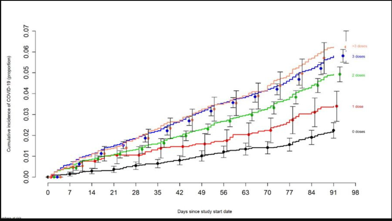
Take a close look at the researcher’s chart, below. The Y-axis is the proportionate risk, based on the number of times people caught covid, and how often. The x-axis is the number of days from their first dose. The colored lines represent the number of doses received.
HA !
The Cleveland Clinic researchers mused about the unvaccinated and unboosted, which — amazingly — included almost HALF of the healthcare workers in the study. The researchers figured unvaccinated and low-vaccinated people were the ones most likely to NOT wear masks, isolate, or otherwise mitigate their risks but, despite being covid “risk takers,” they were STILL catching covid less often than their boosted co-workers
more in the comment section
A new Cleveland Clinic pre-print study posted Monday, titled “Effectiveness of the Coronavirus Disease 2019 (COVID-19) Bivalent Vaccine.” Let me spoil it for you: They found the bivalent vaccine was NOT very effective. But guess what else they found?
The study observed over 50,000 Cleveland Clinic employees from the beginning of the pandemic. Let’s start with how the study ended, with this amazing concession of scientific ambiguity:
We still have a lot to learn about protection from COVID-19 vaccination, and in addition to a vaccine’s effectiveness it is important to examine whether multiple vaccine doses given over time may not be having the beneficial effect that is generally assumed.
Still have a lot to learn, eh? And here I thought the “science was settled.” Shows what I know, I’m just a lawyer. But why’d the Cleveland Clinic researchers admit that ambiguity? Because of the study’s most important finding:
Risk of COVID-19 increased with time since the most recent prior COVID-19 episode and with the number of vaccine doses previously received.
Holy jab juice, Batman. In other words, the more jabs, the more and faster the covid infections. The researchers weren’t prepared for that finding, or for the fact that the increased risk of catching covid was seen, not in decrepit, nearly-dead old people in care homes, but in young, healthy healthcare workers without co-morbidities:
The association of increased risk of COVID-19 with higher numbers of prior vaccine doses in our study, was unexpected. A simplistic explanation might be that those who received more doses were more likely to be individuals at higher risk of COVID-19. A small proportion of individuals may have fit this description. However, the majority of subjects in this study were generally young individuals and all were eligible to have received at least 3 doses of vaccine by the study start date[.]
……………………
Over a 90-day period, participants with three or more doses faced a risk of catching covid up to SIX TIMES higher than the baseline. Six times higher, over just the first 90 days! But drop down to the zero doses line — the “unvaccinated” — and discover those lucky souls enjoyed the LOWEST risk of infection.
Weird. Seems backwards somehow.
Remarkably, every single dose of the “vaccine” proportionately INCREASED the risk of infections. That strongly suggests some kind of correlation. And it’s not how traditional vaccines work, not at all.
The Cleveland Clinic researchers mused about the unvaccinated and unboosted, which — amazingly — included almost HALF of the healthcare workers in the study. The researchers figured unvaccinated and low-vaccinated people were the ones most likely to NOT wear masks, isolate, or otherwise mitigate their risks but, despite being covid “risk takers,” they were STILL catching covid less often than their boosted co-workers:
[T]hose who received fewer than 3 doses (>45% of individuals in the study) were not those ineligible to receive the vaccine, but those who chose not to follow the CDC’s recommendations on remaining updated with COVID-19 vaccination, and one could reasonably expect these individuals to have been more likely to have exhibited higher risk-taking behavior.
Despite this, their risk of acquiring COVID-19 was lower than those who received a larger number of prior vaccine doses. This is not the only study to find a possible association with more prior vaccine doses and higher risk of COVID-19. A large study found that those who had an Omicron variant infection after previously receiving three doses of vaccine had a higher risk of reinfection than those who had an Omicron variant infection after previously receiving two doses of vaccine.
Another study found that receipt of two or three doses of a mRNA vaccine following prior COVID-19 was associated with a higher risk of reinfection than receipt of a single dose. We still have a lot to learn about protection from COVID-19 vaccination, and in addition to a vaccine’s effectiveness it is important to examine whether multiple vaccine doses given over time may not be having the beneficial effect that is generally assumed.
Alert commenters noted that, during animal trials for earlier failed coronavirus vaccines, the poor mice’s immune systems were completely destroyed. A strange coincidence. It makes you wonder. What do they call doing the same thing over and over again and expecting a different result? It’s called … what’s the word … I can’t think of it right now. But it’s not good.
Pfizer didn’t conduct any animal trials this time, unless you count those eight mice, now deceased.
The study’s authors worked diligently to find SOME effectiveness of the new bivalent vaccine — which is critical for getting past journal editors — and managed to scrape up a “modest” 30% effectiveness rate. Thirty percent. Back in the day, two years ago, vaccines with less than 50% effectiveness could not get FDA approval.
But, times change, especially when you’re moving at the speed of science.
The graph really highlights the story!
Sure does…a Clear Bull market 🙂
“Safe and Effective”