Back to Gold: Opinions Requested
The ratio chart of Gold to the S & P 500 is NOT acting well. For me this is a cause for real concern so I took about 1/3rd of my metal holdings to CA$H on January 25th.
This ratio chart illustrates my concern. (It has a 46-Month Simple Moving Average that correlates very closely with the 200-Week SMA.)
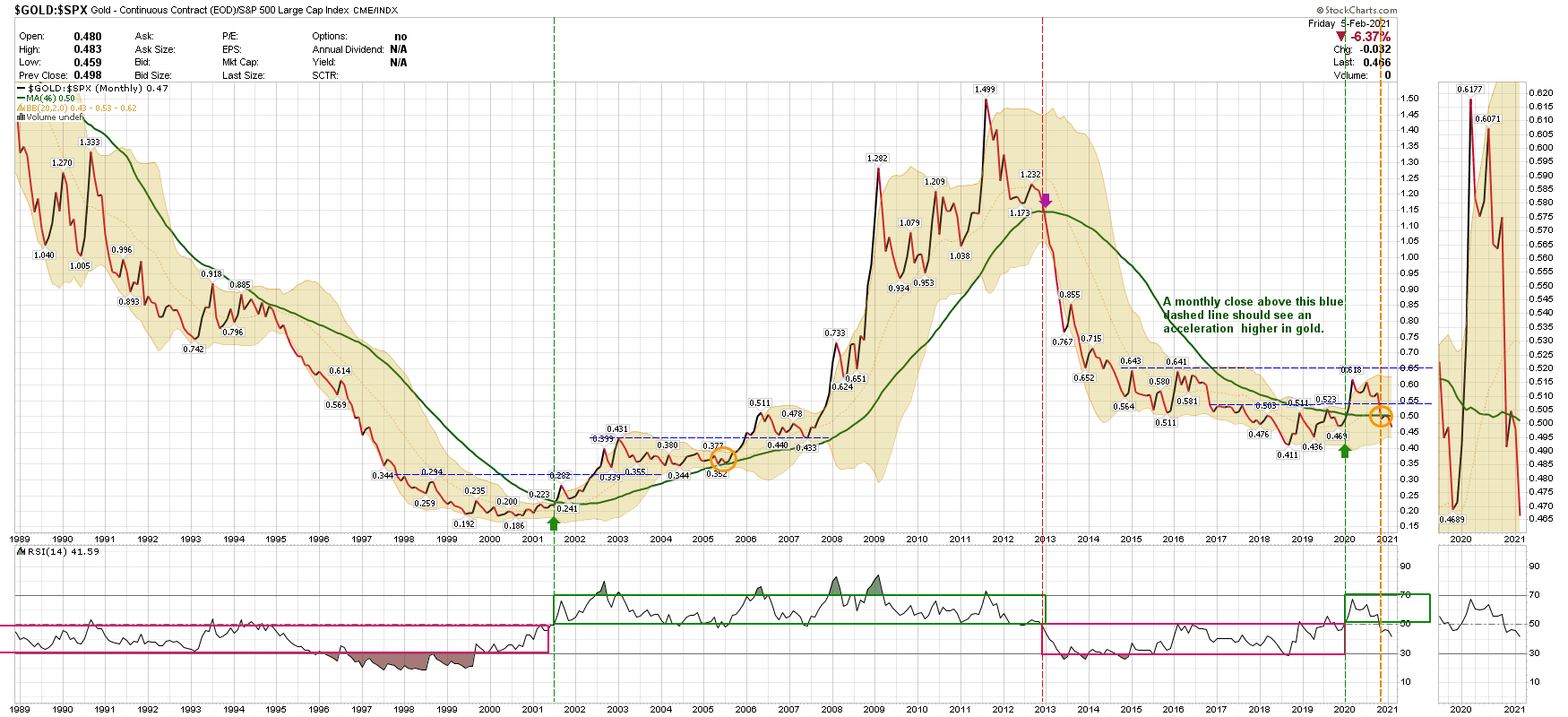
Here’s why I’m soliciting opinions from my learned colleagues on GoldTent: the S & P 500 is Market-Cap Weighted and the following 5 stocks make up 24.1% of this index – Apple, Microsoft, Amazon, Facebook, Tesla and Google. With the exception of Bezos’ Baby they are the Tech Darlings to the managers of OPM (other people’s money).
Now take a look at the ratio chart of Gold to the New York Composite (NYA)
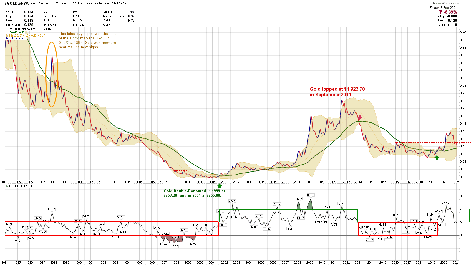
The NYA is also cap-weighted, but it contains 2,400 stocks and is NOT dominated by those you can count on the fingers of one hand. Could the domination of and fascination with the Tech Darlings be the reason why the ratio chart of $GOLD:$SPX is giving a bearish signal against the yellow metal?
Here is a cycles overview of gold from Sentient Trader using Hurst Cycles software.
https://www.youtube.com/watch?v=jykCrf61LOU&feature=youtu.be
Yikes dude, interesting video. I think he’s right. That would suck but would save me a lot of energy/attention as we let this play out a few years. I’m seeing major red flags that we peaked in gold and silver and this is more ammo . I’m stalking a position in DUST & it looks like May time frame to go heavier there. (Hedge against my long term buy and hold phyzzzz)
Don’t discount it may be a H and S Bottom Pattern forming .
I would only use it for weekly swing setups as support / resistance has changed. Did the s& p collapse from 84 to 99 ? No.
Highroller,
Are you addressing MY question, or commenting on the video hyperlinked by Banimal?
Of course, there is also the 2021 forecast for gold from Turd Ferguson we all know. Here’s his forecast he recently put out: https://www.tfmetalsreport.com/blog/10606/2021-gold-odyssey
And Fully, I did look at a gold chart and do see the inverse H&S you suggested that may be forming. We’ll have to wait and see how it progresses. I hope you’re correct!
The Fed has embarked on project Zimbabwe which entails large doses of MOPE.My take on the charts…don’t believe your lying eyes. Get real!