Covid-19 meets Bollinger Bands!
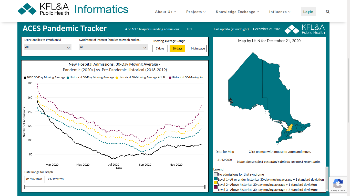
“The ACES Pandemic Tracker provides real-time situational awareness of admissions to hospitals in Ontario for reasons that may be related to COVID-19.”
There has never been a hospitalization crises in Ontario all this year! Am I missing something?
Note: the colored lines are Bollinger Bands for Covid-19! Top/Middle/Bottom +1SD/0/-1 They’re not the usual +2/-2 of most Bollinger Band indicators, but you get the idea.
Data is from triage nurses classification of new patients admitted to hospital based on patient complaint as well as nurses’ observation. Main point: this is symptomatic observations not PCR lab tests. It includes a wide range of respiratory symptoms which could include flu, covid, or other things, but only for those who come to the emergency room and are actually admitted to hospital. That’s probably why it paints such a different picture –no asymptomatic “cases” with PCR tests run at ridiculously high levels of amplification. These are sick people who are admitted to hospital because the triage nurse can see they are really sick people who ought to be in a hospital. Old fashioned medicine; clinical diagnoses.
https://www.kflaphi.ca/aces-pandemic-tracker/
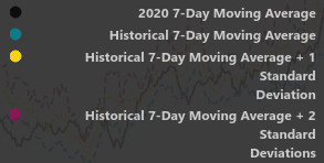
UPDATE 845pm : Legend for colors
The government of Ontario announced yesterday that come Boxing Day, 26th of Dec. they are locking down the entire province, including that big, sparsely populated chunk (where I was born actually) that has more bobcats than people, for two weeks. The southern part stays for another 2 weeks.
If you understand Bollinger Bands (you must by now), how long can prices stay below -1? So, hospitalization for Influenza like illnesses, Pneumonia and general Infections, which would include Covid-19 symptoms is pretty low. Low as in time to go back to normal not ABNORMAL.
TimH
This is huge
I have some questions
Is this graph you posted for All of Ontario or just for the District in Yellow …which looks to be Muskoka Simcoe ?
The Black line is the 2020 7day MA up to date right ?
The Blue line is the 2018 2019 7 day moving average right
The Yellow is + 1 std deviation and the Red +2…but for someone just wanting to compare 2020 with 2019 and 2018
we should just look at Black vs Blue
Also it just says “New Hospital Admissions”
This implies ALL admissions and not just Covid ?
I would like to make this understandable to non Chartists and non math people
tia
PS…If my interpretation is correct this is a simple chart to show admissions all year are lower than 2019 and 2018…!!
OK I think I get it now
You need to click on the link
It is an interactive chart
ALL the BLUE regions are BELOW the Average Yearly Hospital Admissions for Flu Like Respiratory Illnesses
Many of them 1 standard deviation below !! This is Most of the Province !!
There was a spike above the averages in April but since then its all below average.
There are 2 regions that are Above average at the moment…Red Being 2 STD deviations above and yellow 1 std dev above
These are smaller regions .
So this is stunning
In general the vast majority of regions in Ontario ( including all the “HOT” spots like Toronto and Ottawa and Windsor ), are well below the norms for Hospital Admissions with Respiratory Symptoms
Something is really really Rotten here…someone has to ask the Health Czar for the Province WTF is going on ?
If you think about it, this chart shows us what we’ve all been seeing with our own eyes.
Yes, it’s quite a different kind of chart and a different sort of data. The admissions are for “syndromes” of symptoms that the ACES people consider to be indicative of Covid-like illnesses. The purpose of syndrome classification is to help identify quickly developing trends in hospitalizations that would indicate a “respiratory problem” in the area.
It’s for all of Ontario. The yellow place is the only one above normal. All others are green -at or below normal.
I’ve updated the post with a more readable legend.
It is a huge. At first I thought I must be misinterpreting it. The big thing is it uses clinical diagnosis –observed symptoms– and not laboratory testing. Also, it groups a whole lot of possible illnesses together into a syndrome because at admission time they don’t actually know what the patient has but they do know what they patient is complaining about and what symptoms they have. It’s intended to be a real time surveillance for outbreak detection and hence it’s a rougher, but more practical view of what’s going on.
But as far as the hospital admissions and ICU (emergency) situation, it’s a very accurate and up to date picture. It’s updated every day.
Here’s their 47 page pdf user manual. It’s got the basics of syndrome classification as well as the whole idea behind real time surveillance.
https://www.kflaphi.ca/wp-content/uploads/ACES-User-Manual_v01032020.pdf
So in a nutshell ..for non TA geeks..
In 90 of Ontario Regions Right Now and for MOST of the year…Admissions to Hospitals for Respiratory “Syndromes”
( Flu like / Covid like symptoms) are way below Normal !
Not only is there no Pandemic ..there is an Anti Pandemic !
TimH this is monumental ..we have to get this info out to some MPs and have them ask WTF is going on
Public Health needs to explain why they are locking everybody down when Respiratory Admissions are historically LOW ?
Call you MPP and I will call mine…and somebody needs to call Randy Hillier !
It’s the same in the U.S. Nothing different. This is a worldwide con job to end freedom and liberty.
Period.
Resist now or forever be a slave.