Putting the “second wave” in proportion…
In the world of technical analysis we’re accustomed to looking at data in a number of ways based on what the data is about. The MACD histogram is a good example. It presents the distance between the two MACD lines, which you can already see, as a bar chart, a histogram. Same information but presented in a different form because it’s harder to compare the distance between the lines when both lines are curving. The histogram presents the distance as bars stacked up beside each other and all starting from zero. Also, we often change the color of bars and lines and the background of charts to make important distinctions more obvious.
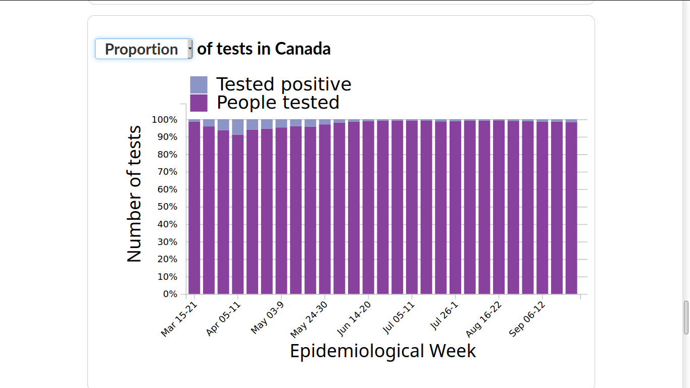
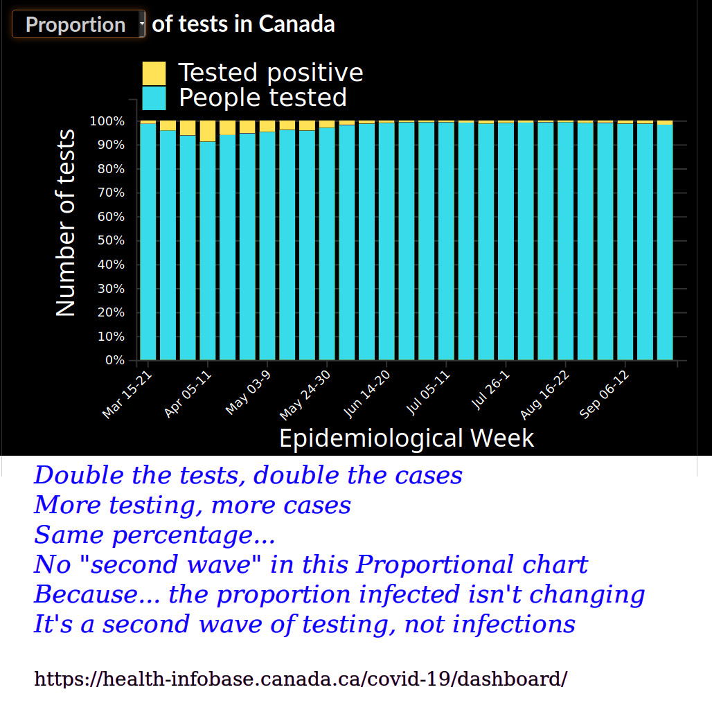
In this original Government of Canada chart it’s almost impossible to see the positive test portion at the top of each bar for the (so-called) “second wave”. Of course, part of that problem is the actual positive test portions are so very small (for “Son of Tsunami!”). I inverted the colors and gave them a more contrasting hue in a graphics program. Like the MACD histogram, the underlying data in my darkened and high contrasted proportional chart is much clearer to study and draw conclusions from although all I changed are the colors and chose the “proportion” option instead of the more popular “number” option, which is here below.
Doesn’t this one make you “quake in yer boots”? But like the converging and diverging movements of the MACD lines, gauging a meaningful trend in positive PCR testing results is hard in this form. But as technical analysis enthusiasts we’re all used to this analysis of technical things. Maybe that’s why most of us have a much different perspective on this current crisis than other equally educated people who are not as familiar with charts as we are. And also because we’re used to sorting out the charlatans from the real experts in the world of trading. I don’t even trust myself anymore!
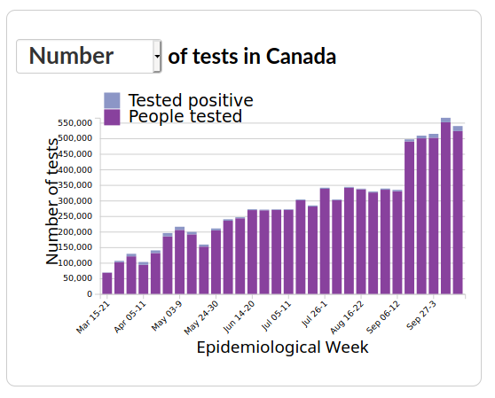
Get a load of this beauty of chart…
Now that’s a wave the whole country can surf on! But again, it’s literally out of proportion. Unless you work in a testing facility perhaps, and in which case it is probably a good indication of overtime hours, new hires, new purchases of supplies and equipment …and money, money, money! I’ll bet some of those testing and vaccine companies are worth looking at.
All charts from the Government of Canada’s COVID-19 Situational Awareness Dashboard.
https://health-infobase.canada.ca/covid-19/dashboard/
Good post. Thanks Tim.
Excellent Work TimH
This is research that bears instant appeal .
Your comments and color contrast is great for us in the TA community but that first chart says it all even for laymen.
Thanks for that website as well