Covid-19 vs. Flu (2018)
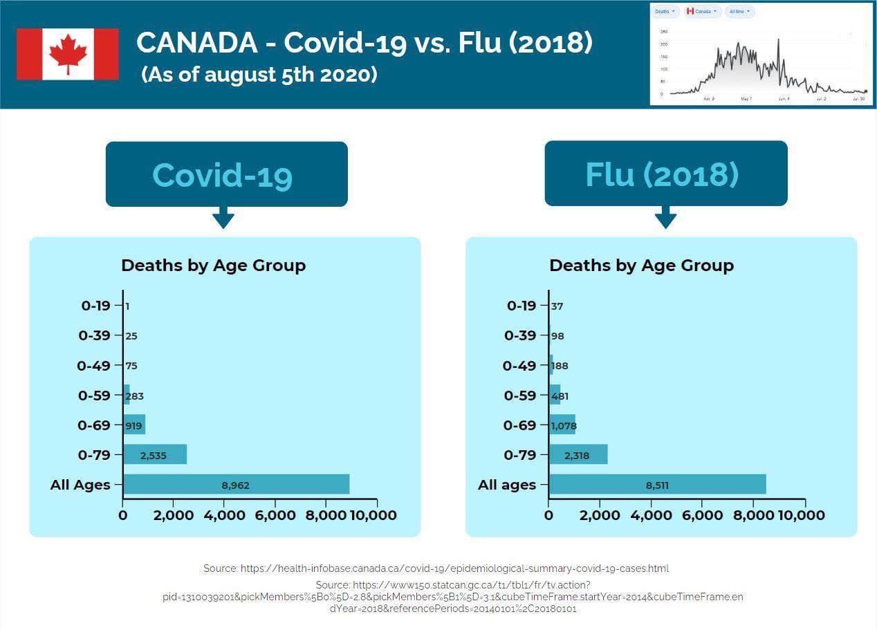
The Canadian government’s own chart! I couldn’t find it anymore online but it is also posted on the independent Canadian federal parliament member Randy Hillier’s Facebook site. Where he said this almost a month ago (Aug 7):
I encourage everyone to pause the talking heads for a moment and check the numbers for themselves.
Clearly for me, lock-downs, masks, social distancing, closing down our economy and education makes no difference. Our government has dug themselves into a deep hole they can’t get out, and we won’t either until we face up to the facts and stop buying into the fear. Politicians and the media have become to fearful to speak truthfully because of the backlash from social media mob. It’s time all reasonable people speak up and ditch the maskerade.
*COVID-19 Deaths of those 80+ are 6,327 and Flu deaths in 2018 of those 80+ were 6,193*
I don’t know if this has been posted here before or not, but even so I think it’s worth a rerun. Kind of says it all, doesn’t it?
And, and… it’s the federal government’s own chart! I’d like to print this on facemasks and give them out for free. At least then all those masks would be doing some good.
Edit: Randy Hillier’s Website has many more graphs showing the comparison with Covid and a Normal Flu Season
Wow…first I have seen this…excellent TimH
Looks like THIS Conspiracy “Theory” has been elevated to a Conspiracy”Truth
Would like to hear from Simon and the gang about this graph
What do you conclude from this?
My conclusion is that this year is a normal year for respiratory illnesses. It’s like the weather. Same as last year. The panic, hysteria, media hype and public fear is entirely man-made and government-induced. And it’s not like the “experts” didn’t know this back in March, either. This coronavirus, from an epidemiological standpoint, was shown to have the same traits and characteristics of a type A influenza outbreak with the sole difference that most cases are extremely mild and it has almost no mortality in the younger age groups, even those up to 50 or 60. It has killed the same sorts of people, those already weak or very old, that the flu does.
Amazing chart though, isn’t it? It’s as good as that one that shows, so simply, how increasing test numbers come from merely increasing the amount of people you test! There is no -qualitative- difference although most people will think there is. It’s a trick, just like graphing cumulative results instead of daily or weekly so that the line on the graph always climbs higher on the chart and never goes down. Of course, any goldbug is already wise to a lot of these data tricks. We’ve all learned the hard way.
Probably the best graph to show anyone who doubts the covid is a Flu !
A Picture is worth a billion Words in this Inflationary environment .
We should send Mr Hillier an acknowledgement for his brilliant work