Gold is at a key juncture – a 10 year inflection point.
I have had to reconstruct my old giant gold pitchfork from years ago because I was suspecting that the price had possibly reached the point where I thought it had – and it had. This has been drawn by “eye” because stockcharts software is not working on my laptop to annotate the chart for some annoying reason. Anyway, here it is:

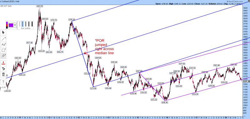
Below is the old chart posted here years ago, where the price plunged in the 12 and 15 April 2013 (Friday and Monday) by $270 (-17%) creating the point of recognition of the bear market and jumping right across the median line of the huge $1800 to $1180 swing. The key points of the fork were $1309 (point A), $1798 (B) and $1179 (C). The median line also points back in time to the late 2009 high at $1227 by the way – but not exactly. There was a smaller fork (the red one below, almost parallel but not quite) at the start of this current bull market; point C of that one being the low at $1045.
This price action near $1700 is gold trying in my view to get into that giant fork once again. Maybe the clear point of recognition of the new bull market will come at that point?
Re-drawing the forks by eye above was easy because of the precise alignment of the rejection point at $1307 in early 2015 on the big fork and the virtually exact alignment of the $1124 low on the smaller fork which was the first higher low after the bottom at $1045:
The price levels of this large pitchfork are currently at:
bottom line: $1740
median line: $2066
top line: $2406
This gives an idea of the potential upside moves if it were to become active. However, a rejection here is also possible!
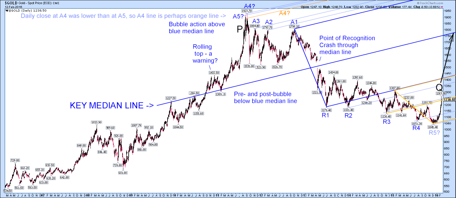
Dredging up some old charts from 2016, the action reaction lines and the subsequent behaviour of the newer, smaller fork were enough to convince me as an amateur chart watcher that the bear market was highly likely to be over. Now after a very long time, gold is hitting the underside of that huge pitchfork again (top chart). Will it be rejected or accepted on this occasion? The upside potential would be huge, surely?
Very interesting!
GREAT explaination Dave! Indeed.. we are at cross roads for gold … and your charts shows it. I think we bust through.. but not without some emotional pain.