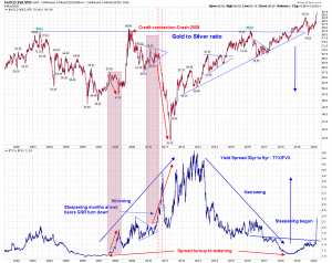
Gold to Silver ratio vs Yield curve 30 yr – 5 yr T bond rates- Huge breakout
A chartist will definitely say that is the BO on Yield curve. Waht is the O from this chart for the Yield spread?? Please it is ?
In current financial cycle what is the relation with SGR?? since 2008 crash?
Below is the combo chart of gold to silver ratio (inverse of SGR) and yield curve in the bottom panel.
As Yield curve broke out and rose with some lag GSR dropped in recent past. This not some thing in last 33 years just in 2008- 2009 with current Monetary practice of FED policy. market is responding to FED. Which can be seen on charts only. No opinions.
Outlier here is GSR not yet responding??
In 2007 -2008 Yield spread turned up from inversion to to + 2.0 and GSR dropped 57.88 to 47.56.
Today at the time of BO GSR is historically highest above 100. AND Yield spread just broke out from lowest level?? What distorted market from past.
Chart from past is only guide .
My head is not in sand rather it is in charts.
