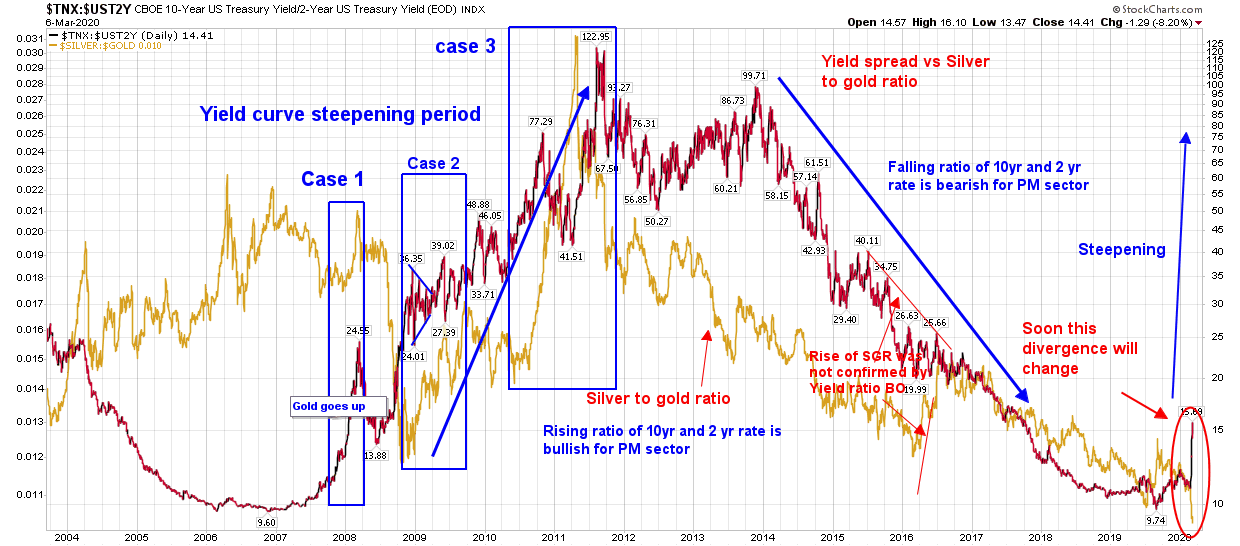
Yield curve TNX to 2yrT vs Sillver to gold ratio
Since 2008 dynamic changed for relationship between Yield curves across all maturities Chart shows periods of positive relation in blocks 1, 2 and 3. Silver to gold is plotted in gold color line chart behind price.
10 yr to 2 yr T bond spread in rates is aligned to PM sector with varying degree of time lags.
This chart highlites relation of yield curve and SGR from 2007 turn from inversion to steepening.
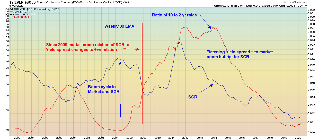
Also a weekly chart of SGR vs yield curve in 30 ema line to eliminate noise shows positive relation and turn up delayed due to divergence.
A very strong possibility SGR will turnup or inversely Gold to silver ratio expected to breakdown soon??