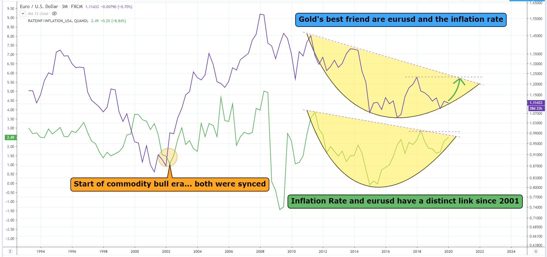
Who is leading the dance?
Lots of charts look alike… the inflation rate pattern is seen in a whole bunch… kinda makes it easy which camp of goods belong to which basket.
Now.. who is leading who in this dance?
Lots of charts look alike… the inflation rate pattern is seen in a whole bunch… kinda makes it easy which camp of goods belong to which basket.
Now.. who is leading who in this dance?