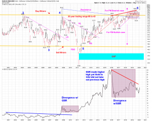
Gold to silver ratio Monthly, Daily
Monthly chart shows GSR above 100 but daily shows it was less than 100. ??? Strange.
The daily chart is a combo chart with Yield curve TYX/FVX in bottom panel. As the chart shows Yield curve turned up GSR bean to drop in 2009-2010, finally making high in 2011 April.
Hope this is repeat of 2008-2009.


Is it my impression.. or it feels like the head winds are too strong.. and we need to crash before we get back up?