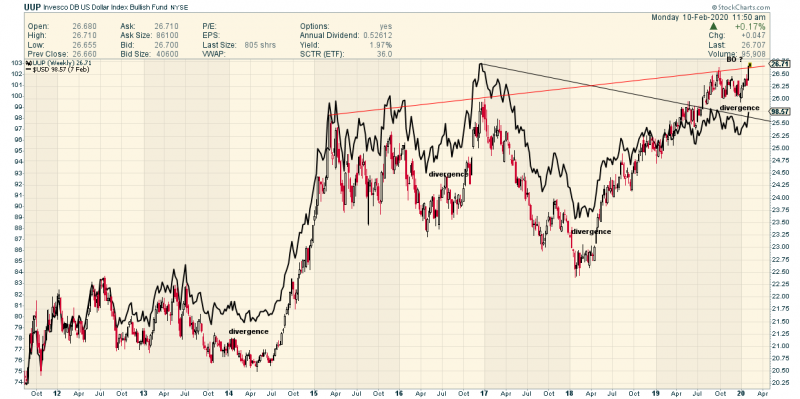
UUP vs US Dollar Index
Looks like we may have stumbled upon something significant.
Thanks to pedro and Alfa8
We were discussing why the UUP looked different on different platforms.
Turns out Stock Charts “Normalizes” the price following Distribution …which UUP had a little while ago
While other Platforms just print the raw data.
Distribution causes an “artificial” gap on the chart….and that seriously changes the character.
Also as Alfa8 explained UUP can diverge from the Dollar Index even though it is based on the dollar index..as Investors who are bullish the dollar bid UUP up .
This chart shows that when UUP is outperforming the DX will eventually catch up !
UUP in Red
Dollar in Black
UUP has broken out to new 10 year highs while the Dollar has not yet done so
Interesting No ?
My working thesis is…Gold doesn’t follow the rulse any more.
Gold doesn’t have to plunge when the Dollar rises.
It has been rising WITH the Dollar and therefore rising in ALL Currencies…as it should in this near zero to sub zero interest rate enviornment.

From Carl………
Another sign of an economy that is slowly turning down is a slow rate of money velocity. More technical signs are emerging of an economy that is gradually weakening. The Fed is scrambling to keep the economy stable. GDP growth is not possible because of trade problems, broken supply chains, a manufacturing recession, and massive consumer and corporate debt. In the future consumers and corporations will be forced to committ more money to debt reduction. This will reduce demand. Other indications of systemic problems in the economy are a dramatic increase in farm bankruptcies and declining volumes of shipments in the trucking and railroad sector.
I stand by my belief that sometime between late 2020 to 2023 most people will agree that a full scale possibly deflationary recession is a reality. By 2025 to 2028 the U.S. will be fully focused on trying to manage a huge national debt that either a Sanders or Trump presidency would make worse. Neither have the skills to manage these problems. Sanders is an ideologue who will go to his grave preaching his version of massive government spending programs in the face of a shrinking economy with an existing debt level that few fully comprehend. If Sanders somehow became president he would evoke to the Republicans and a large part of the population the same anger and rage that Trump does to Democrats and many independents and moderates. The question that would be being asked is, who was worse, Trump or Sanders?
Trump will advocate lower taxes and increasing spending in his desire to buy votes for a second term. Either outcome means nothing but trouble in the next four years. Trump may also attack the safety net of the disadvantaged and poor by reducing Medicaid, Medicare funding and increasing S.S. access at a time when it will be need more than ever. Sanders would attempt to increase the same programs with money the government does not have access to. Raising taxes when the economy is declining is a death warrant. If you want to see what happens just study how the Labor Party almost bankrupted Great Britain under Prime Minister Wilson. Wilson of course paved the way for Thatcher to become the P.M. , in a similar way that Bush Jr. made it possible for Obama to become president. In a declining economy the U.S. may have trouble borrowing money from anyone but itself. It would have to try and inflate the currency to pay off debt with dollars that have less value. Deflation could turn into stagflation, followed by inflation not caused by increasing demand but by currency devaluation—the worse kind of inflation.
I have been suggesting since the 1990’s that by 2025 the demographic problems and ballooning national debt would become enormous negatives preventing economic growth in the U.S. My observation in the 90’s was based upon demographic studies and the impact on deficit spending caused by an aging population and the financials demands on Medicare and Medicaid. There is little evidence to suggest that scenario is not unfolding. The trade wars may actually be speeding up a move towards deflation and a contracting economy.
The stock market has surprised me over the last two years. I did not expect interest rates to remain down as long as they have. In the long run, low interest rates become a negative. Low interest rates cause valuation bubbles in some stocks and some real estate markets. All bubbles only based on buying that is being forced by increasing prices eventually pop. Valuations in stocks and real estate are currently being justified only by low interest rates. However not all real estate and not all stocks are participating. The excessive valuations are selective. This is similar to what happened leading up to tbe breaking of internet technoloy bubble in 2000. Eventually the NASDAQ declined by 70%. Dont think it cannot happen again.
Now the trend looks like we could be heading towards negative interest rates if my belief about future economic developments proves accurate. That is an outcome I would have never anticipated. Negative interest rates reinforce deflation. Broken supply chains reinforce deflation as countries not being impacted by tariffs battle to establish business relationships with companies looking to develop factories outside of the economic war zones being created by Trump will cause enormous problems for most retirement plans particularly pensions. Carl
Doesn’t the level of divergence vary depending on you starting point for the chart. In this case its late 2011, but if you use a different starting point it looks different.
Fair point
But just considering the present divergence
It looks quite significant UUP has made new highs ( adjusted for distributions)
But the US Dollar has not.