A Few Bullish Possibilities For The PM Space
I have not had the time to keep up with this site so forgive me if any of the following chart scenarios have already been posted.
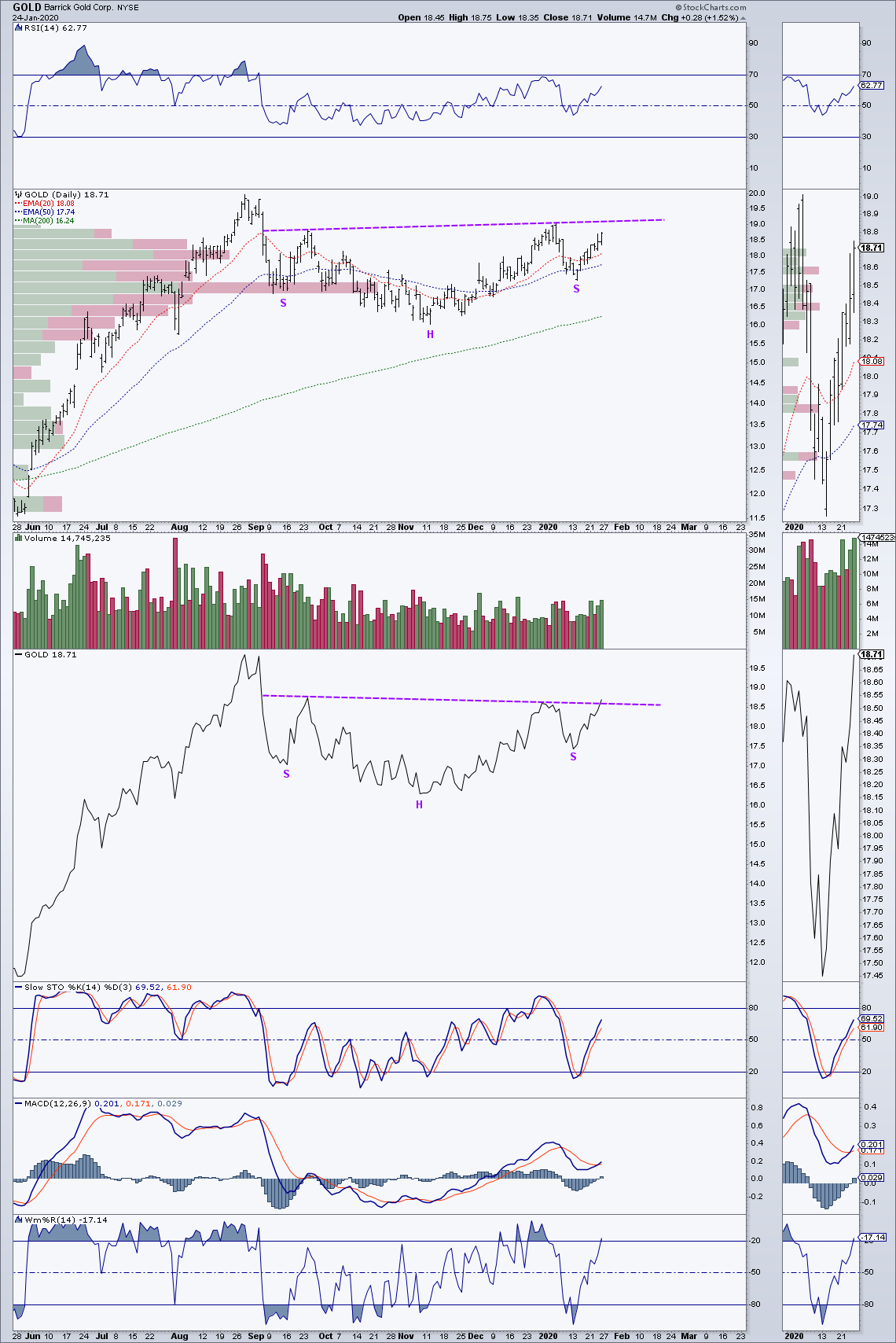
Because Barrick Gold is among the largest gold producers on the planet, Ive been following its chart developments as a possible proxy for the PM space. This first daily chart for Barrick shows a possible 5 month inverted H&S pattern in the making. Note the break out above the 5 month AP line shown on the solid line version.
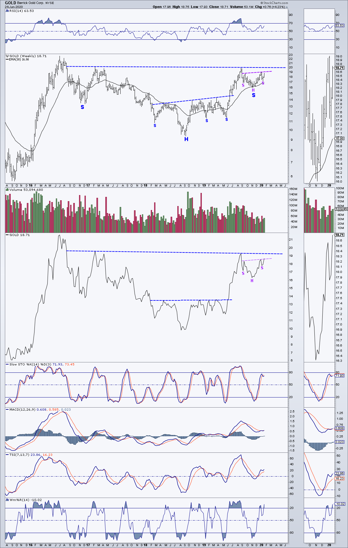
Next is a weekly chart for Barrick that shows how the above purple inverted H&S pattern fits into a possible 3 1/2 year inverted H&S pattern. The above purple H&S has the appearance of being the right shoulder for the larger possible 3 1/2 year pattern. The solid line weekly also shows a slight break above the purple H&S AP line.
Next is a daily stacker chart showing bullish possibility’s for some of the largest gold producers on the planet.

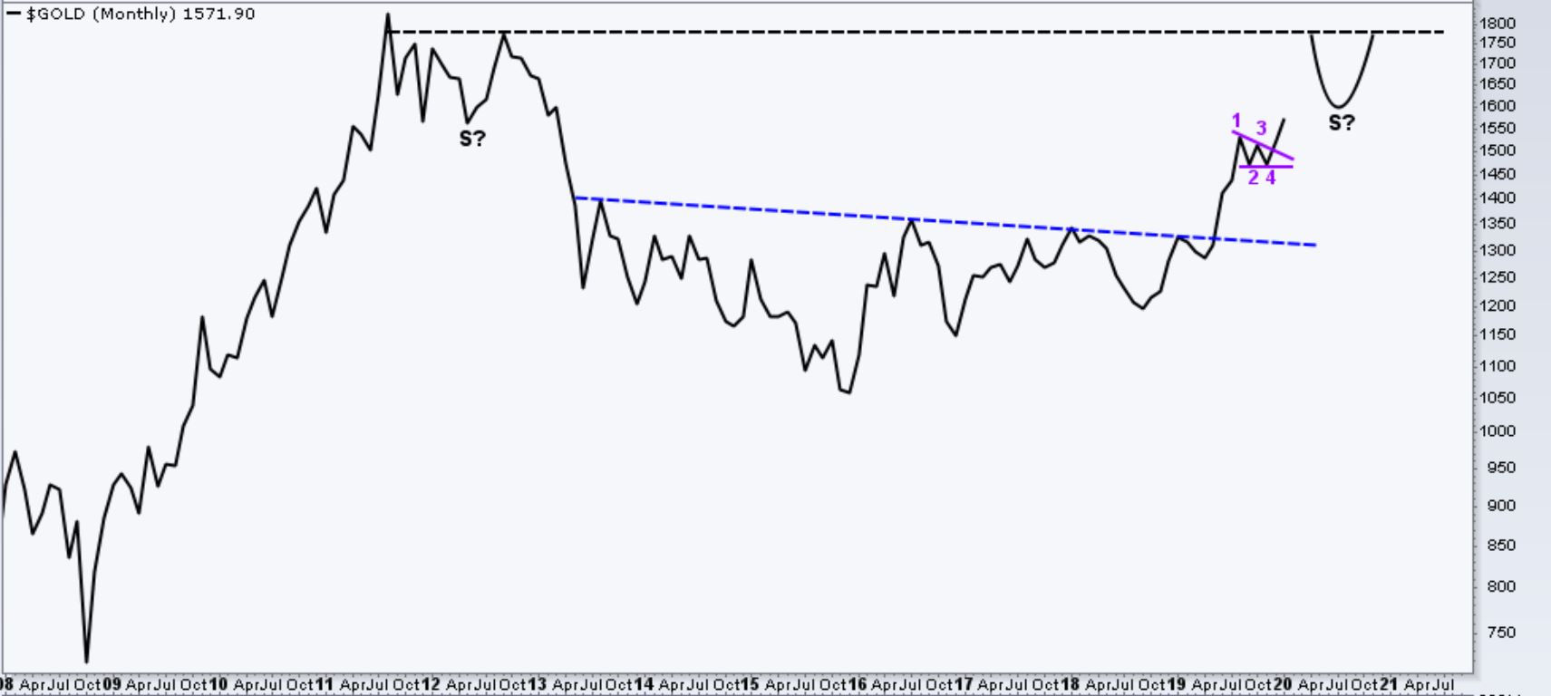
This simple solid line monthly chart for gold shows the recent break out of a 4 point wedge shown in purple. The purple wedge has the appearance of being a possible halfway pattern to the up side. The black dashed line illustrates the possibility of Gold building out a right shoulder around the high 1700’s for a much larger inverted H&S pattern. As much as I thought gold was going to back test the 6.5 year inverted H&S AP line around the mid 1350’s, the recent break out of the purple 4 point wedge on this monthly chart has me thinking we may not be getting a BT. Although a mid 1350’s BT for gold still remains a possibility, this chart seems to be suggesting the possibility of higher Gold prices.
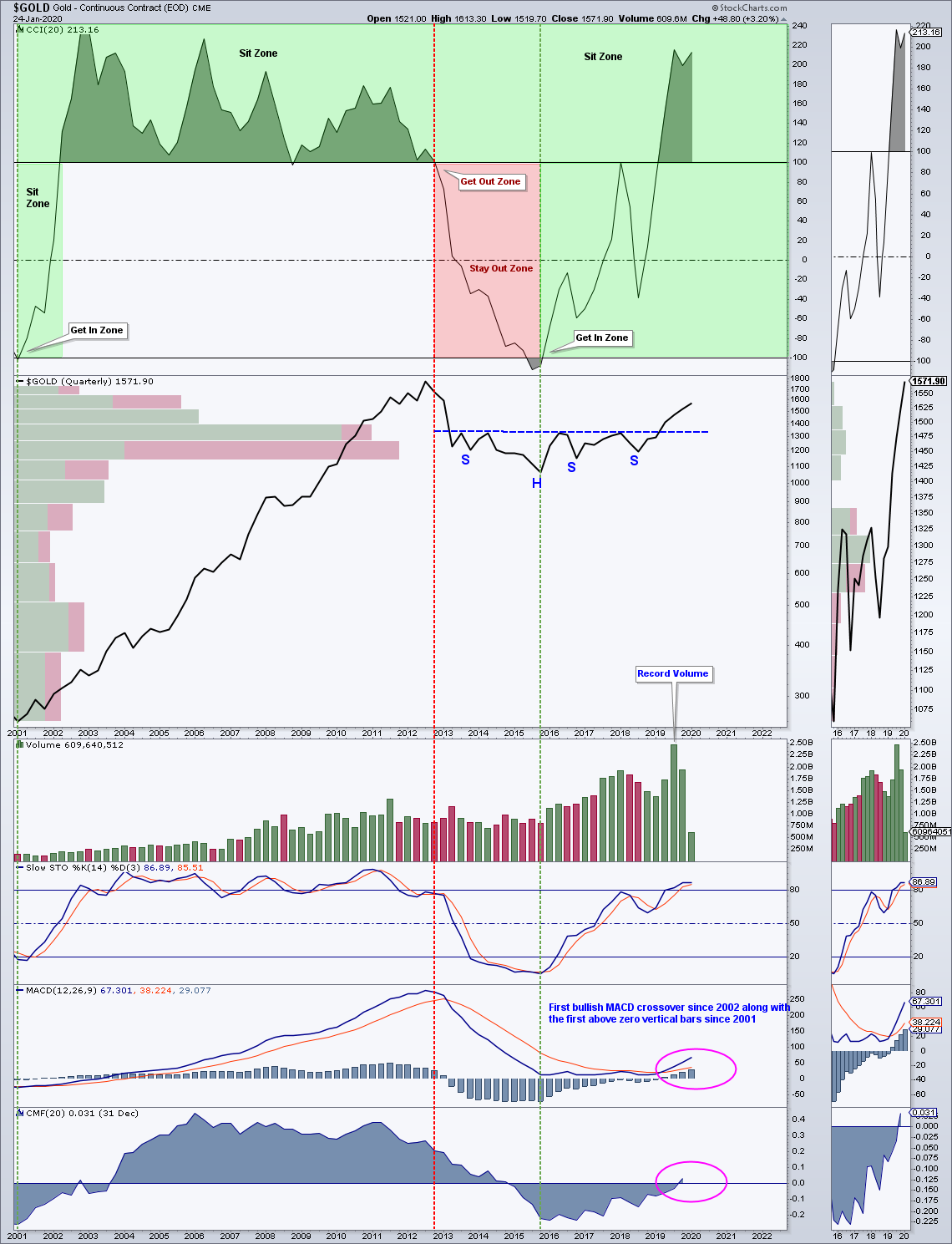
This next chart is a Gold quarterly chart posted here back on Jan 18th 2018. The 4 positive MACD bars along with the bullish MACD cross over are the first seen on a Gold quarterly chart since the early 2000’s. For the long term trend trader, this chart says Sit.
After way too many years of listening to way too many catalyst predictions, I’m now of the opinion that the successful completion and breakout of a chart pattern in either direction, (is a catalyst in it self) that’s worth paying attention to. If circumstances change, I am getting much better at accepting that change while leaving my denial at the door.
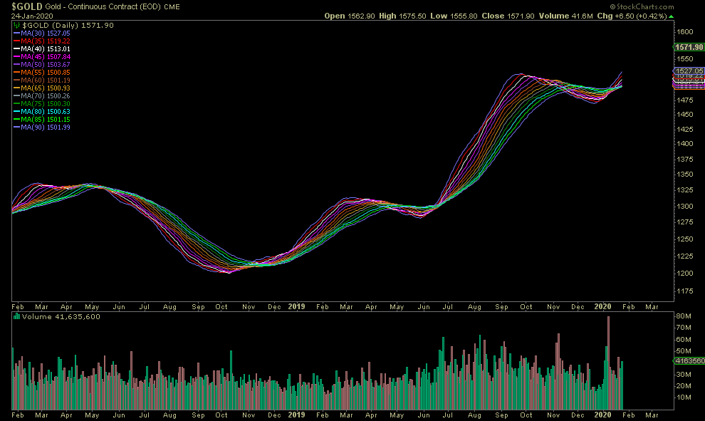
Added, the following chart is a recreation showing nothing but simple moving averages for Gold. Unfortunately, I can not remember the original source so credit goes to the unknown creator.
Good charts. Thanks.
Welcome back Optional @!
There is NO way to learn other than to get smacked around for a while.
Even then the thick headed ones don’t learn.
🙂
PS…Nice Chartwork.
Maybe we get gaps up tomorrow morning.
It’s about time.
Optional
You need too post more often Sir….!
Great perspective.
Thanks
Thanks Gentleman. “The temptation to quit is greatest just before ones about to succeed!”
YES!!! This is soo true!