Gold – 2020 Vision
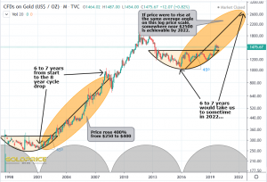
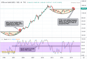
What follows are 3 gold charts which lay out my expectation for 2020. The first compares the base breakout in 2002/2003 to where we are now. In effect, back testing the breakout with a bullish descending wedge, which targets somewhere in the $1410 area (that’s also roughly the region where the 200 day moving average sits currently). I’m not saying we are going to hit $1410, just that it’s a possibility. I’ve highlighted the 6 to 7 year advance that followed, which, if repeated, takes us into 2022…
Next up, I’ve highlighted those breakouts and added the Stochastic Indicator…
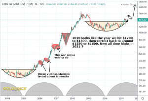
So, my theory is that we advance 20% or so from current levels, taking us to around $1700. We may overshoot towards $1800, but we’ll have a better idea nearer the time if that’s looking likely. Another lengthy consolidation/correction can be expected after that, probably bringing us back to $1600 or a little less. The next advance in 2021 will, most likely take us to new all-time highs…
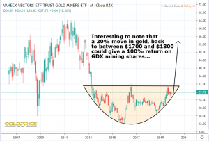
Finally, what does that mean for the miners ? Well, it’s pretty clear to me that we could realistically expect a 100% gain in the next few months…
So that’s my working plan. If the first part of it pans out, and we do indeed see a very big move in the miners, my recommendation (for what it’s worth) would be to lock in profits as the move is coming to a close (I’ll be posting my views on that nearer the time of course). 2021 also has great promise, and could well bring new all-time highs. With the mid-15 year cycle low due in early 2023, I would view 2022 with great suspicion.


Great stuff, once again.
Super, thanks NS!
Excellent roadmap – muchas gracias!
Okay, a bit confused here. I see you started the first line in the first chart at the cycle low…but then for your projection line, you start AFTER the cycle low. So, how do these two lines match up? The price action since 2016 is also significantly different than that which started in 2001. So why do you believe these two match up/mirror each other?
Sorry Silverboom – I should’ve made it clear. the black line is not a support/resistance line, it’s just there to indicate a rough median line for the direction of travel. The orange shaded areas are what I’m really highlighting in this chart. It’s less of a technical chart, more of an ‘overall pattern’ type of chart – very broad brush.
Of all the markets Gold exhibit fib moves more.
From break out in 2003 to top in 2011 gold extended almost 5.4 times. Current break out above 1350 if gold replicates same fib extension in next 6 to 7 years it could top at 7000+
I also notice that in your notation you say gold went from $250 to $400 for a 400% increase. I think you mean gold went from $250 to $800 for a 300% increase, no?
Oops, I meant $250 to $1000, a 400% rise.
250 to 1000 is a 4x move or (1000-250)/250 = 300%
Sorry, I should say a 300% rise or a 4 times move. You’re quite right. I need a day off I think. Too many mistakes lately.
Join my world… I must have the record for post-publish edits.. add-ons… corrections.. and what-nots! I’m just soo happy to share when I stumble on something cool