Gold Going Parabolic ?
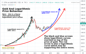
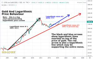
So far, the answer has to be yes (at least since 2001). Since that time gold has demonstrated one perfect parabolic run (2001-2011). The move since early 2016 is also showing every sign of conforming to a parabolic curve. The entire period may also be contained within an overall parabolic curve (shown in red). On a linear chart, a parabolic move shows up as a curved trajectory trending towards a vertical rise (infinity). On a log chart, a parabolic move will show itself as a perfectly straight line trending from lower left to upper right. In that sense, when looking at longer term price projections, support and resistance levels etc, it makes more sense (if you’re drawing straight lines) to do it on the log chart. Why ? Because the evidence supports the idea that gold price is continuing to behave in a logarithmic fashion.

