Rambus Wednesday Report
Gold Bull Reality Check
https://rambus1.com/2019/08/14/wednesday-report-253/
For Members
……………….
Sniped from This Blockbuster Post
(For Sir Steins1)
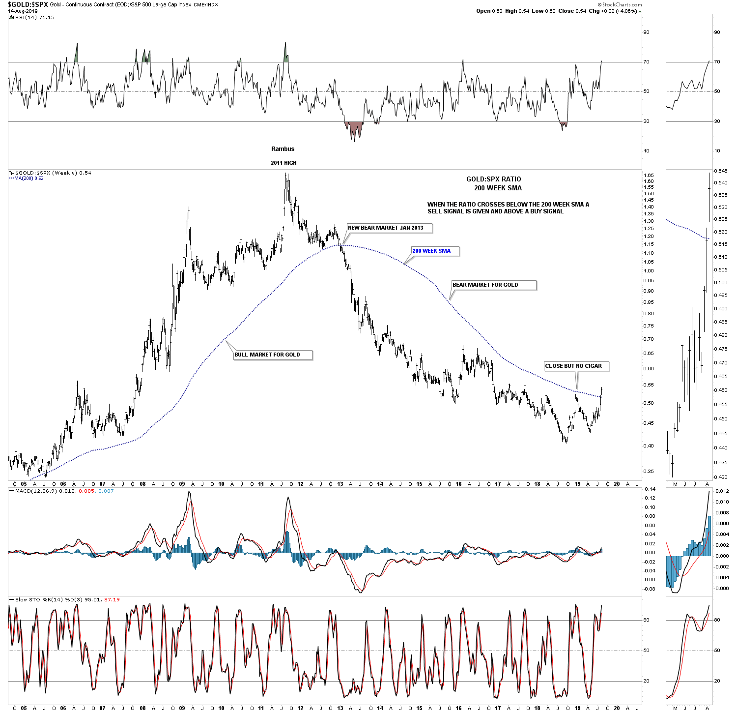
Below is another ratio chart we’ve been following for a long time which is finally giving us what we’ve been waiting for. This ratio chart compares gold to the SPX. When the ratio is trading below the 200 week sma gold compared to the SPX is in a bear market and just the opposite for a bull market. The last time we looked at this ratio chart was earlier this year when the price action rallied up to the 200 week sma but couldn’t break through. Note the last bar on the right hand side of the chart and the breakout gap this week above the 200 week sma. This week marks the first buy signal since the ratio went on a bear market sell signal back in January of 2013. To say this is a big deal is an understatement.
Thanks Fully!!!!
The SPX – Gold ratio chart is a game changer! Not even in 2016 did we see this!
If I may….. “To say this is a big deal is an understatement.”
This to me is just chilling! And explains to some degree why Plunger didn’t buy in, in 2016.
I’m sure there were a multitude of other reasons to, I remember some, but this is striking!
Agree …Looks like the worm has turned
Much maligned Gold investors may have the last laugh.
Tres Cool, Fully. I added this one to my chart list (of course with the notation “Credit to Rambus”). What a beauty!