Horses For Courses
Not sure how widely that saying is used, but it just means certain horses are suited to certain courses. In other words, some things are better in certain situations than others.
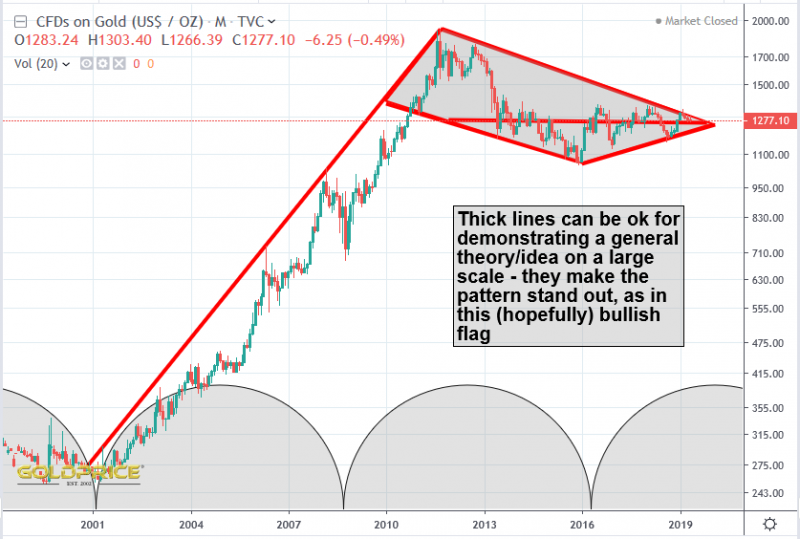
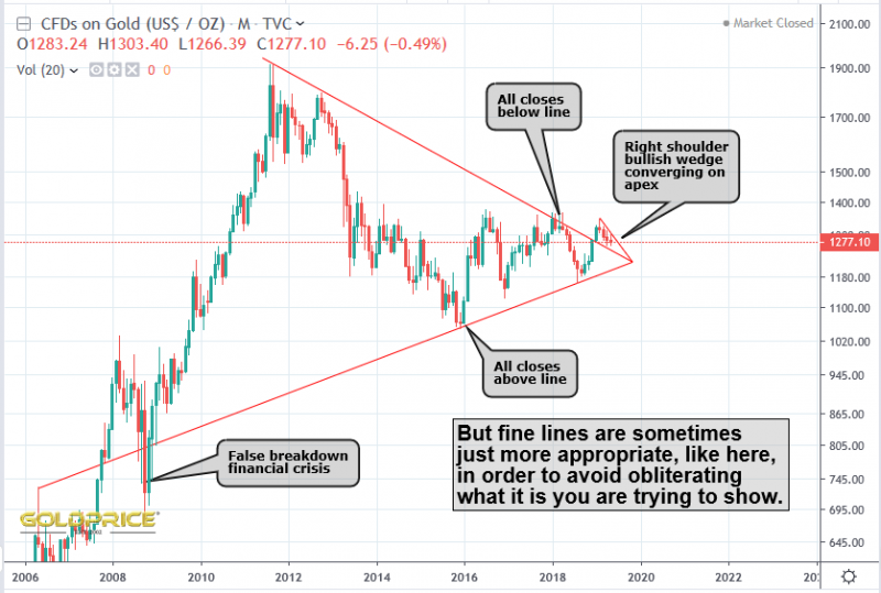
How you draw a technical chart is entirely up to you. It depends what it is you are trying to find out/demonstrate. The idea of thick lines or thin lines comes down to using them in the right context. You might’ve noticed I’m somewhat ‘vague’ about the breakout level for gold. I prefer to talk about a ‘zone’. That’s the ultimate thick line. It’s justified though, because there are several ways to draw the chart (the ‘bowl’ can have a flat top, or it can be inclined at an angle. You can put it on a log or linear scale etc). I’ve used the term ‘turbulence zone’ a few times to try and express precisely this point. Below are two charts – one with thick lines, and one with thin ones to demonstrate my point.


Did you notice that end of May 2019 is 61.8% correction in TIME of the gold rally from 1999 to 2011 (12 YEAR rally). Nice coincidence and Fib ratio again.
I didn’t. Thanks for pointing it out. Mathematics is amazing sometimes.
Great Chart!! Thanks.