Hindsight ?
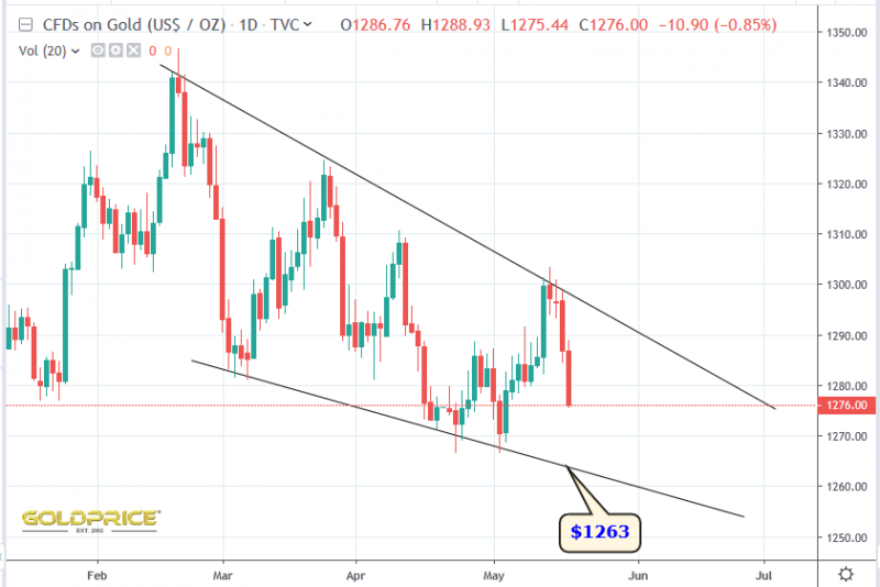
I’m going to lay myself open to accusations of changing the chart to suit my bullish bias, but I don’t mind. I think it’s perfectly ok to go back to the drawing board and reconsider things like line placement. We’ll soon know if my bullish bias is correct, because we’re closing in on the bowl support area. Here’s the bullish wedge with adjusted line placement…
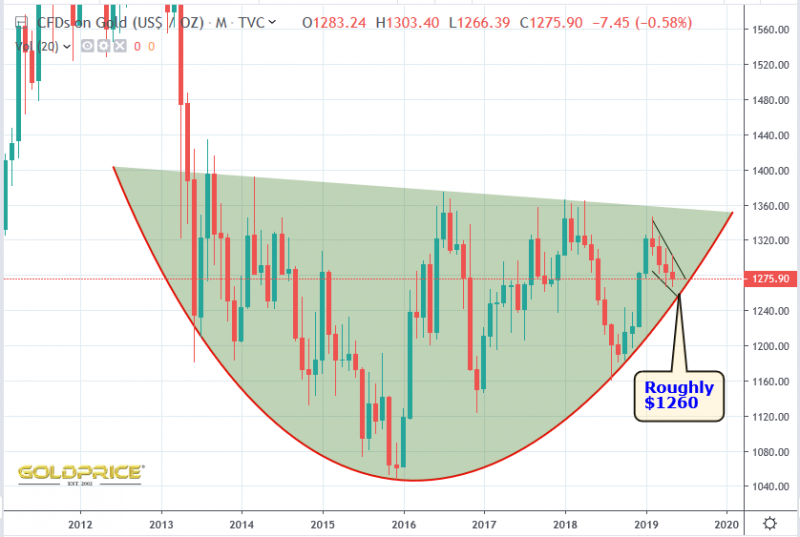
The reason I’ve done this is that I do still think this is a bullish descending wedge chart pattern. Putting it into the bigger picture, this is how the chart now looks…


No Problem NS
That’s all good chartology there
Keep on truckin’ NS.
Cheers guys. Unless $1260 fails, I have no concerns.
I think it turns up, when or perhaps AFTER spx turns down.
Then talk about rate cuts will return.
As for trendlines … used to sub Jack Chan years ago, with his focus on PMs.
During my time there, I don’t ever recall him posting a tutorial on how to draw trendlines, even though that was central to his method. I could always see an arbitrary dimension to those, especially as to using body or tail of candlesticks etc. Never thought to ask him. Not there’s a rule out there, just guidelines folks adopt.
Here is a comment or question that I could append to any number of posts. I suppose now is as good or as bad a time as any.
I don’t so much question changing lines to fit new data as having sharp lines at all, especially sharp lines based on relatively extreme numbers. Do you do that in meteorology? Don’t you include all the data? Then to forecast what’s coming do you use sharp lines? I bet that either if you use sharp lines you use confidence intervals along with them, or things that similarly represent uncertainty–or thick fuzzy lines that are a little intense towards the center and become fainter and fuzzier outwards.
I suppose there is a rationale for sharp lines in finance since other people will be drawing sharp lines since many people do the same thing, and many people will behaving similarly according to the same sorts of sharp line forecasts, so there are self-fulfilling prophecies in finance, whereas low pressure systems, clouds, and ice accumulations presumably do not look at your forecasts. So there’s that in favor of sharp lines in TA and sticking to them I suppose.
But all in all I just don’t get sharp lines, yours or anyone else’s. I also don’t get the strong reliance on sharp lines based on relative extremes as opposed to the mass of data within a period of time especially for representing overall trends of the data as a whole (as opposed to representing extremes). I do however see it as perfectly reasonable to change the lines as you get new data and to show changes from prior (fuzzy) lines to current (fuzzy) lines.
I hope I make some sense.
That all makes perfect sense Karl. Weather parameters don’t obey sharp boundaries. A downward trend in temperatures can be accurately forecast for example, but you have to use a confidence range as you head further into the future. Trading in stocks etc is similar and you have to allow for price crossing your lines at times – it doesn’t invalidate it straight away. That’s where so-called ‘false breakouts’ come in.