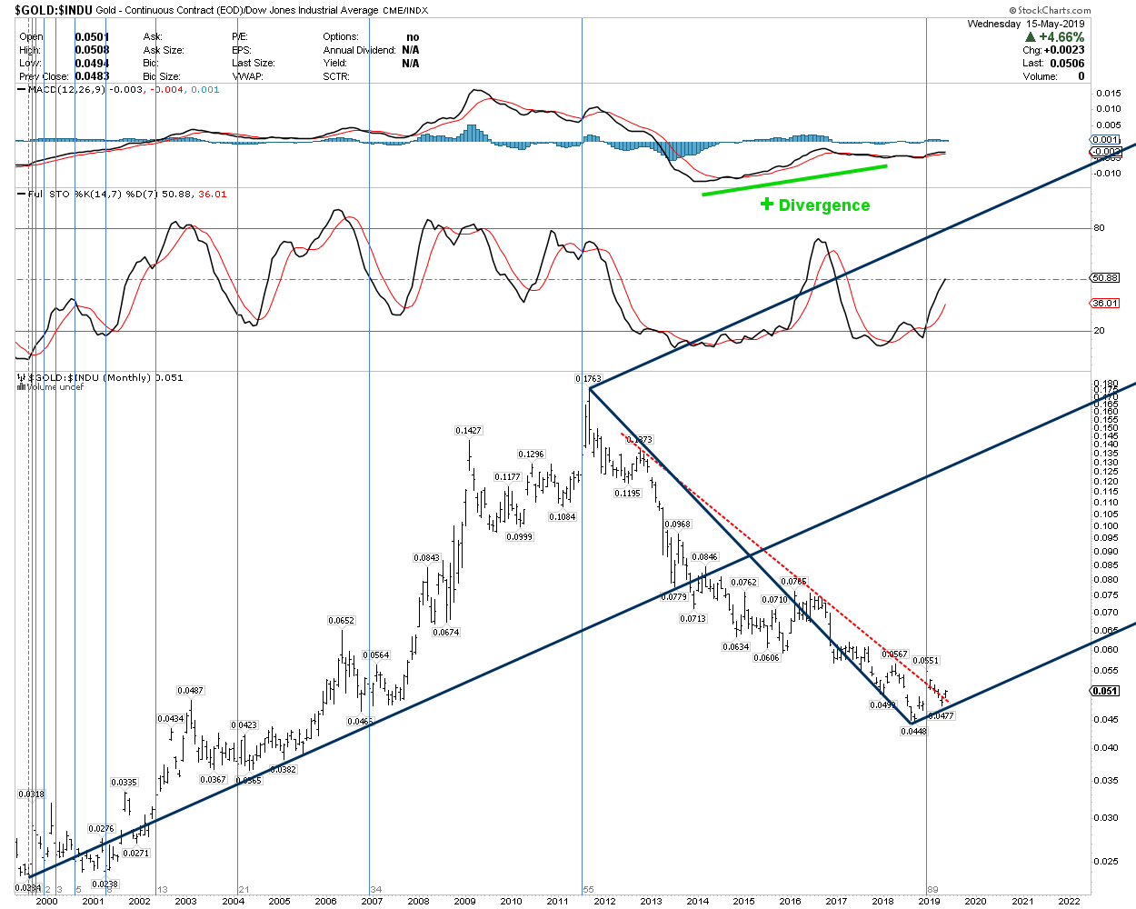
Gold vs. Stock Market
In this monthly chart, showing the value of gold relative to the Dow – I observe the following:
- Gold remains historically undervalued relative to the stock market.
- The Andrew’s Pitchfork placement, indicating support levels, as well as projected price targets – appears to be valid.
- Gold – relative to the Dow – has broken out above resistance (red dotted line) which has contained this ratio for the past 6-8 years.
- Positive divergence continues to develop in the MACD indicator as it has over the past 5 years.
- As indicated by the light blue vertical lines – Senor Fibonacci appears to be driving the entire process, which indicates that the end of the last 89-month cycle, and the shift from bear market to bull market – occurred at the start of this year.
Exactly correct. Thank you RTV.