Silver To Gold Ratio – What Is It Telling Us ?
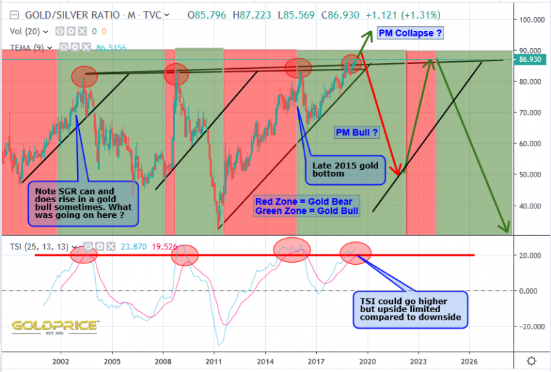
First, the chart…
I’ve shaded gold bull runs in green and bear drops in red.
Some key points here:
1 – We are at a level that has frequently marked a turning point. In fact we just broke through that level
2 – Indicators like TSI are also at a level that might suggest a turning point is near (it can remain high for longer though)
3 – Most intriguing to me – look back at 2002 and 2003 – the ratio continued to rise even when gold rose 30%
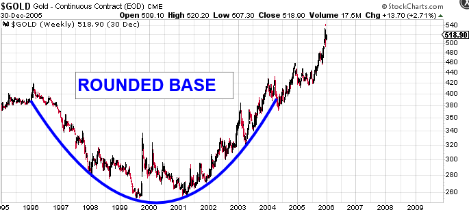
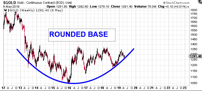
So what was going on ? It’s interesting because this time around gold has risen from $1050 to roughly $1300 with the ratio rising. This is a repeat of the early 2000’s. If we can understand what was happening in the charts back then, it should offer clues about the most likely move that will come next. If there are striking similarities, it would mean the relative price behaviour of the two metals is merely doing exactly what it did nearly 20 years ago. It would add yet more confidence to my bullish thesis. After all, we all know what happened in the years that followed the early 2000’s. Lets have a look at the 2 charts then – the early 2000’s and now…
So there you have it. History doesn’t necessarily repeat, but it sure has some very valuable clues that we can learn from.


All well and true, Northstar. However, from the close of year 2000 to close of 200 HUI increased almost 6 fold. (HUI hit 10 fold increase by the close of 2004)
From the 2016 bottom until today HUI has increased 50%. This glaring difference from yesteryear is not evident in your rounded bottom gold charts. Furthermore, although the recent peak in $gold challenged the August 2016 high, HUI reached just 40% of the 2016 high.
The why of it I cannot say because I have not the depth of knowledge. But I can suggest that sometimes the action in the miners leads the metals price. Are we experiencing one such time?
Oops, typo. Should read as
… from the close of year 2000 to close of 2003 HUI increased almost 6 fold…
Cheers, Northstar
I get what you’re saying, and I suspect the meteoric rise of the stock markets and the ‘FAANGS’ in particular has a lot to do with it. ‘Modern Monetary Theory’ (MMT) has also had a large effect (near zero interest rates and financial miss-allocation). I think the stage is set for something pretty dramatic to unfold. Regardless of that though, there are some definite parallels – that was all I was trying to get across.
“…the stage is set for something pretty dramatic to unfold.”
Yes. Some new fangled economic madness is afoot. People no longer know what money is, not anymore. Is it just digits, ones and ohs on some bankers computer? Often I take from my desk drawer a silver dollar and place it along side a loonie, the “new” Canadian dollar coin. The loonie is by far a smaller coin than the silver dollar of old. Its fashioned of nickle and plated with bronze to give it a golden sheen, but it won’t buy you a decent cup of coffee.
Ah, but the silver dollar! It has heft. It has feel. And it rings true when you strike it. To younger people these silver coins from olden times are a curiosity, nothing more.
You and I and many others here are certain this global monetary experiment will end in disaster. One day people are sure to again value real silver and real gold. Honest money. We need to get the timing right. Yes, it may be possible to have an honest digital currency, if it is backed by precious metals.
My meager efforts may accrue to children and grandchildren as the years on my own clock wind down. In the meanwhile we watch and we wait, and we keep on stacking. As we must.
Geez. Sometimes my mind races faster than I can think. Really, Mr. fox?
…HUI reached just 40% of the 2016 high… should read as HUI 40% less than the the 2016 high.
Cheers again.