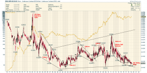
Silver:Gold Ratio Chart
I Set up this chart a couple of years back…..and posted it here….haven’t touched it ( or followed it lately)
Seems like a reasonable facsimile is making the rounds on the twitosphere
The new version lacks imagination and is a hot mess IMHO…I like my original version better ….
Imitation is a form of flattery
🙂

Thanks for the chart. Interesting relation of SGR with price of gold prior to 1980.
As SGR was dropping POG was going higher.