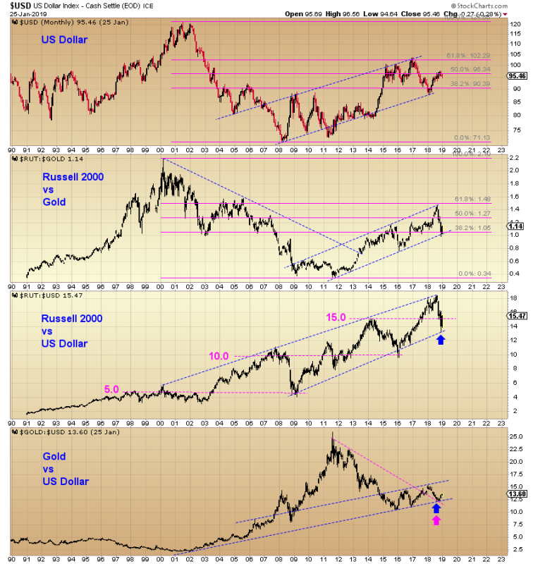
$RUT:$GOLD and the $USD: Similar Shapes
Tbone had an excellent comment on the $RUT:$GOLD ratio the other day with regards to the US Dollar: “To me that view is counter what I would think. There are many financials in the index. Wouldnt rising bank stocks and rising interest rates imply a stronger dollar. Banks make more money with higher rates.”
When you plot the $USD and $RUT:$GOLD, you see a familiar shape… The Financials sector is the largest sector holding of the IWM ETF, with an 18% weighting. The other index we like, QQQ, has essentially zero Financials exposure (less than 0.5%)
Apply some fibonacci lines to $USD and $RUT:$GOLD and the similarity continues. Both charts retraced 61% of their declines from their early 2000s highs, then tested their respective 38% fib lines.

Also interesting is the $RUT:$USD ratio which reveals an upwards sloping channel with a recent backtest of the bottom rail. Ratio levels in intervals of 5.0 seem to be important. This implies a possible upside sell target of 20.0 for the $RUT:$USD ratio (and subsequently buy back in at 15.0 which would presumably become the next support level).
$GOLD:$USD looks encouraging for Gold. Breakout from a downtrend with a simultaneous support from a long term ascending support line. -Harry