Happy US Thanksgiving from Rambus Chartology
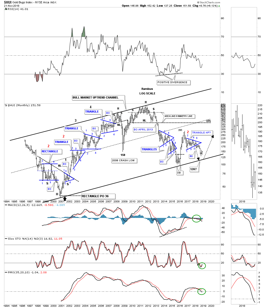
” I know some of the charts above don’t look very bullish if one is investing the the PM complex, but things always look the worst at the bottom. This last chart for tonight is a long term monthly chart for the HUI which shows the entire history and every chart pattern the HUI built out. I personally didn’t become aware of the bull market in the PM complex until the spring of 2002. From that point I charted all of the consolidation patterns in real time until the present. All I can say is this chart shows you classic Chartology. During the bull market years you can see one consolidation pattern forming on top of the previous one. Note the small H&S top which led to the 2008 crash and then the 2011 massive H&S top which ended the bull market.
I’ve shown you this chart a couple of times this year when things were looking pretty bleak for the HUI. The last triangle to form was a halfway pattern to the downside as it formed below the 2016 high. The price objective of that triangle was down to the 120 area which just happens to be close to the bottom rail of the 2000 uptrend channel. So with a lot of bearish patterns, here is one that has some bullish potential for the long term.
Have a great Thanksgiving weekend with your family and friends. All the best…Rambus”
Editors Comment :
And that’s the Whole HUI and nothing but the whole HUI….so help me Gold
Fully Report
for members
Thanks for this.
Thanks for sharing Fully and Rambus. I do feel the bleakness and at the same time the hesitation to buy more at these levels, which tells me it is at least a mid-term bottom. It should feel this bad, so I am pretty cobfudent Rambus is right on this one.