$USD – You can get all the things you seek for a dollar down and a dollar a week…
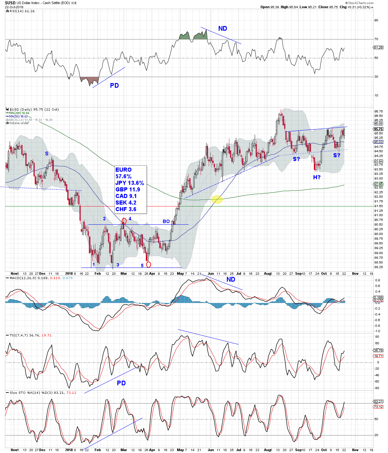
On a candlestick chart it seems that although the $USD is threatening to break above a small inverse SHS neckline it is having trouble overcoming resistance between 95 and 96.
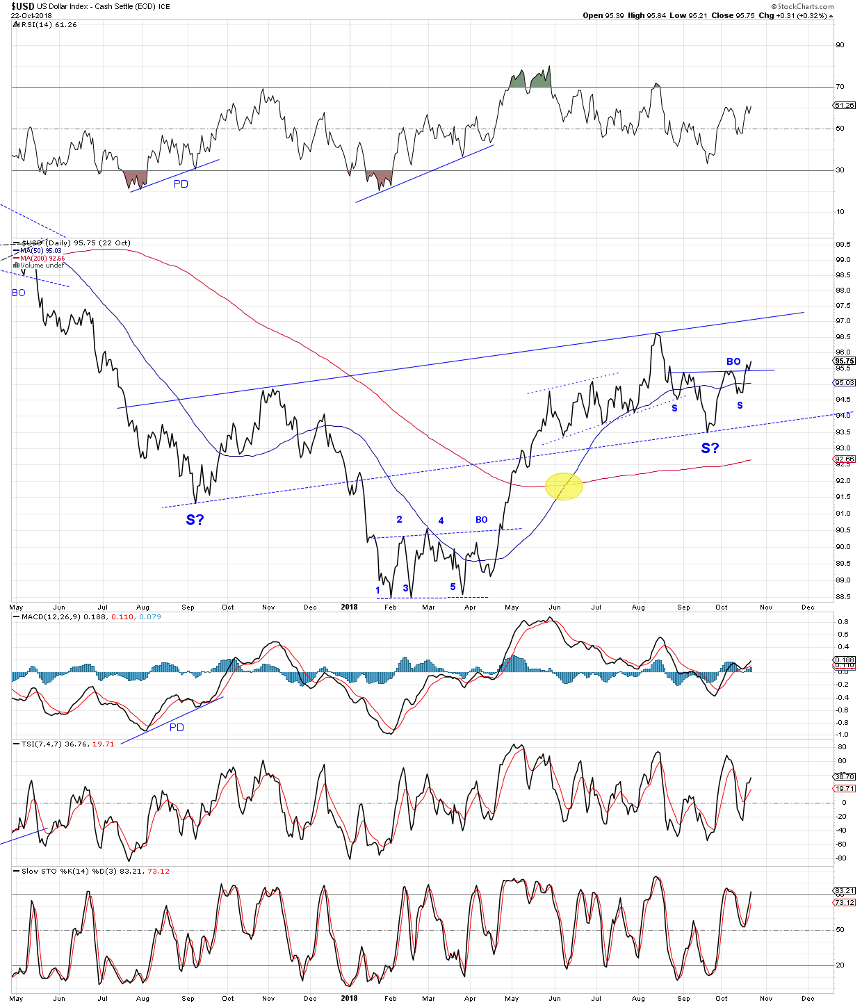
A line chart does away with the chaff and tells a different story. Notice the smaller inverse SHS pattern forming the right shoulder for a much larger inverse SHS.
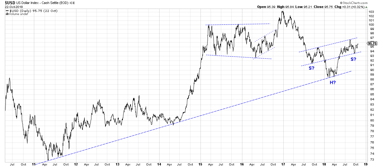
A longer term view shows where the larger potential inverse SHS pattern found support – smack on a trend line with several touches extending back to early 2011. Remember, 2011 was the PM bull market top.
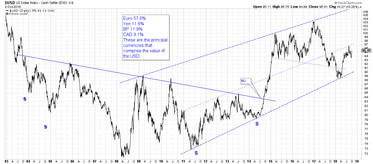
On a much longer term chart we see that $USD launched from an inverse SHS base that built out for 11 years. Big base, big move (Rambus). The top rail on the chart could indicate where $USD is headed.
Too much debt, a soaring doller = deflation? (the big inflation comes later IMHO)
https://youtu.be/OPXUP8xr5nA
Wow Foxy
Great Work ..a fresh perspective…
Your last chart – I have my doubts if that is a valid inverse h&s. I don’t see the neckline. Maybe I’m mistaken, not I’m not sure.
The neckline is the dotted midline which has previous touches on it ..it is valid imo
But as you point out there are no cycles considered…pure chartology
I had a little trouble posting the chart, Northstar. That happens when when one is still in “annotate mode” on stockcharts and you download in preparation for posting. Strange things can happen to your chart. I re-posted with a corrected version.
The tune “A Dollar Down…” is from the late 1950’s or early 1960’s. It was popular on the radio when I was a kid. People still buy on credit. Some things don’t change much.