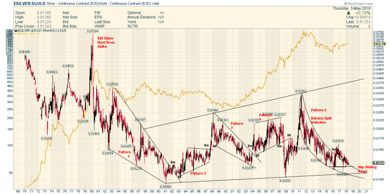
The Peculiar Chartology of the SGR
The SGR ( Silver Gold Ratio) is often cited as one of the most important charts to determine The Direction of the Price of gold
This chart is surprising to me.
It shows the co relation is NOT necessarily strong.
Also shows a banana split .
I had this chart on my back up lap top which I hadn’t used in a couple of years….Amazing how The SGR is following that parabolic line . This is proof that switching from Silver to Gold has been a good idea for a very long time
Keep Stacking ?

FWIW
I use a formula to track the exponential function of change in SGR D/D over a real time limited D running average. The actual value of the SGR is not relevant rather the value of deviation D/D? Never checked the accuracy rate cause I’m in the green and I keep making slight changes to the formula. Appears to be indicating OB/OS conditions in the PM’s?
IMO Long term Y/Y the SGR is also relevant.
Though I’ve never tried to actually apply it to the M/M or Y/Y?
Any thoughts on platinum to gold/silver ratios?