An Opposing Viewpoint
This post will probably not make many people happy, but, it is what I am seeing right now. The large majority of people are expecting the dollar to fall hard and the PM sector to soar. It’s obvious when you look at the long term cycles for the dollar that stand out like a sore thumb, right? Well, here is another view that doesn’t fit squarely into that camp.
As most of you know, I have Elliott Wave software that I run once in a while for a sanity check. I had time this weekend, so here are some charts it produced. They were rather eye opening for me.
First, the long term dollar chart (as represented by UUP).
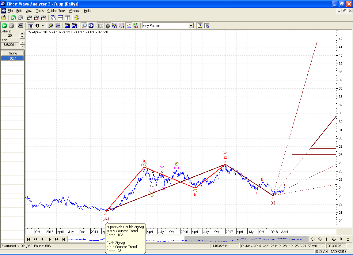
You can see the EW software has declared the decline that started in 2017 over. It shows an ideal target of about 29 in 8 months or so.
Below is a “close up” of the decline:
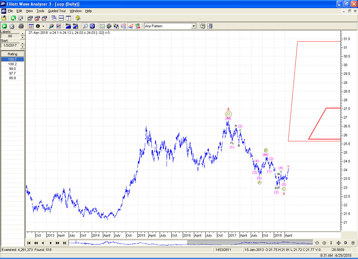
Again, this is just showing the decline as being over.
If this is the case, you would expect gold to show the same sort of counts, but in the opposite direction. Here is gold long term:
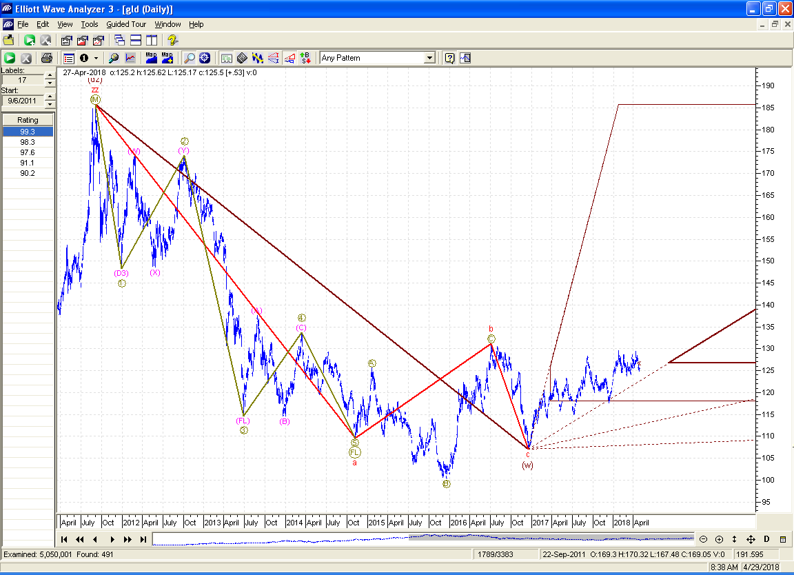
As you can see, the chart is saying the rise staring in 2017 is near the price/time to find its end.
Below is a zoomed-in view of this rise:
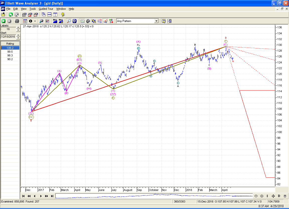
This chart shows that indeed, the software has concluded that the rise is now complete.
I know that the view of most is just the opposite, and that the historical trend of the dollar looks quite obvious, but as the great Joe Granville once said, “If it’s obvious, then it’s obviously wrong.” If and when gold breaks through its neckline, I will run the software again, but until then, it looks like the PM sector has hit its top and is headed down to me (and the software).
Thanks Ken. I for one, welcome opposing viewpoints. I don’t rule anything out.
Plus 1
One Plus 1. Or Plus 1 plus one.
Thanks!
That is very interesting indeed, Ken. This will be a good test for your EW software. Thanks for sharing.
Thanks Ken. How accurate have you found that software to be? As I recall it calculates odds
It gets some calls right, some wrong – like any other system. This particular analysis looks pretty good compared to some it generates. After many years of using it I have gotten to know its weaknesses and strengths pretty well.